-
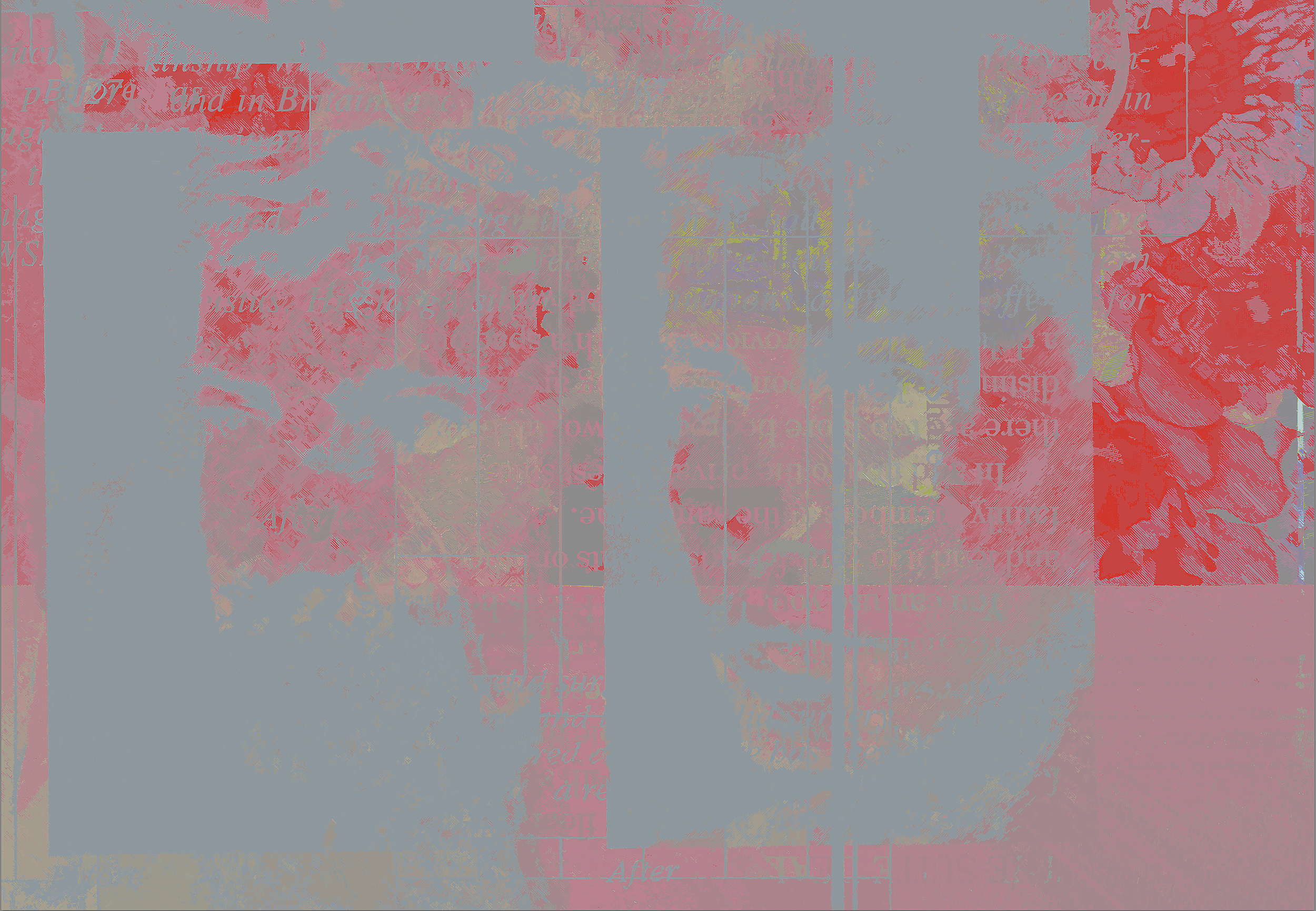
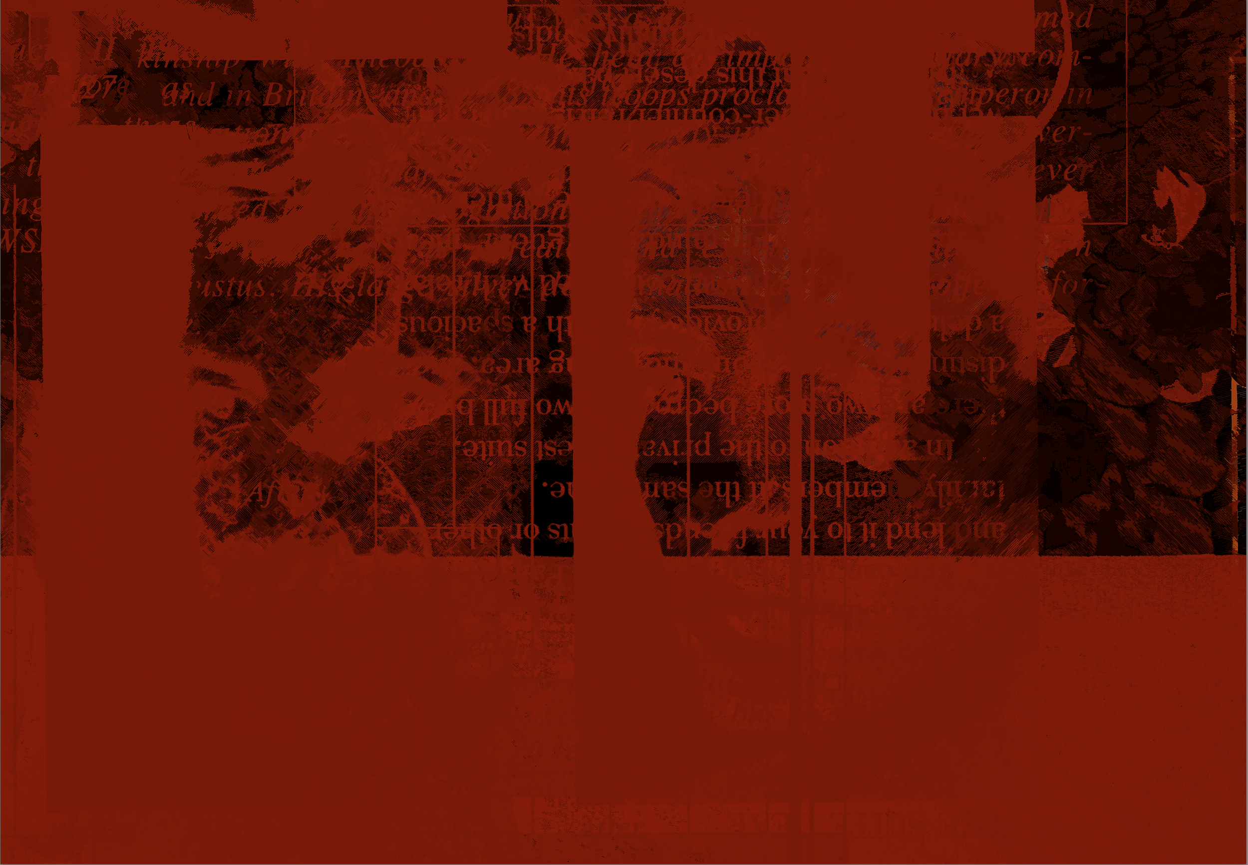
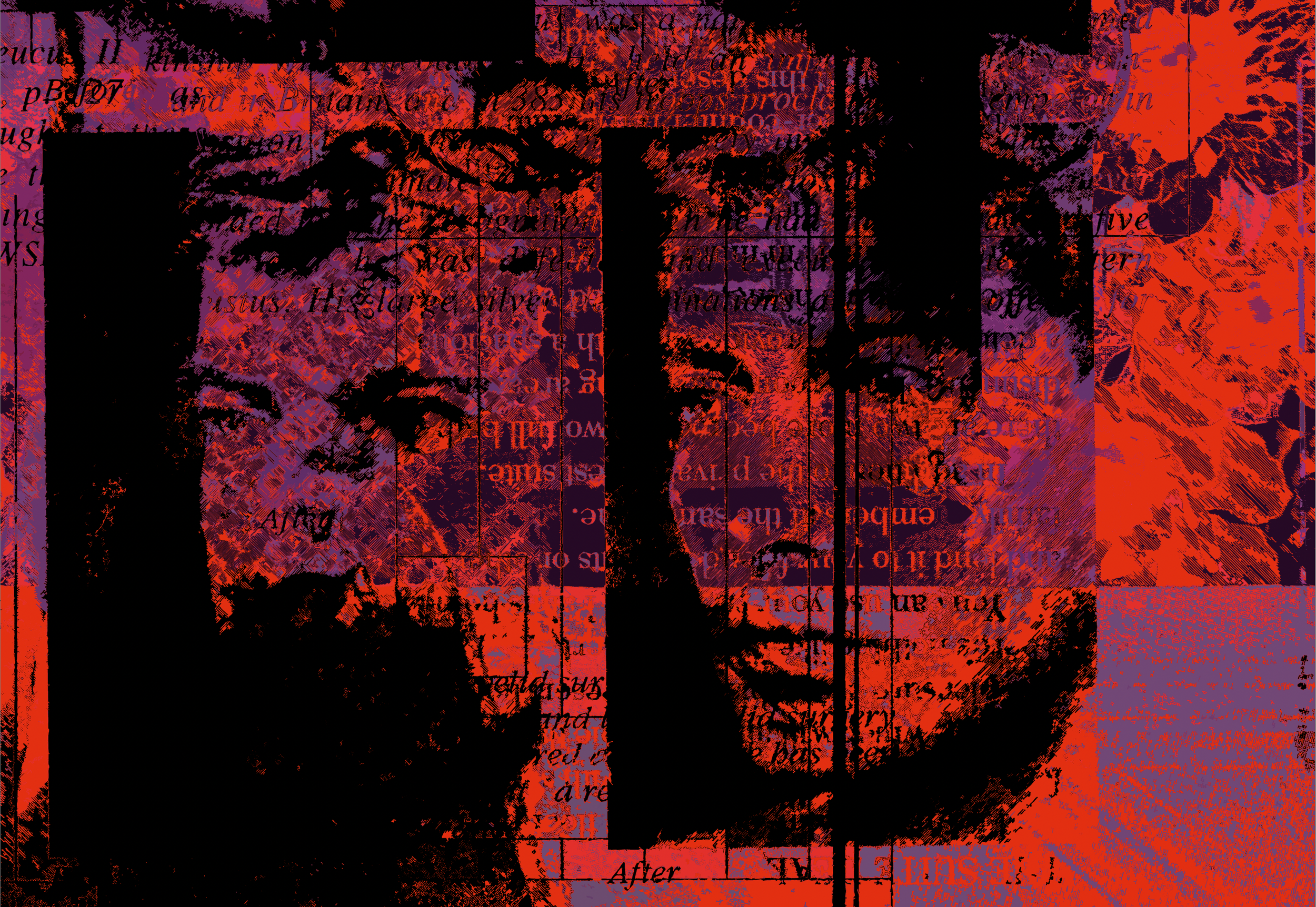
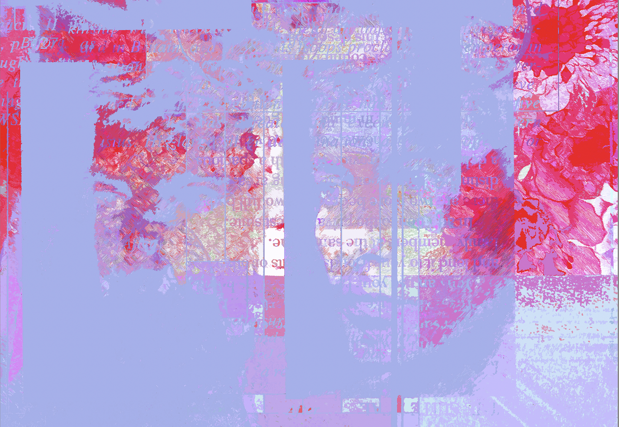
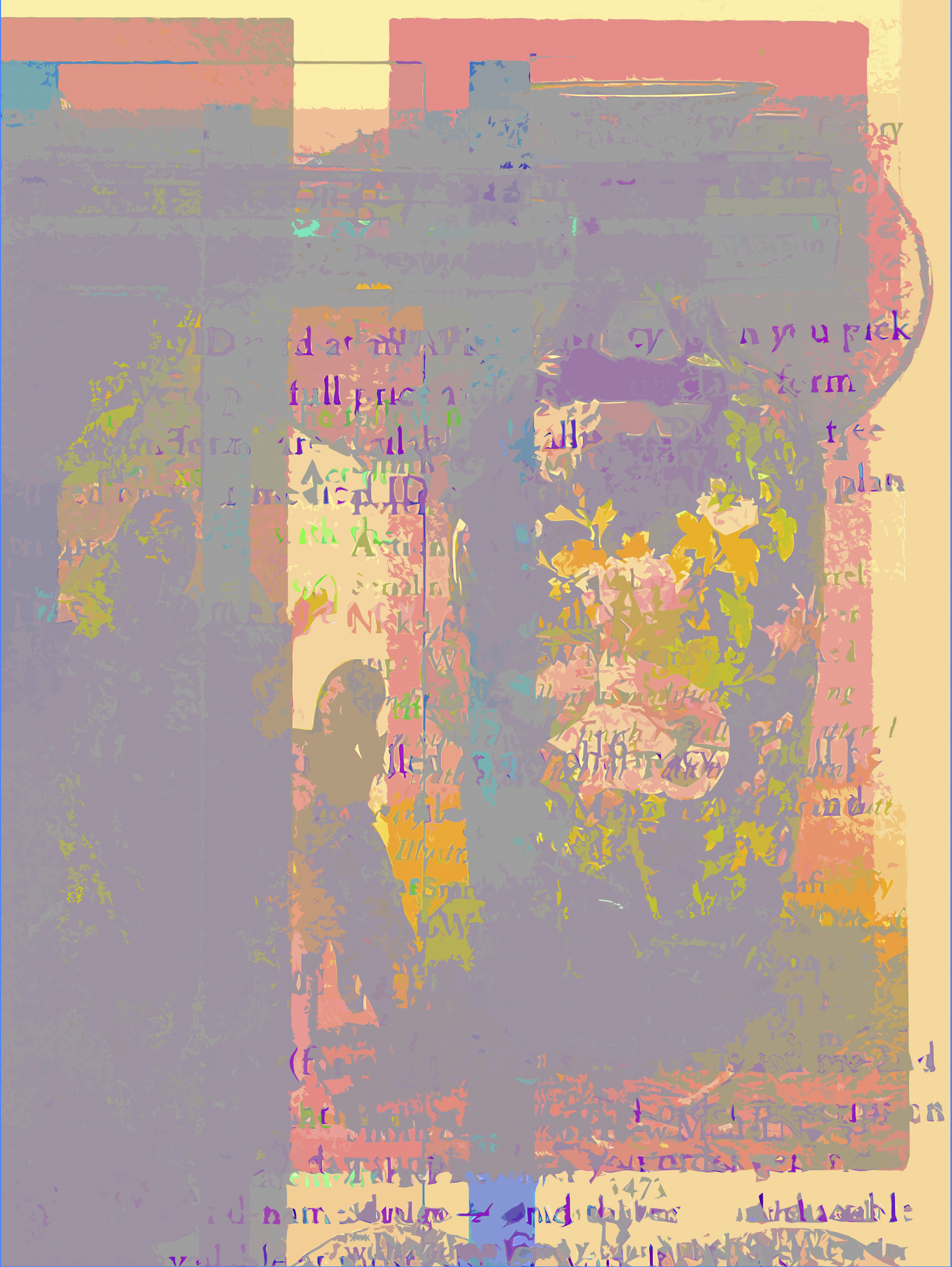
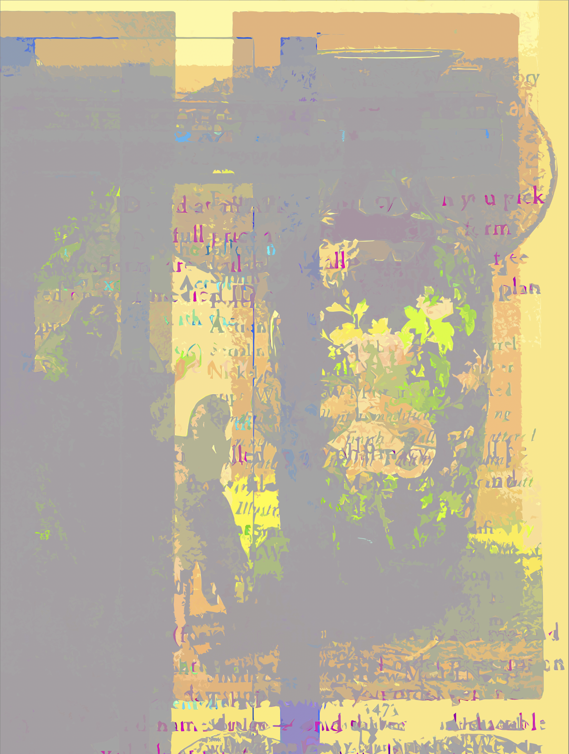
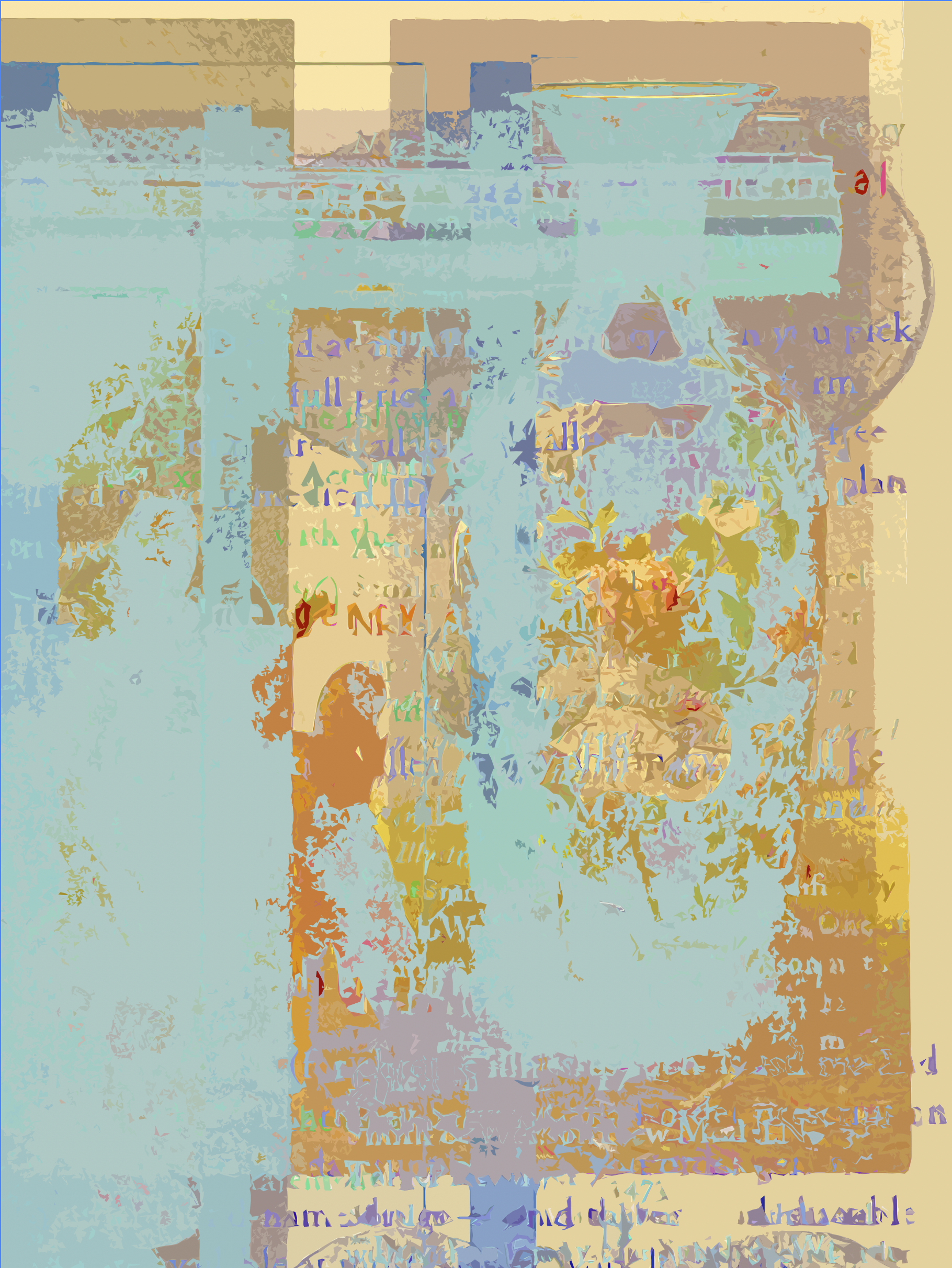
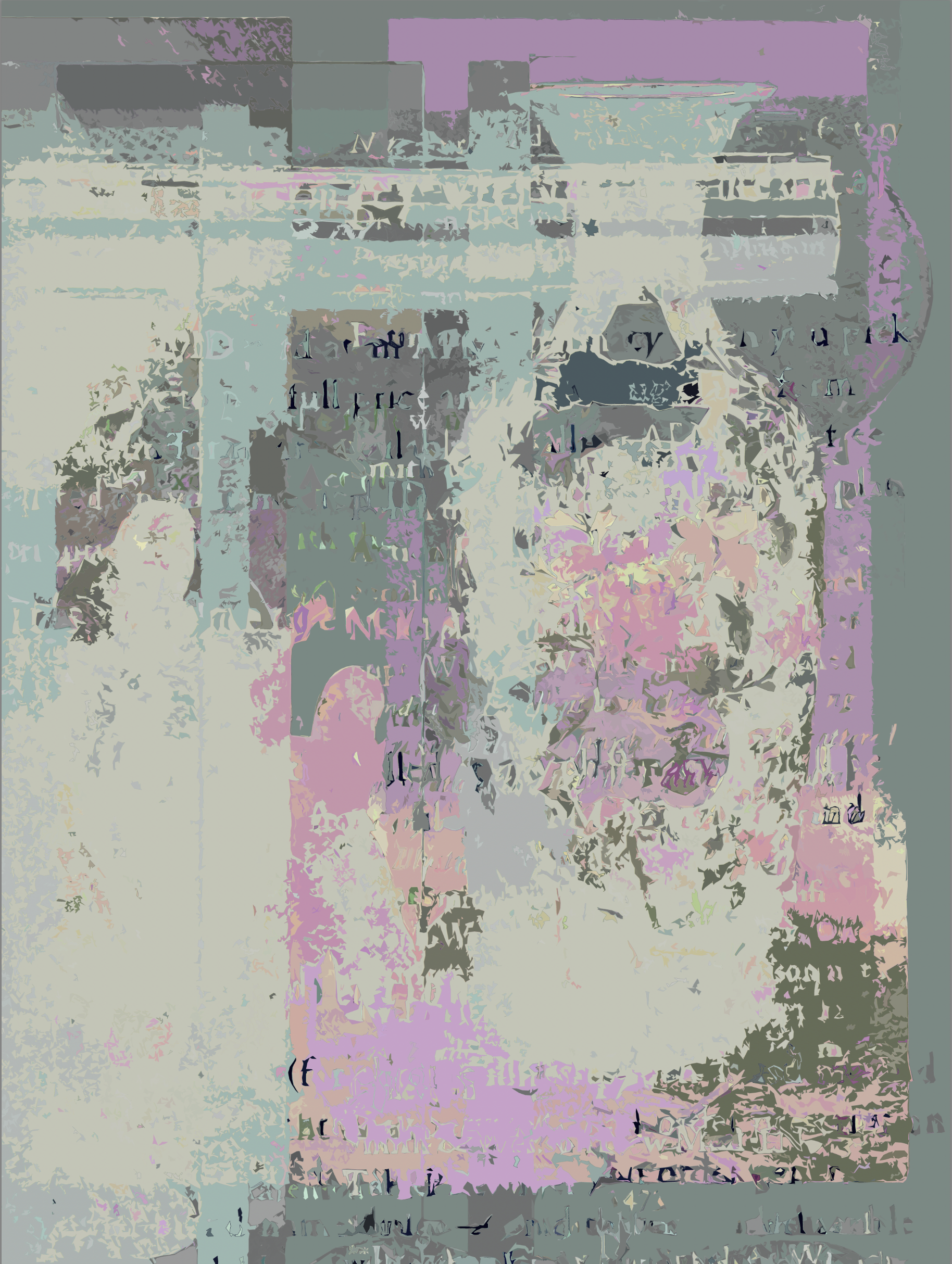
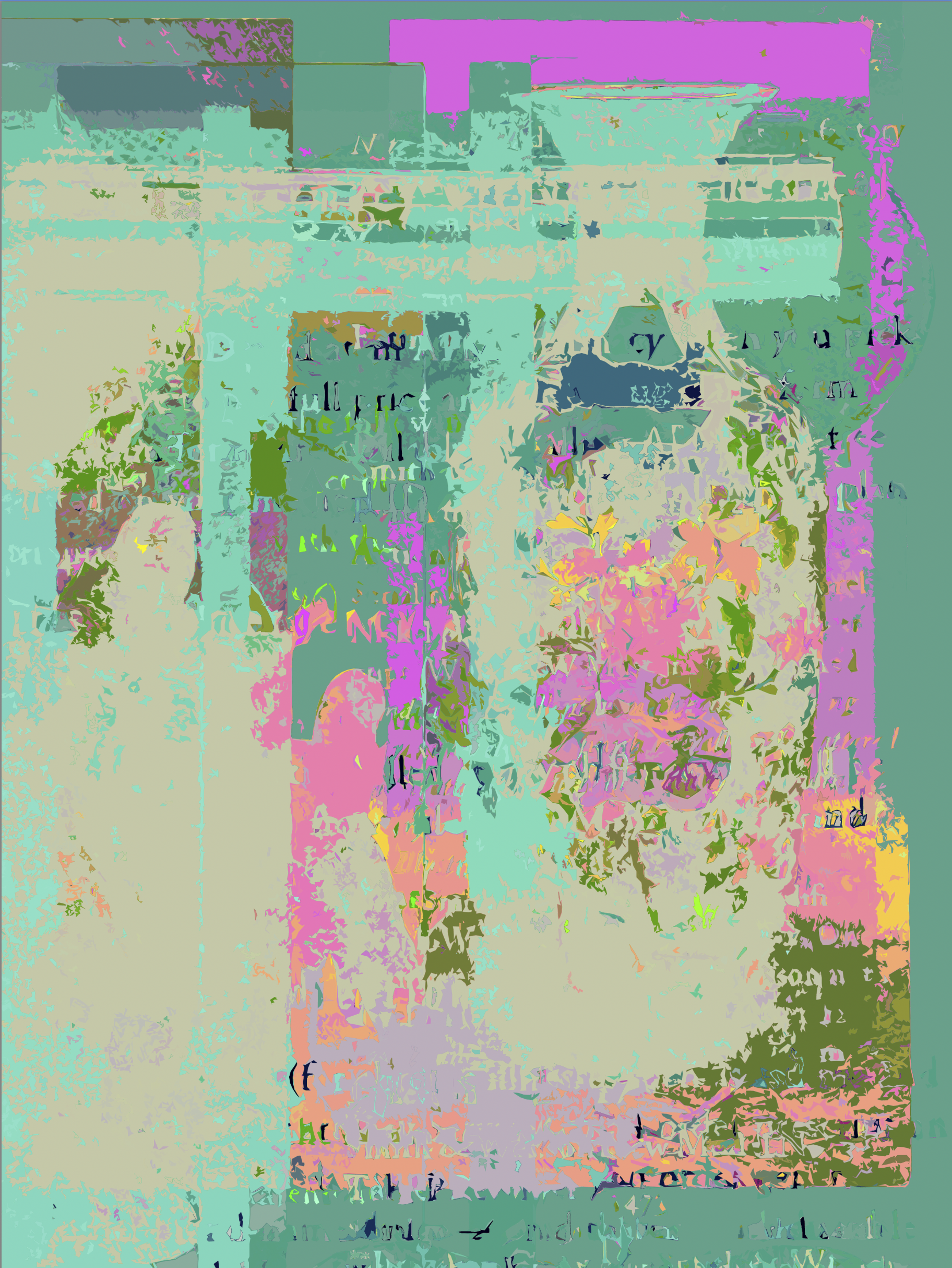
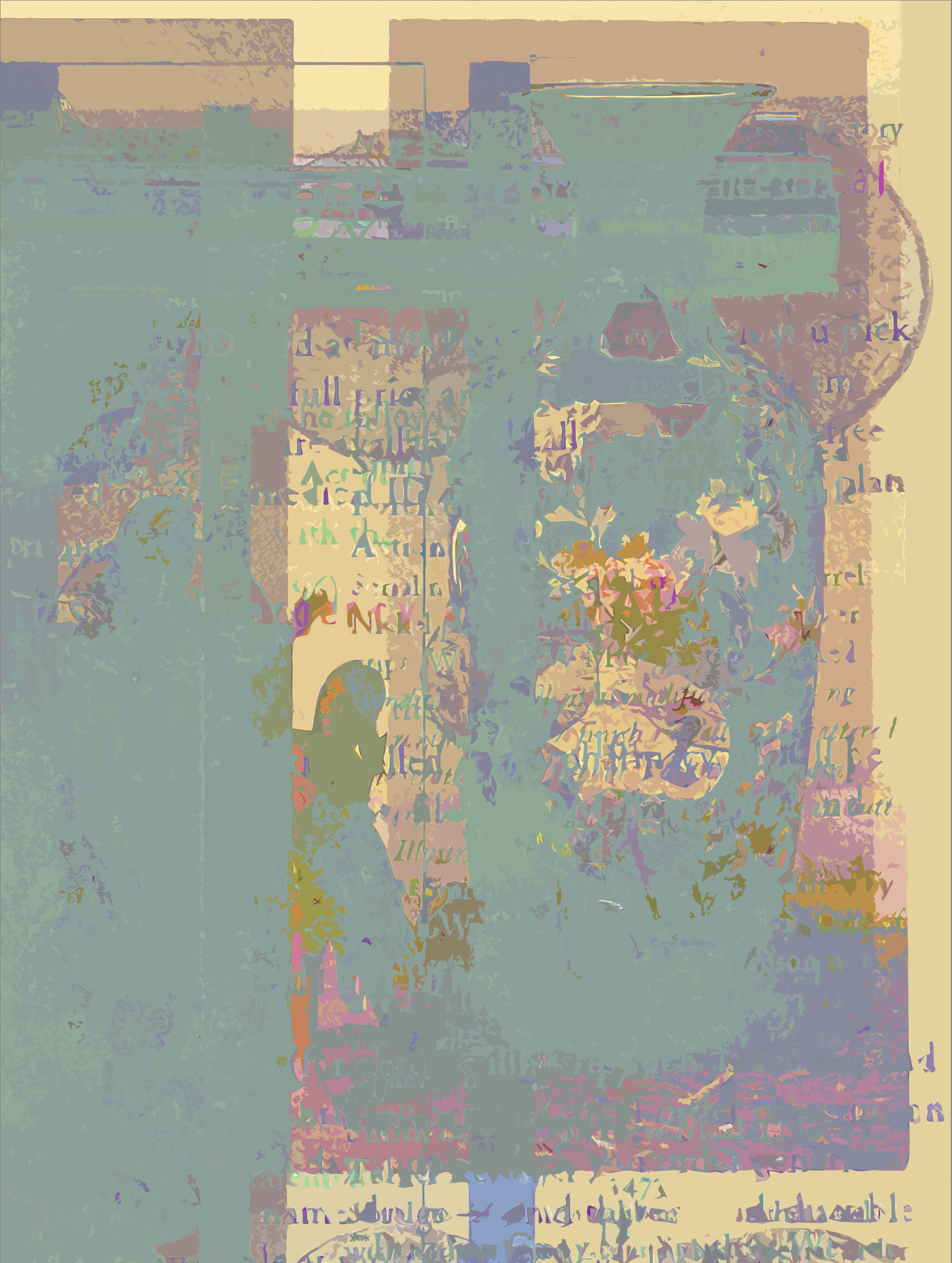
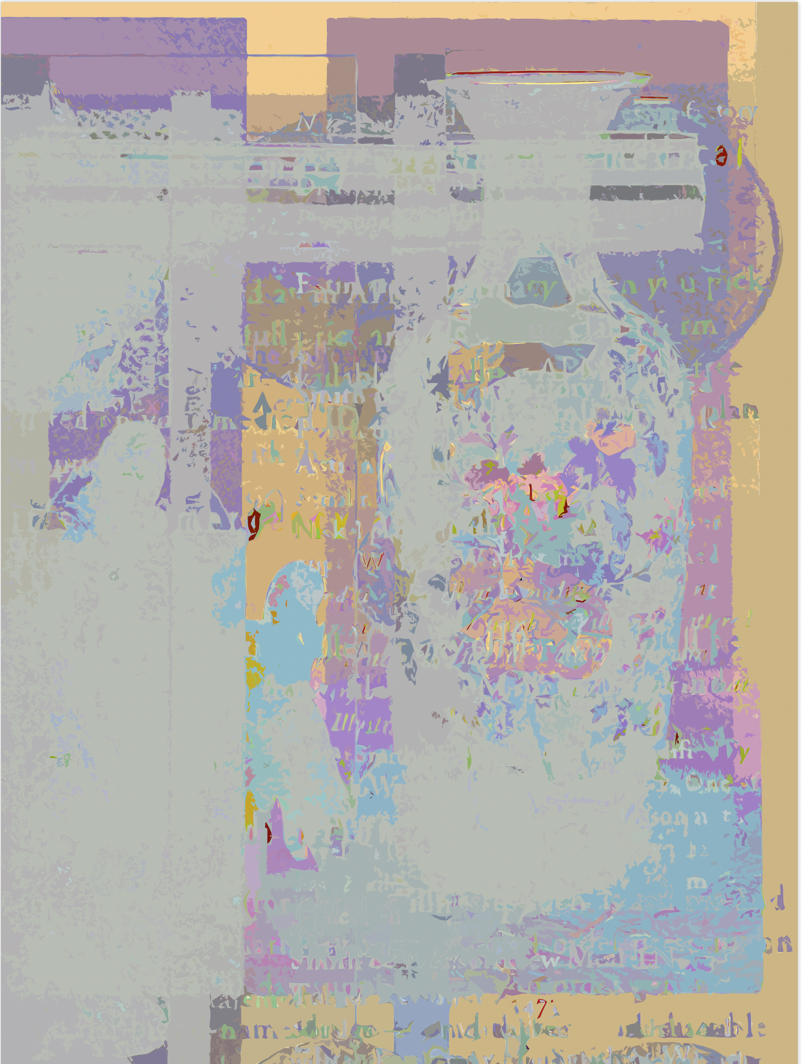
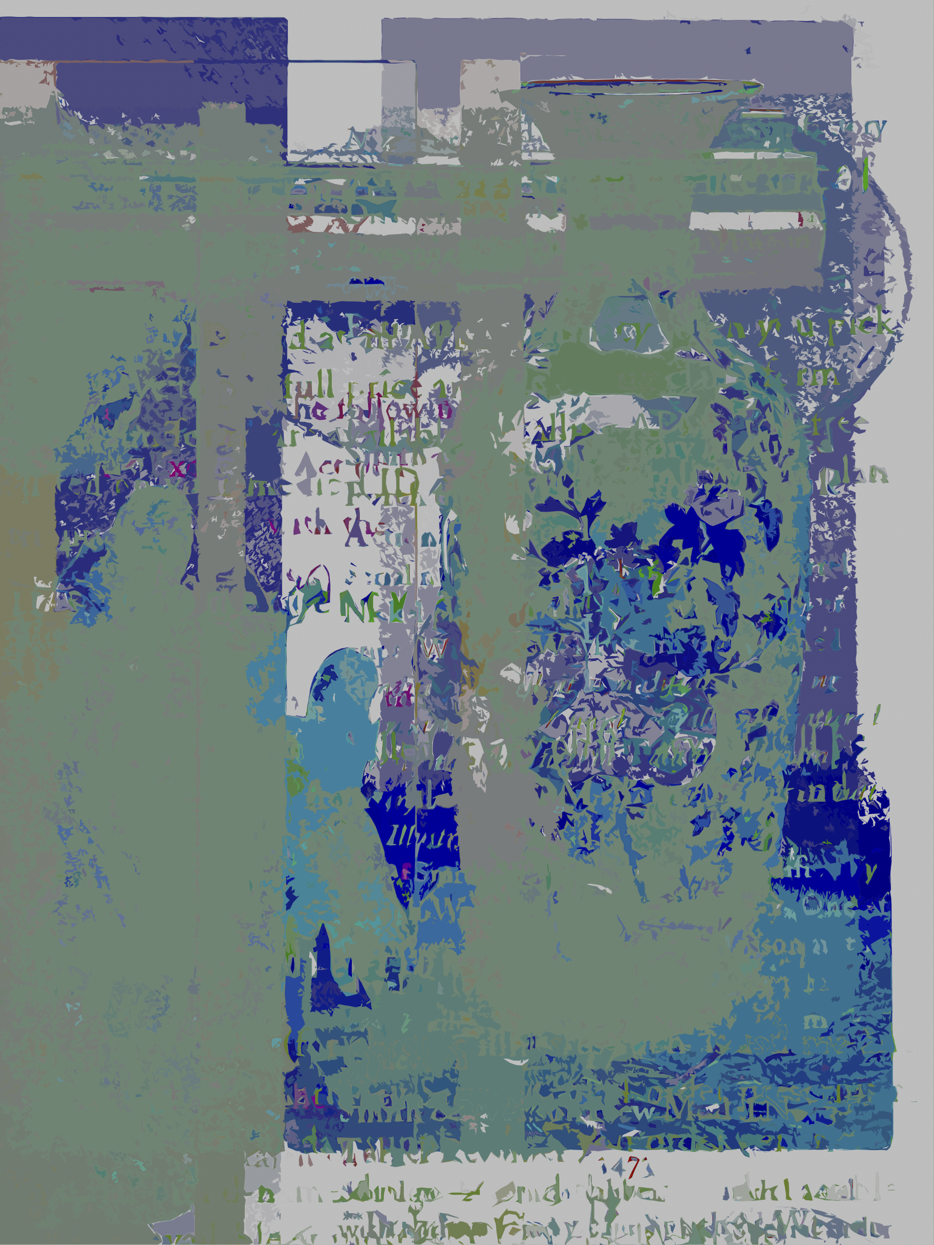
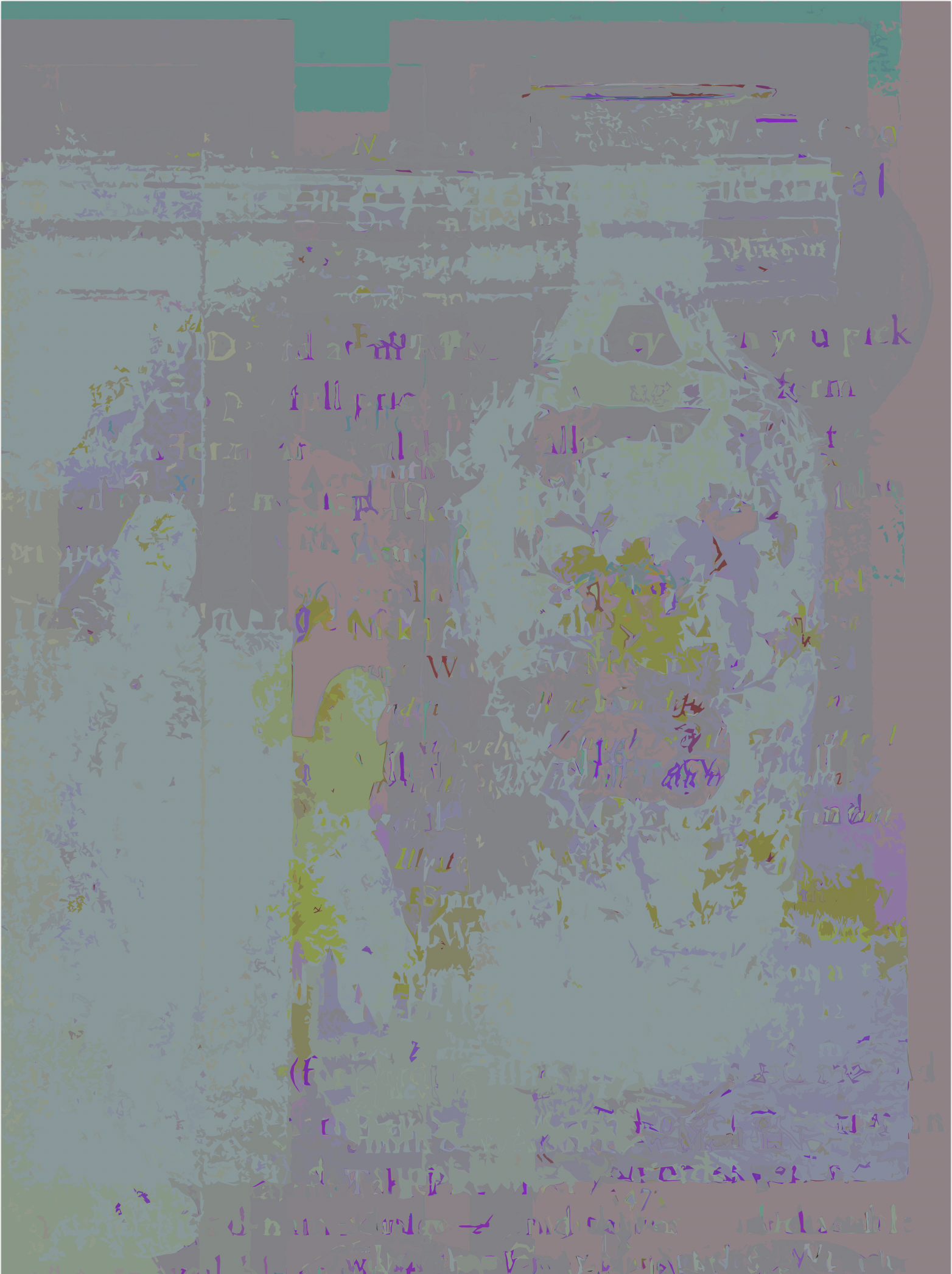
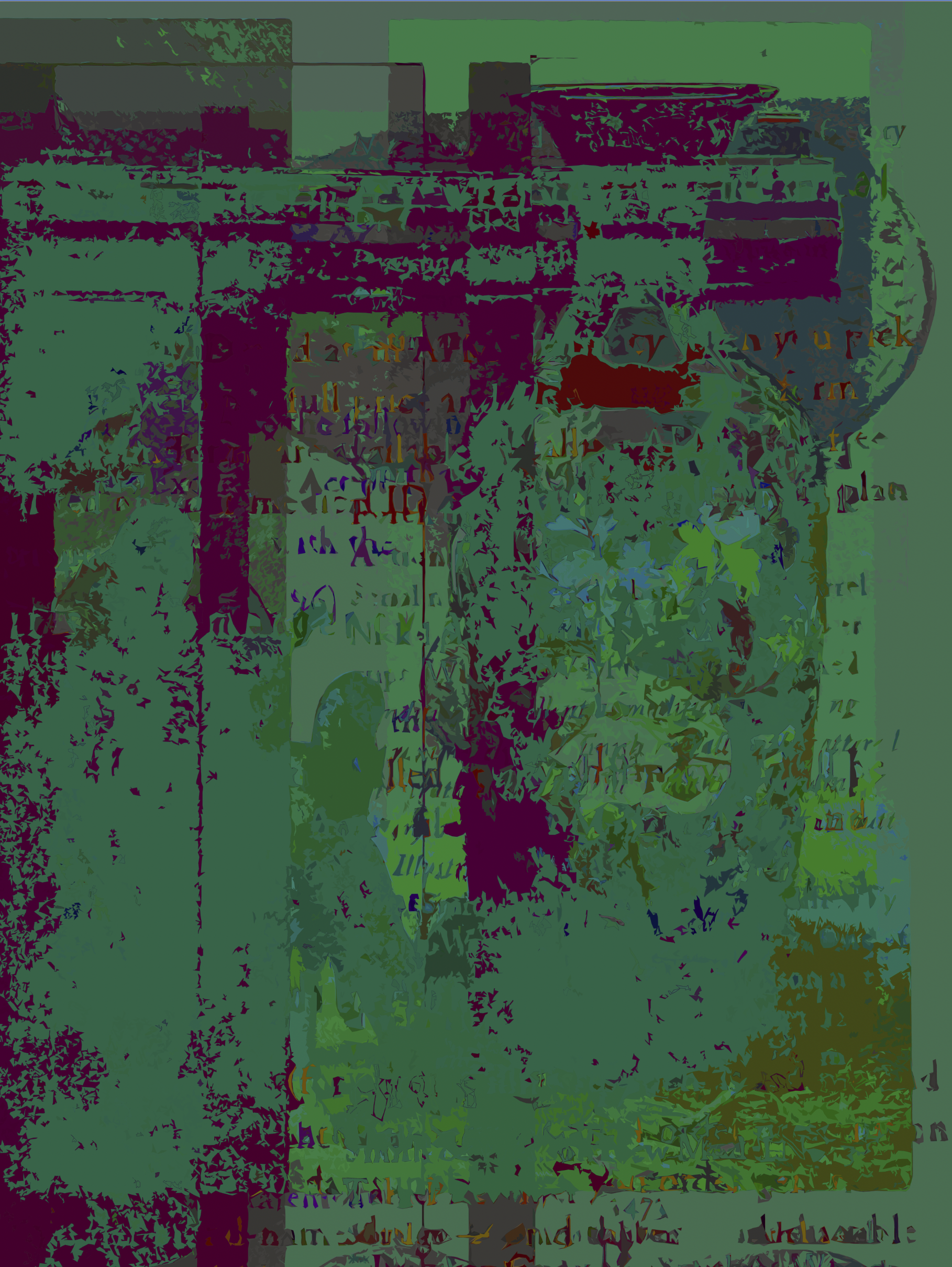
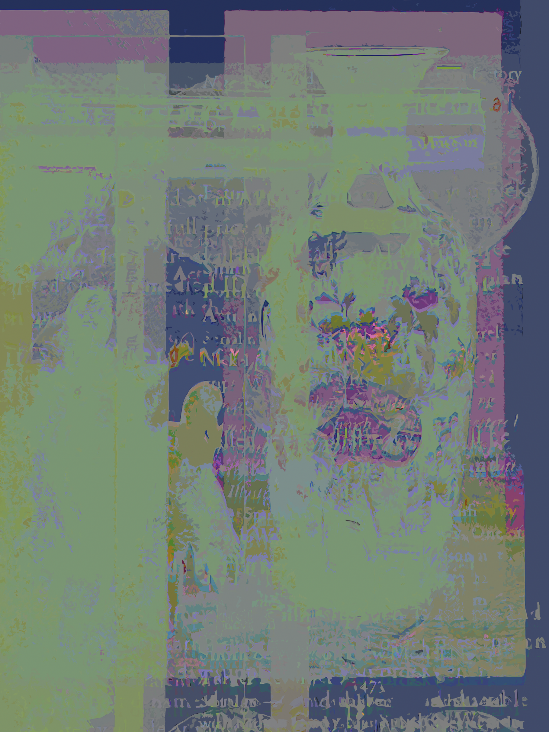
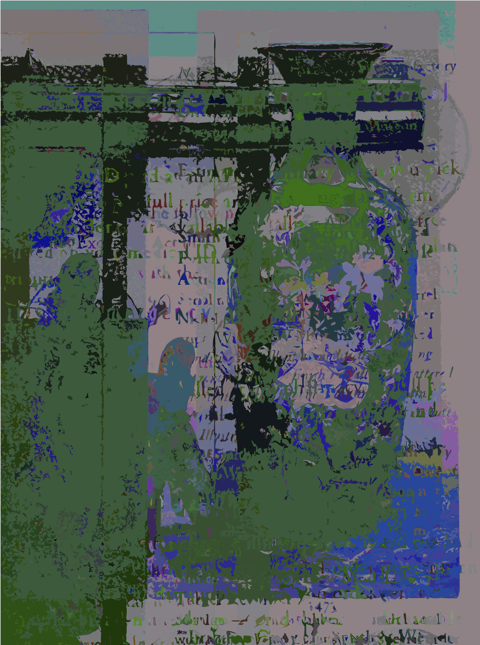
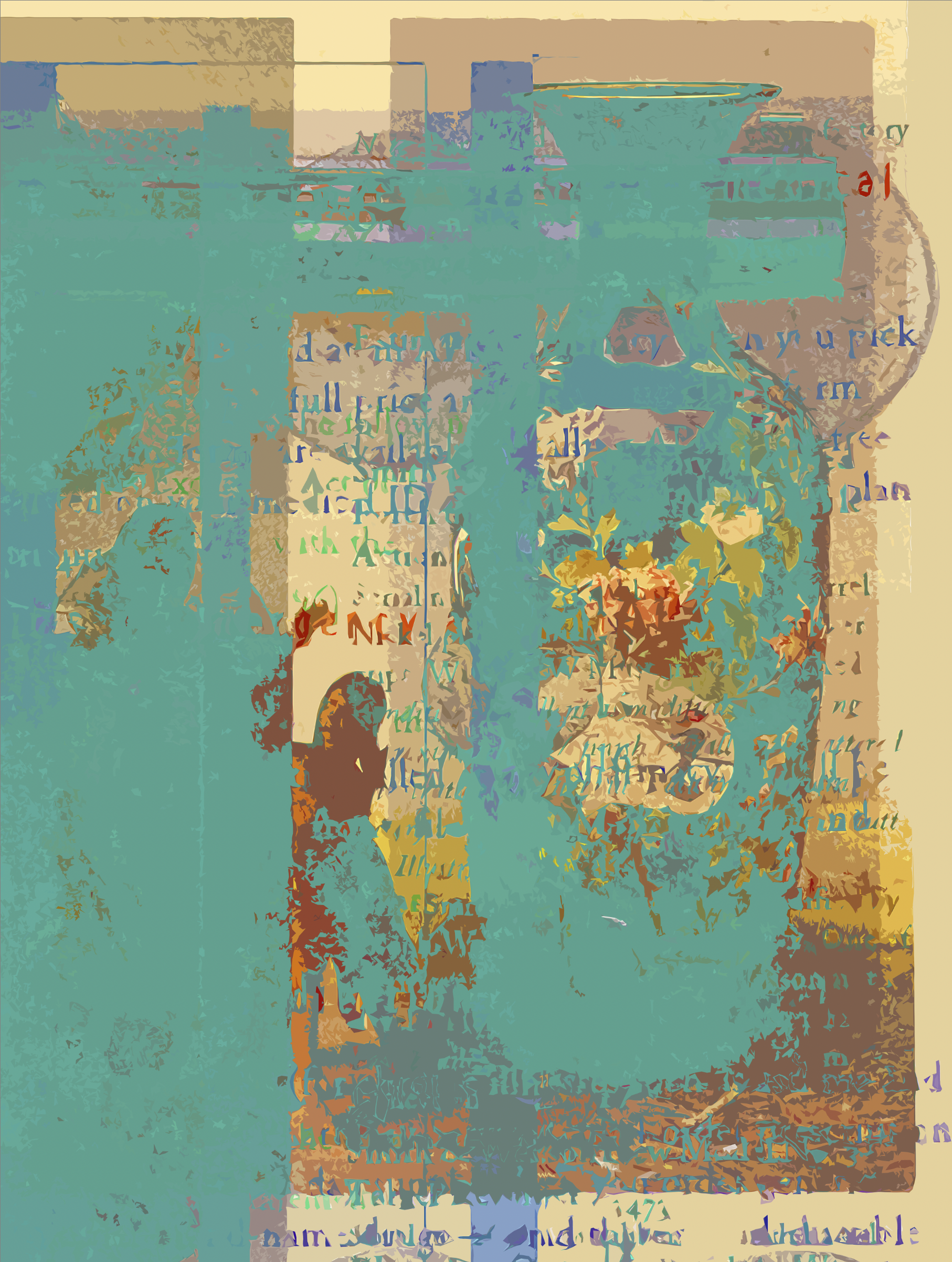
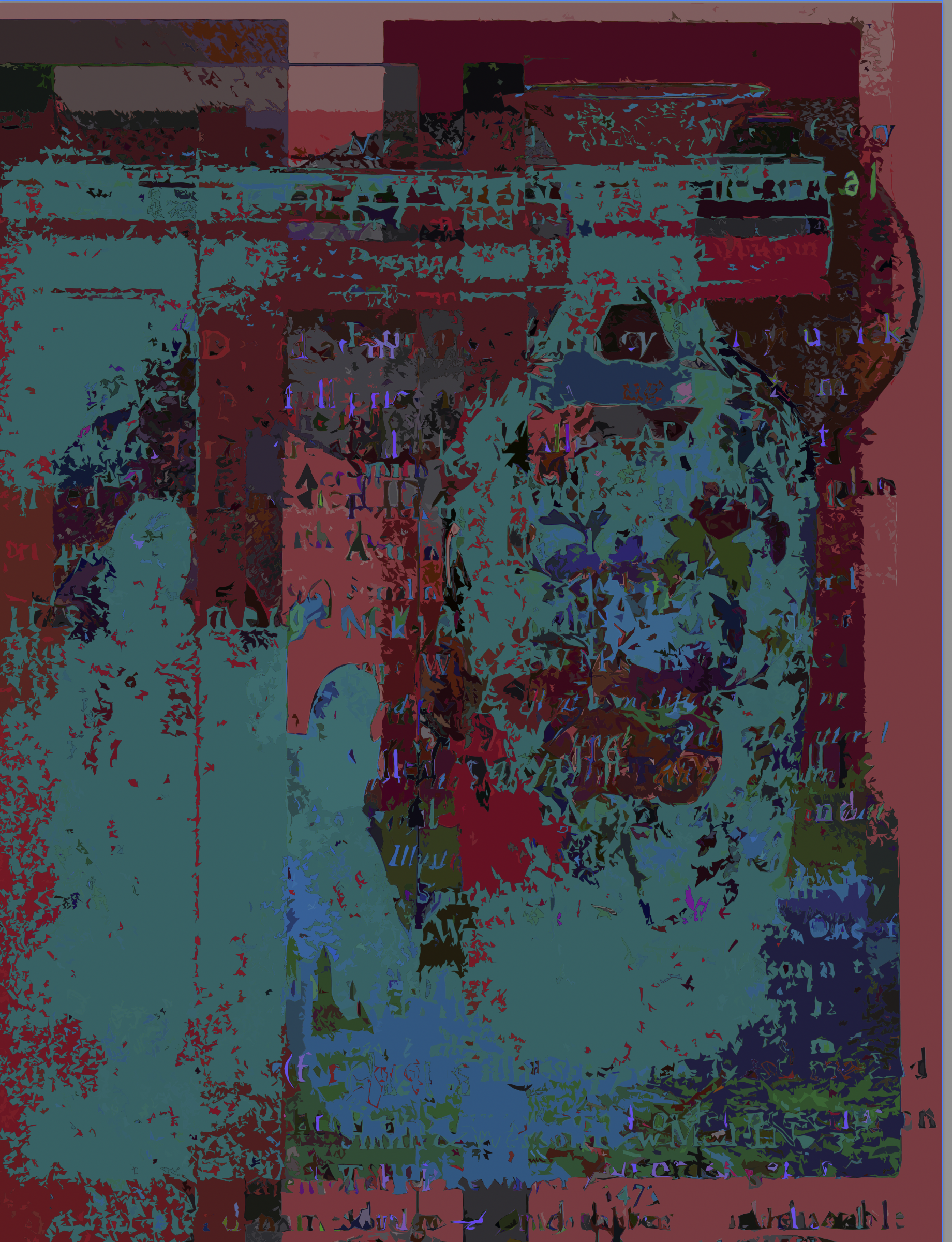
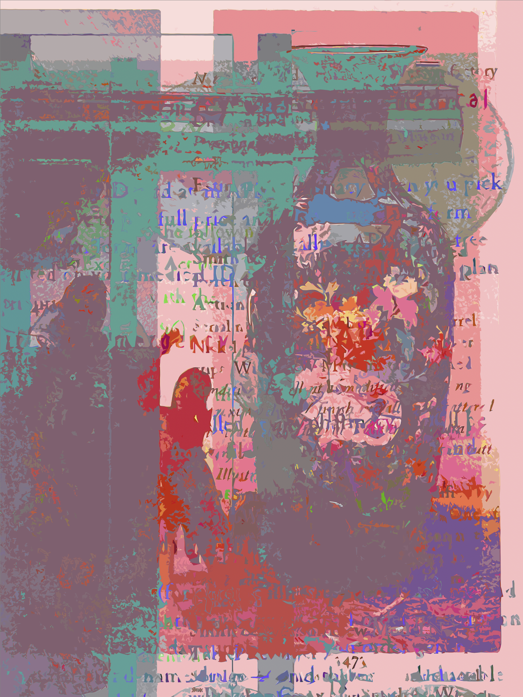
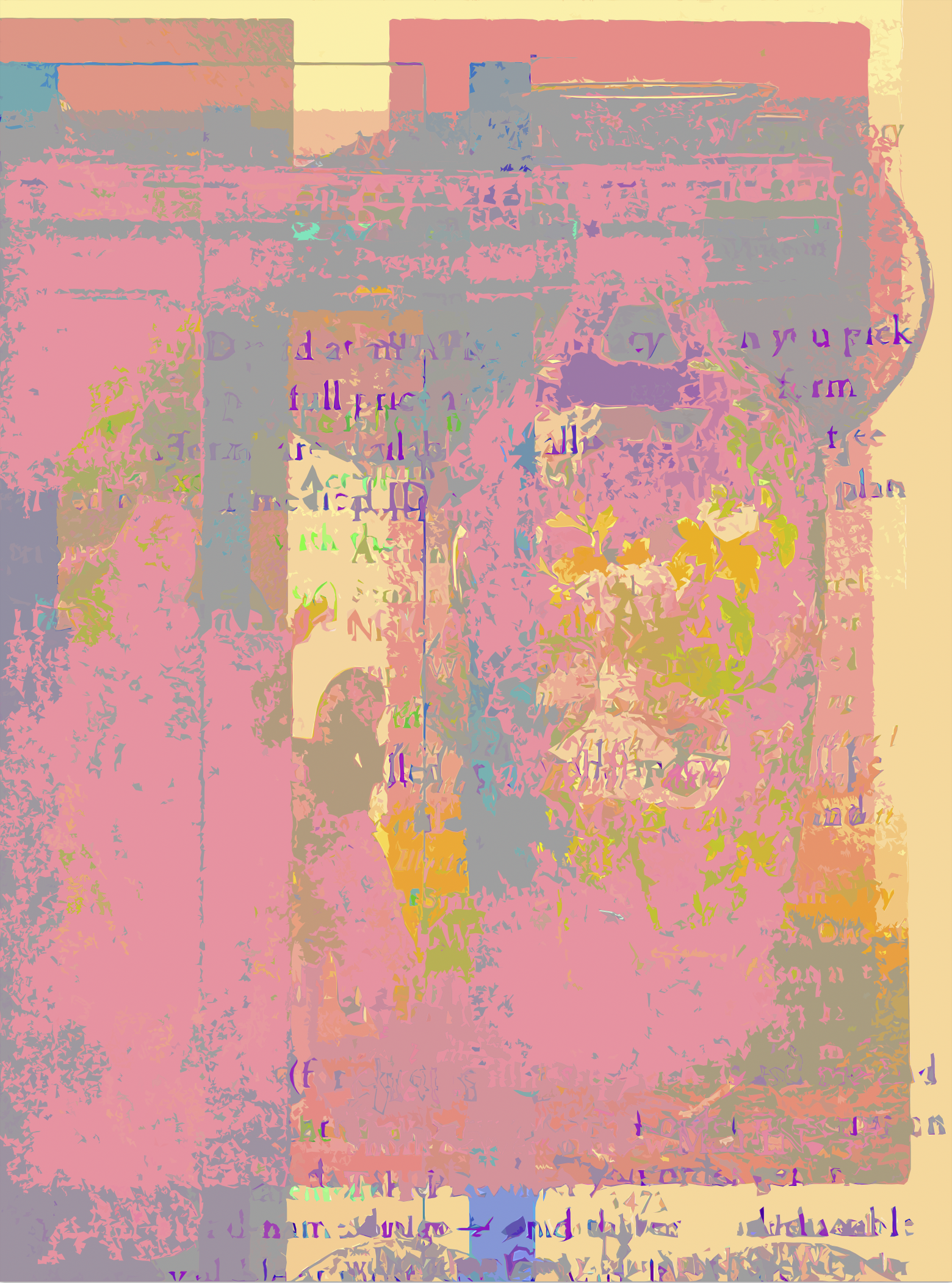
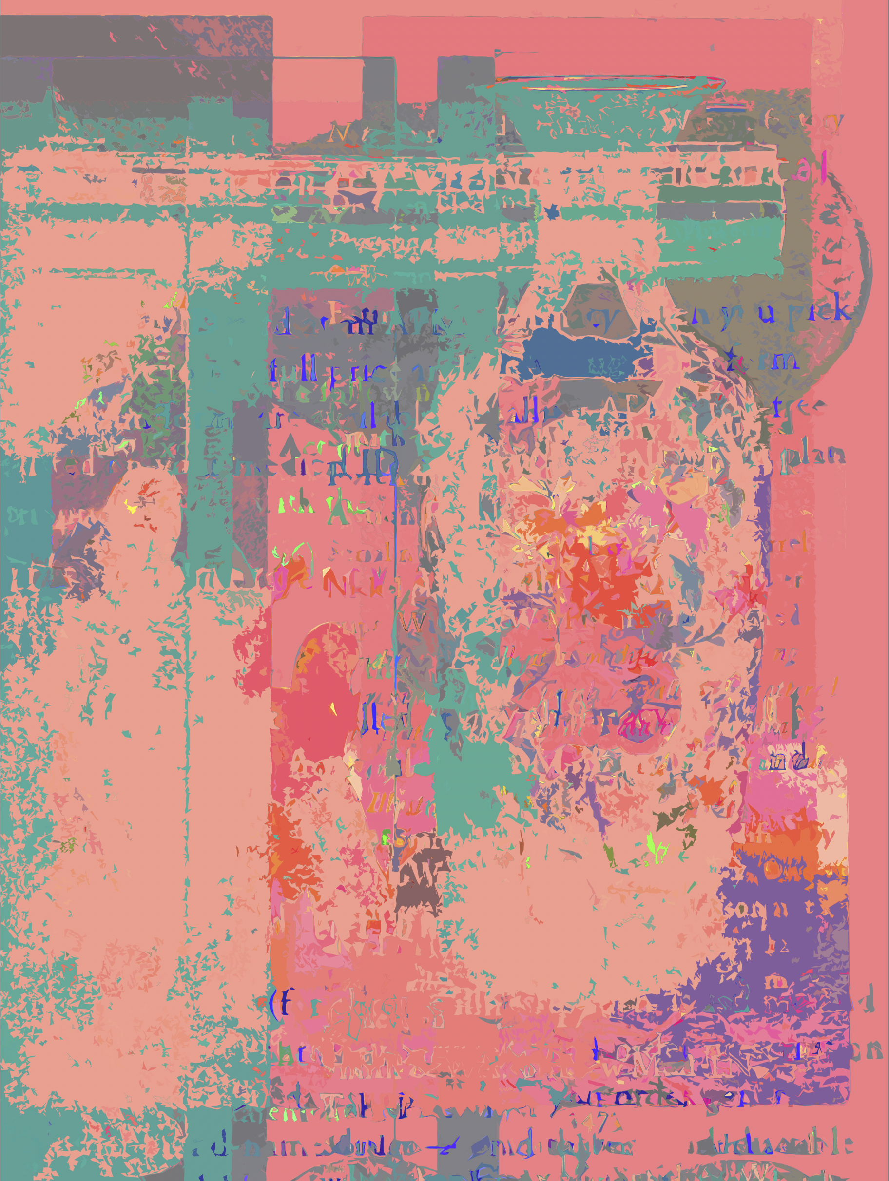
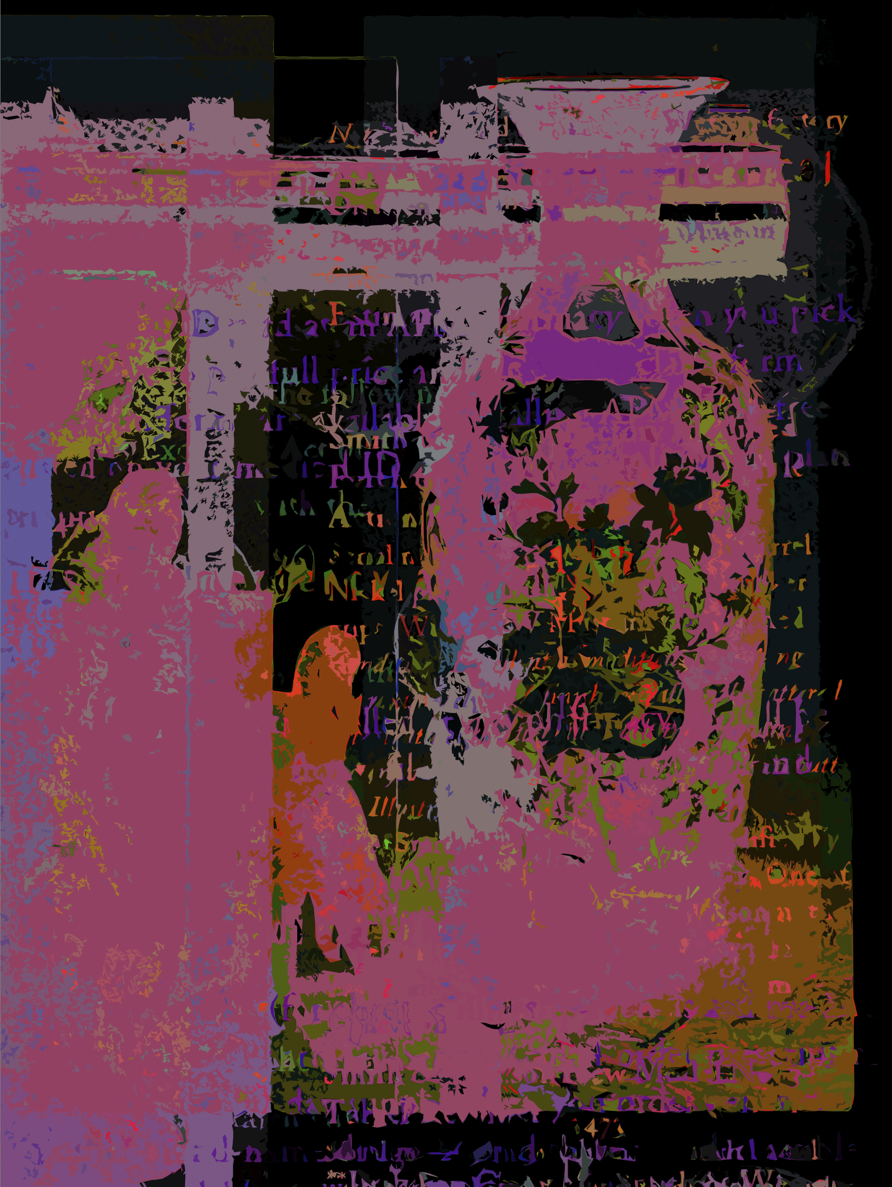
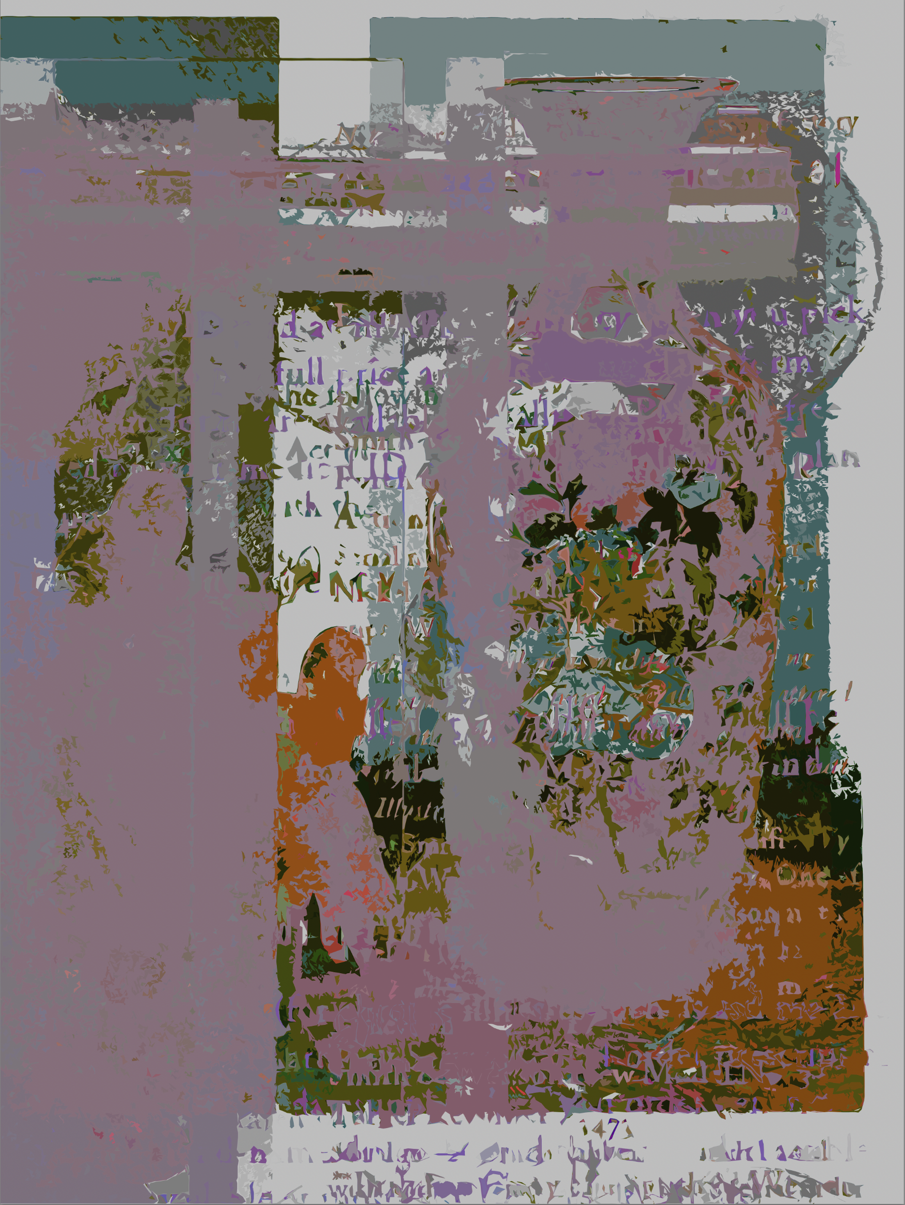
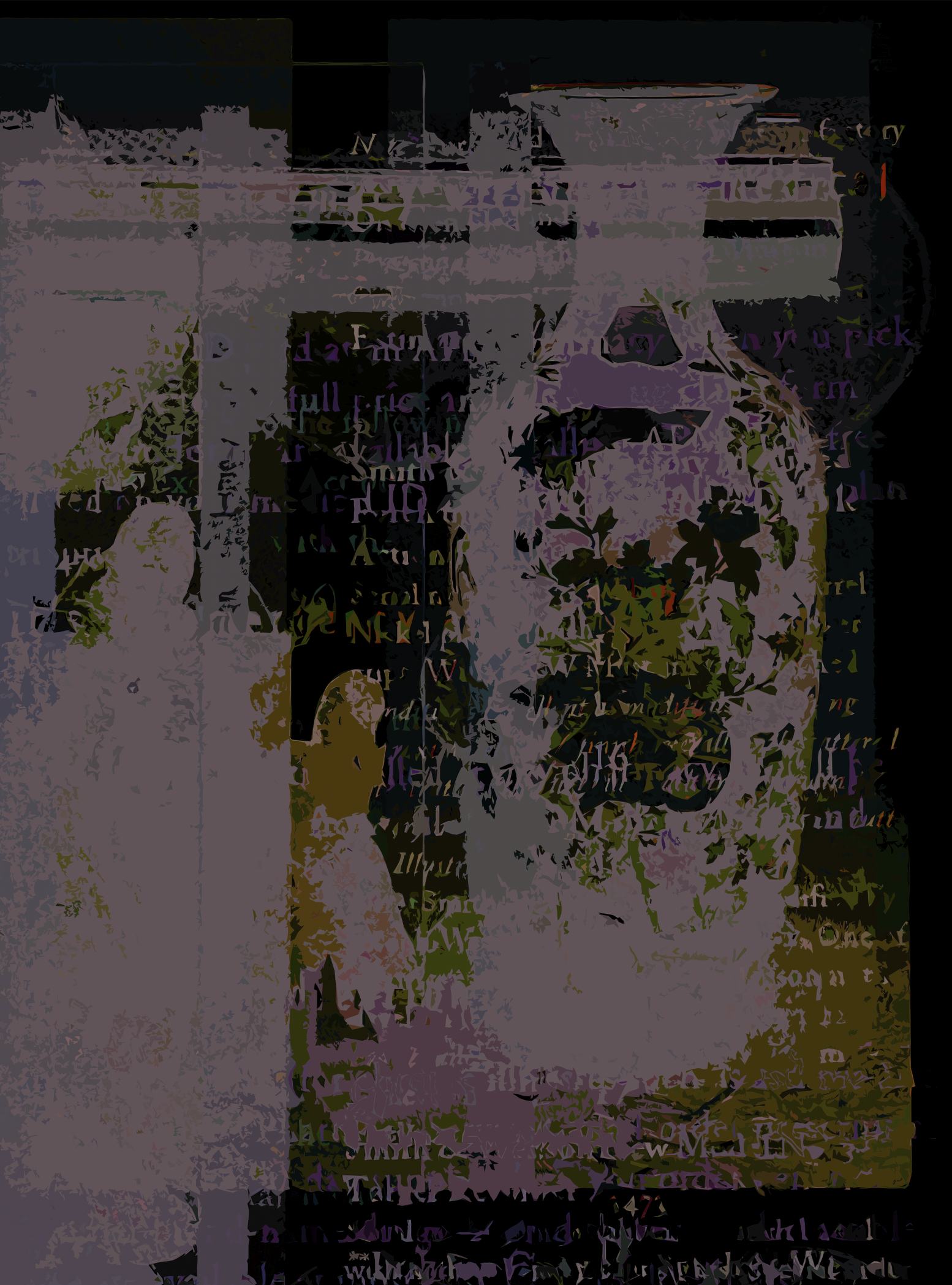
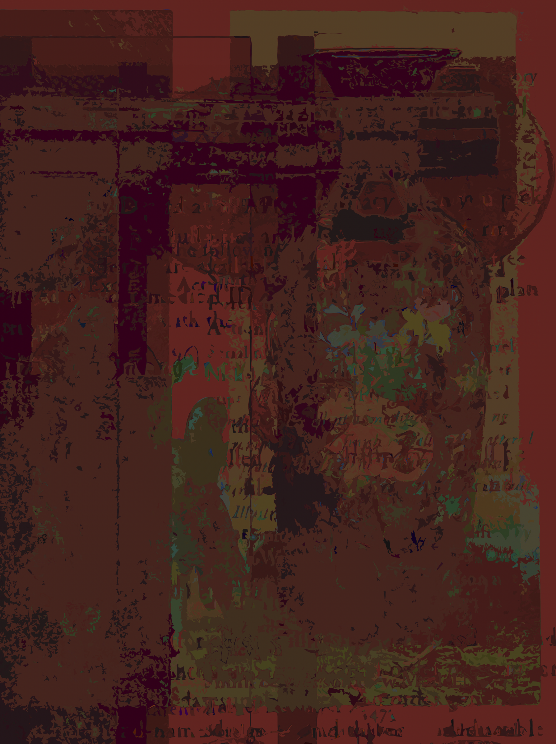
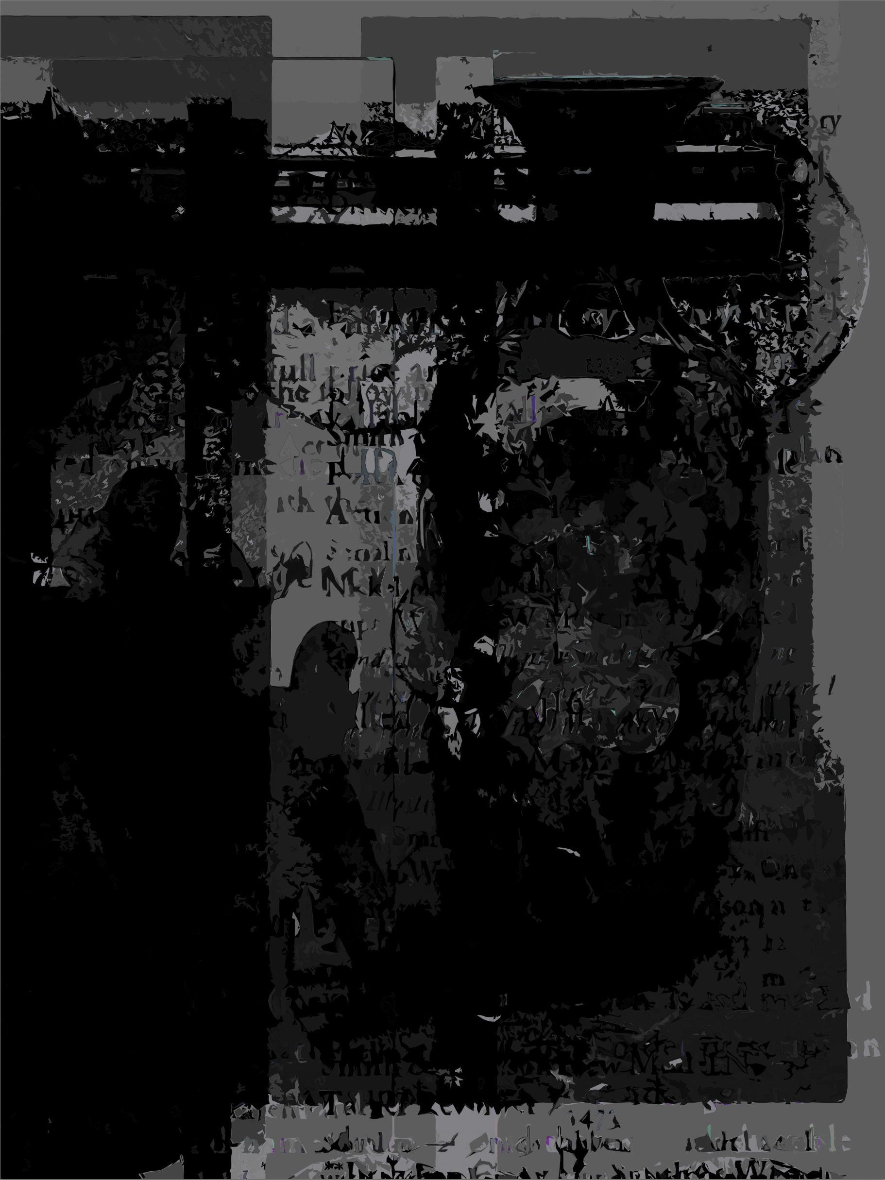
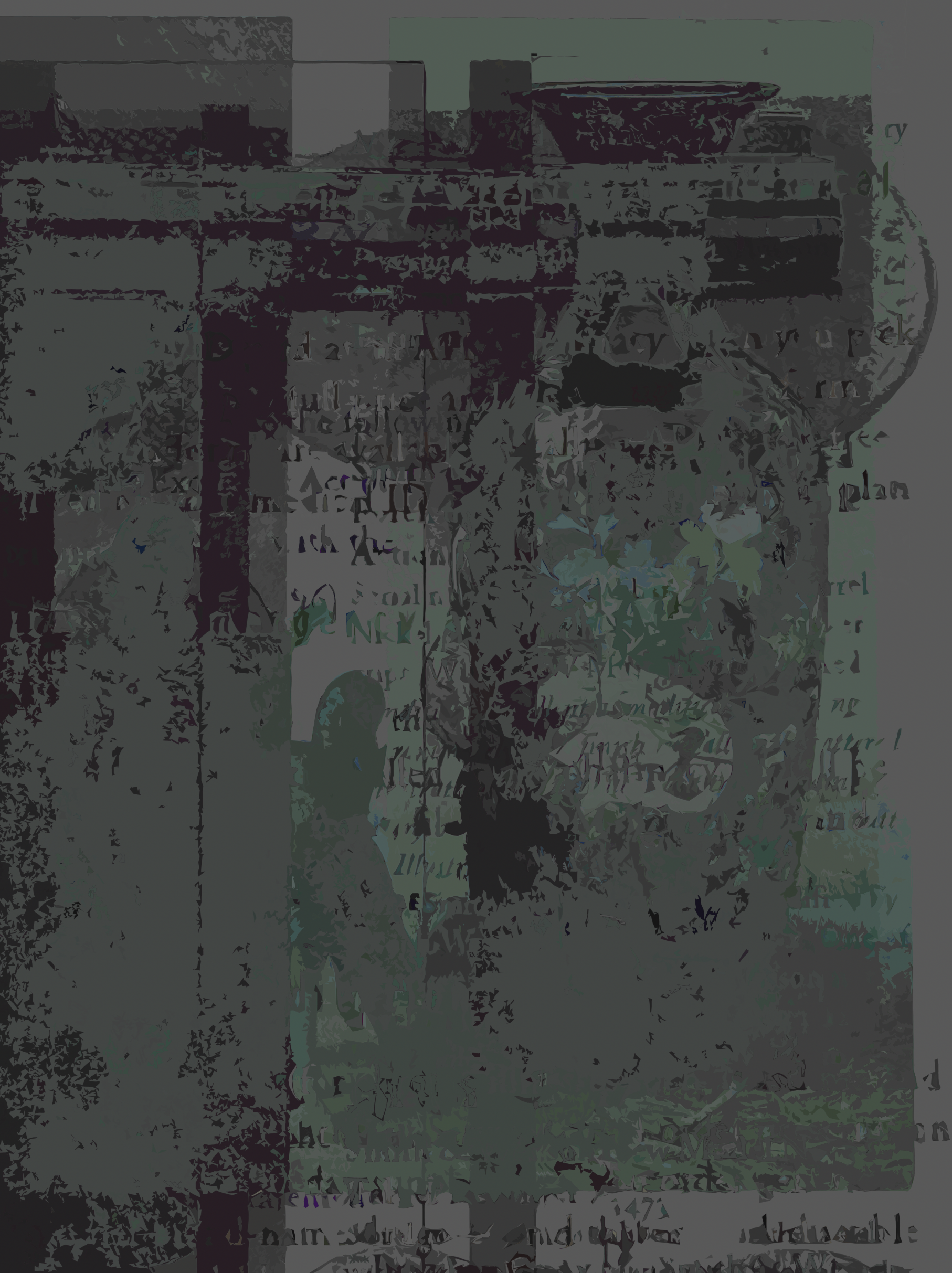
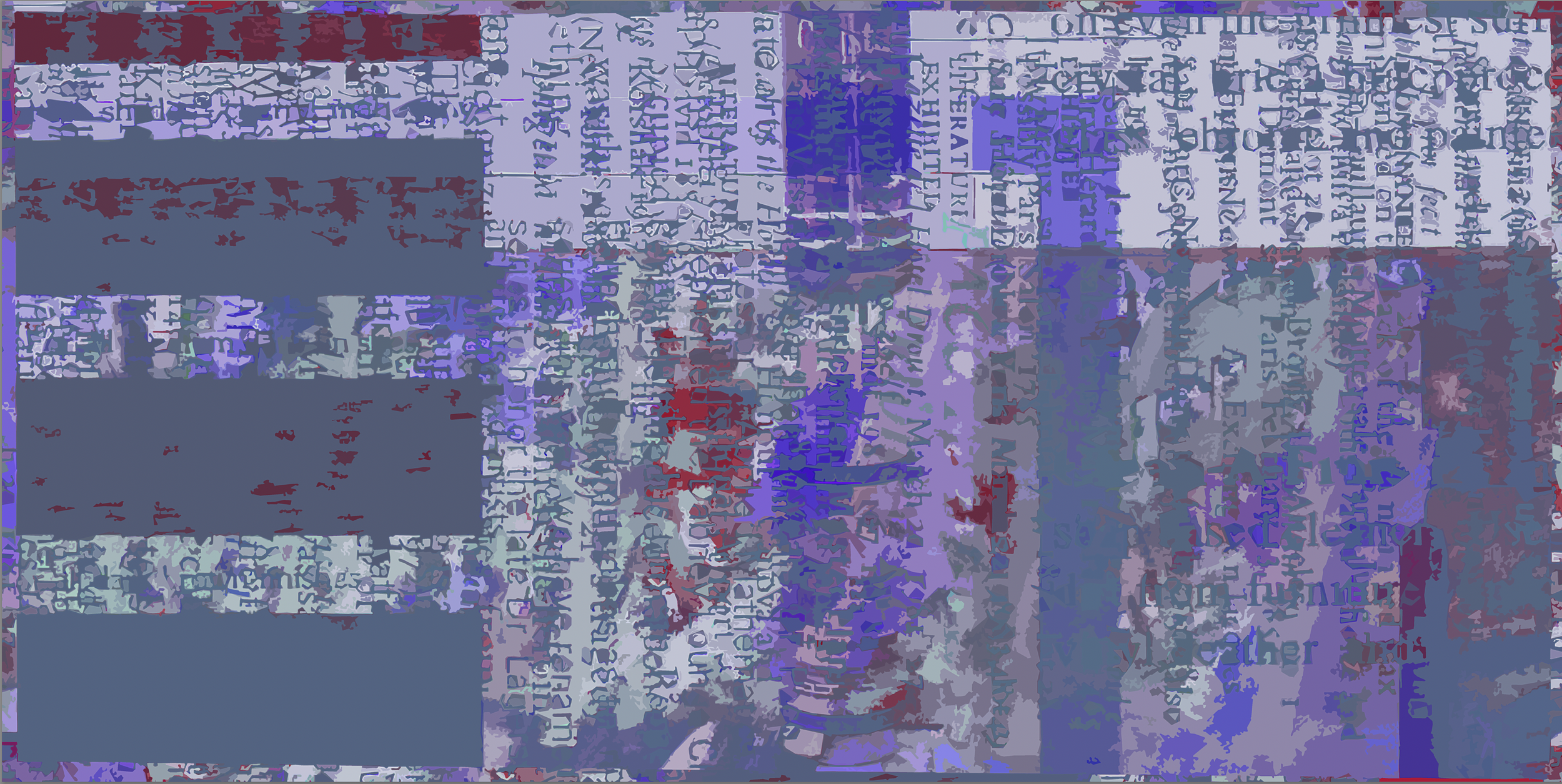
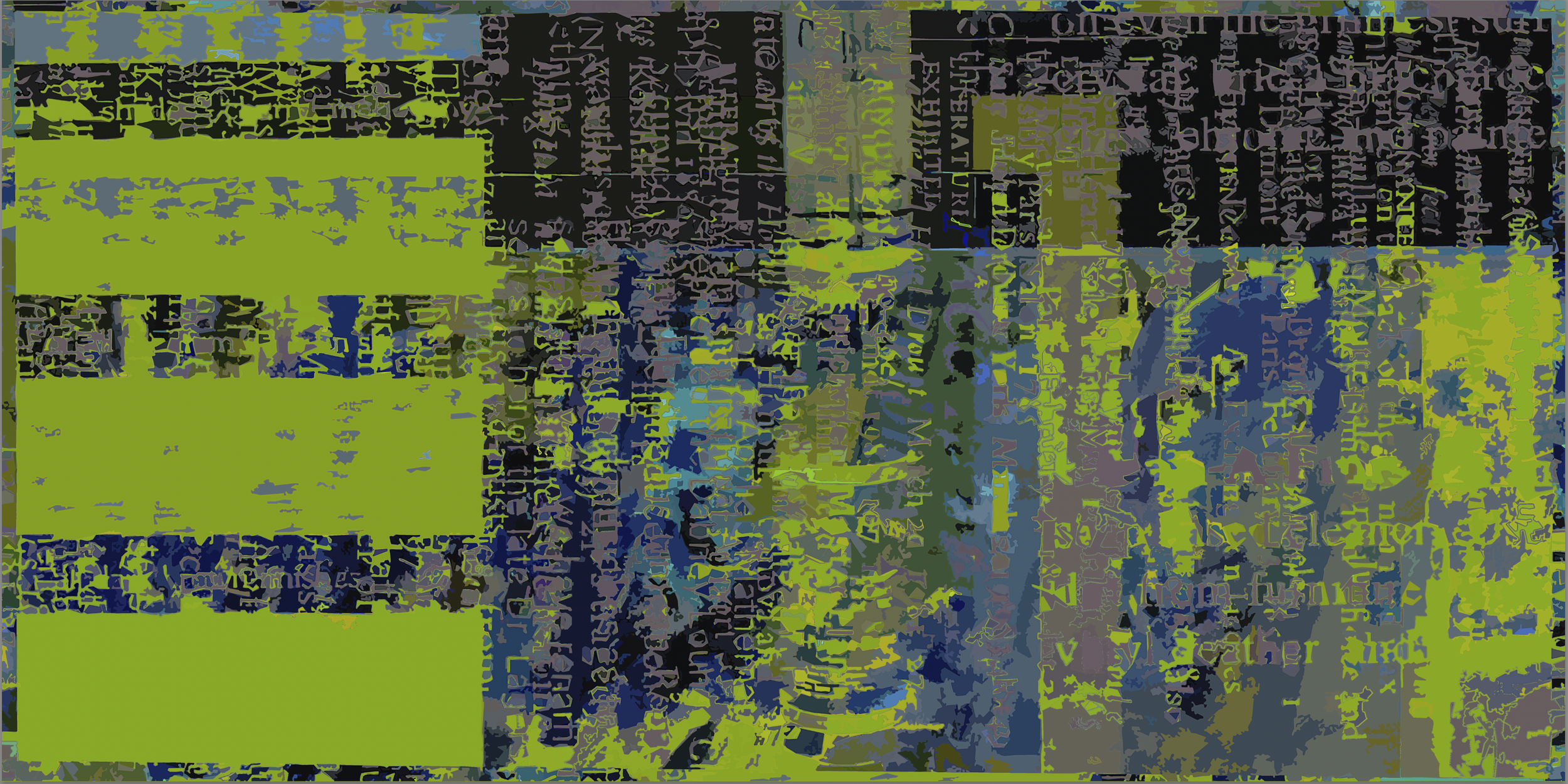
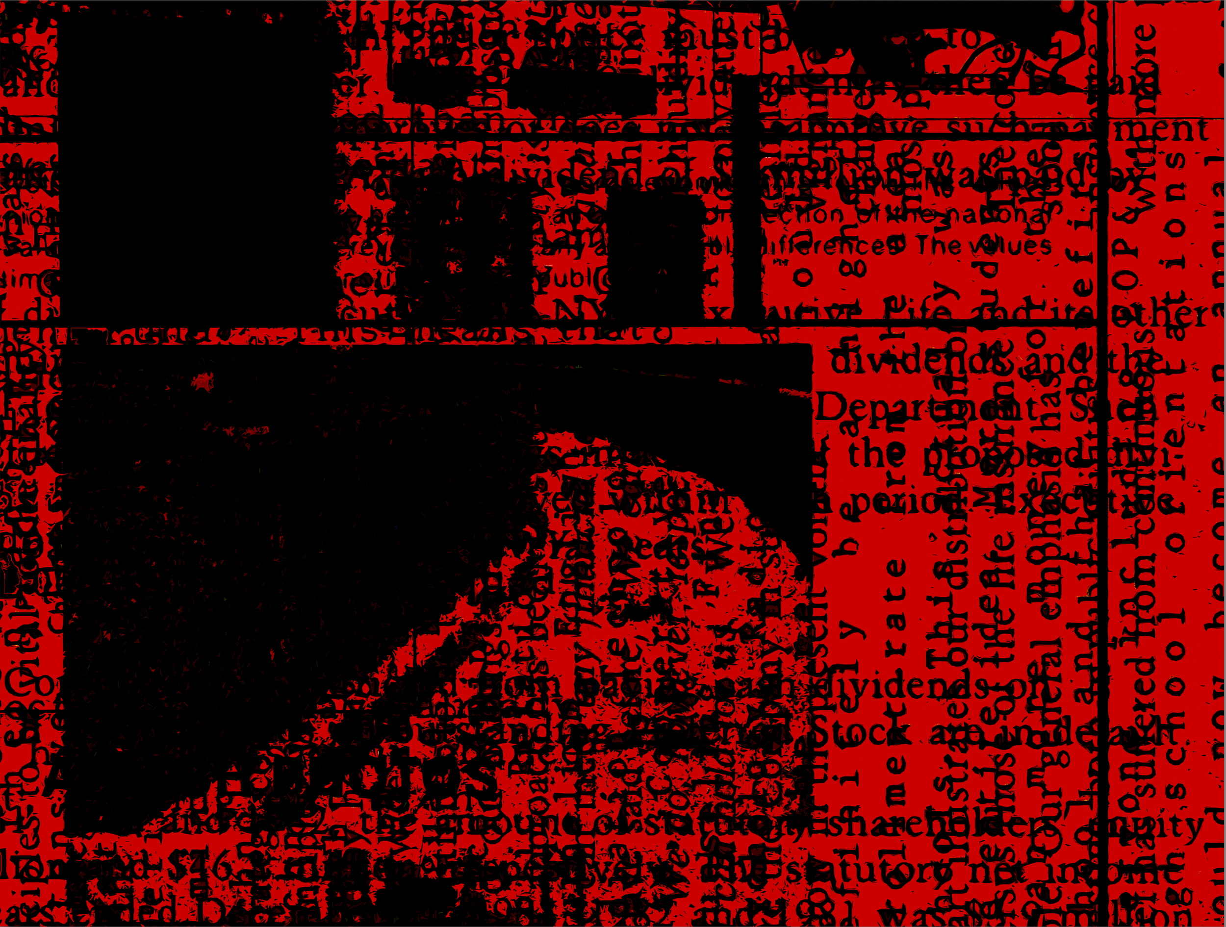
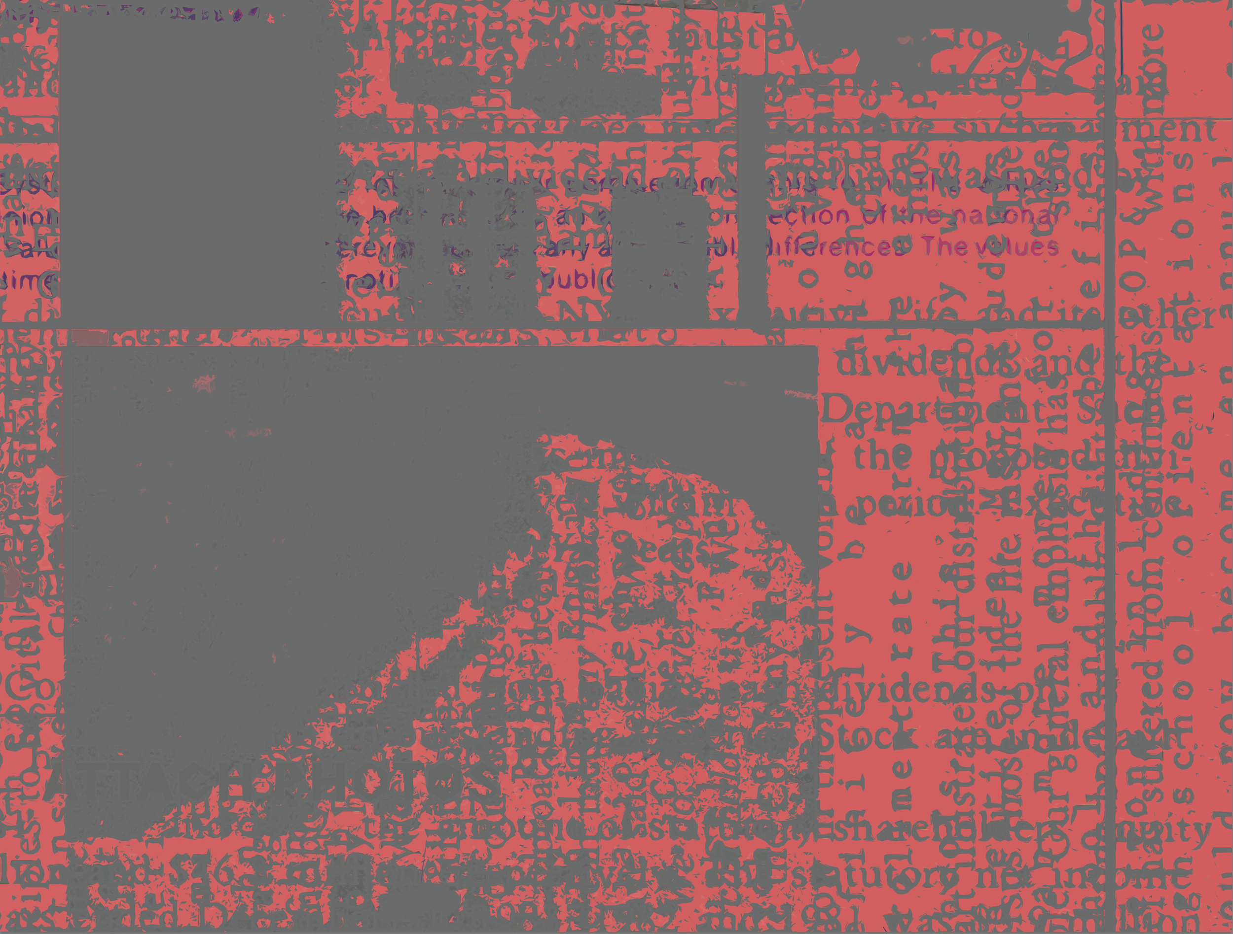
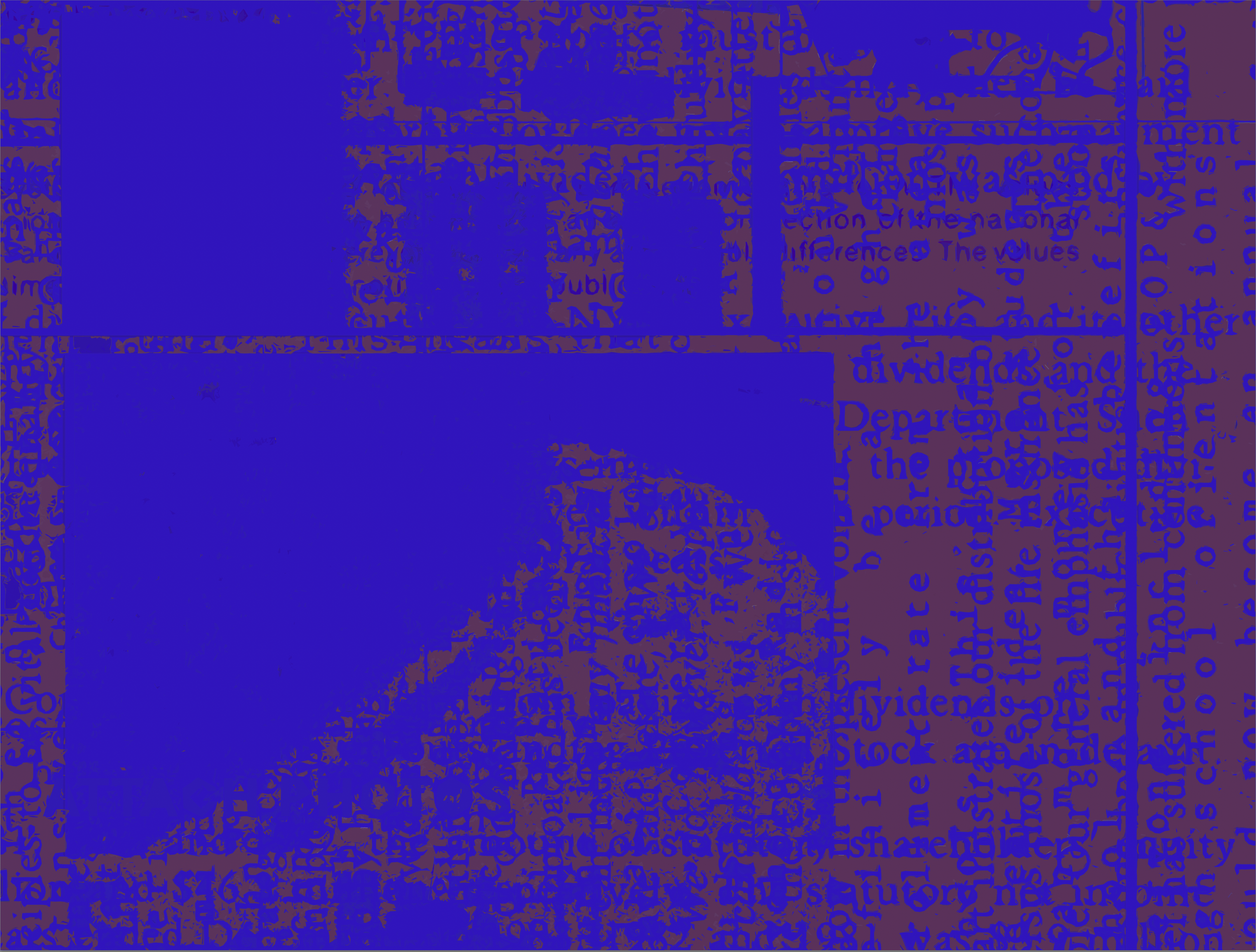
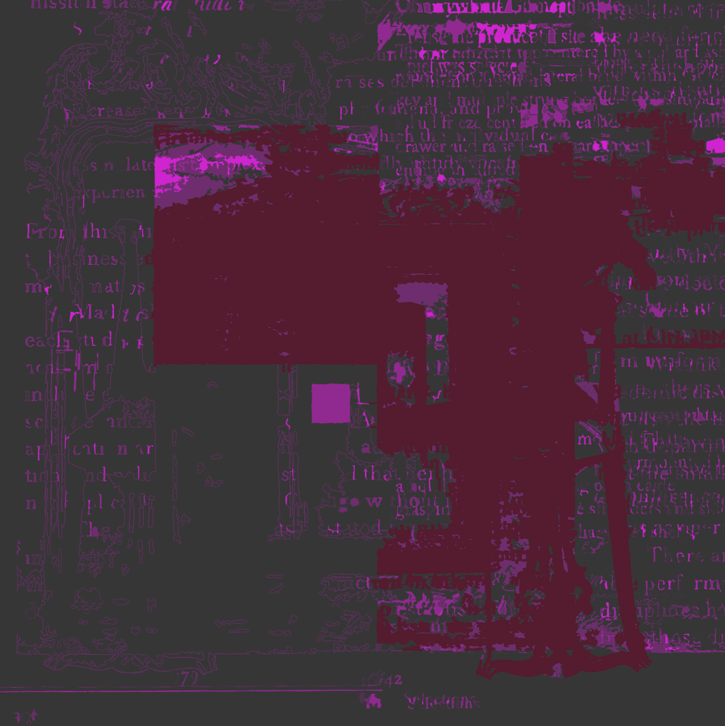
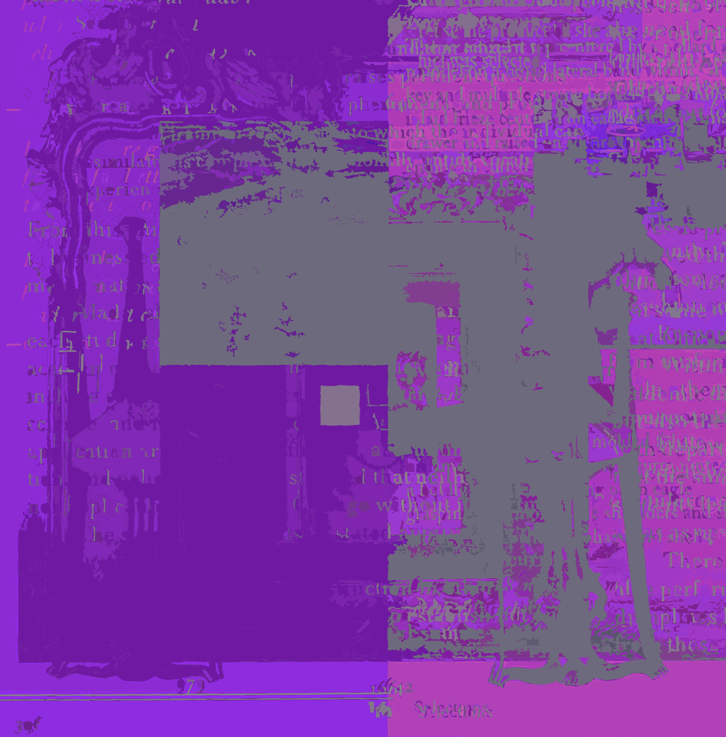
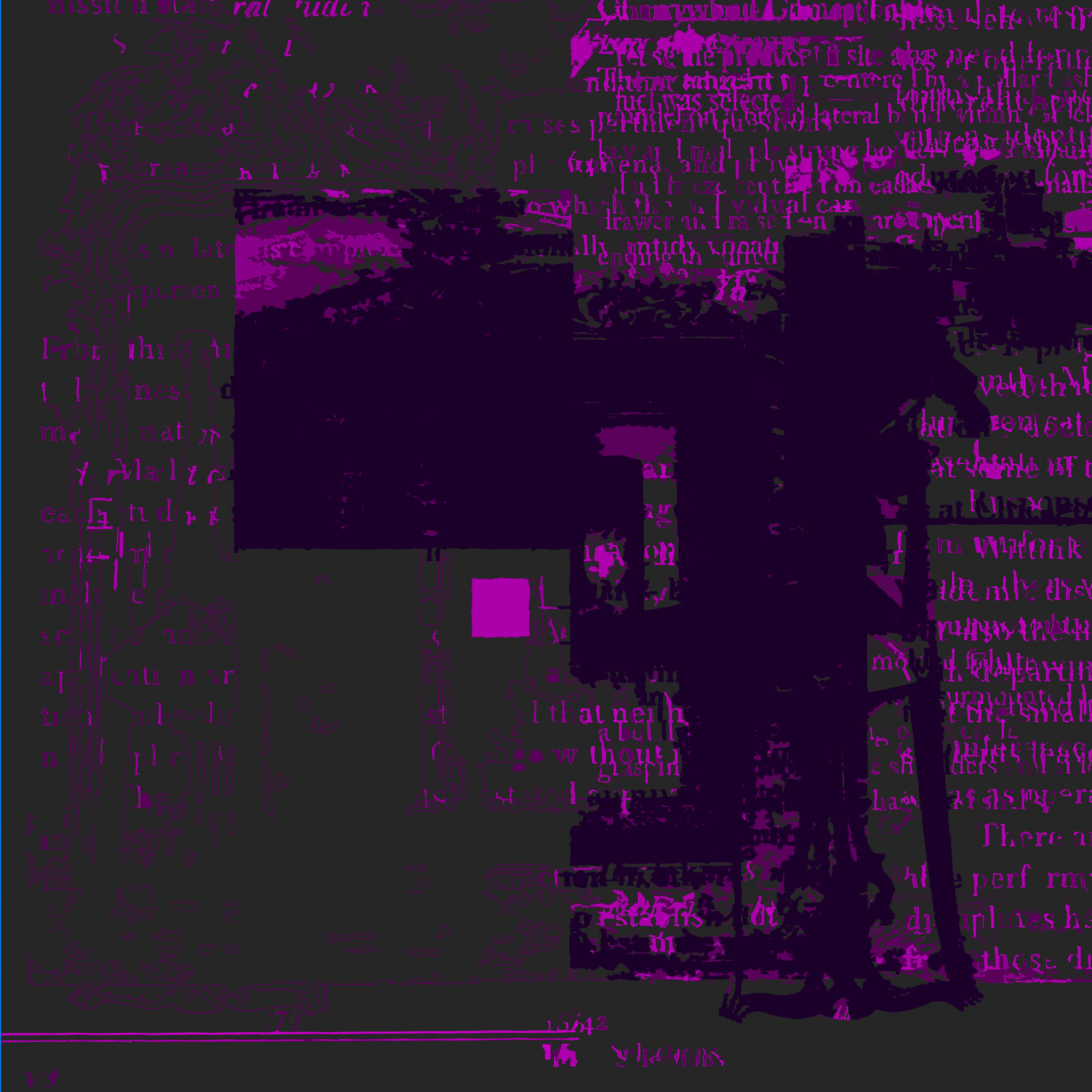
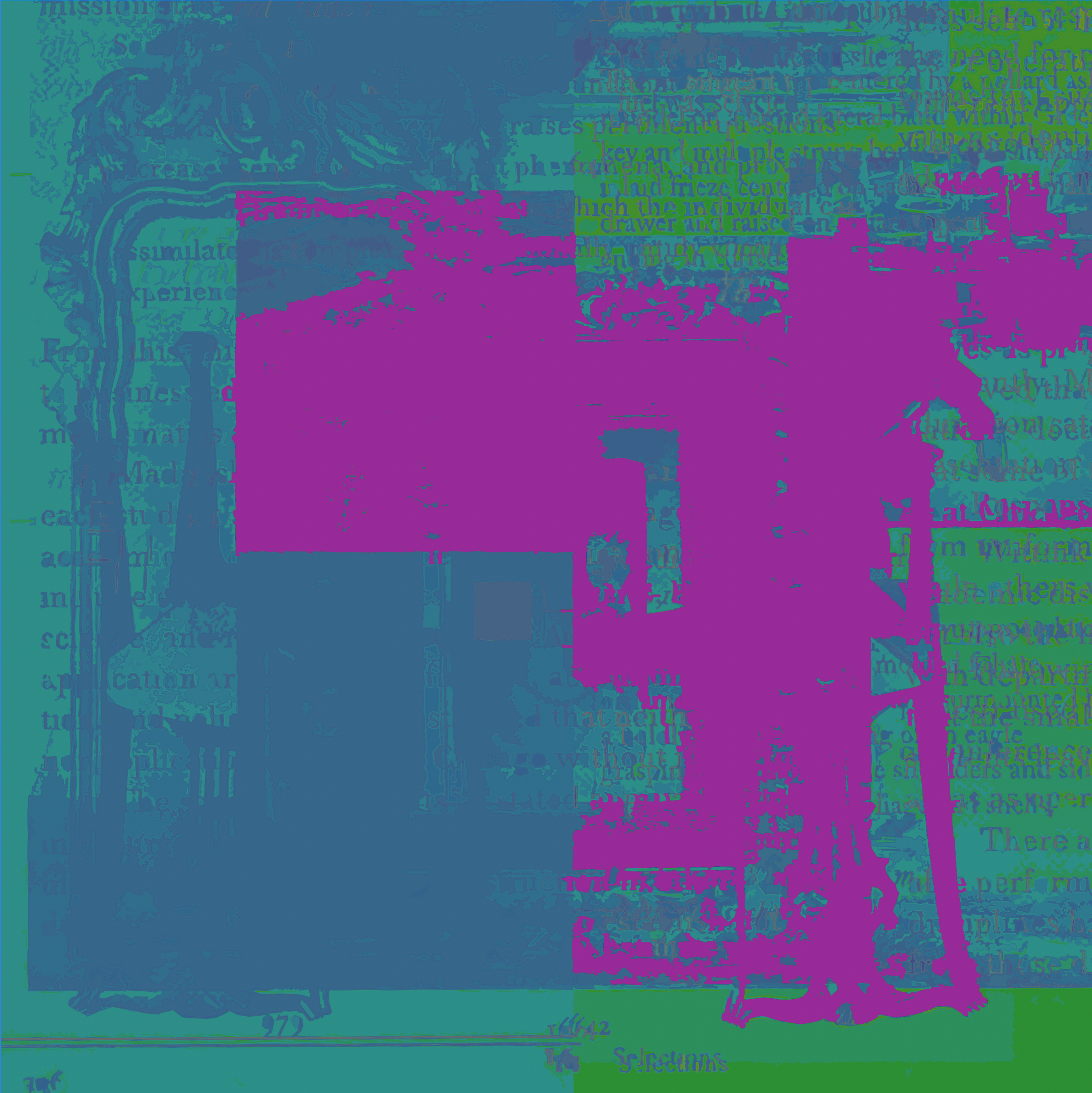
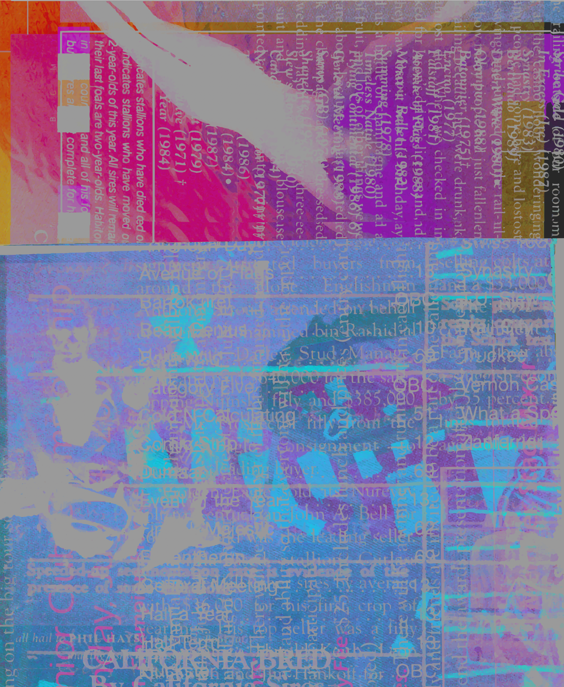
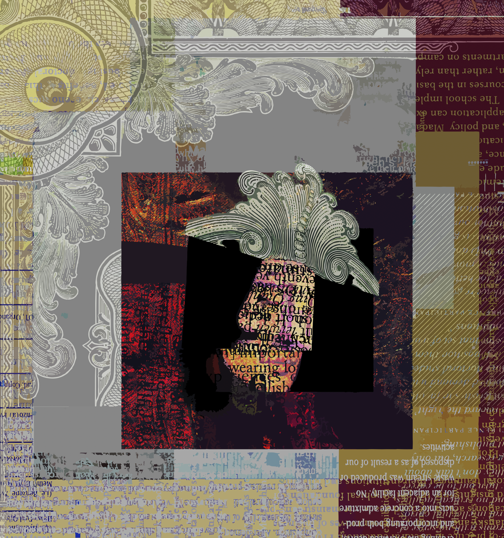
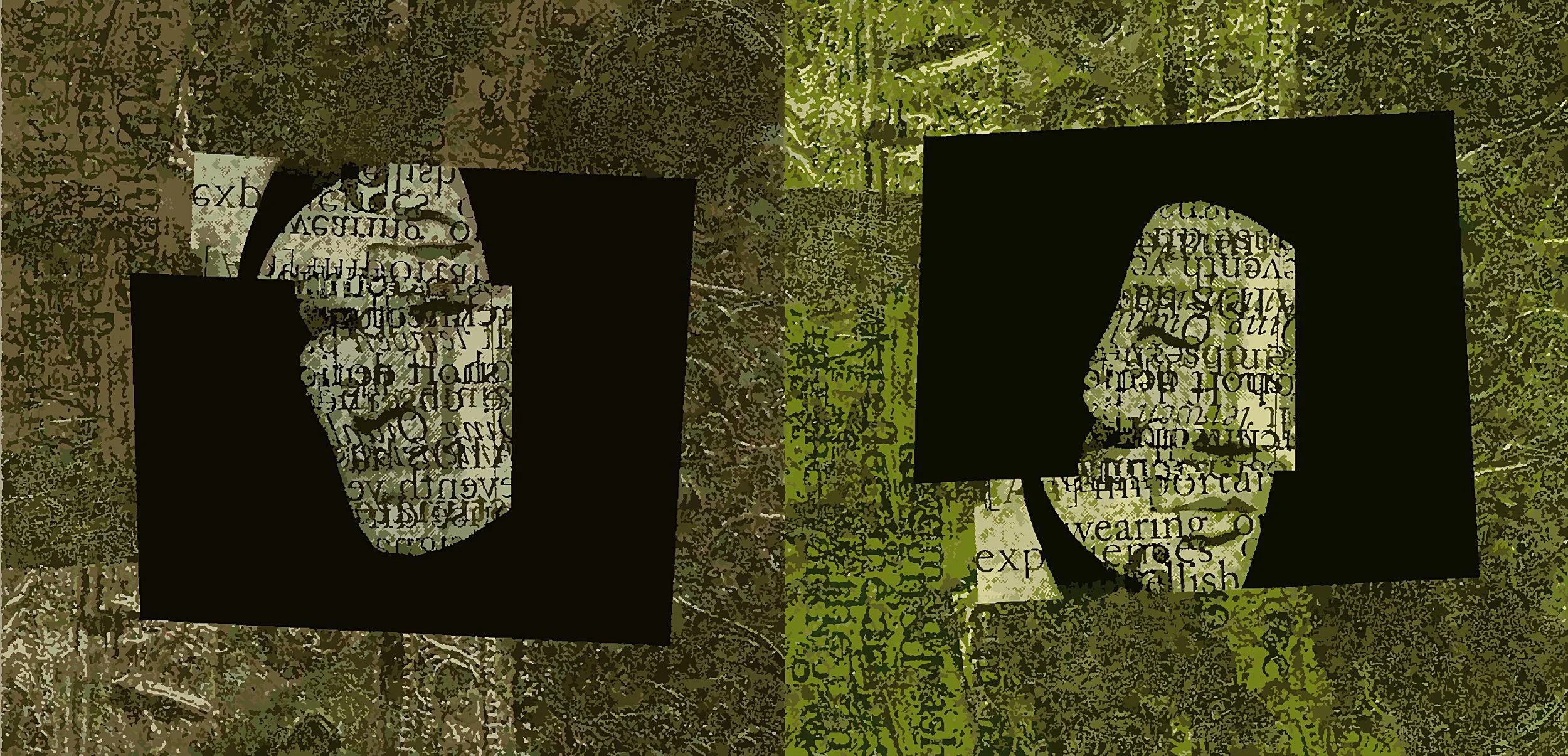
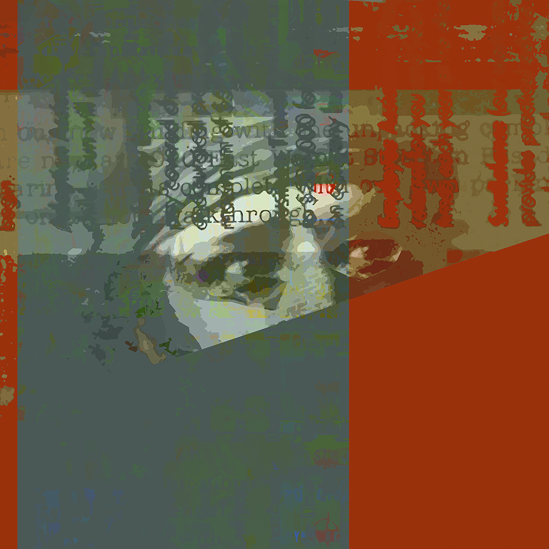
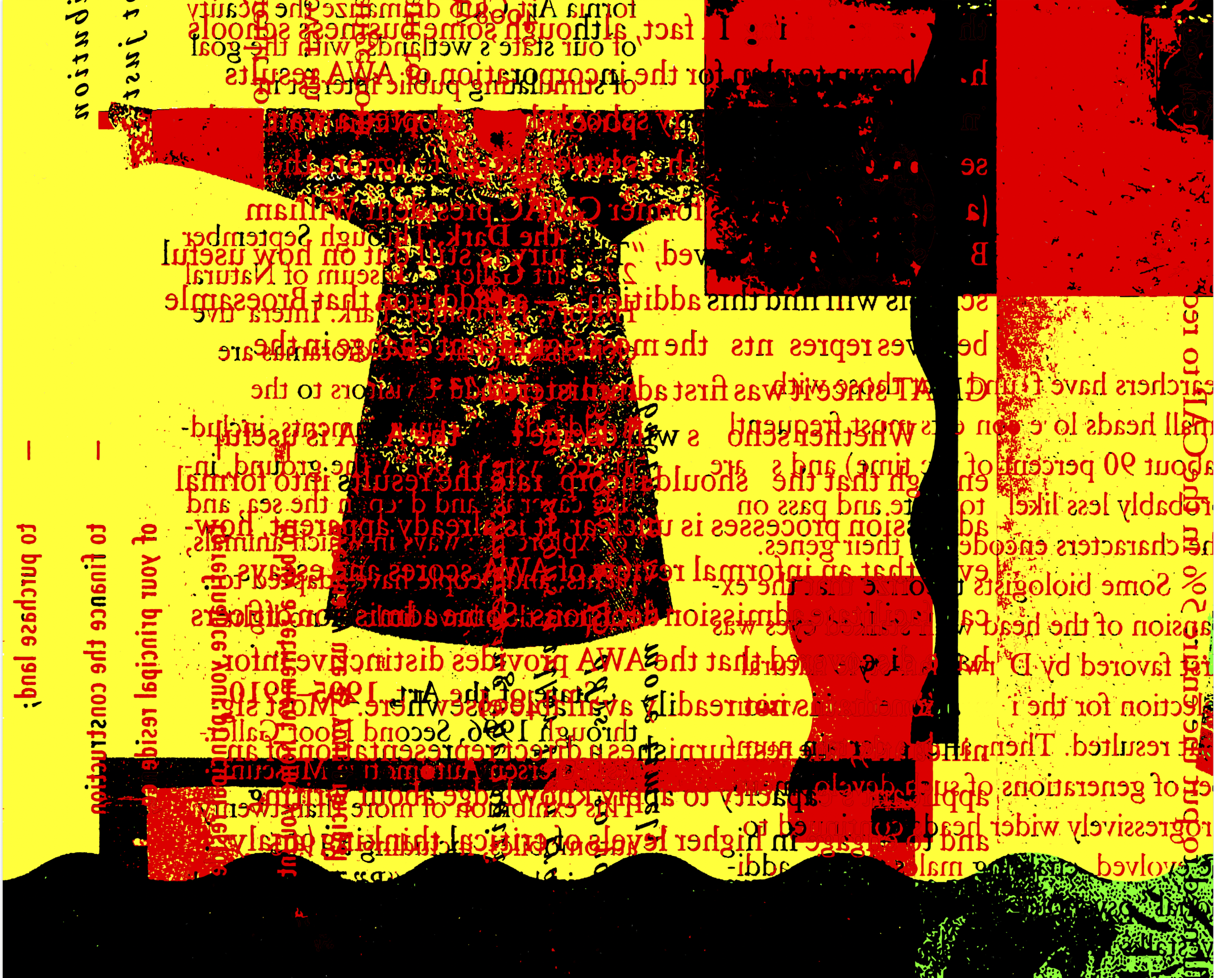
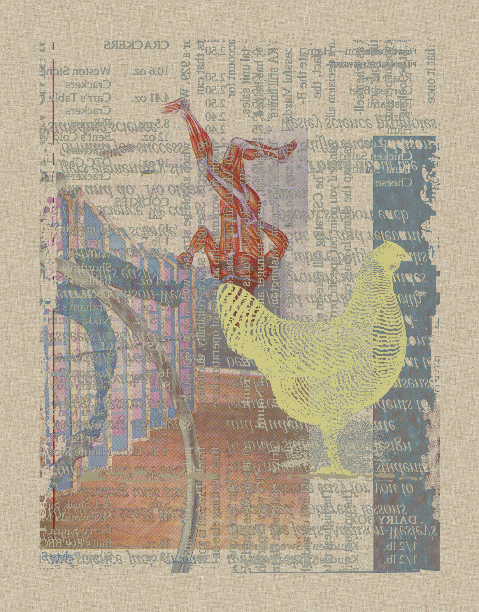
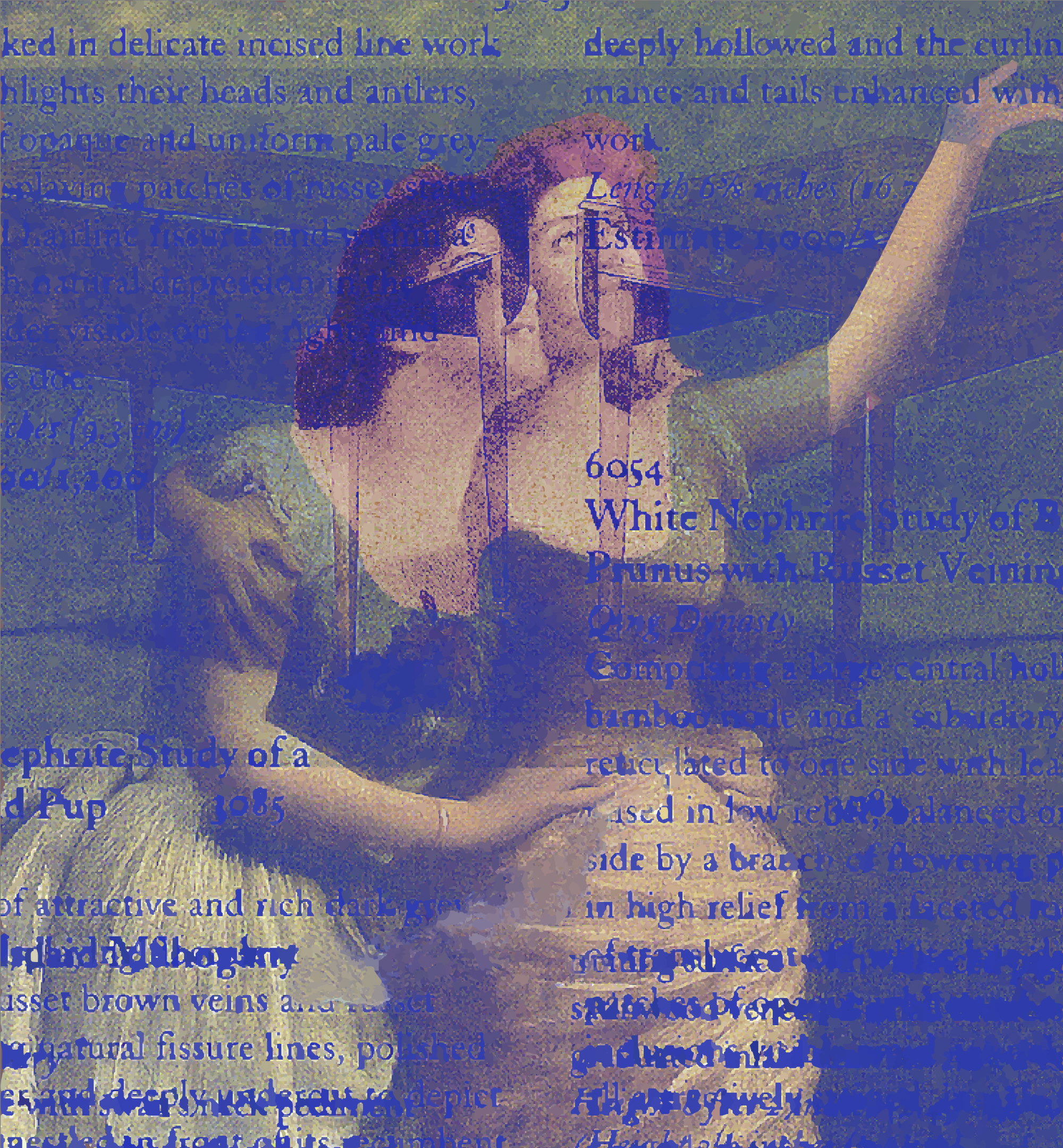
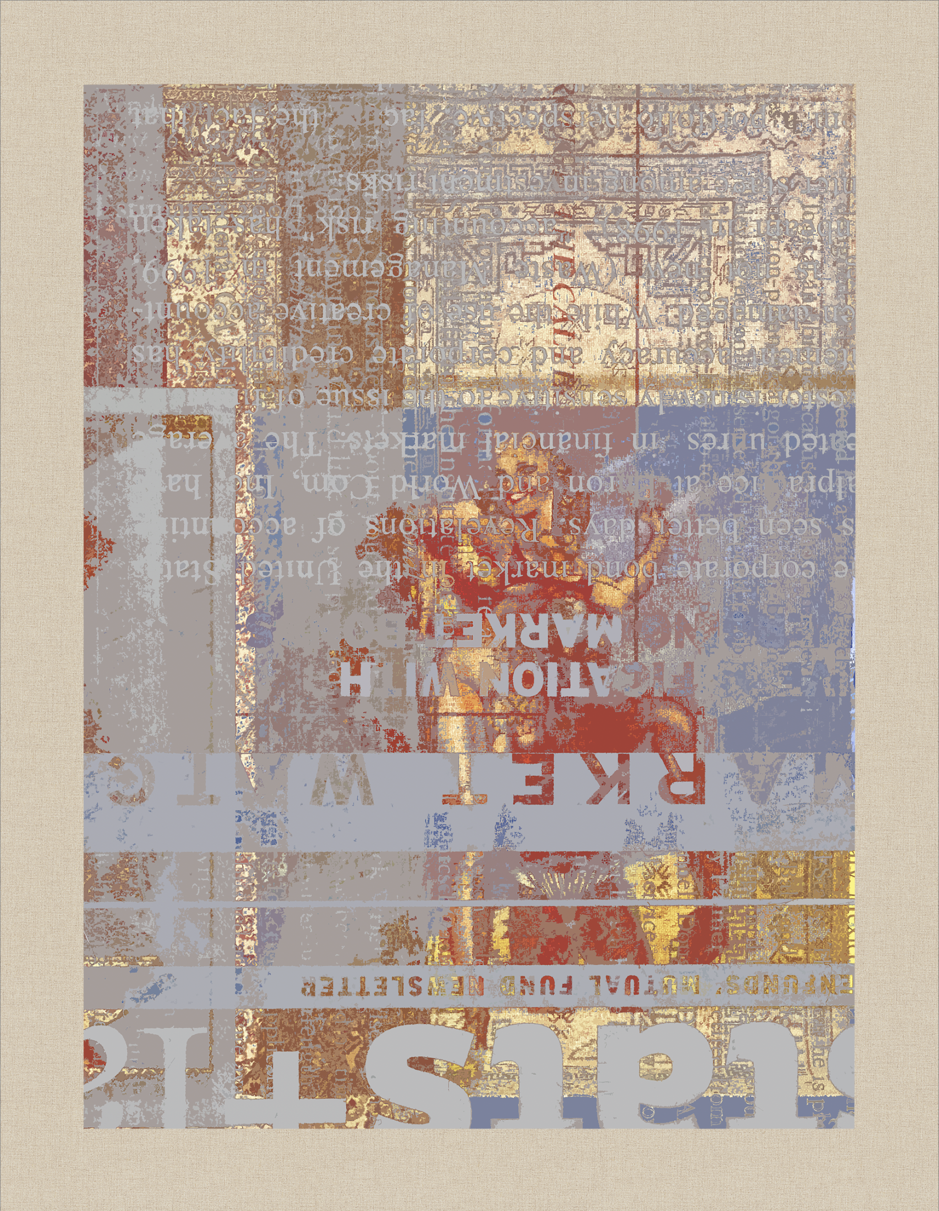
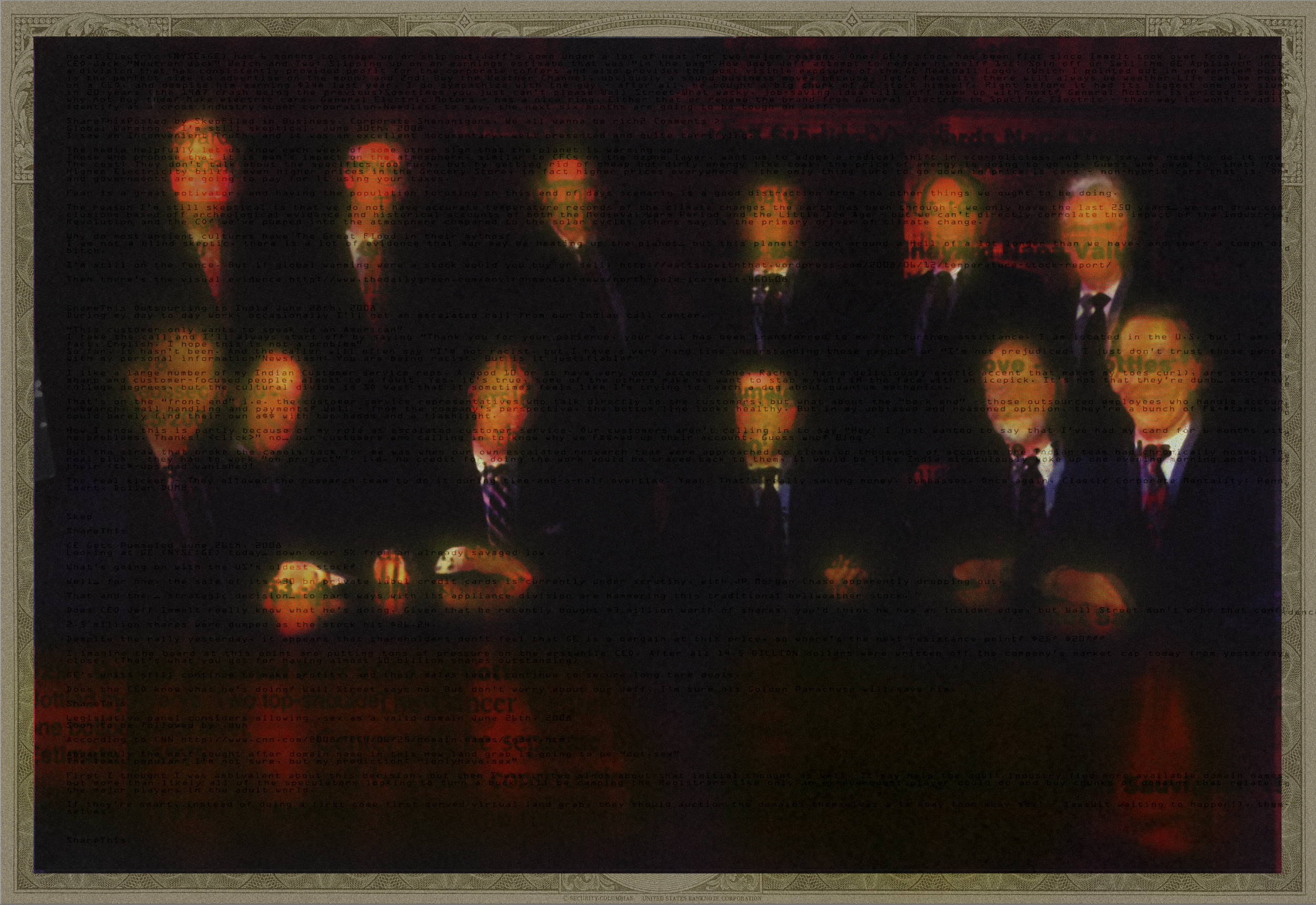
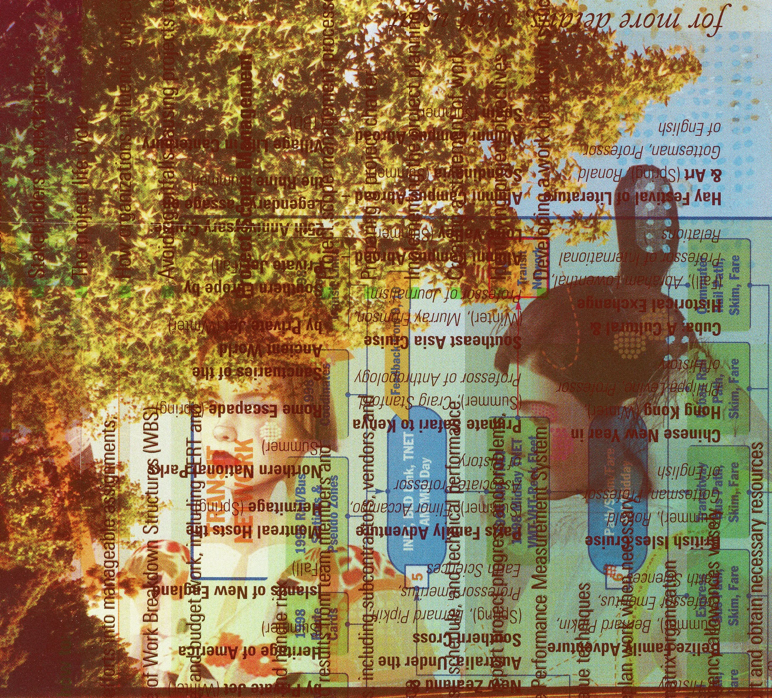
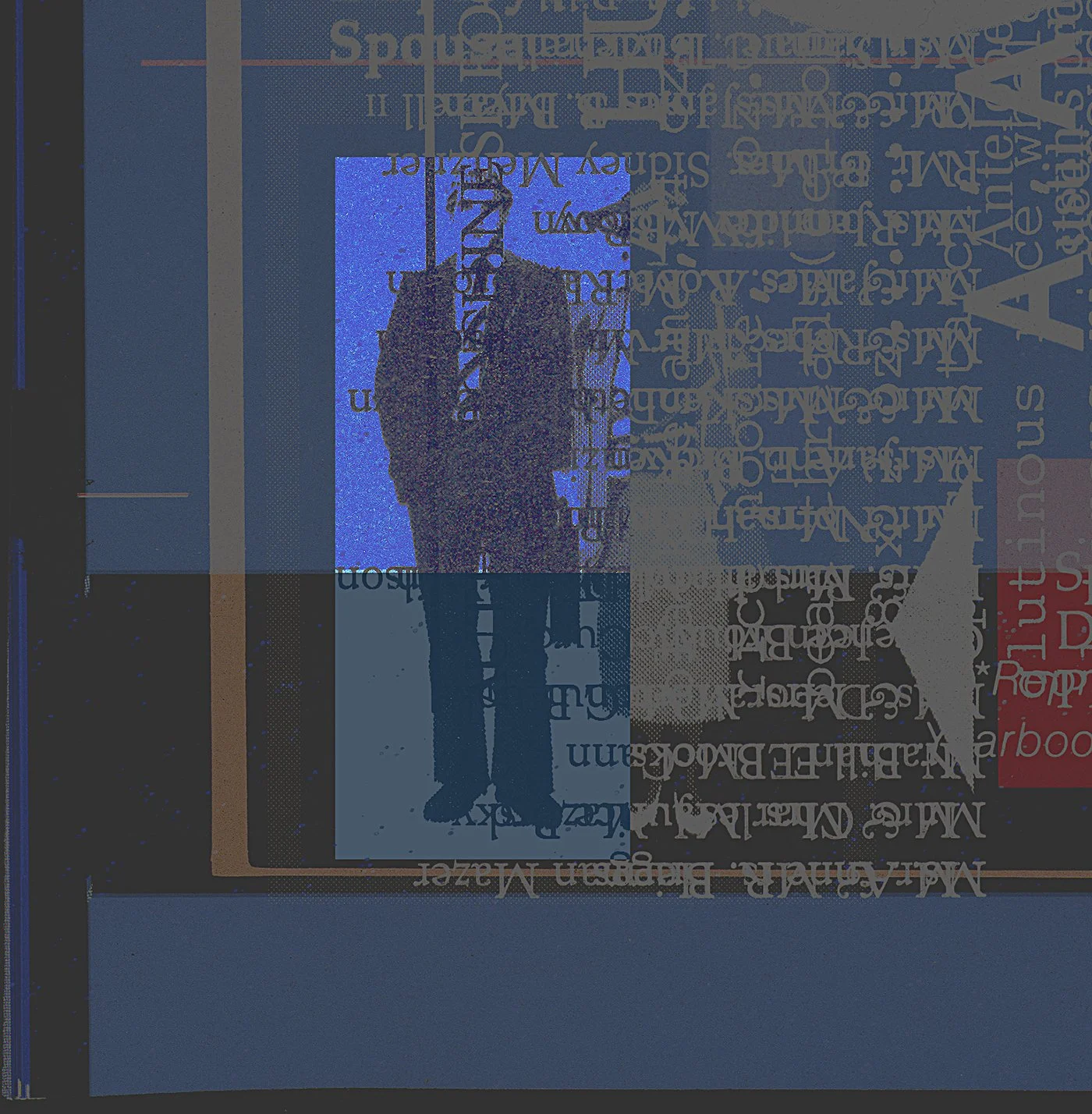
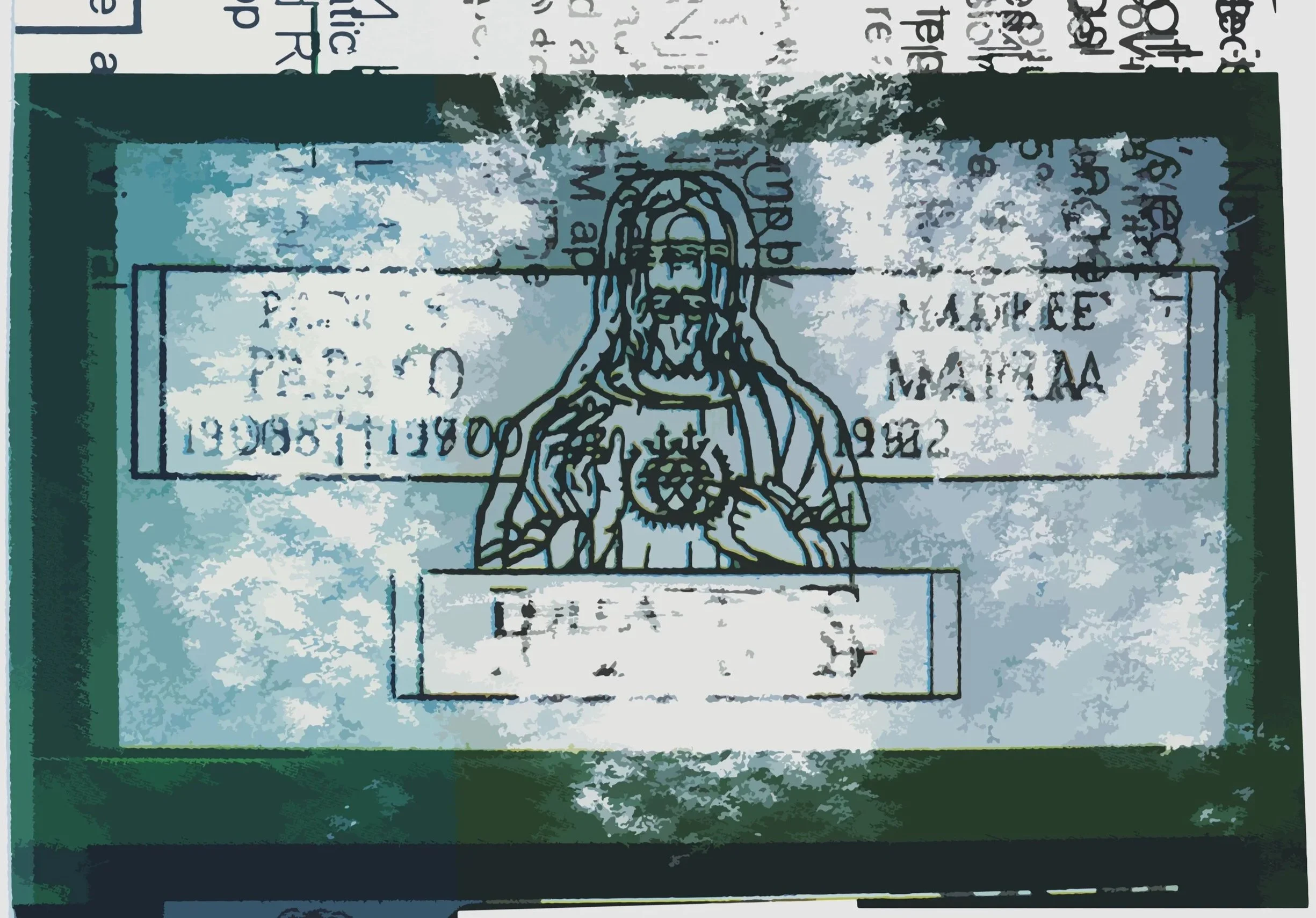
During my years as brand image designer I frequented printing companies to supervise my client’s projects, I became familiar with “make-readies”—the term given the test paper sheets lying in stacks among the presses. This was repurposed “trash’ smothered with unintentionally printed layers of ink from unrelated jobs—resulting in typography and images commingling in unexpected, and in many cases traditionally unharmonious ways. These captivated me and became the inspiration and foundation for my visual exploration and creative pursuit beyond my day work.
I was fascinated with how layered lines of type became fragments, interacting with mostly unrecognizable images of ads, book plates, and other subjects. Unwittingly, this emerged as my visual language. I called this work "well-involved vacant structures," after seeing a make ready fragment with words relating to firefighting. "Well-involved" suggested the multitude of layered imagery, whereas "vacant structures" implied the abstract nature of mostly indecipherable messaging ephemera.
Both sides of my education—degrees in art history, painting and drawing, and communication design, with decades of offset printing experience—now converged into something fresh and exhilarating. A doorway into the art world.
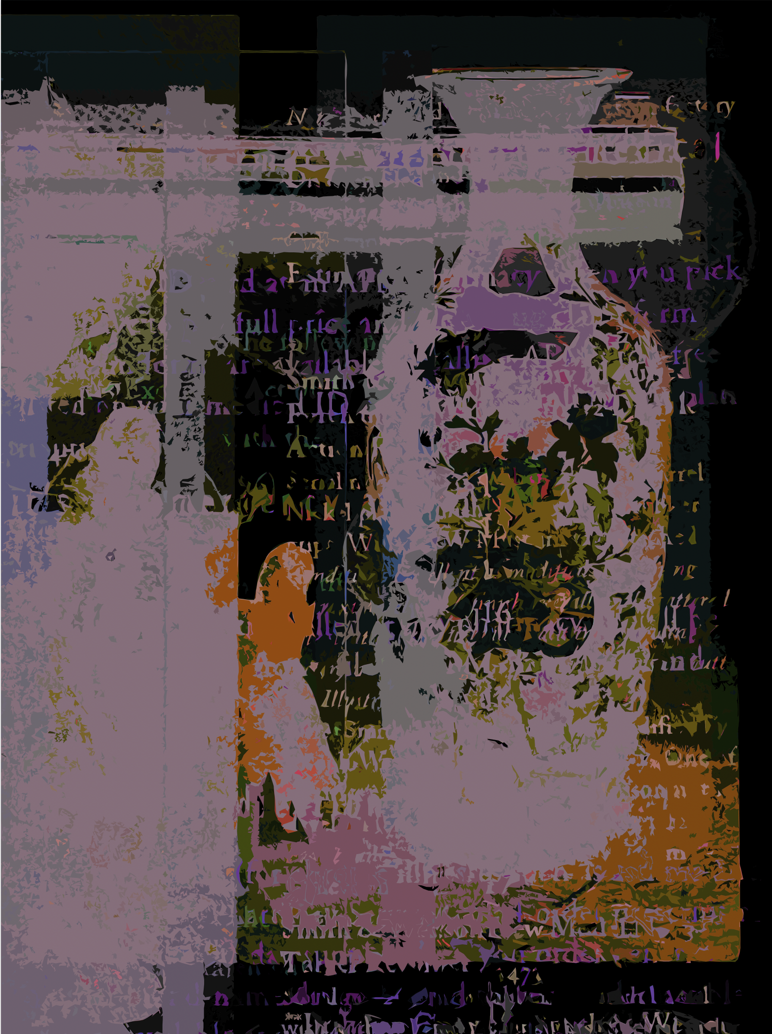
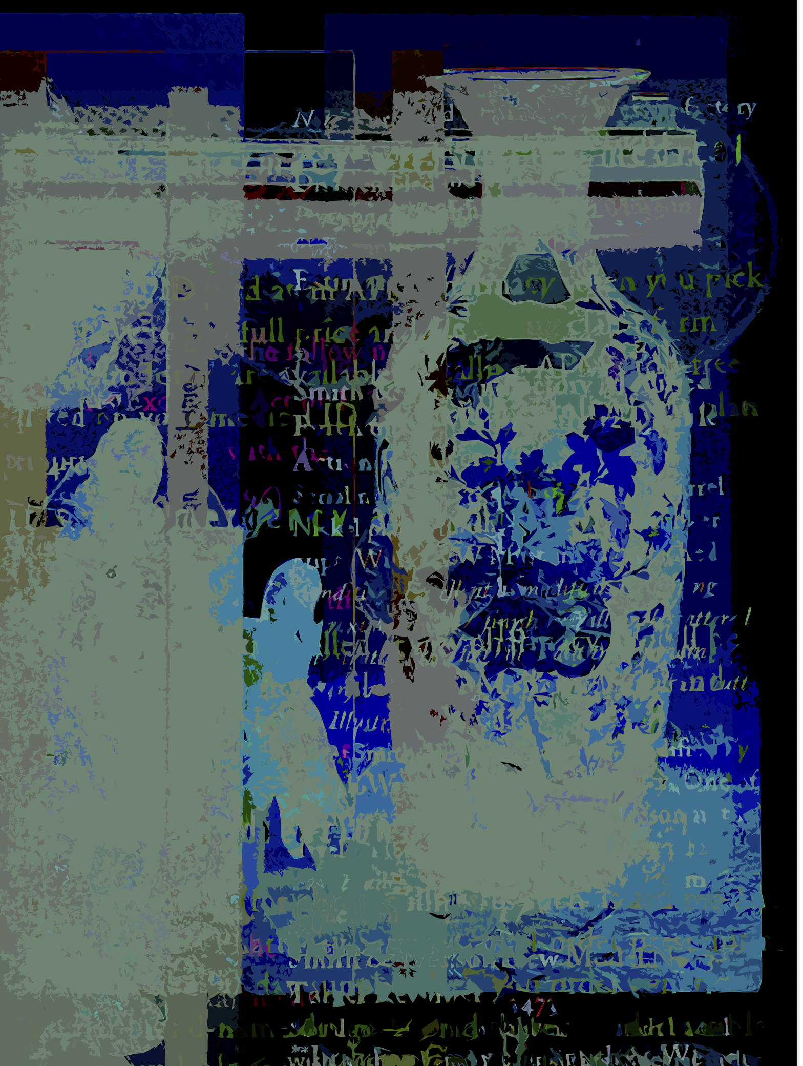
I'd always been drawn to repetition and variation—Monet painting the same haystack again and again, capturing different light and moments. Or Warhol repeating Marilyn's face in shifting colors. Monet chased something almost spiritual in perception; Warhol took a different approach, intentionally stripping away emotion into flat advertising sensibility.
As my work took shape it became evident that what developed in front of me was somewhere between those impulses, occupying mostly abstraction.
The iterative process that grew from my digital design experience plus this new found inspiration became what enthralled me then, and still—the excitement of discovering variations while essentially improvising, not unlike a jazz musician I suppose.
I later realized "make-ready" now echoed Duchamp's "readymades"—an unintentional wink and nod to art history. Whereas Duchamp took finished everyday objects and declared them art through recontextualized appropriation, I create layered abstract fragments never meant to be seen together, finding inspiration in what was destined for re-purposed materials.
Each work begins as built up layering of type and images until I reach the result I’m after. The original limited edition of (9) are archival pigment prints, with two artist proofs mounted on panel. The iterations exist as digital files awaiting the printing of signed and numbered limited edition archival digital pigment prints.
–Benj Čziller, Ojai CA
MAKE READY, 1985-2025, ’Well-involved Vacant Structures’ iterative series’ and singular works.
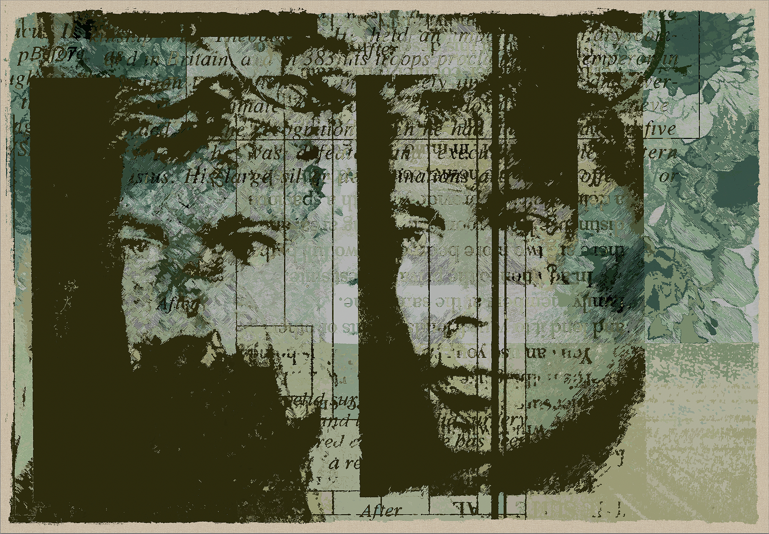
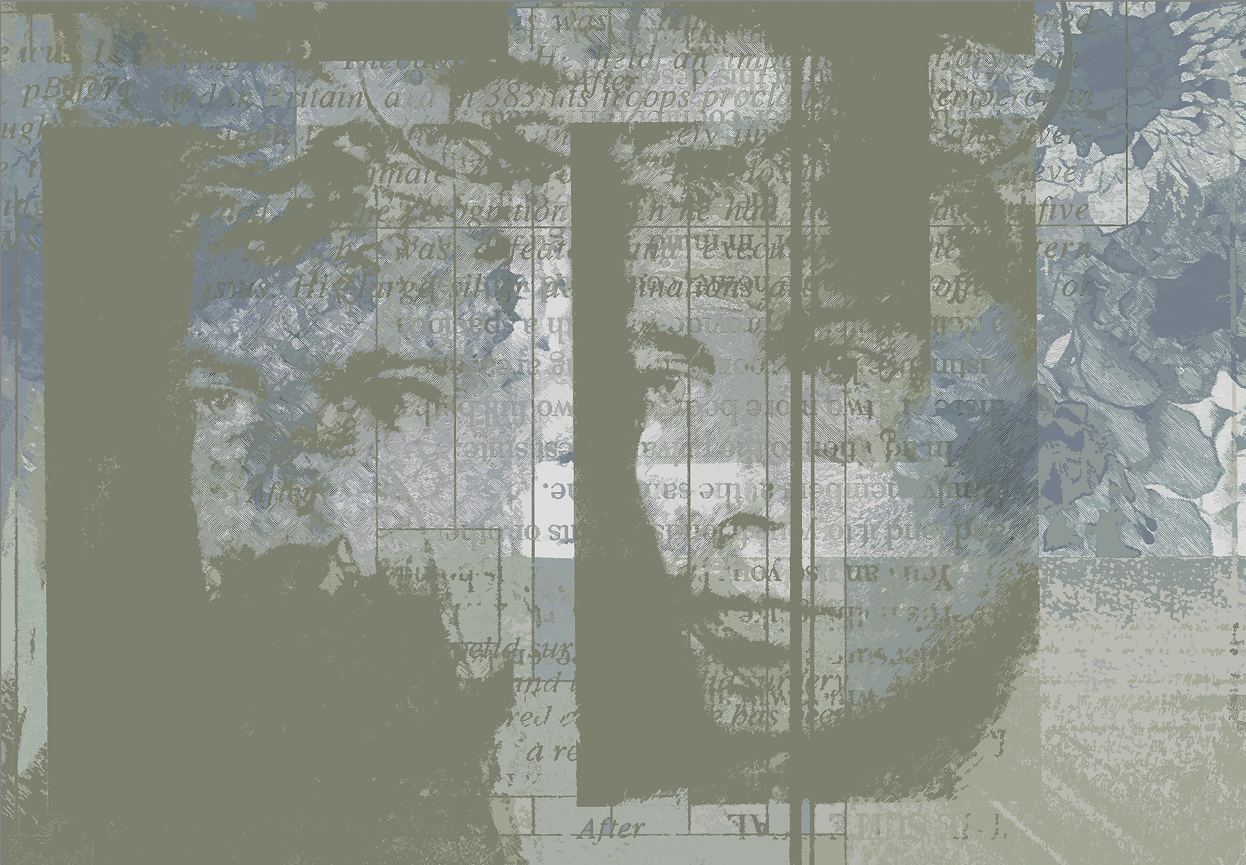
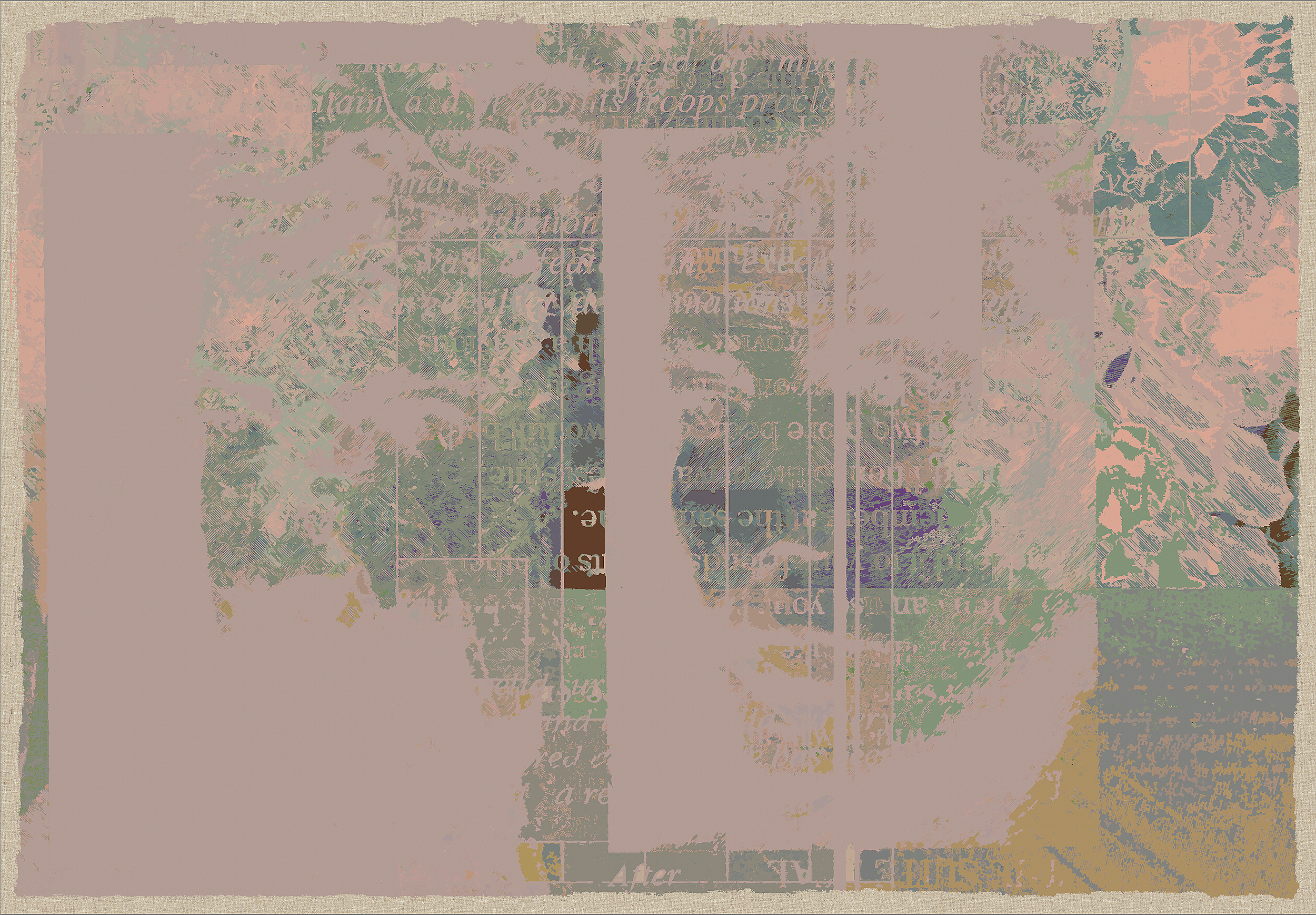
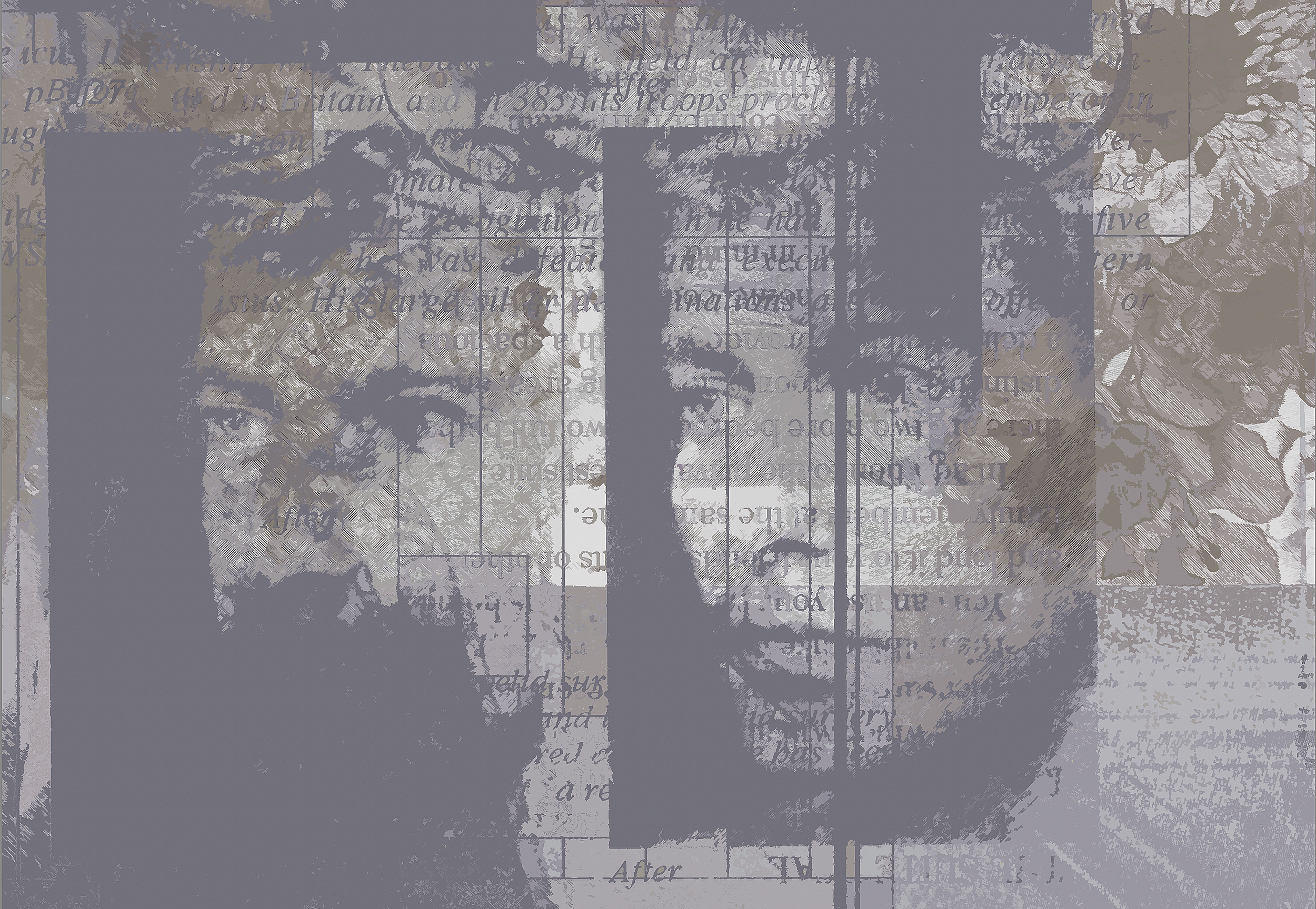
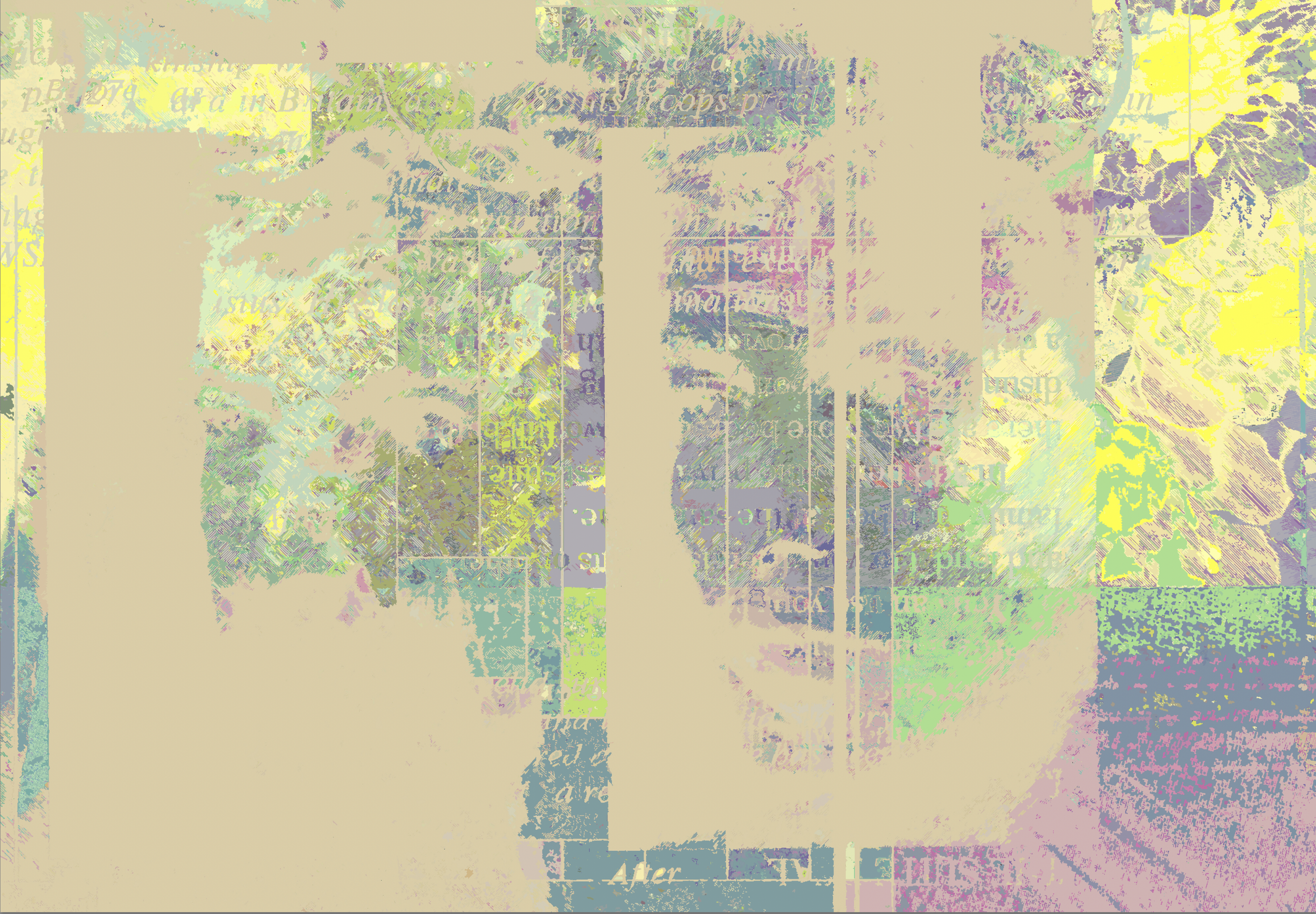
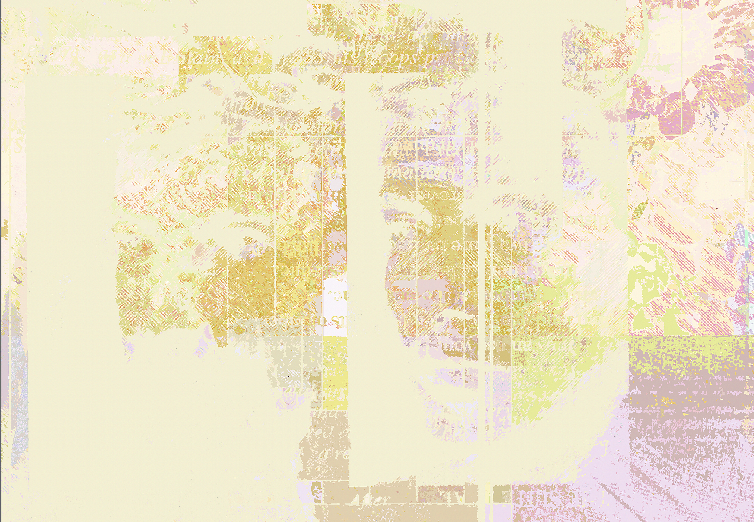
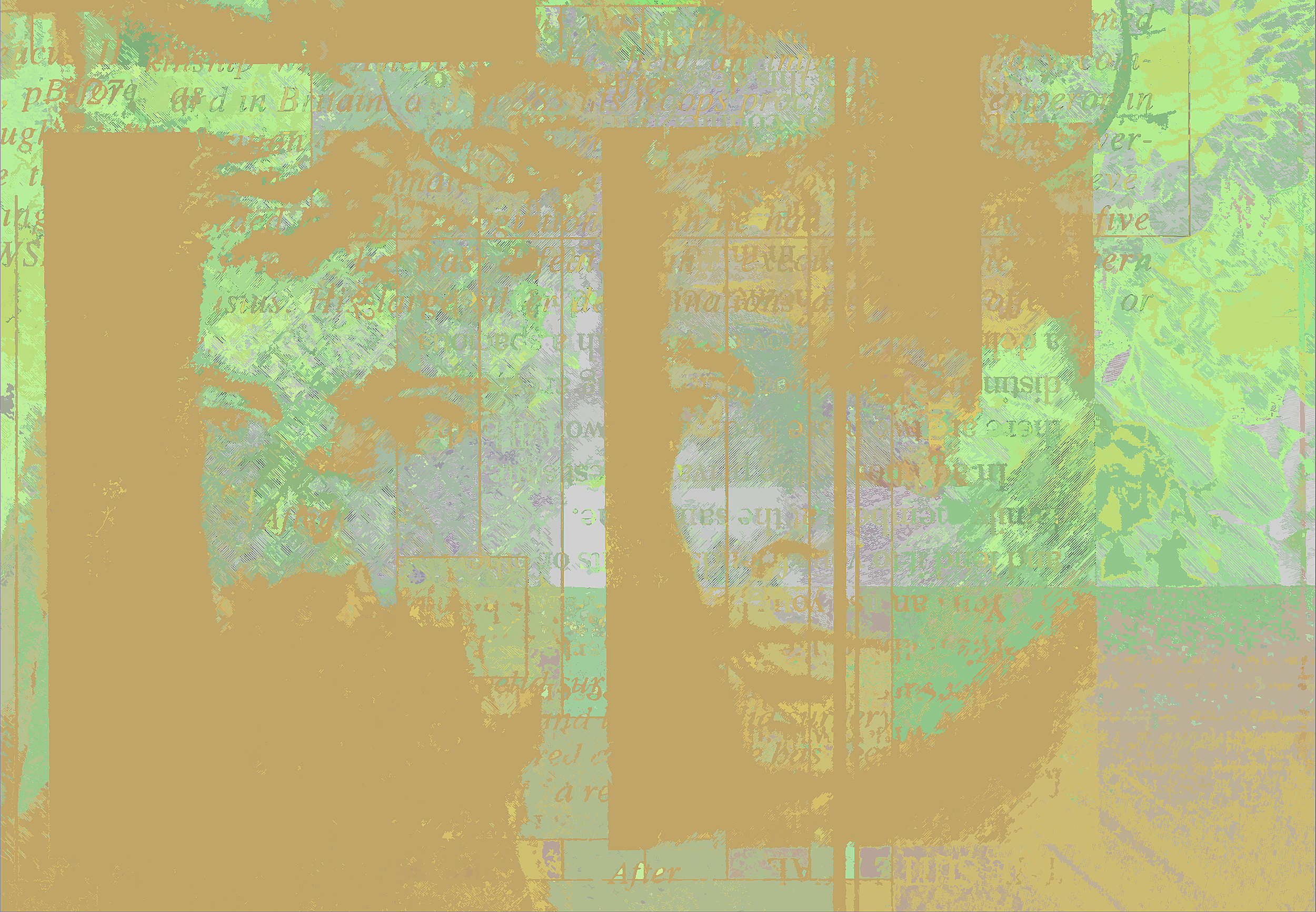
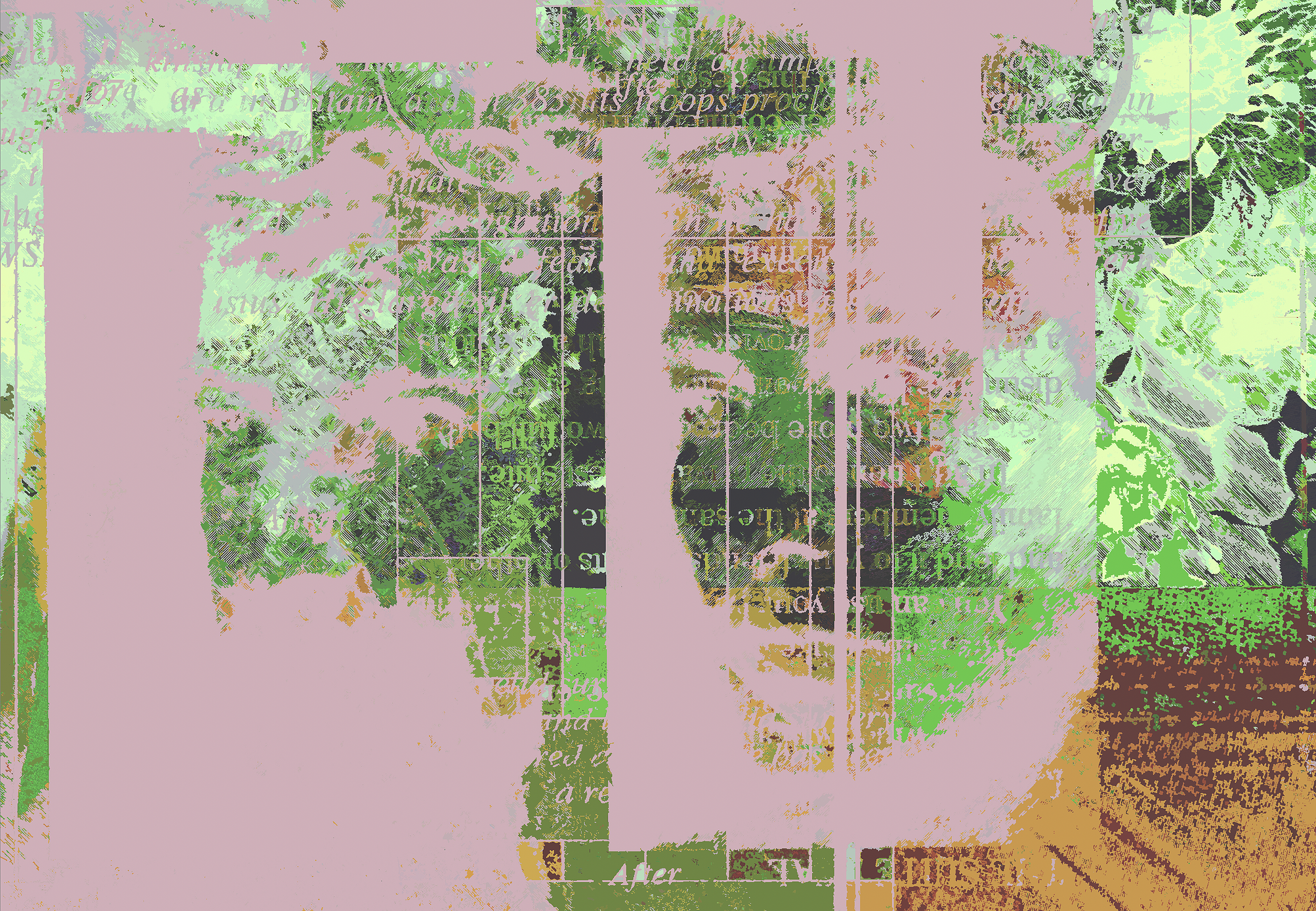
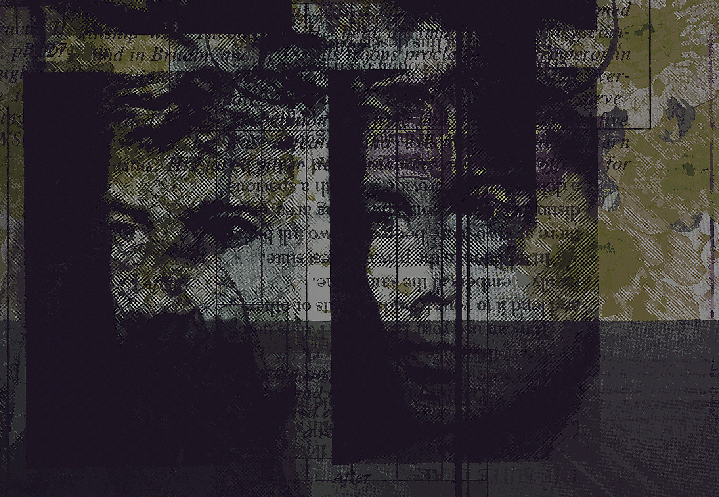
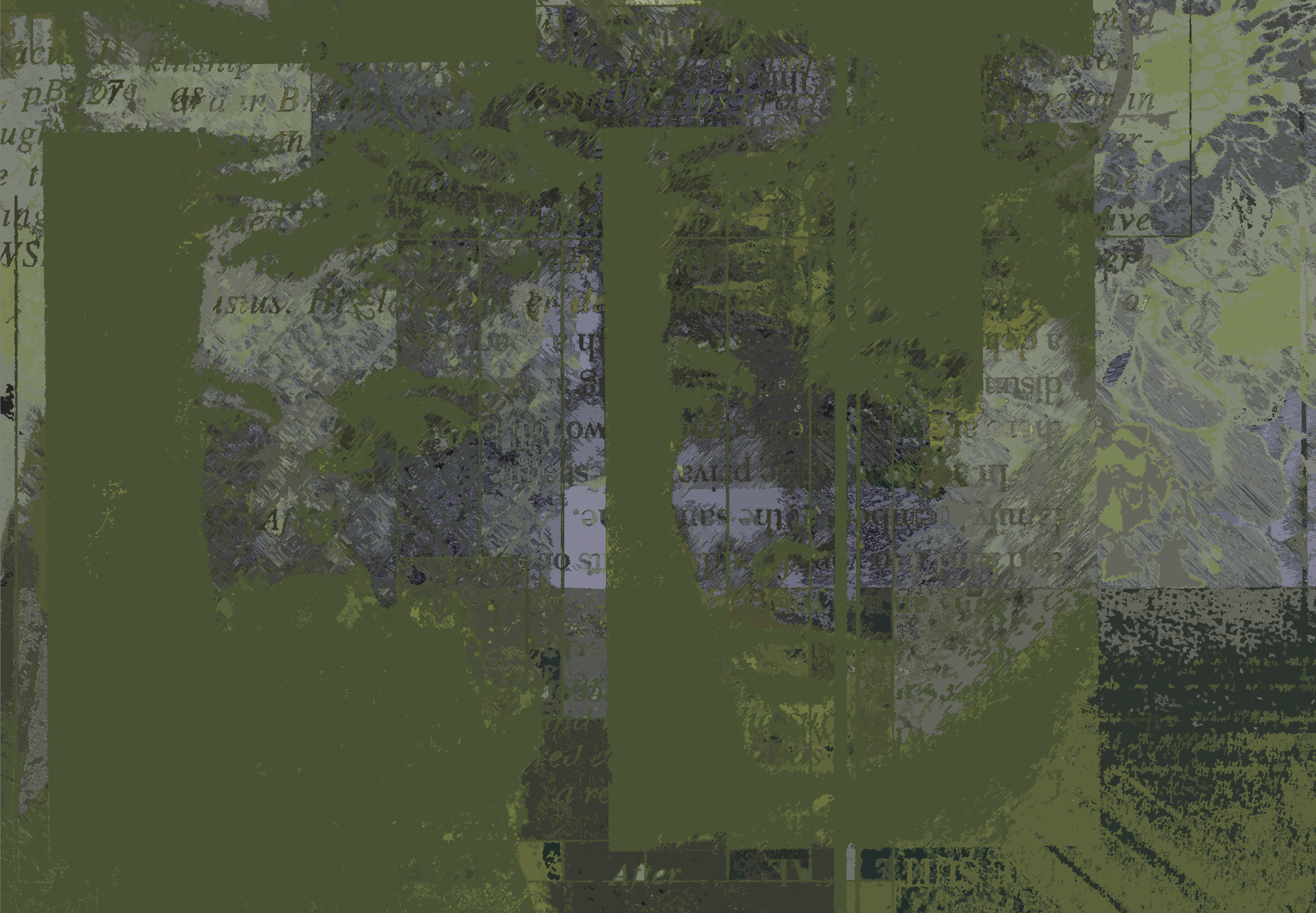
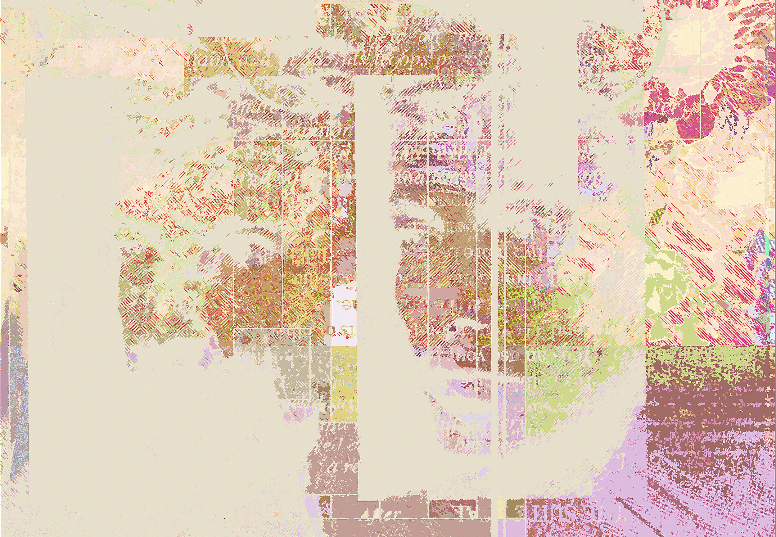
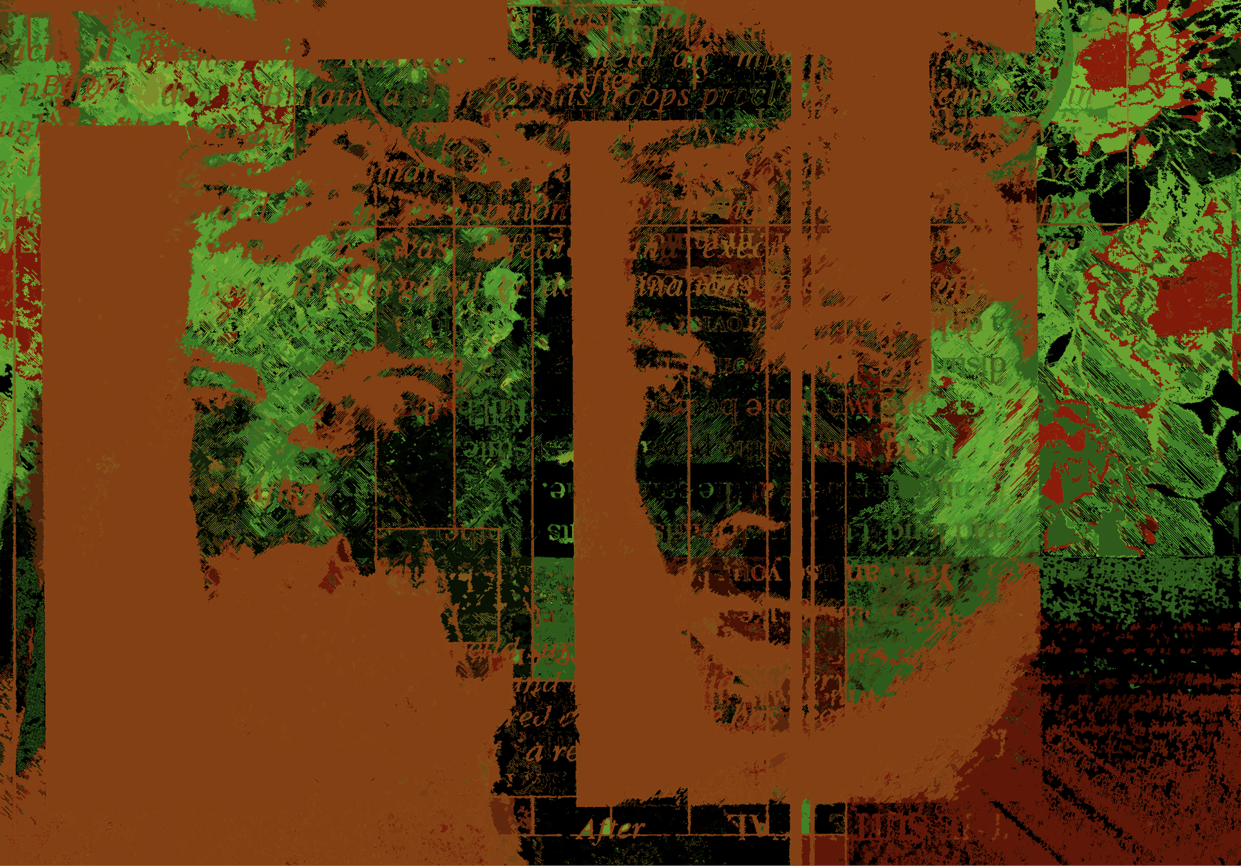
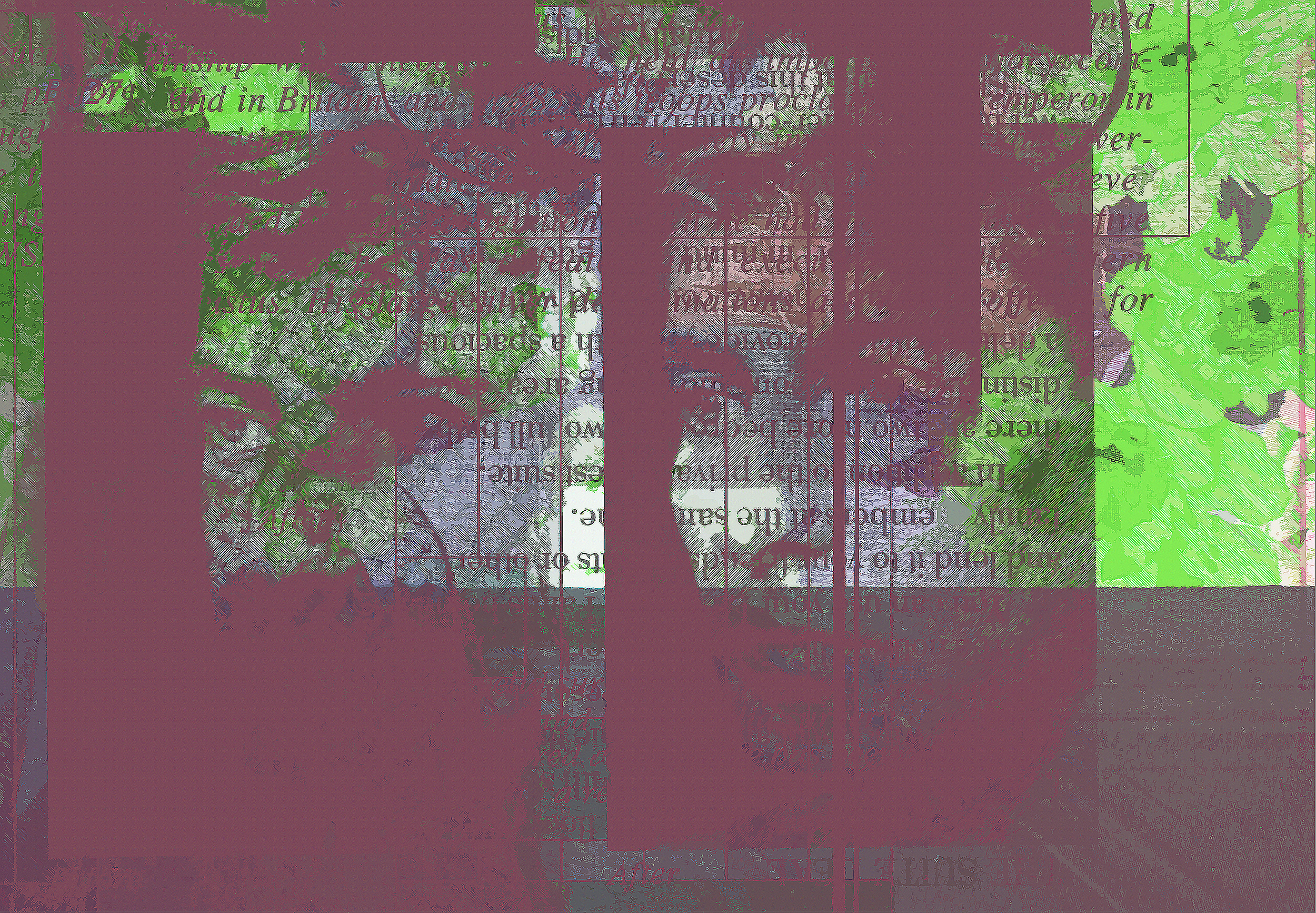
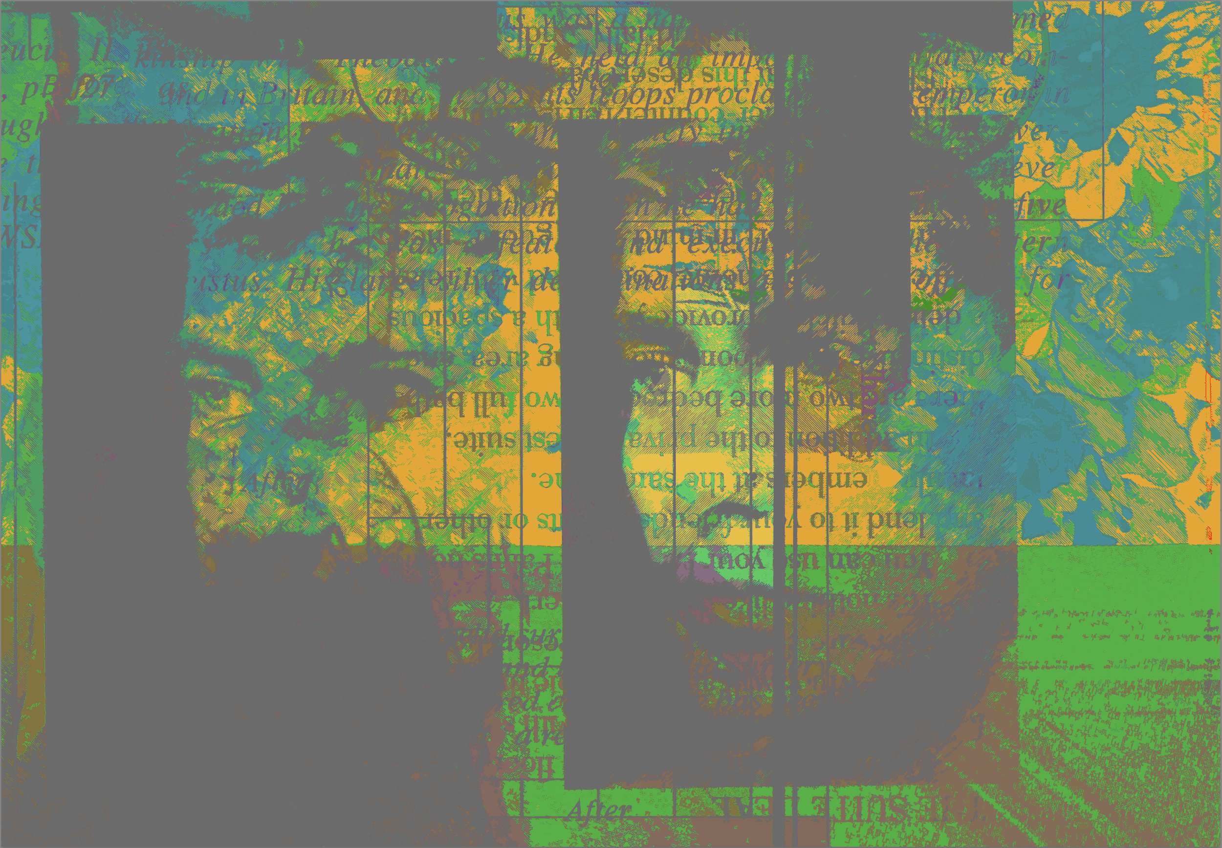
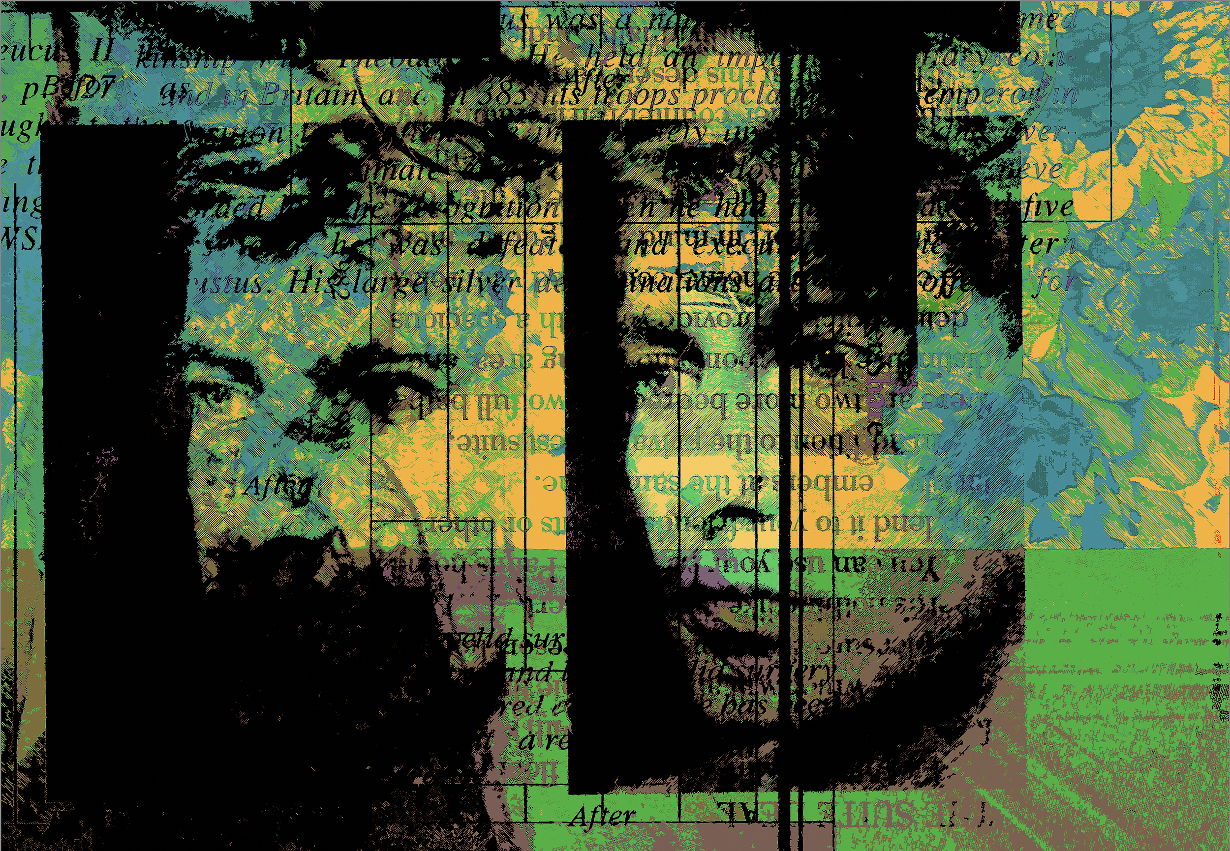
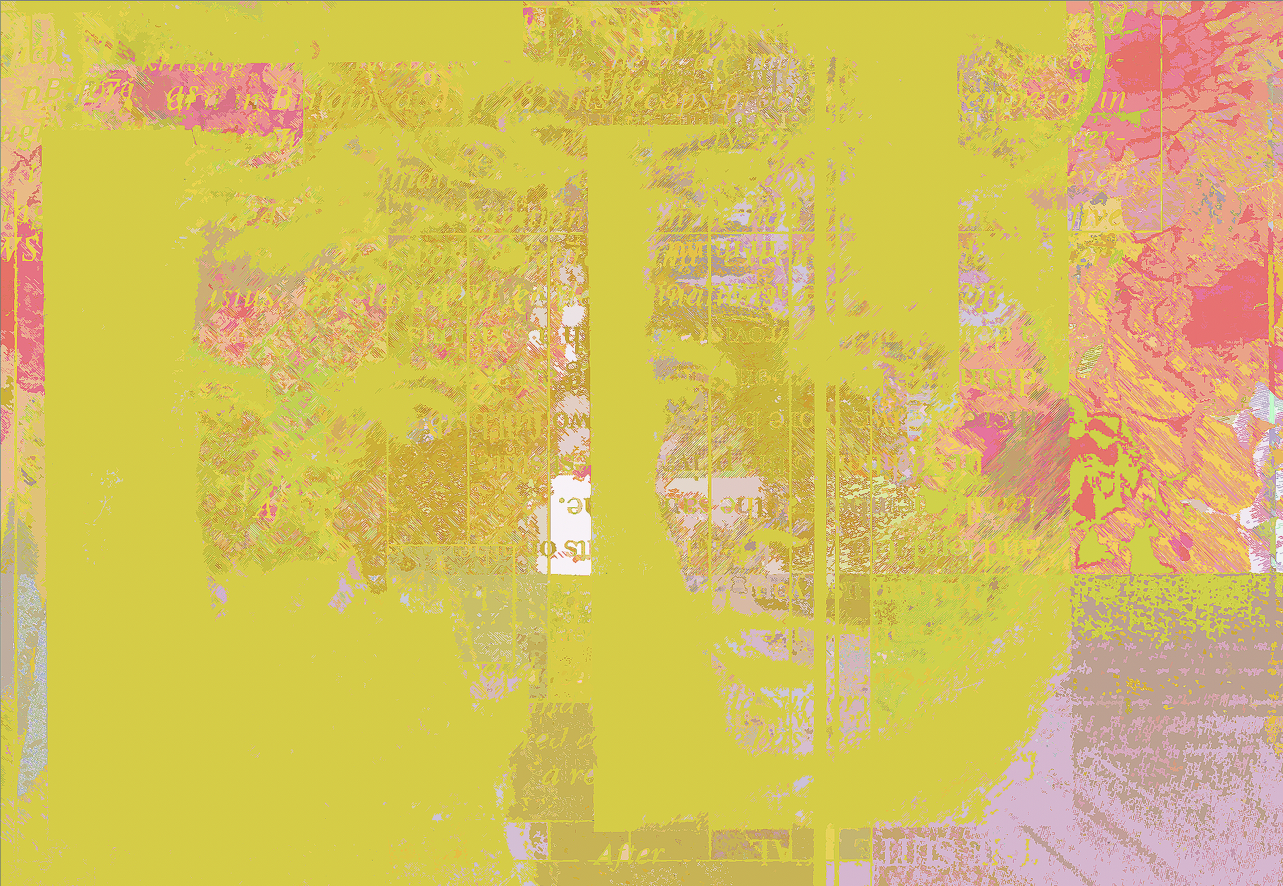
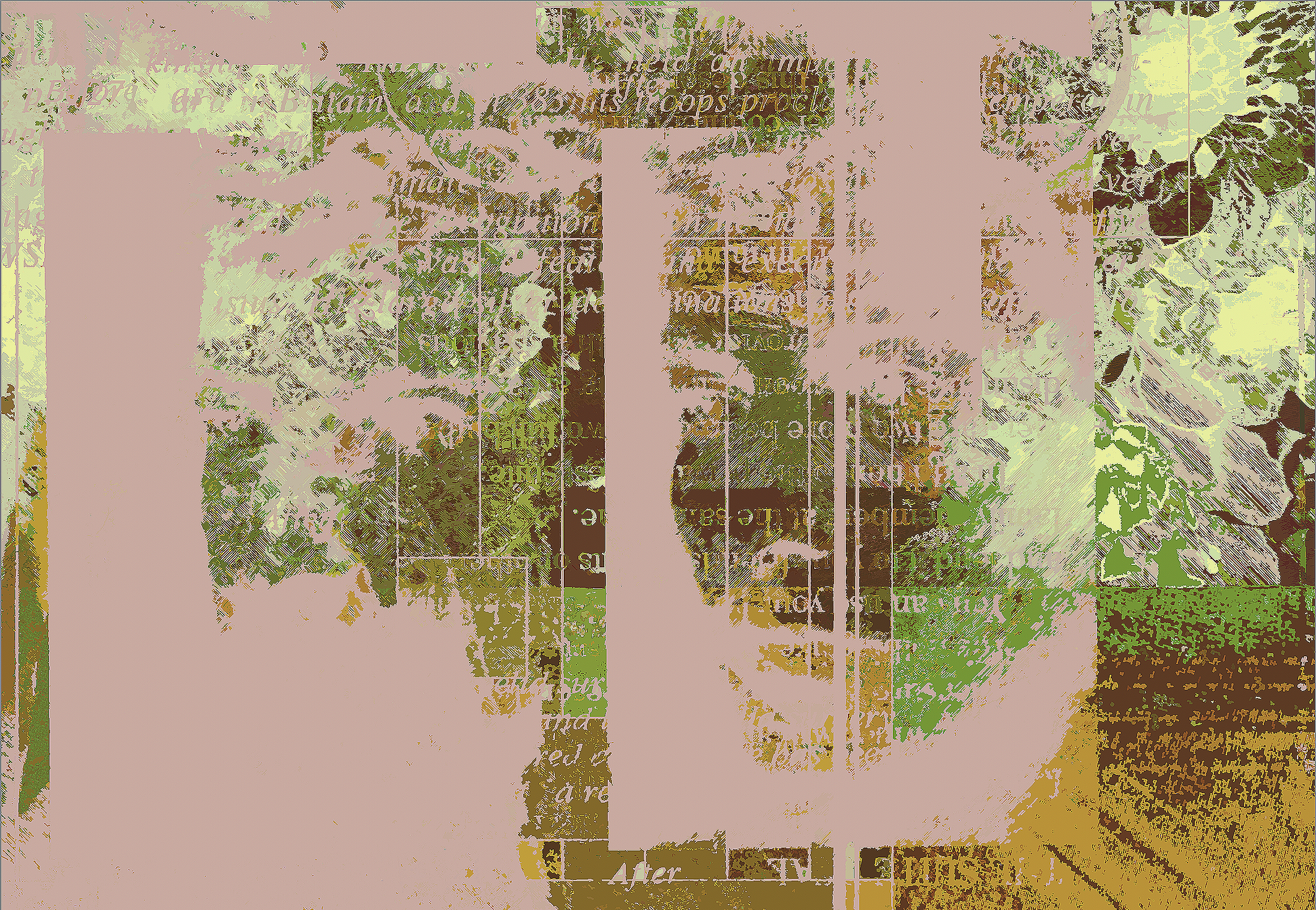
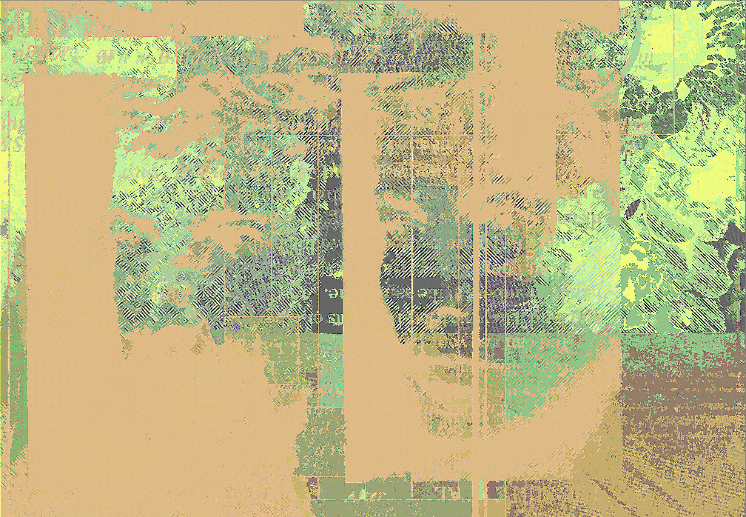
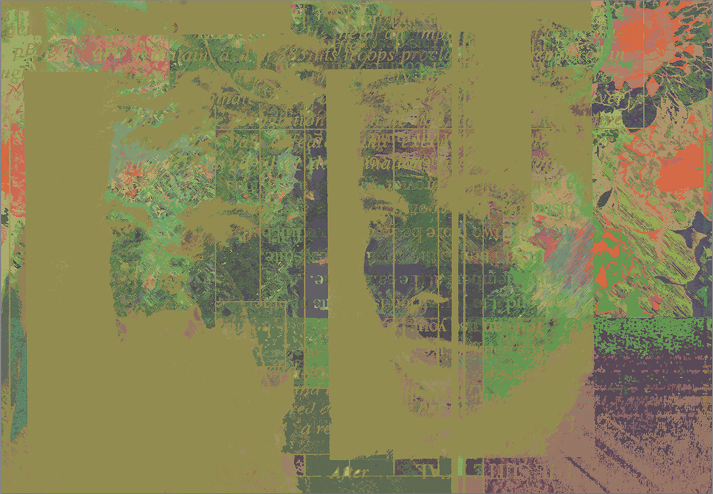
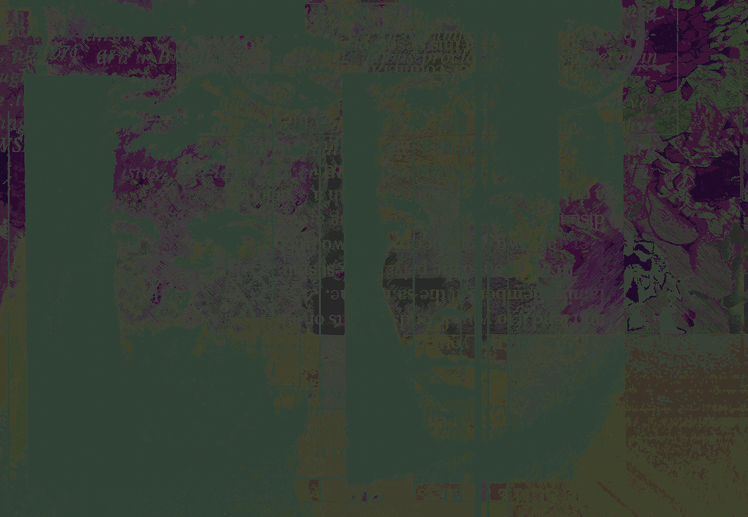
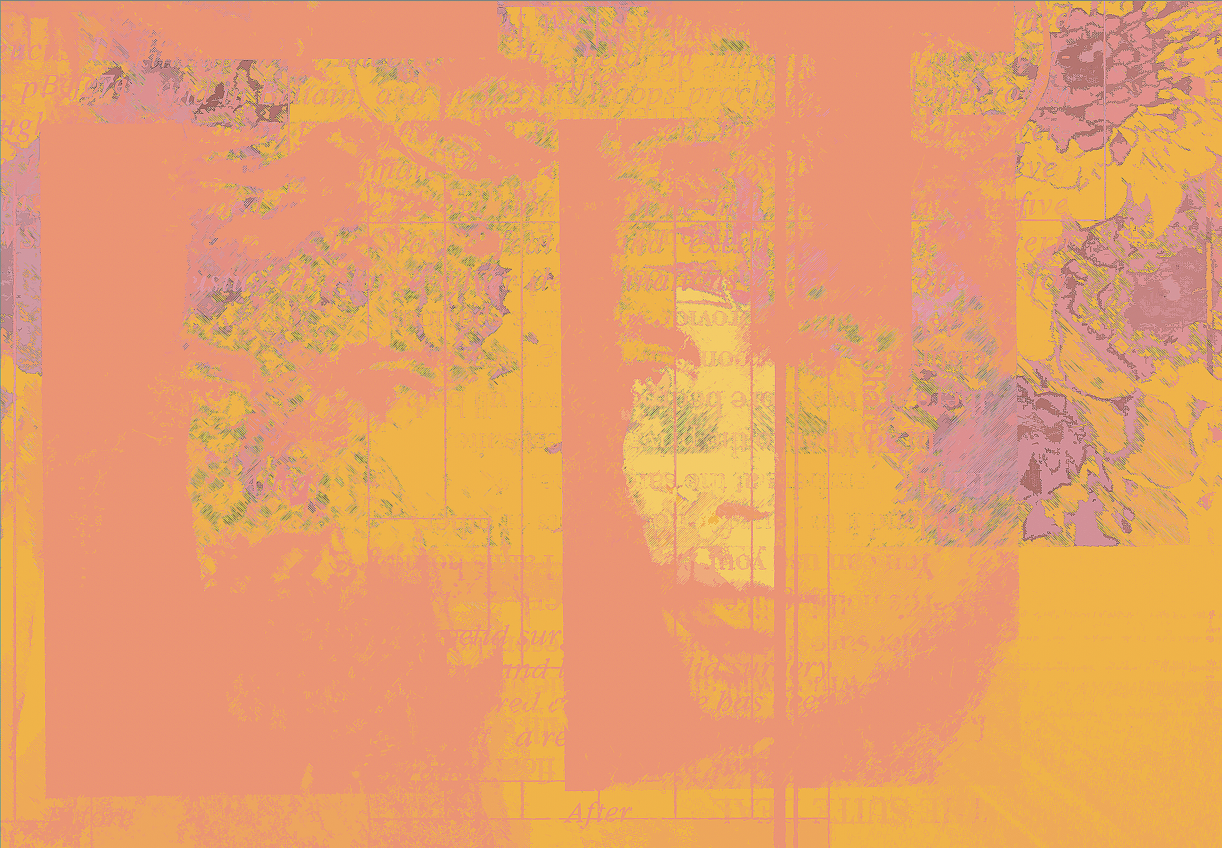
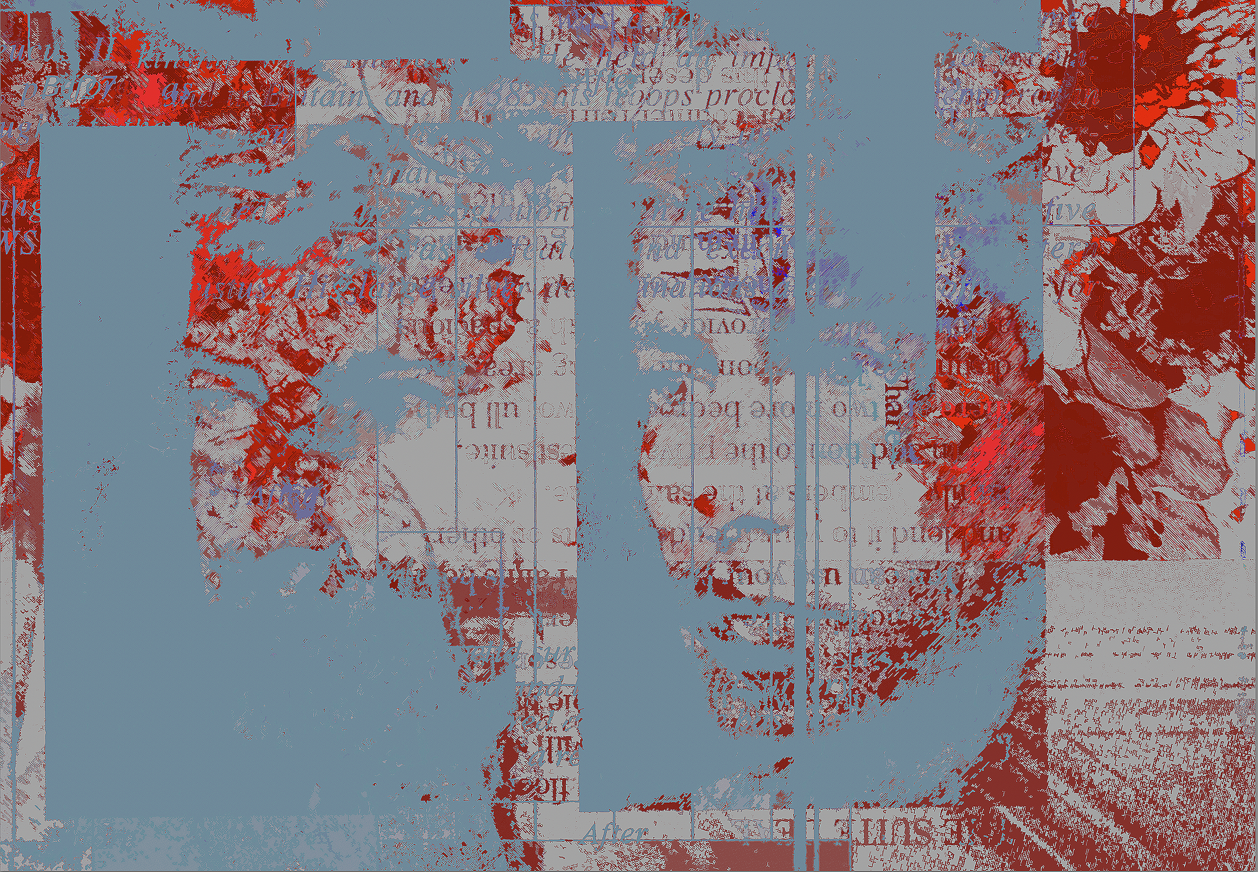
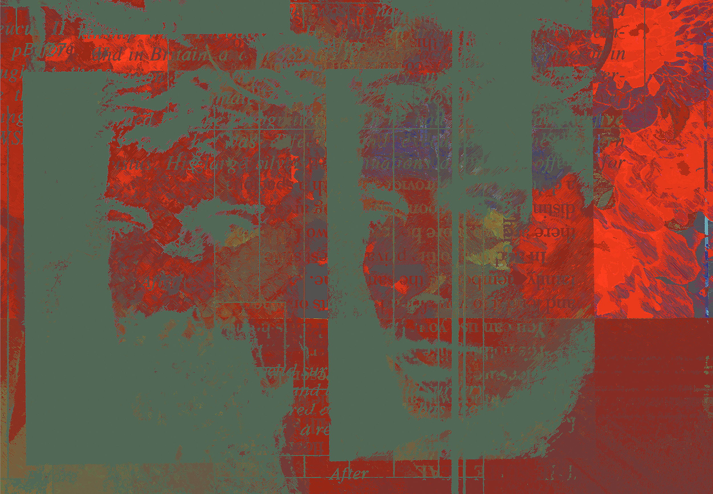
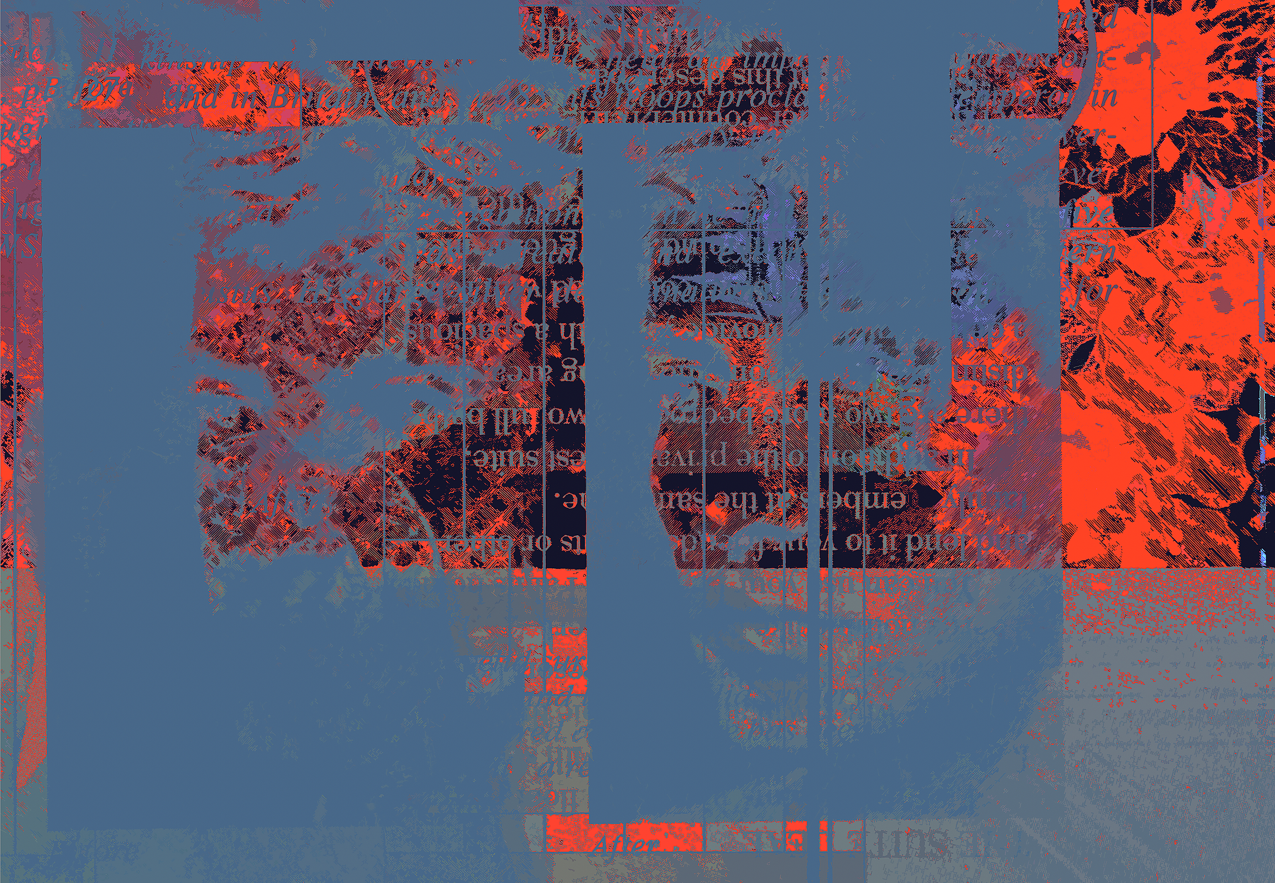
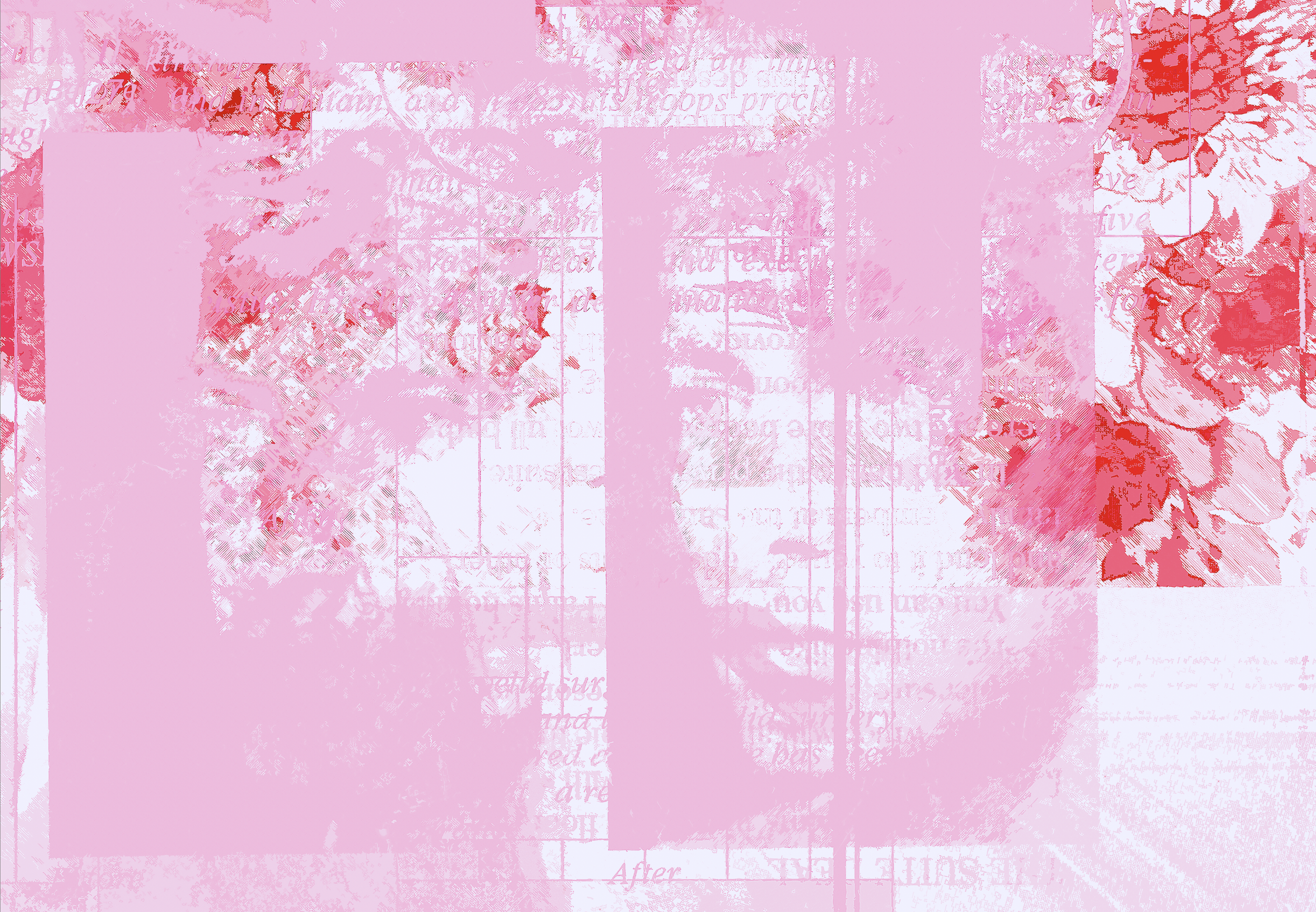
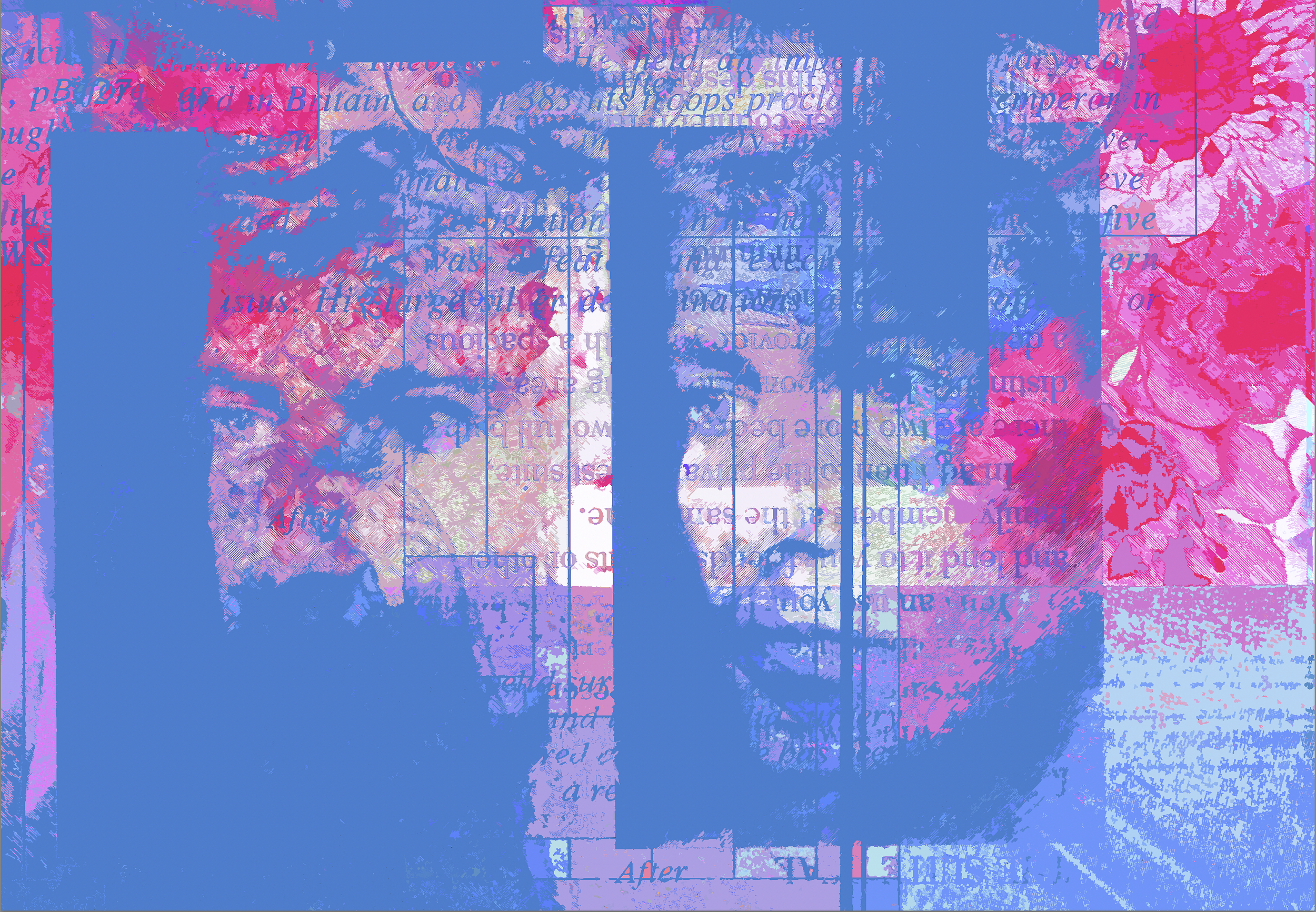
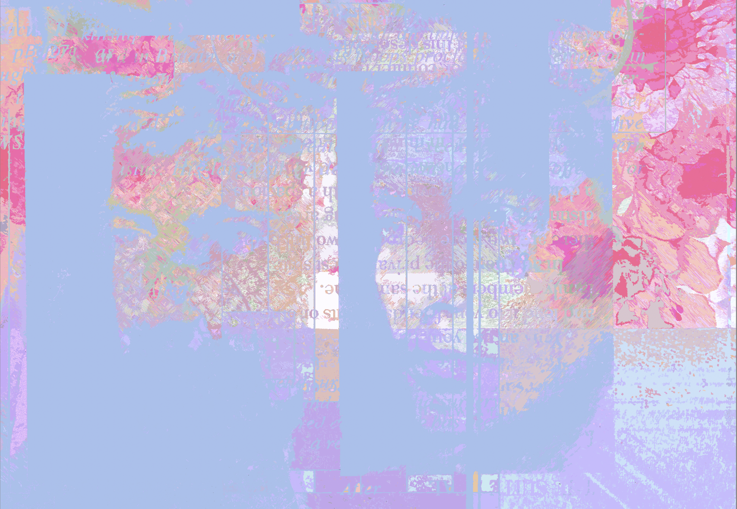
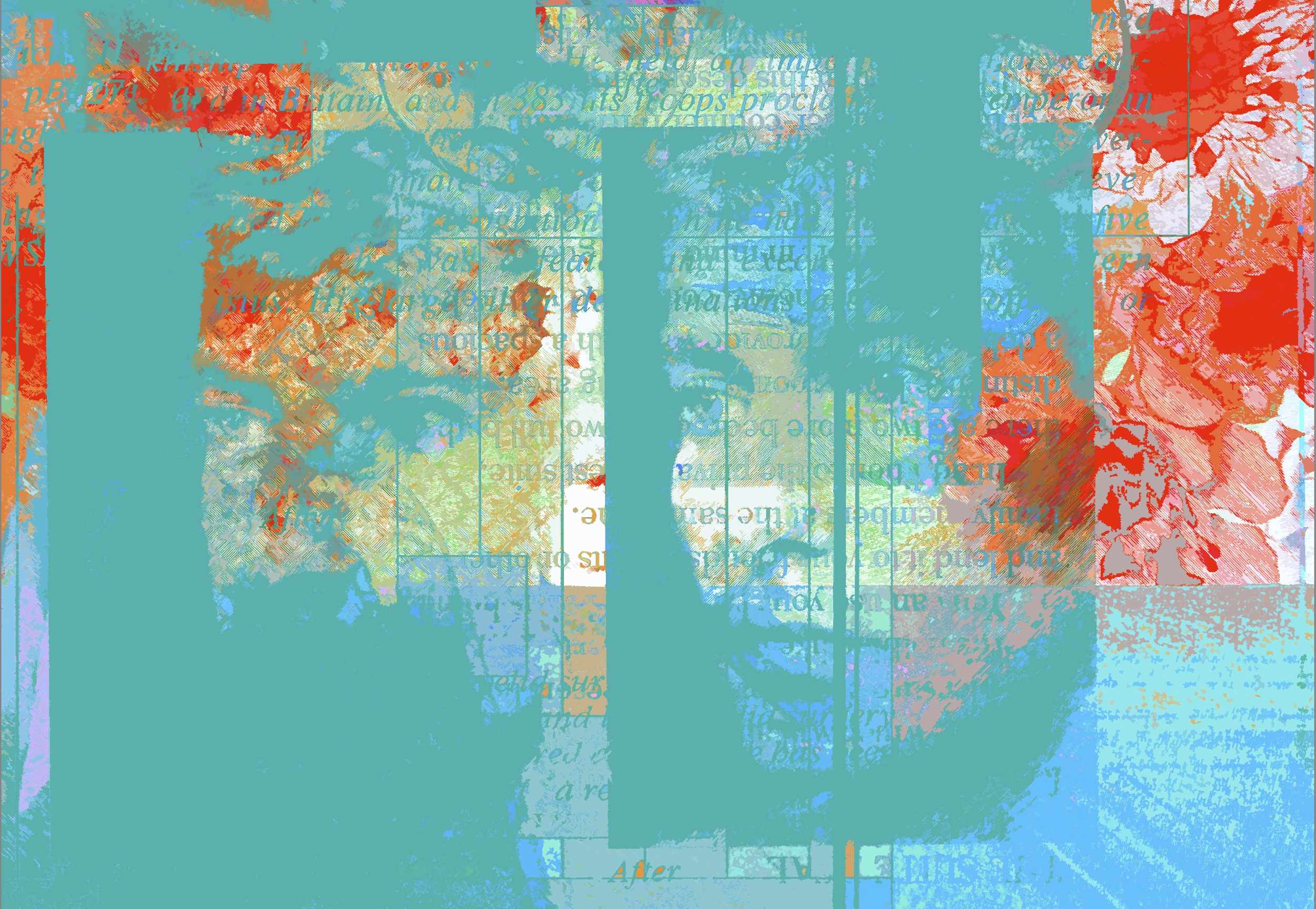
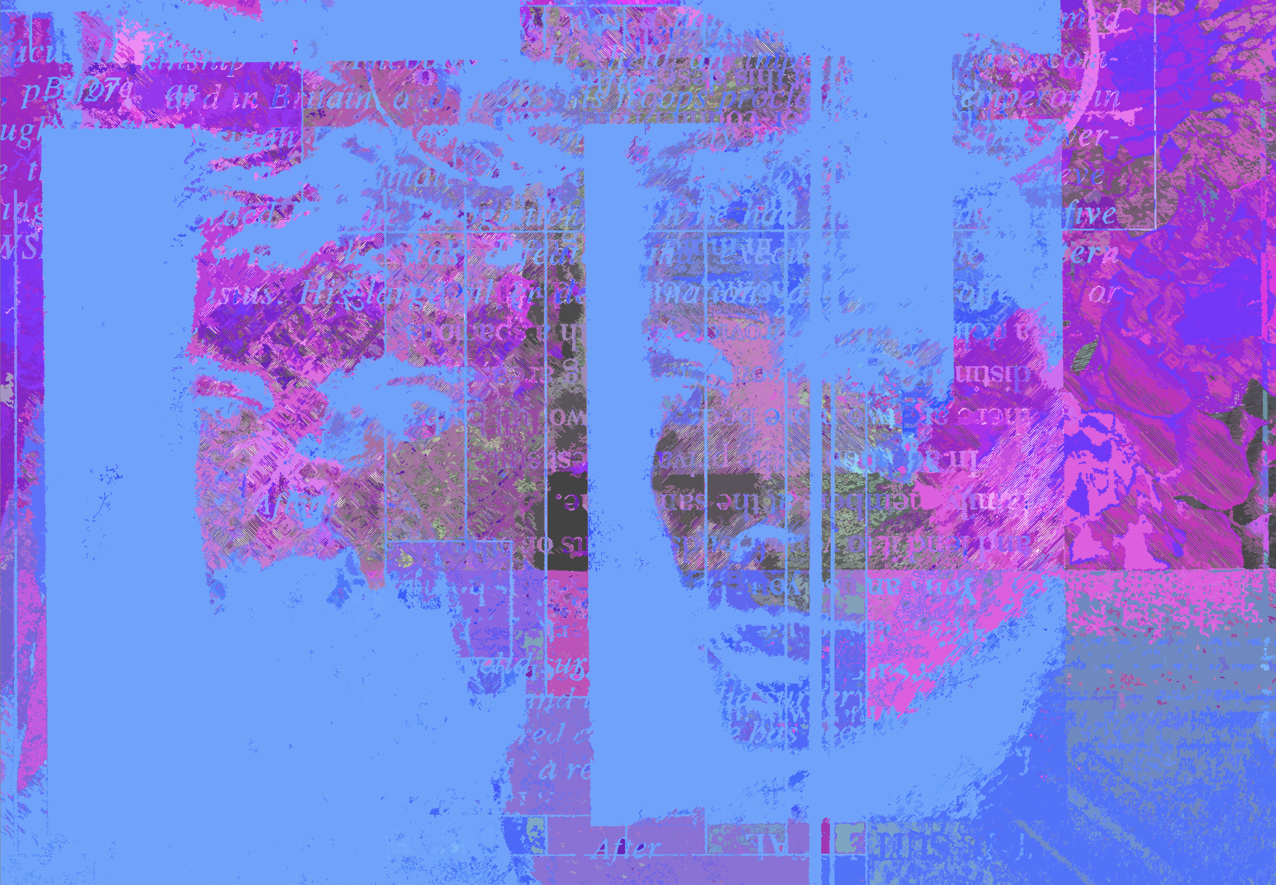
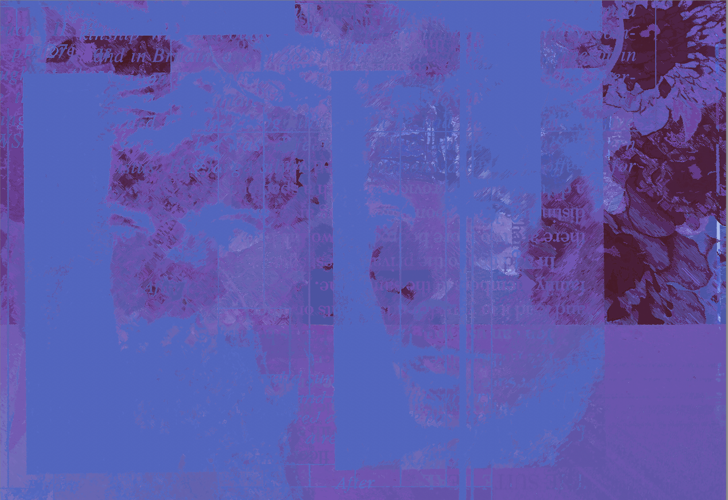
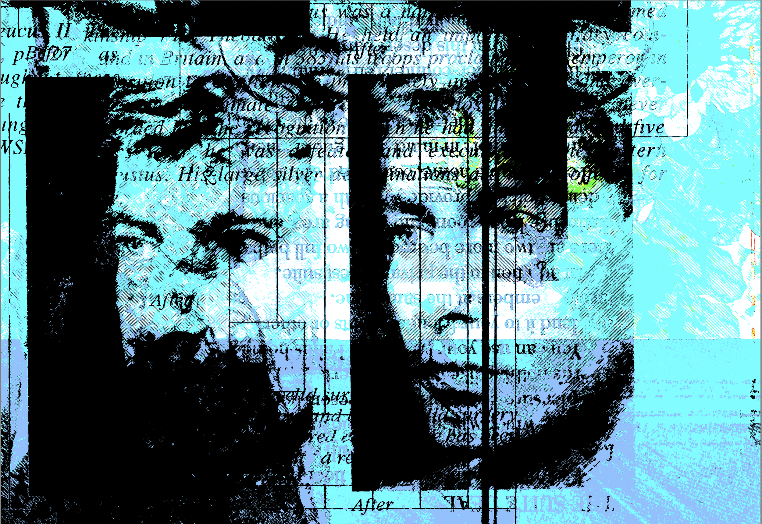
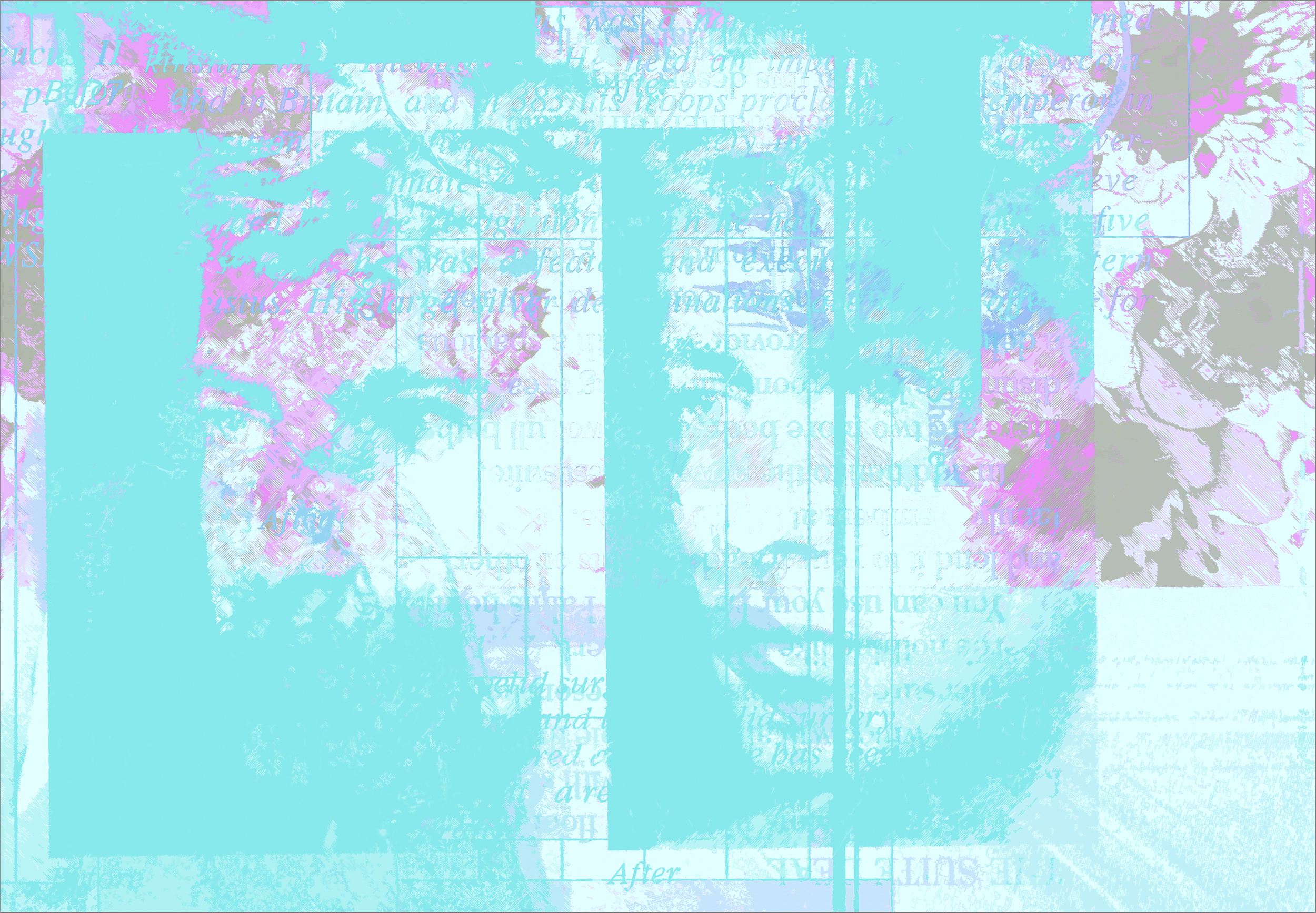
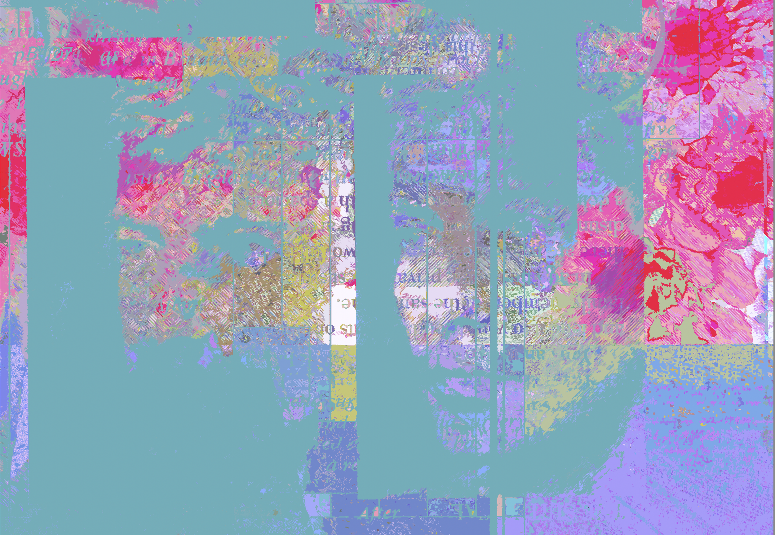
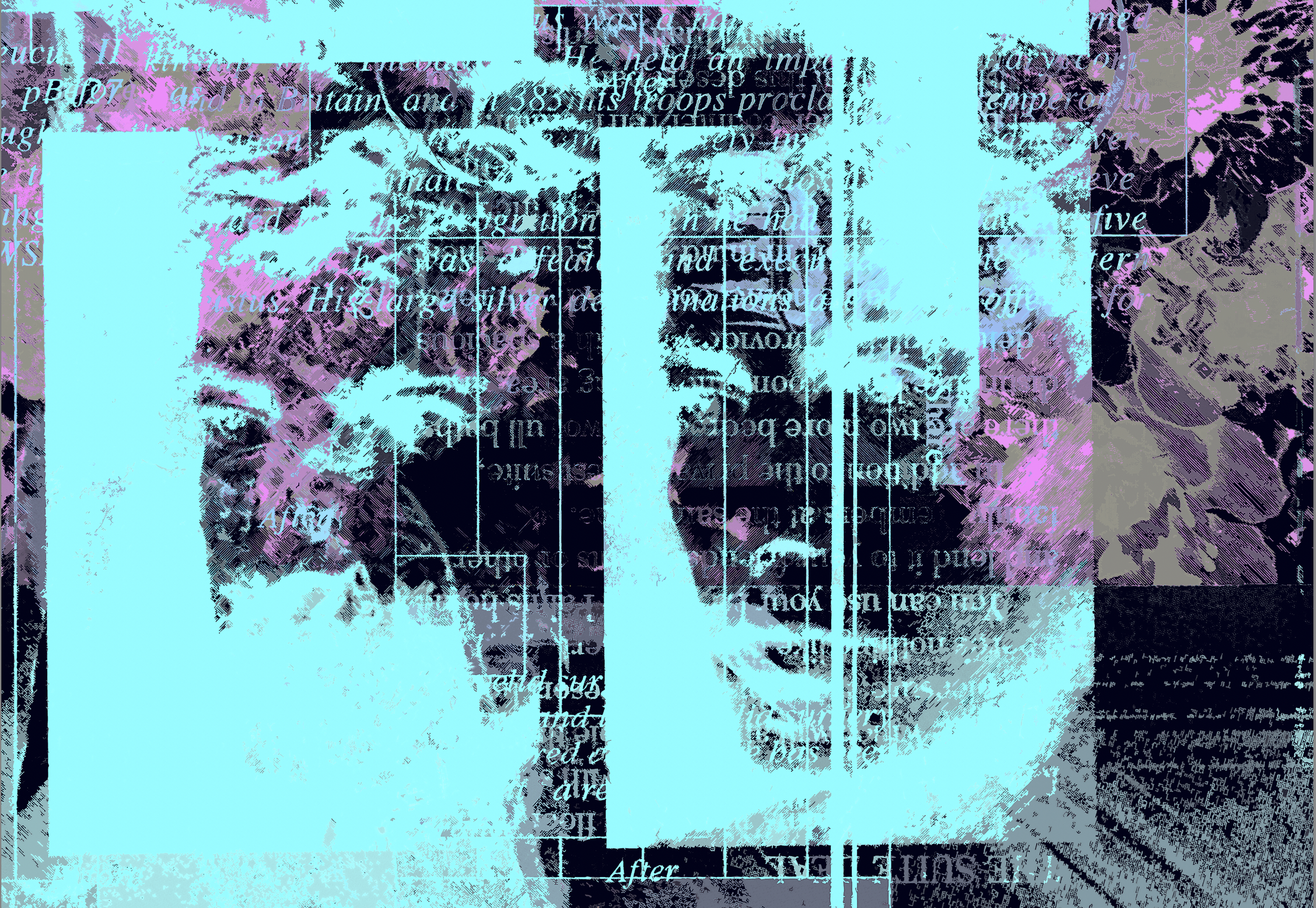
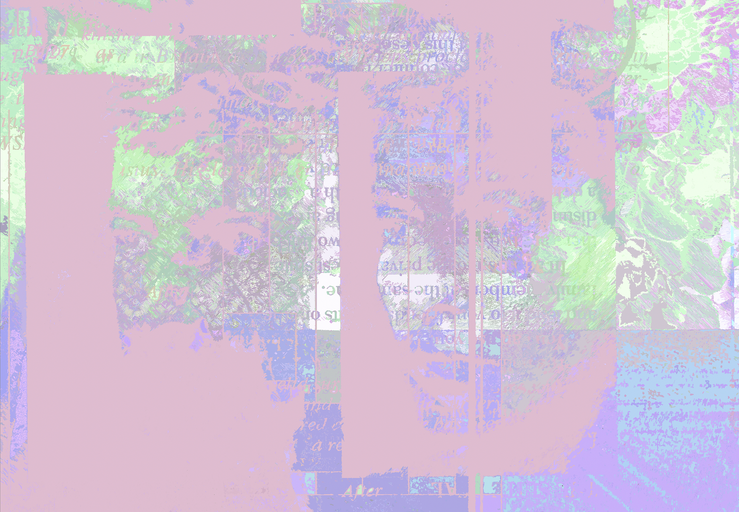
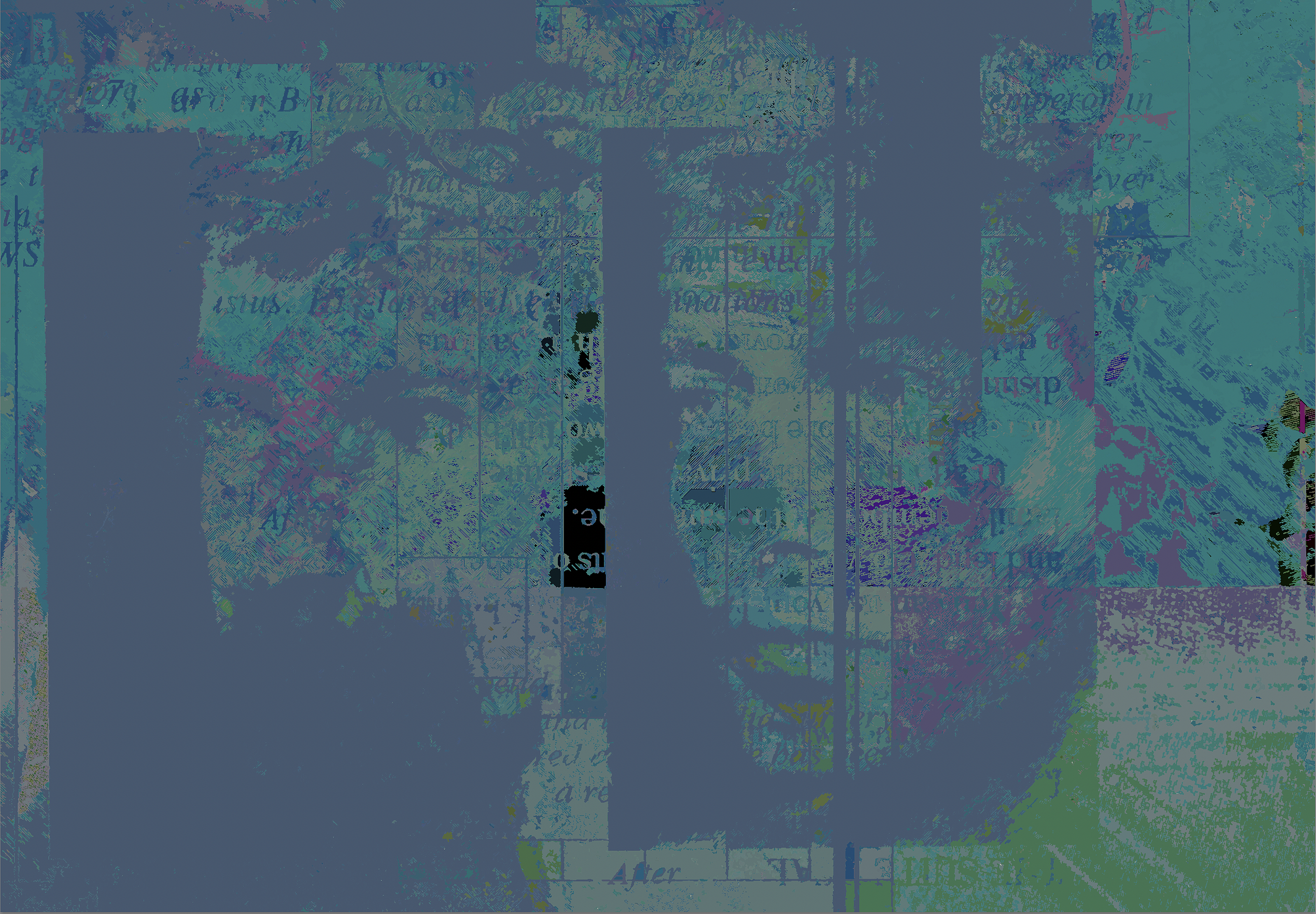
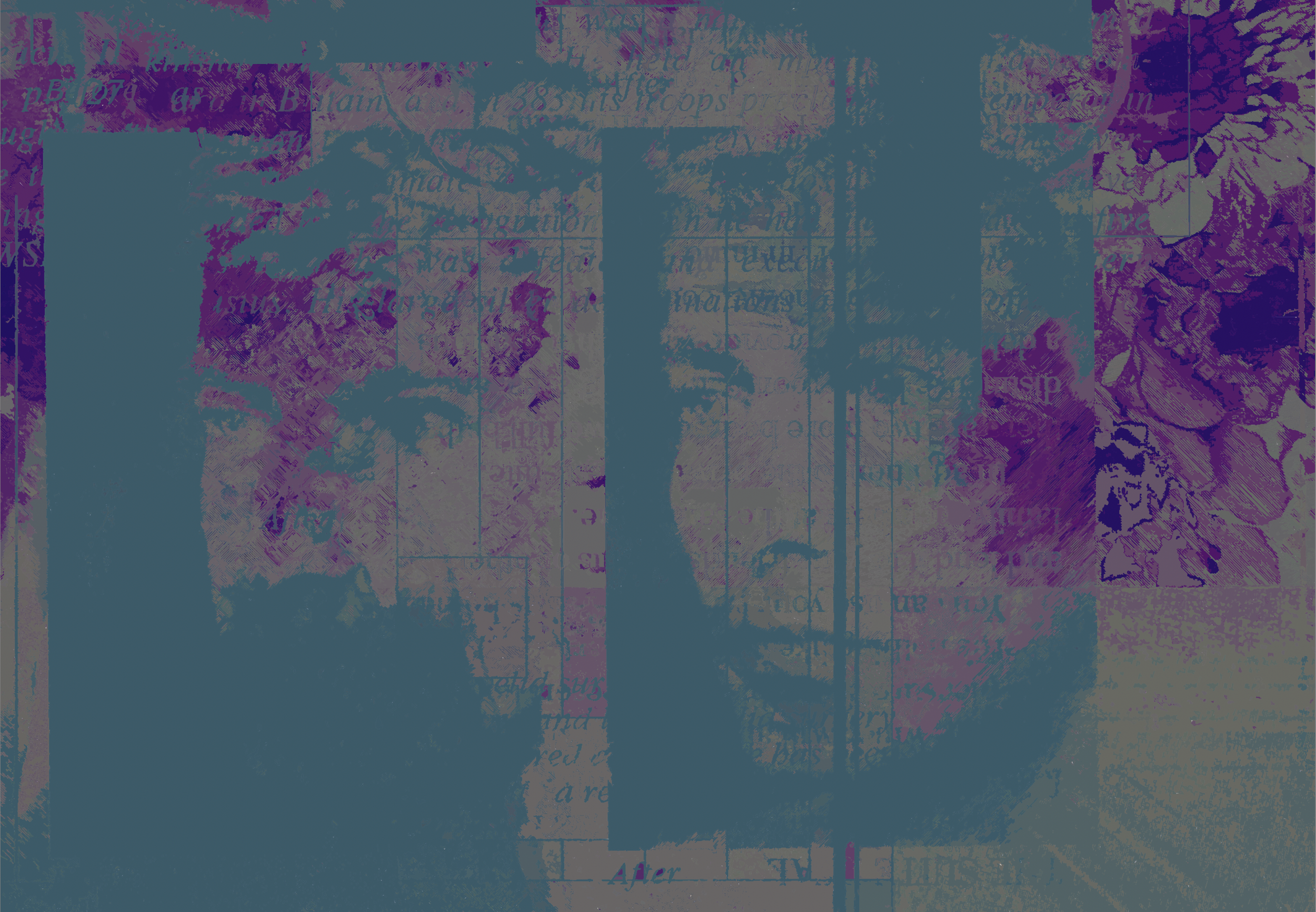
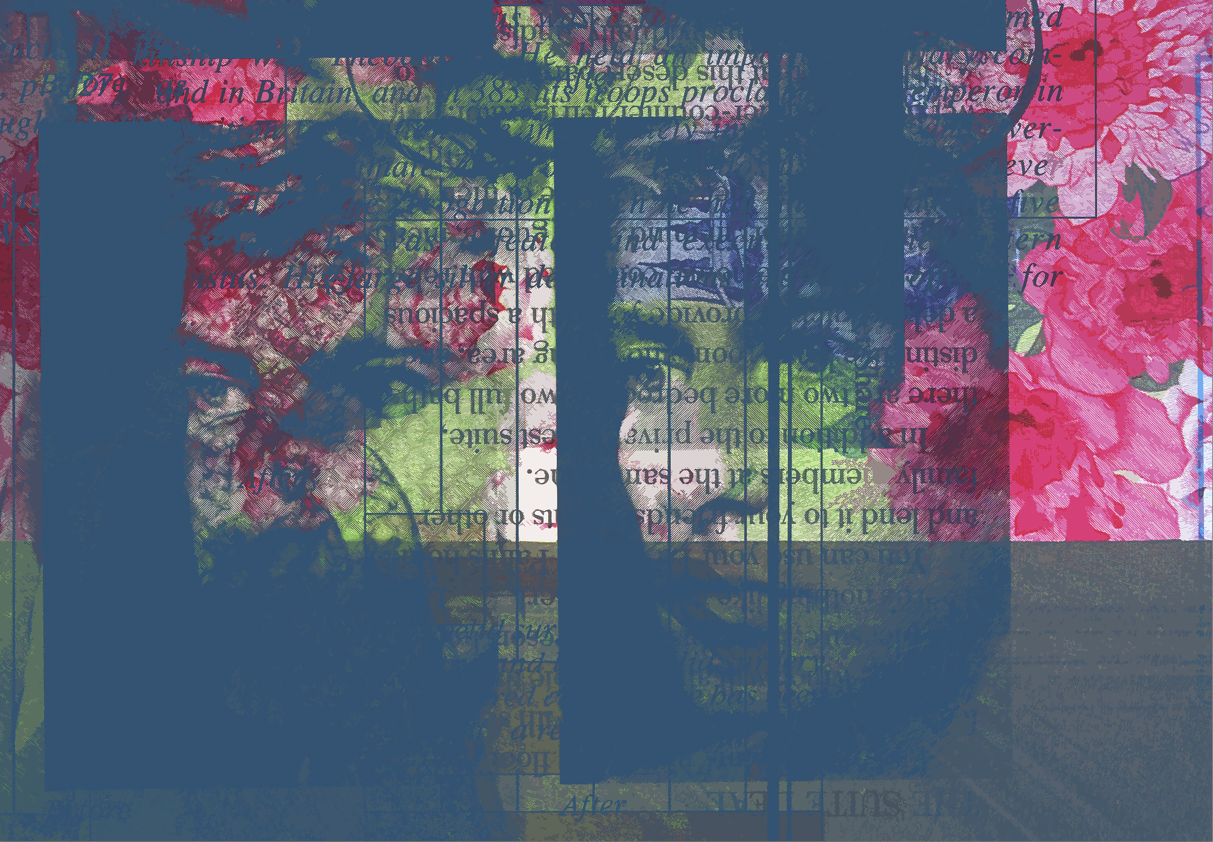
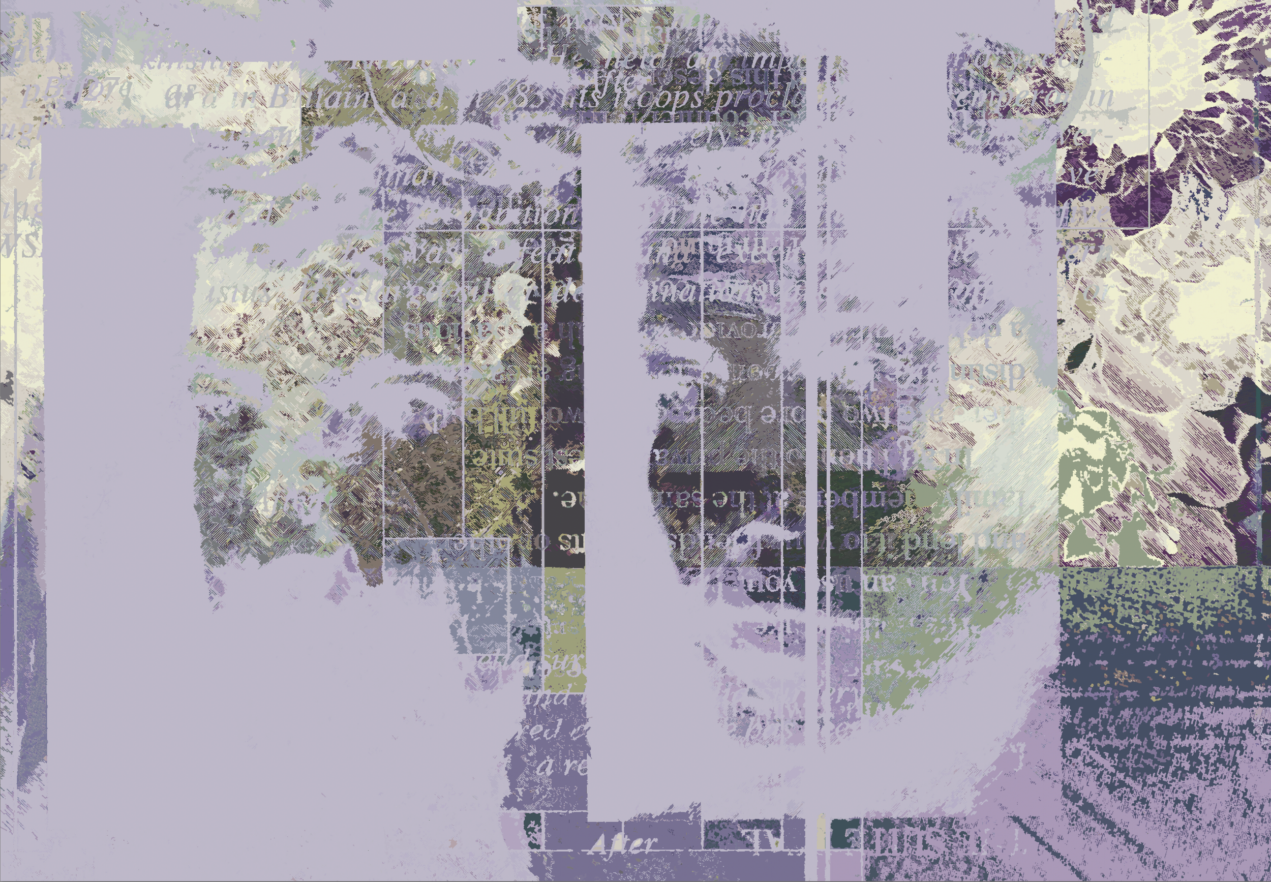
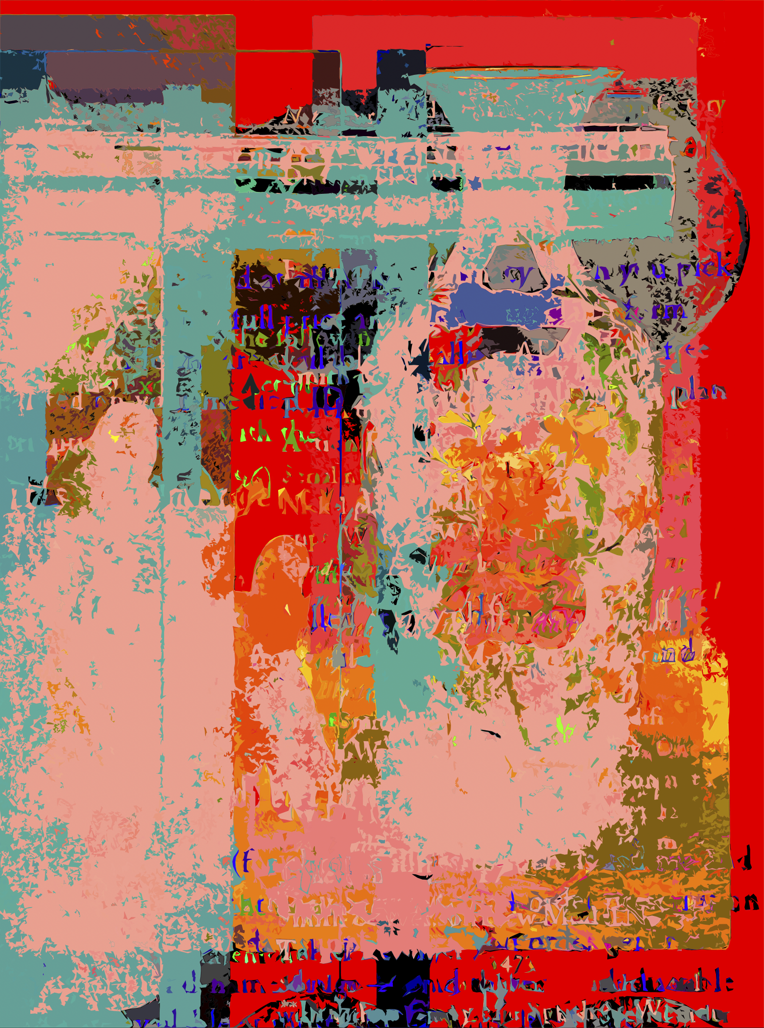
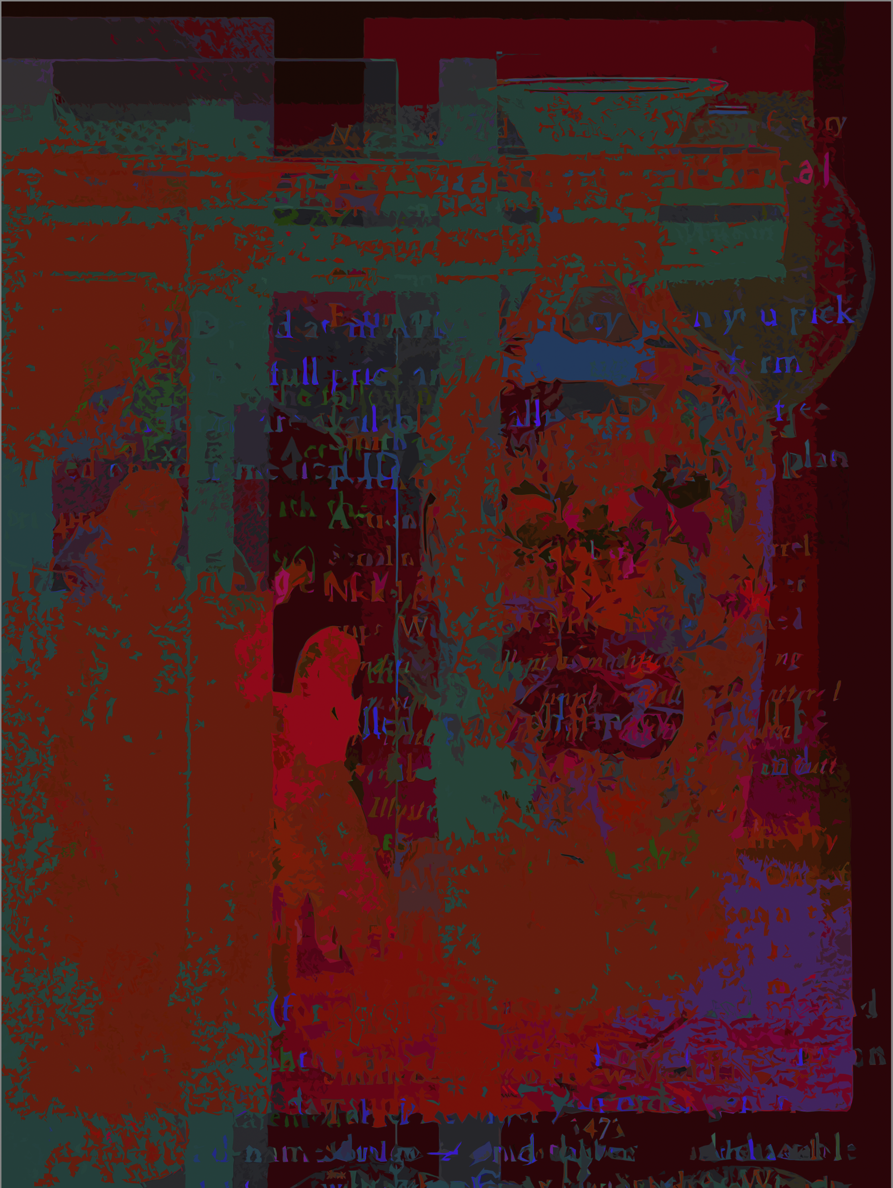
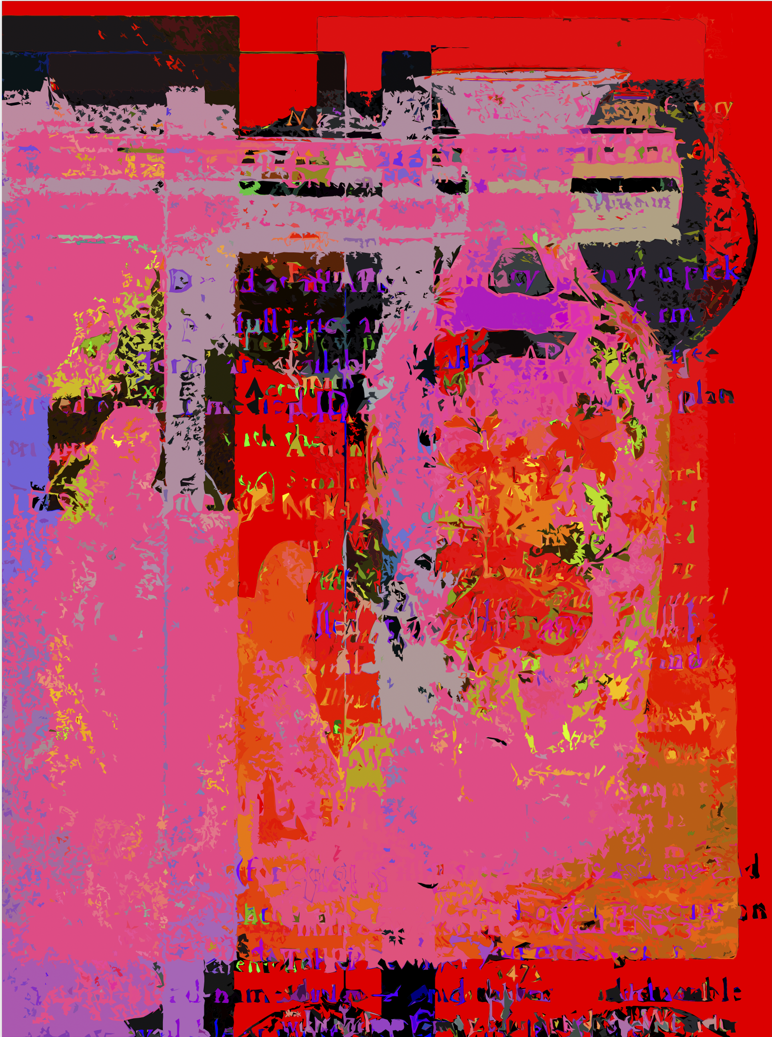
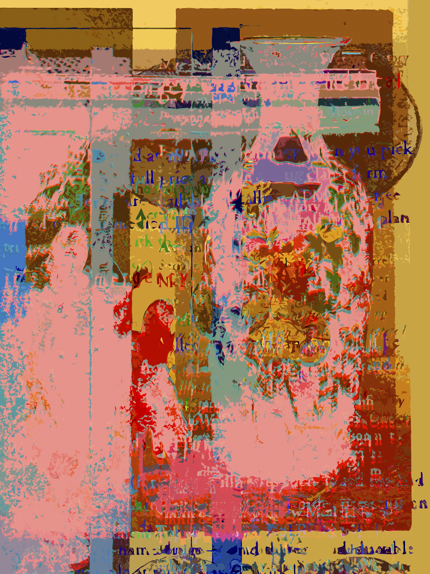
‘After’ (Make Ready Series Three) 2025. 75” x 52” Original #1 (first shown in series): archival pigment print on panel. Forty Four (44) archival limited edition pigment prints on canson hot press.

‘Indian Giver—Full Price” (Make Ready Series Six) 2024. 40” x 54” Original #1 (first shown in series): archival pigment print on panel. Thirty Two (32) archival limited edition pigment prints on canson hot press.


‘Bars’ (Make Ready Suite Series Two) 2019-2023. #1, 64X32, Original #1 (first shown in series): archival pigment print on panel. Sixteen (16) archival limited edition archival pigment prints on canson hot press.


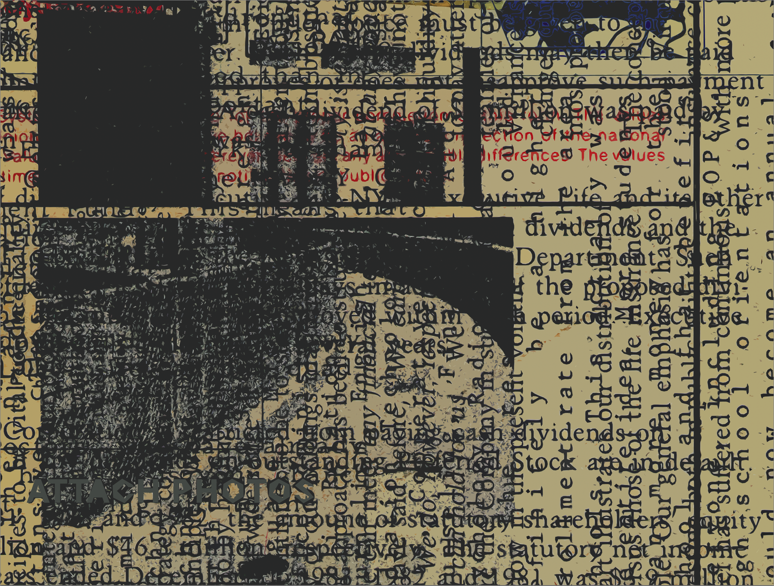
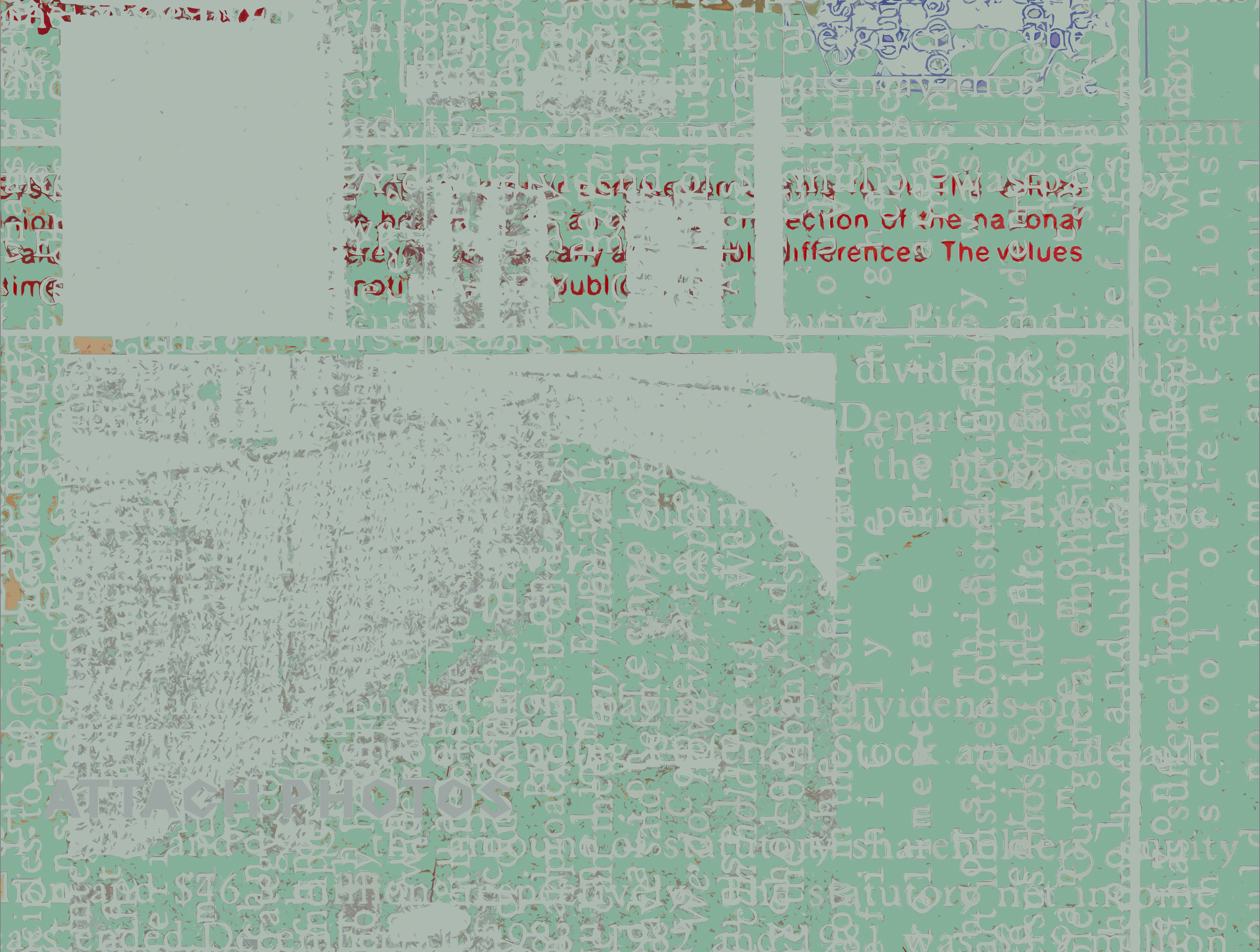
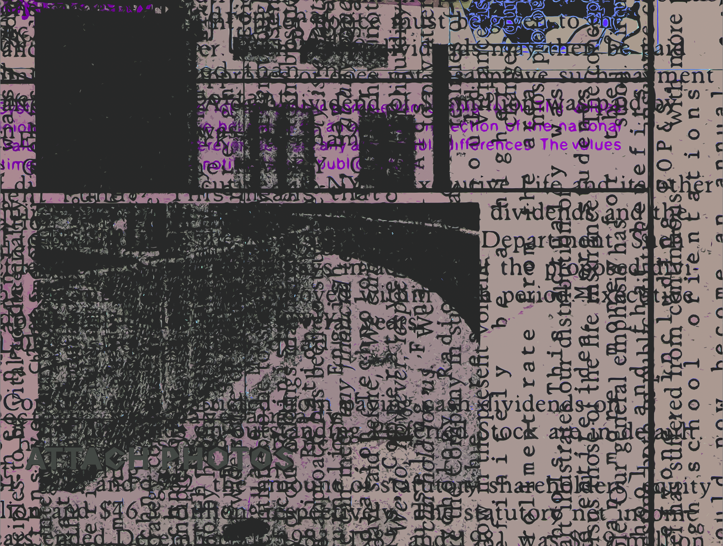
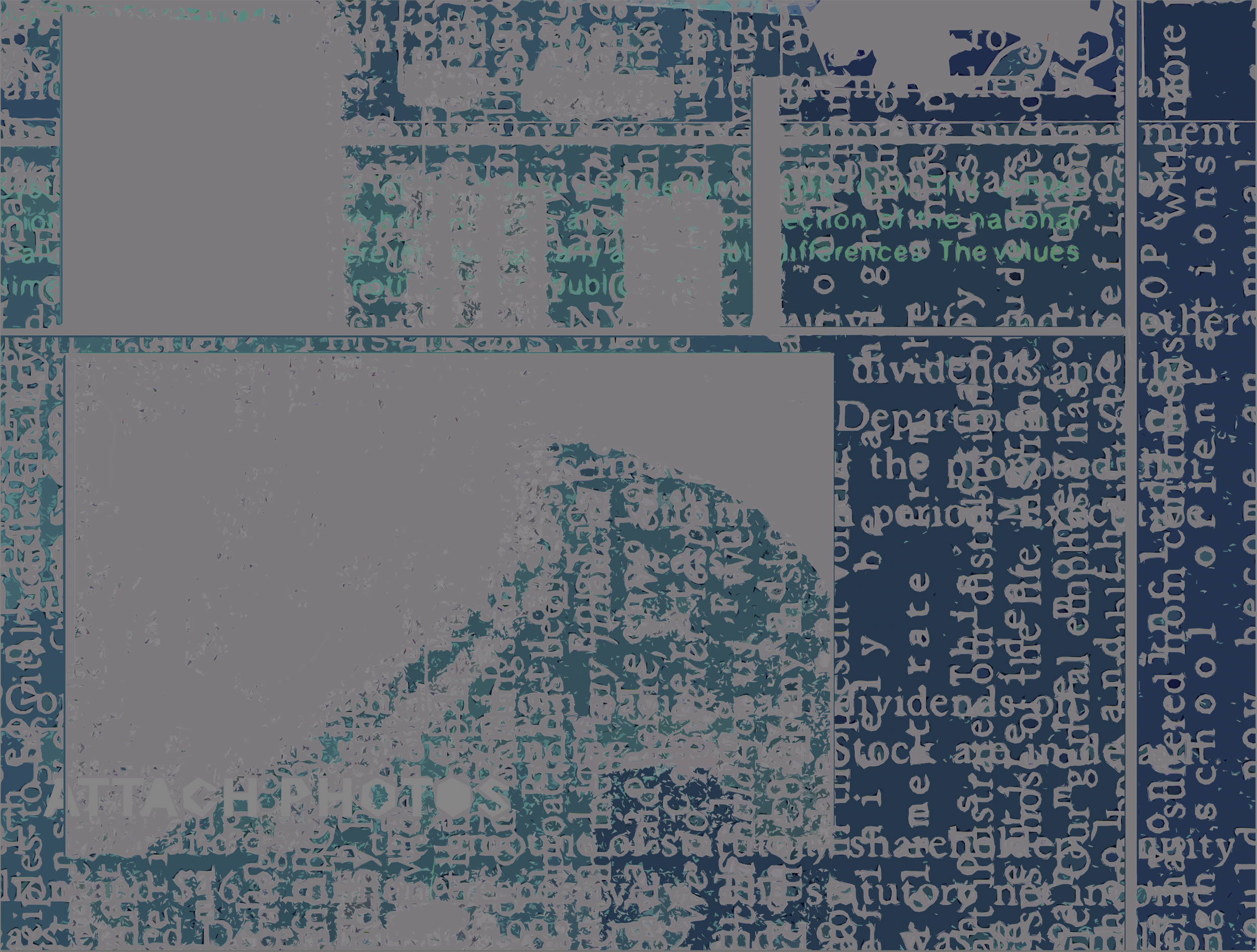
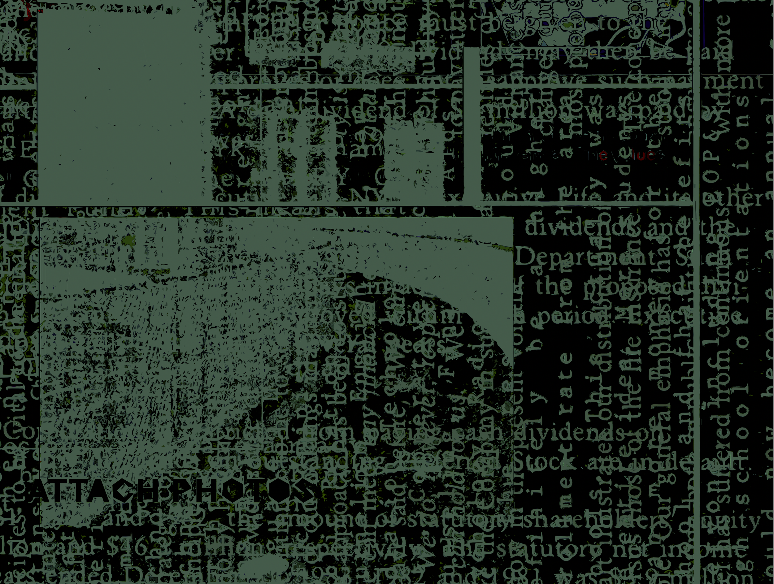
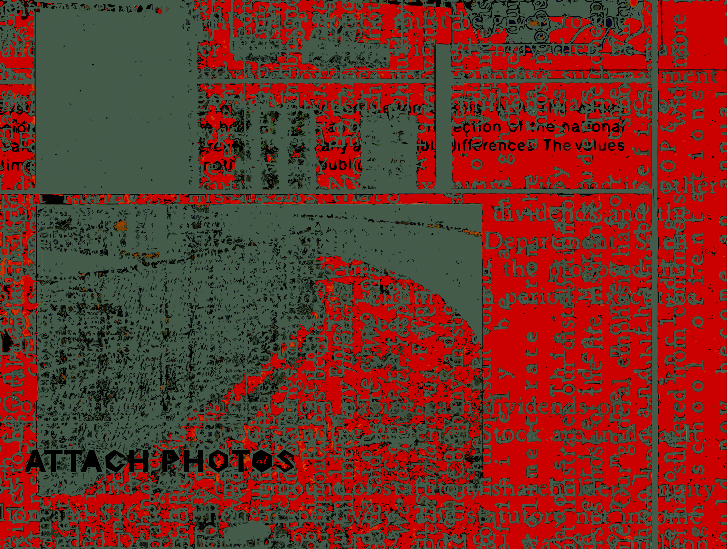
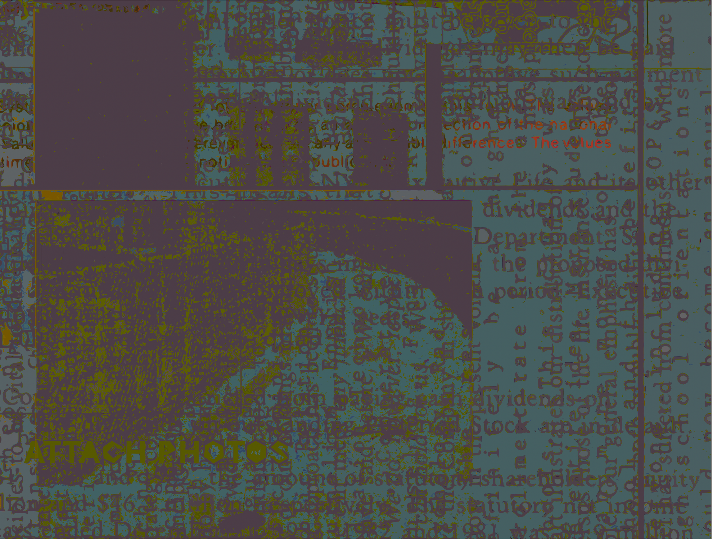
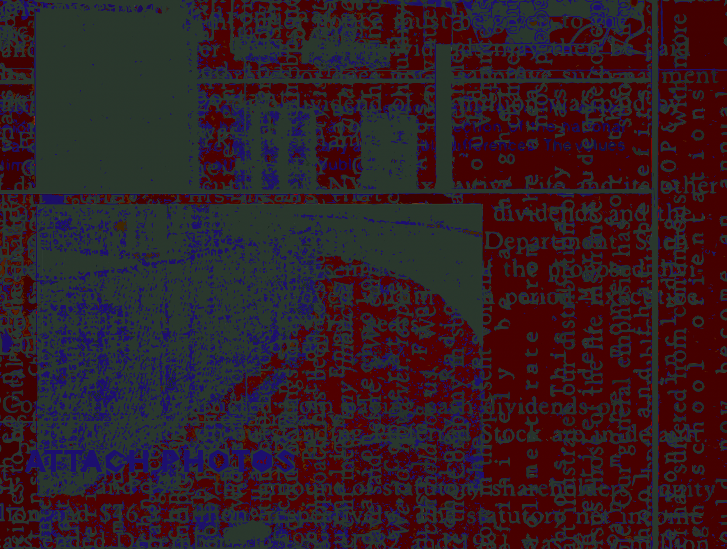
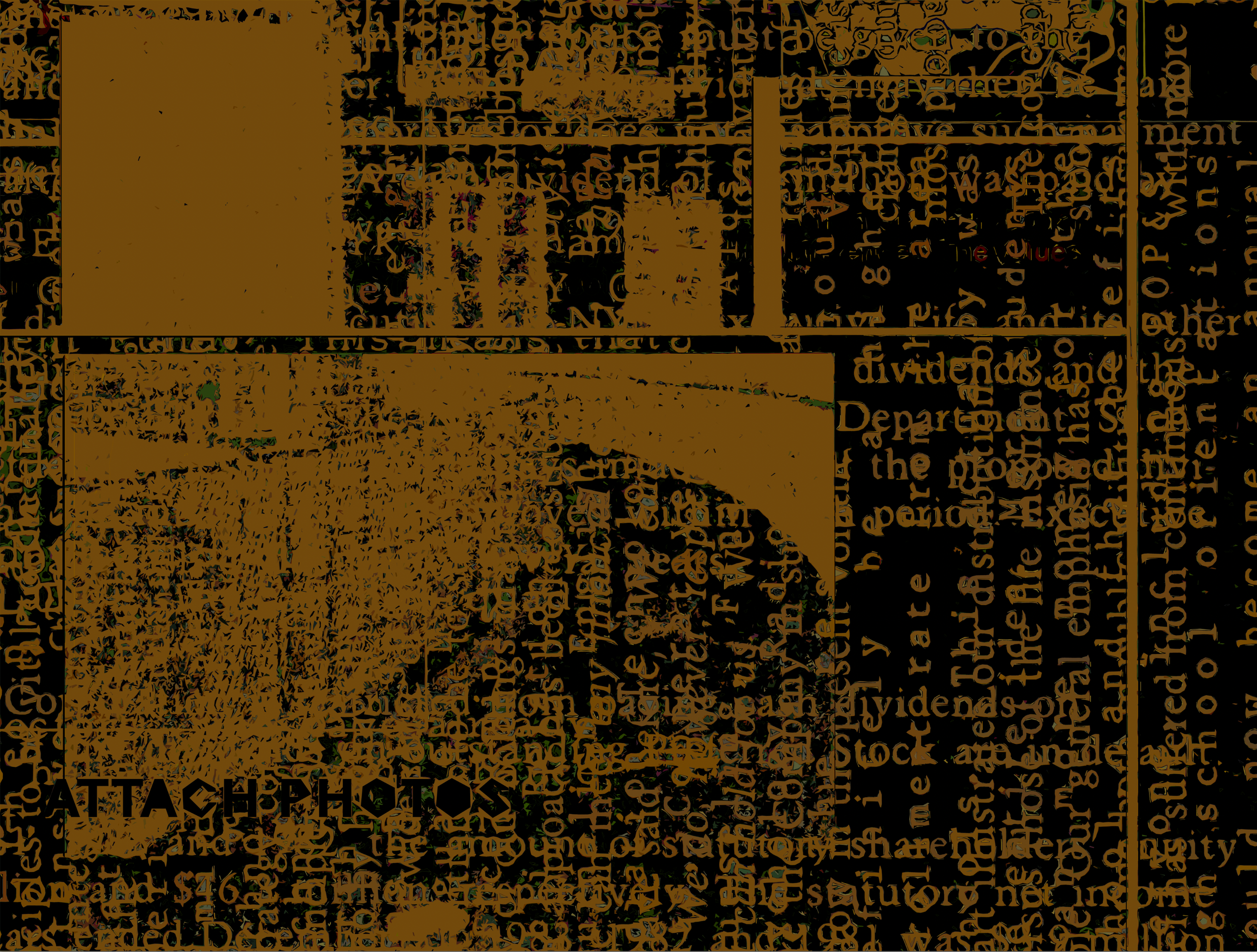
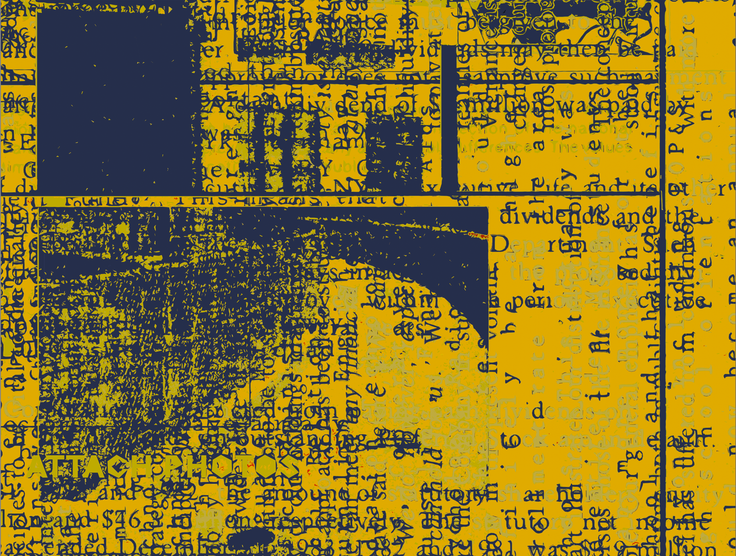
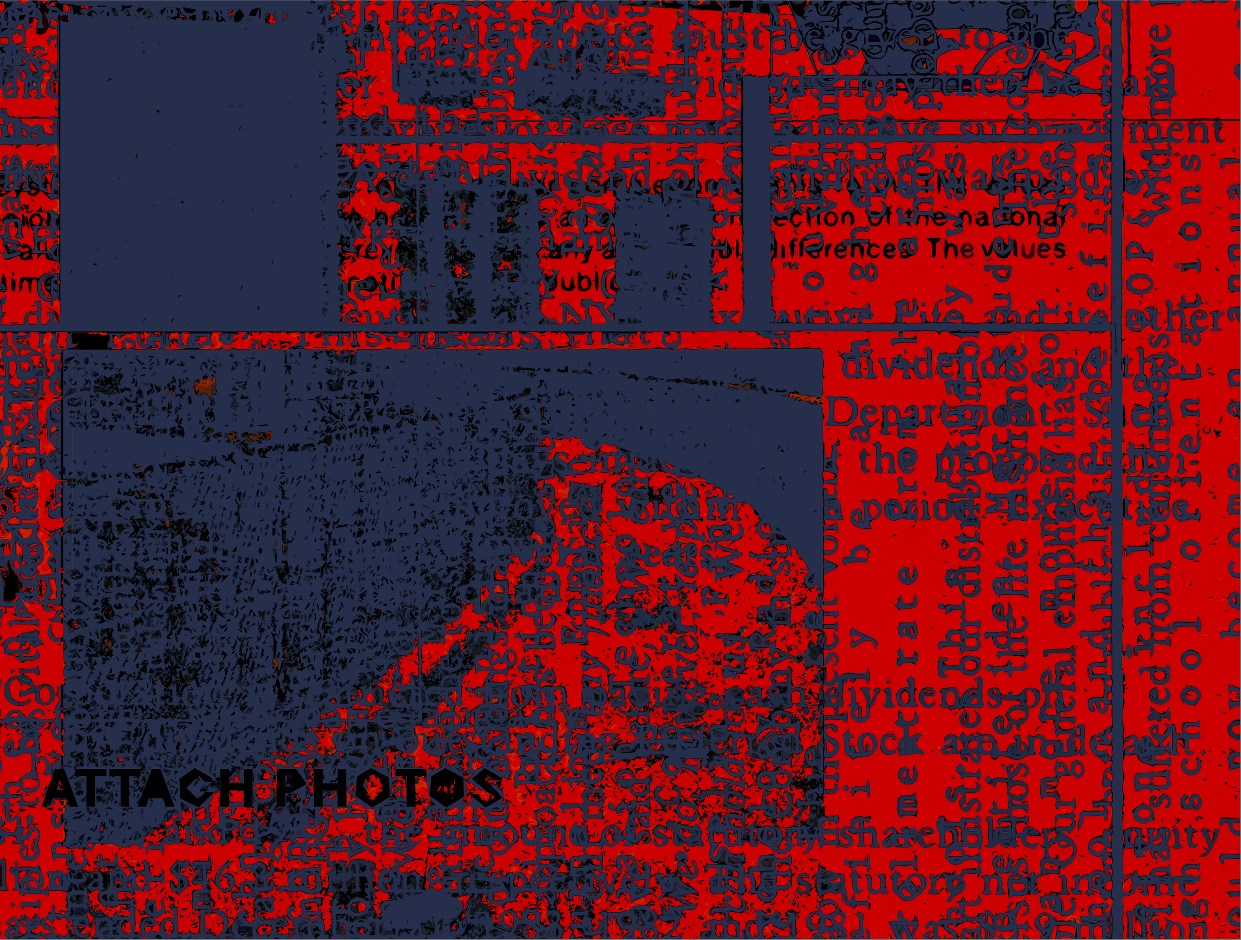
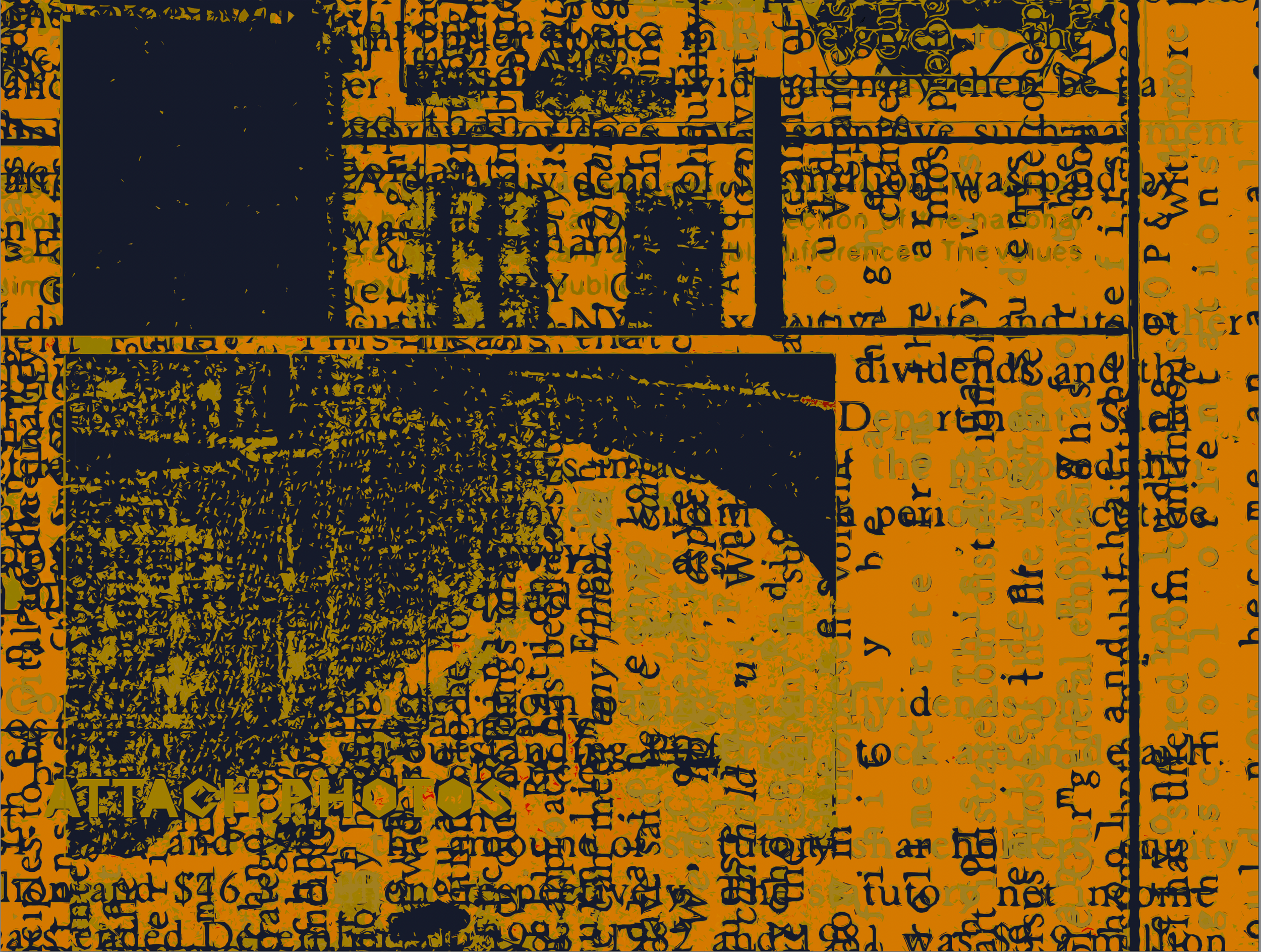
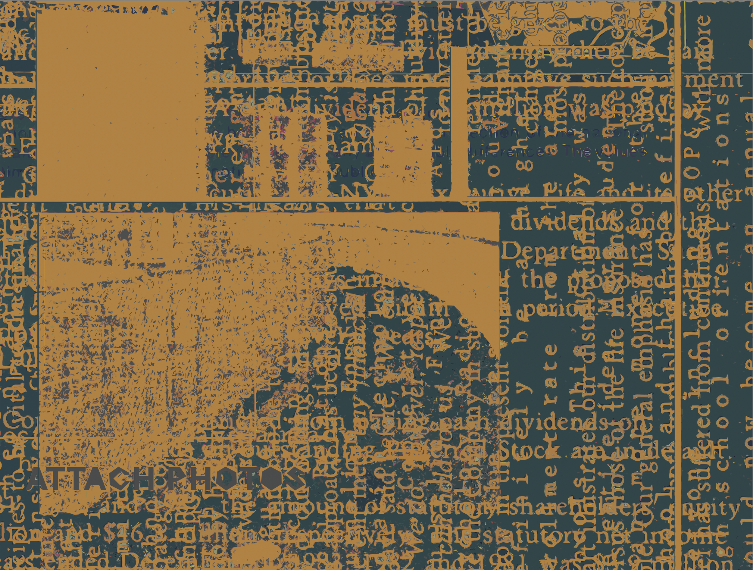
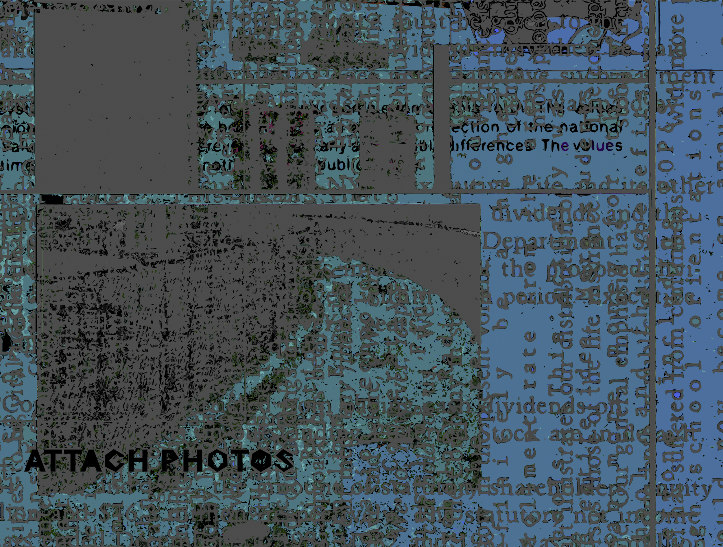
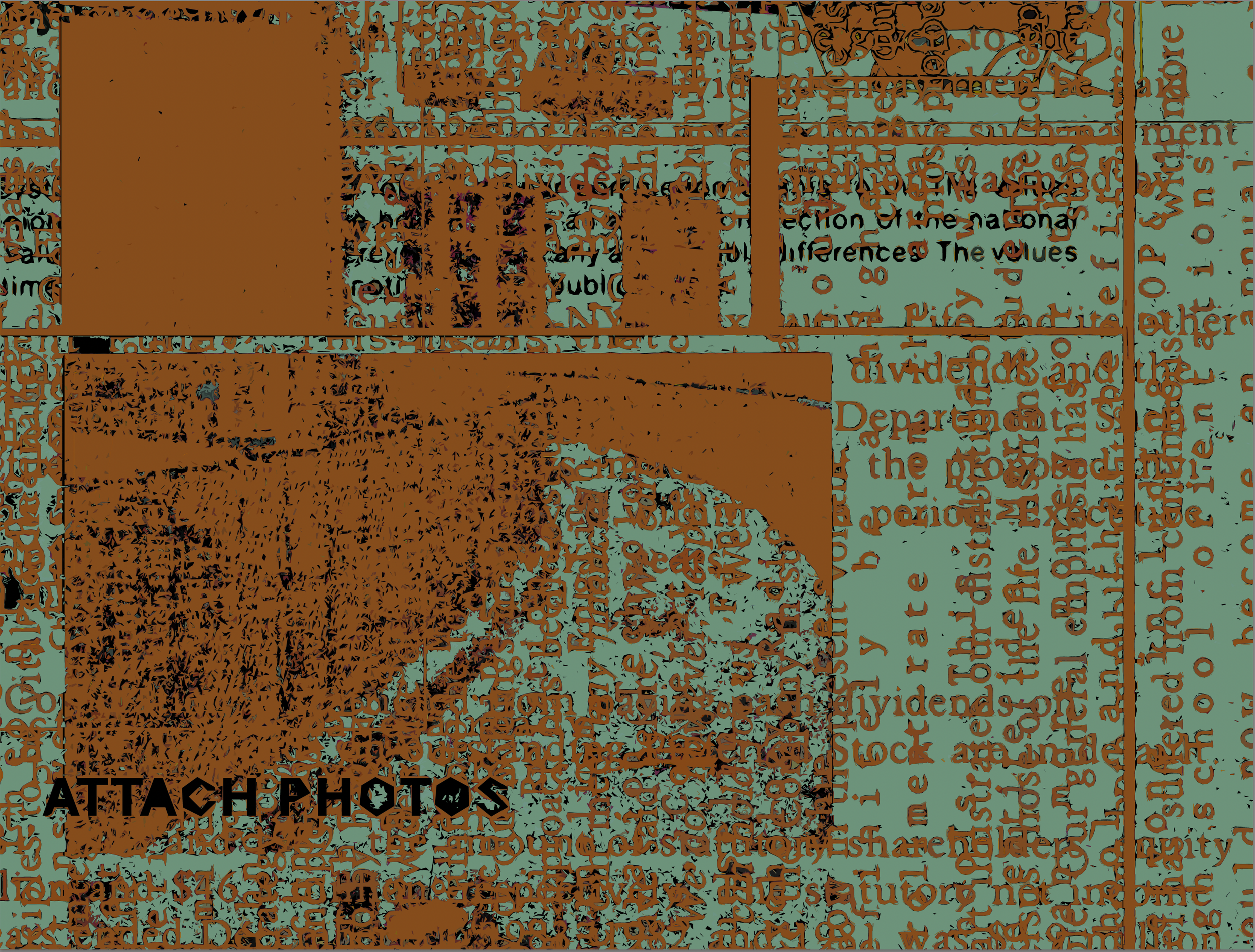
‘Attach Photos’ (Make Ready Series Five) 2019-2020. 70” x 52” Original Number 1 (first shown in series); archival pigment print on panel. Twenty four (24) archival limited edition pigment prints on canson hot press.


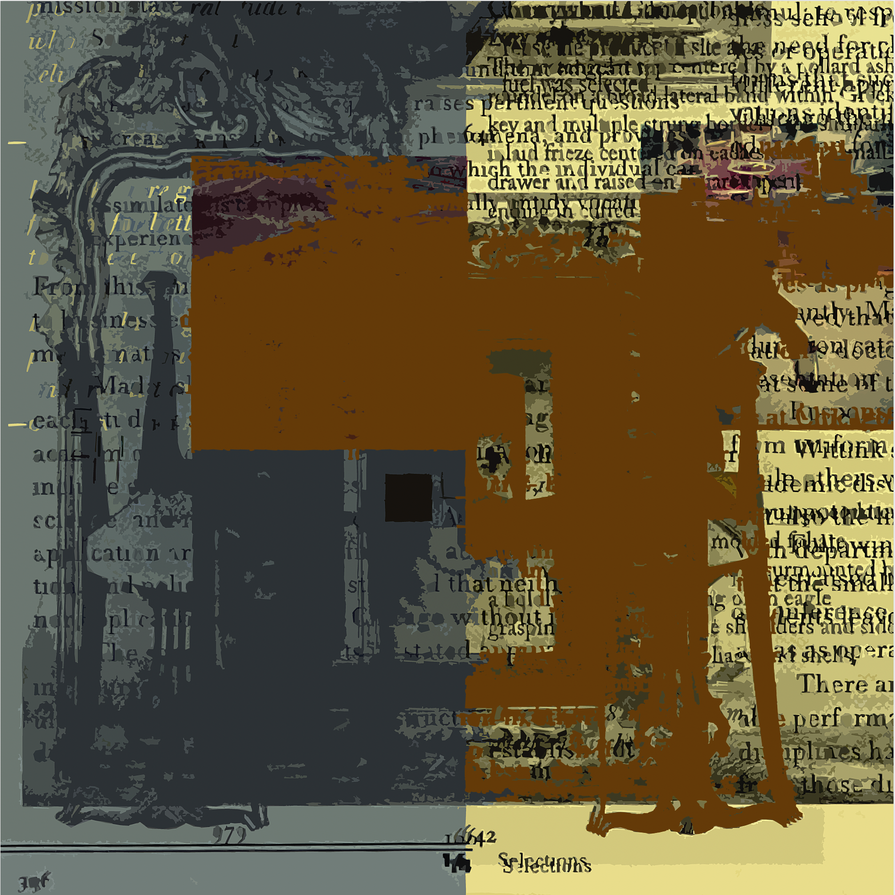
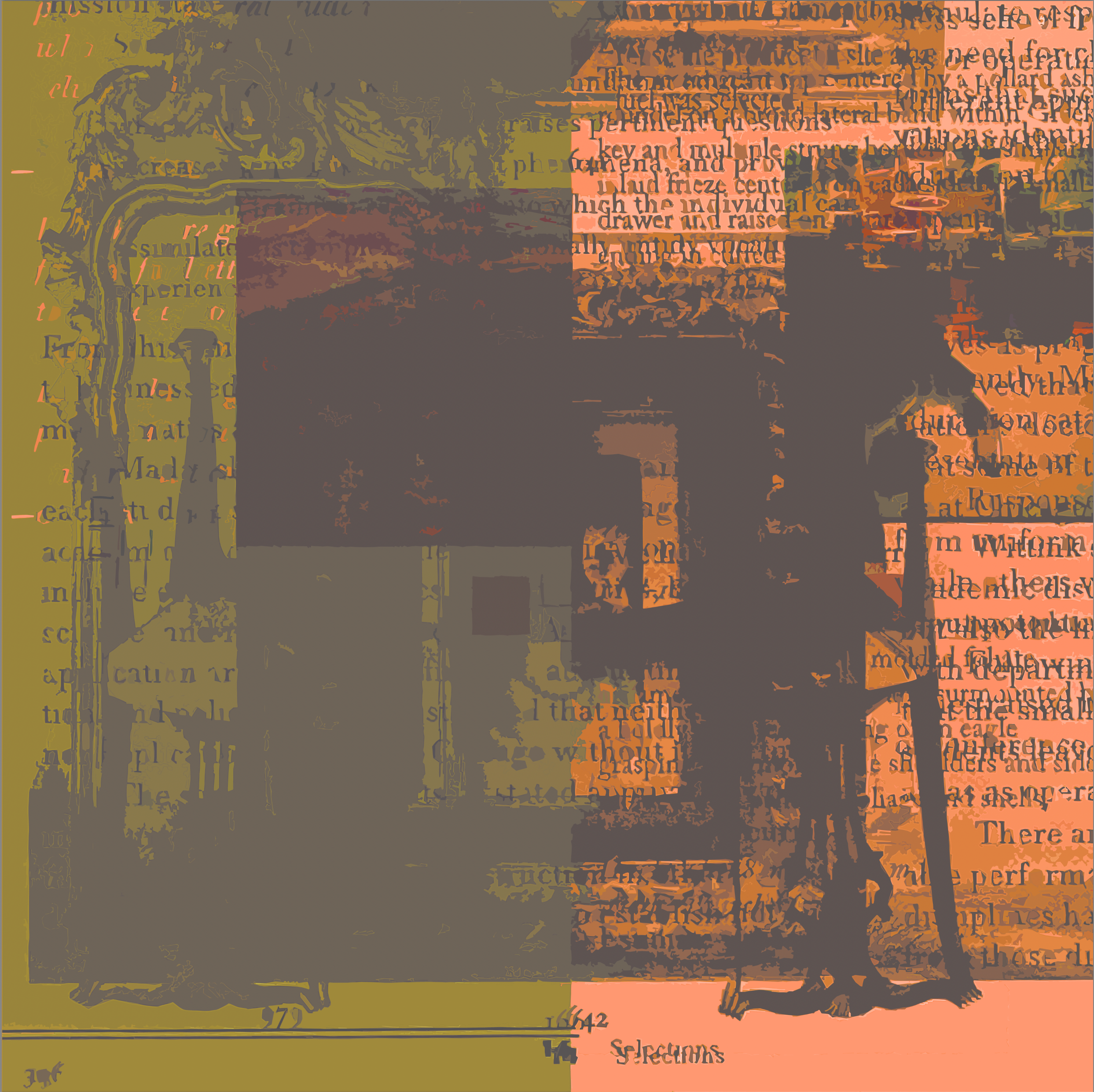
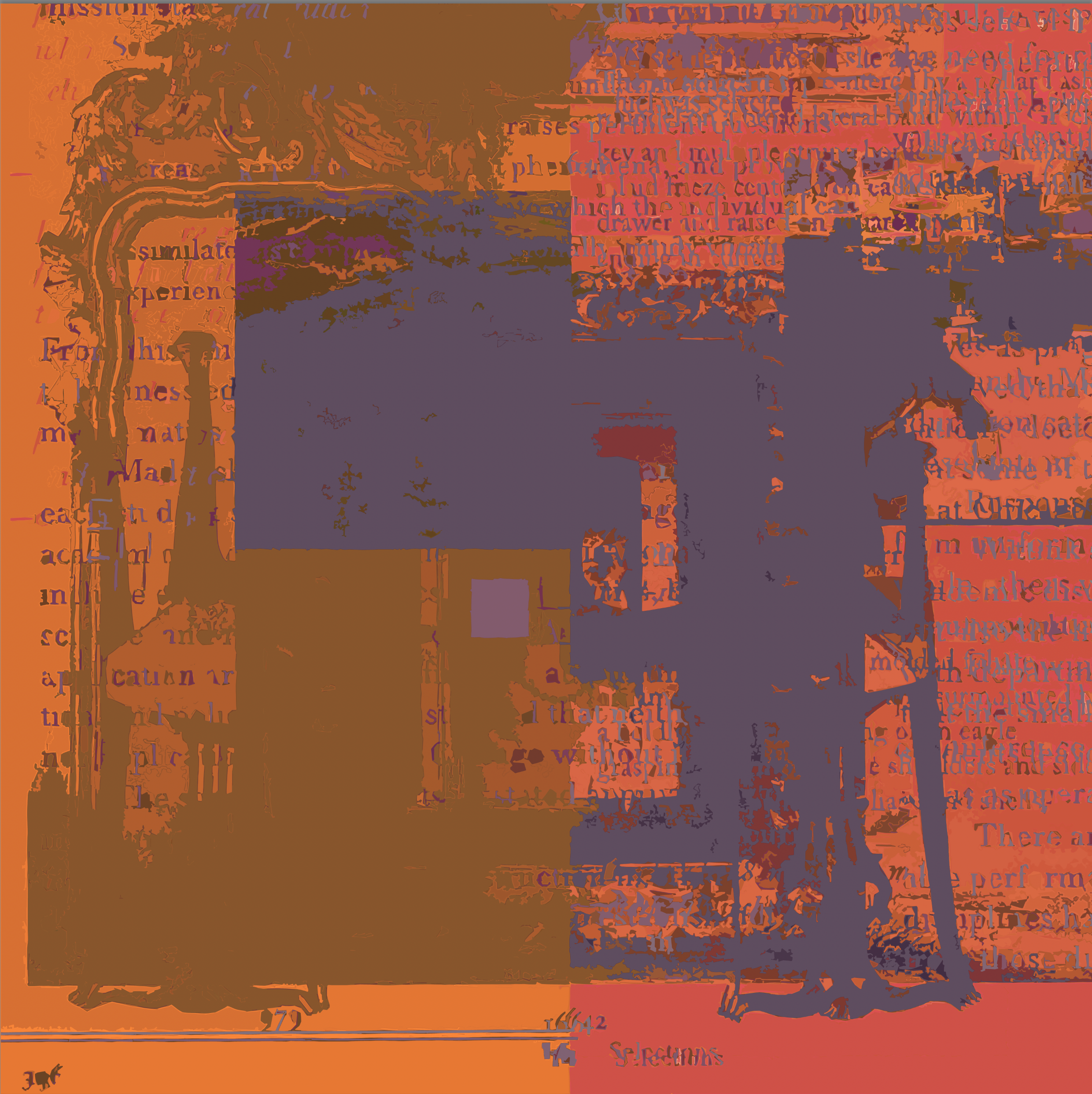
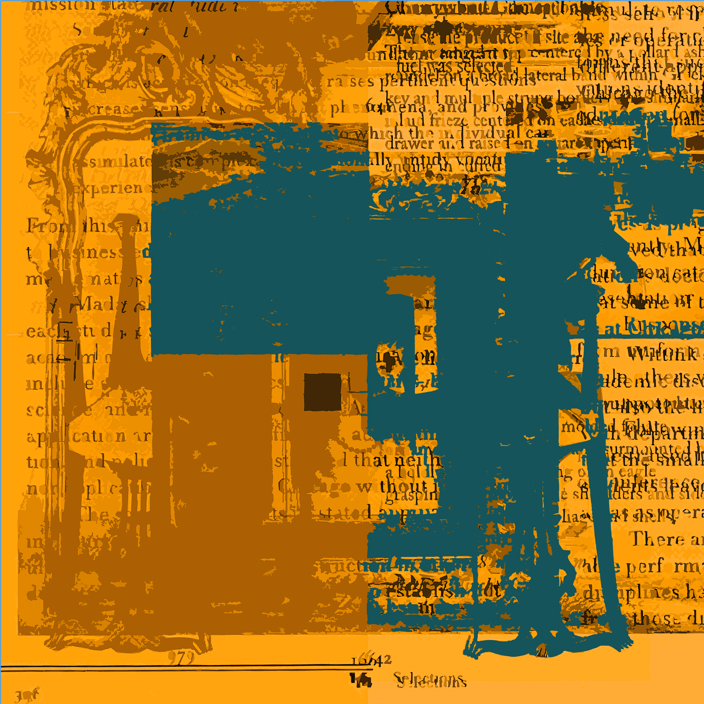
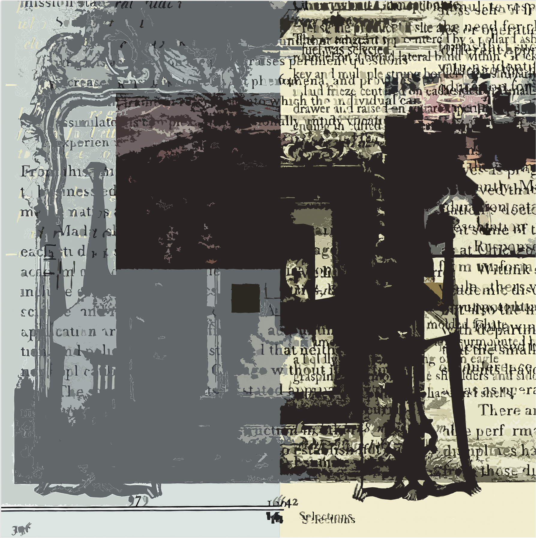
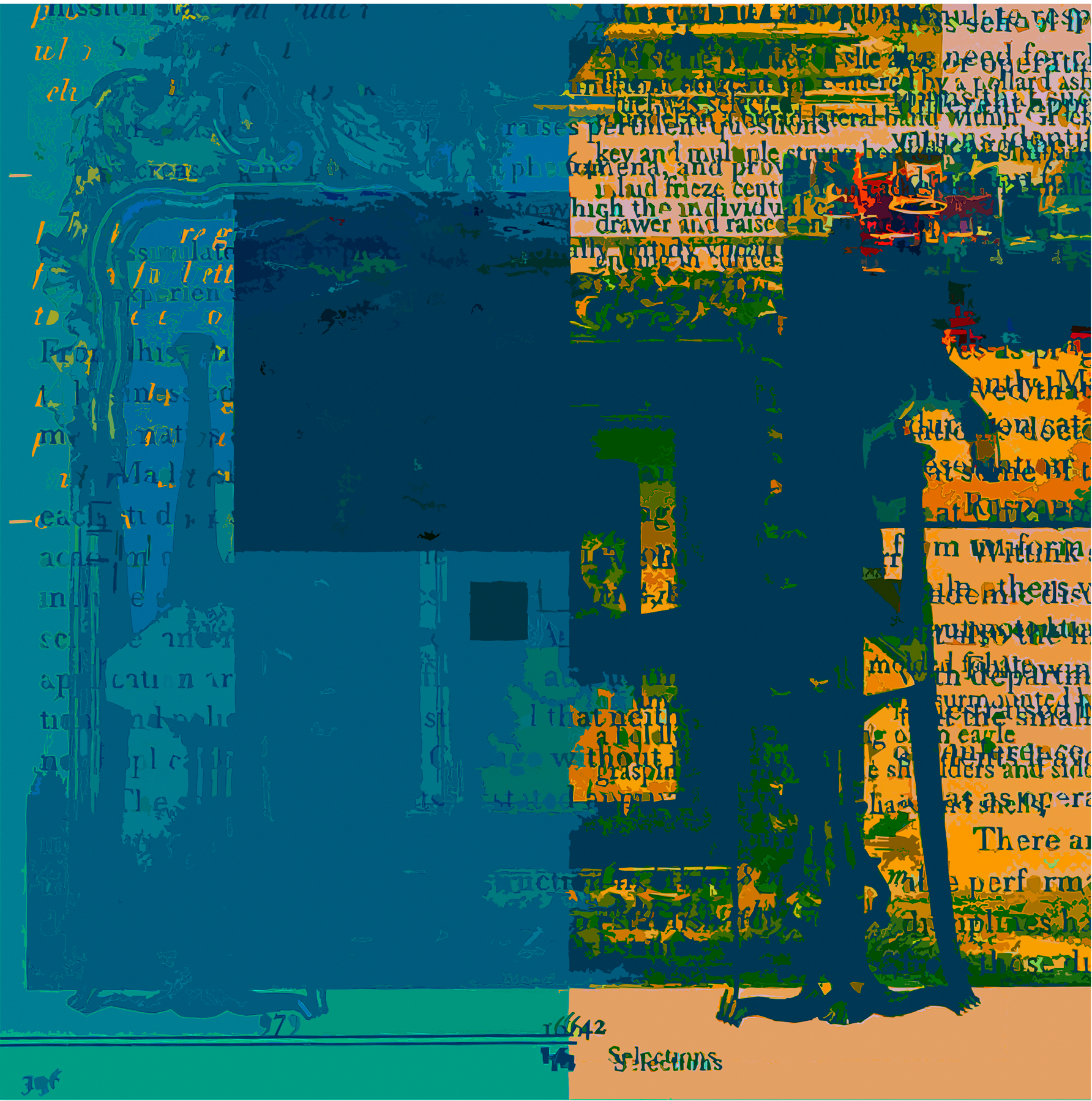
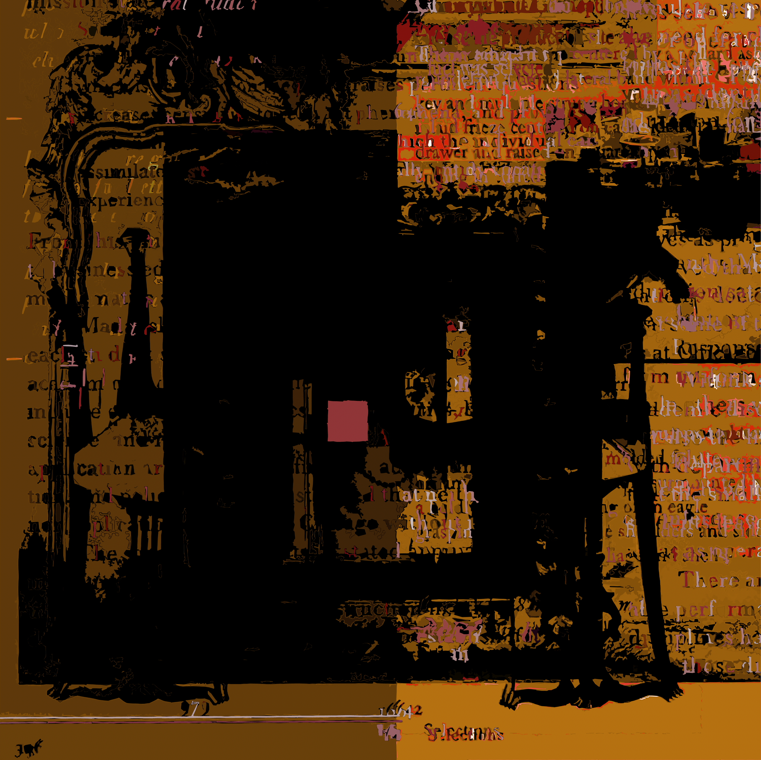
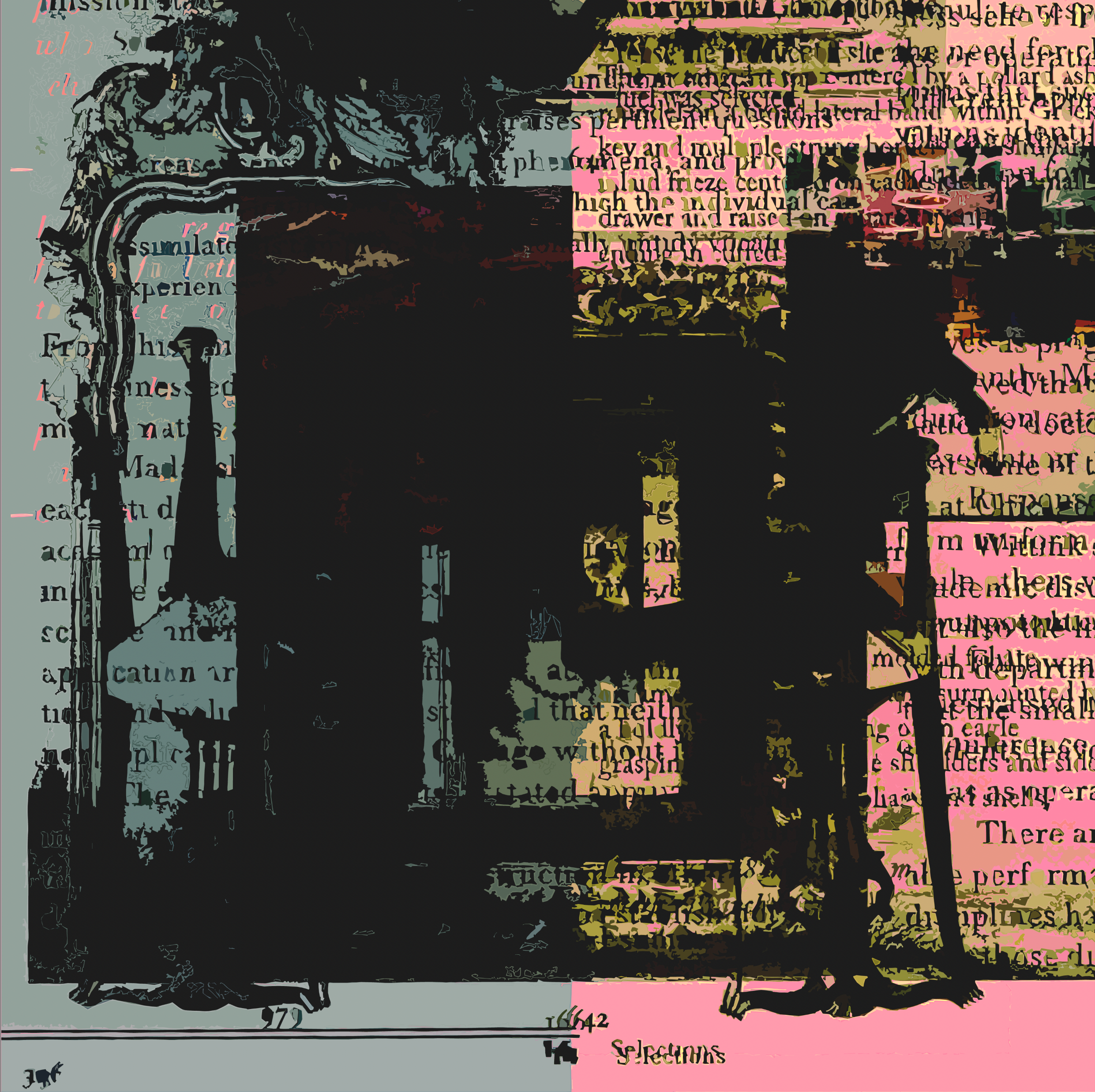
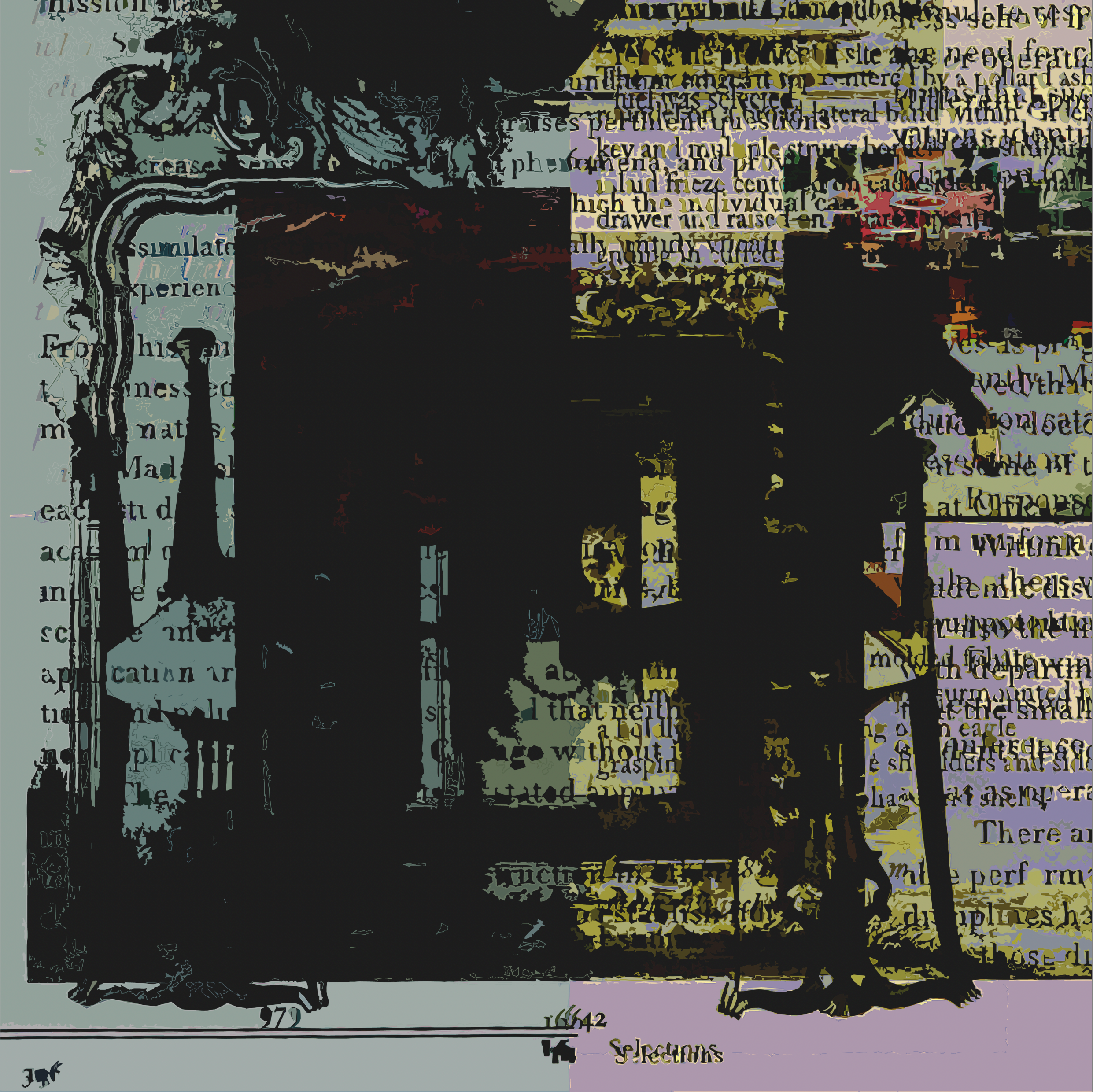
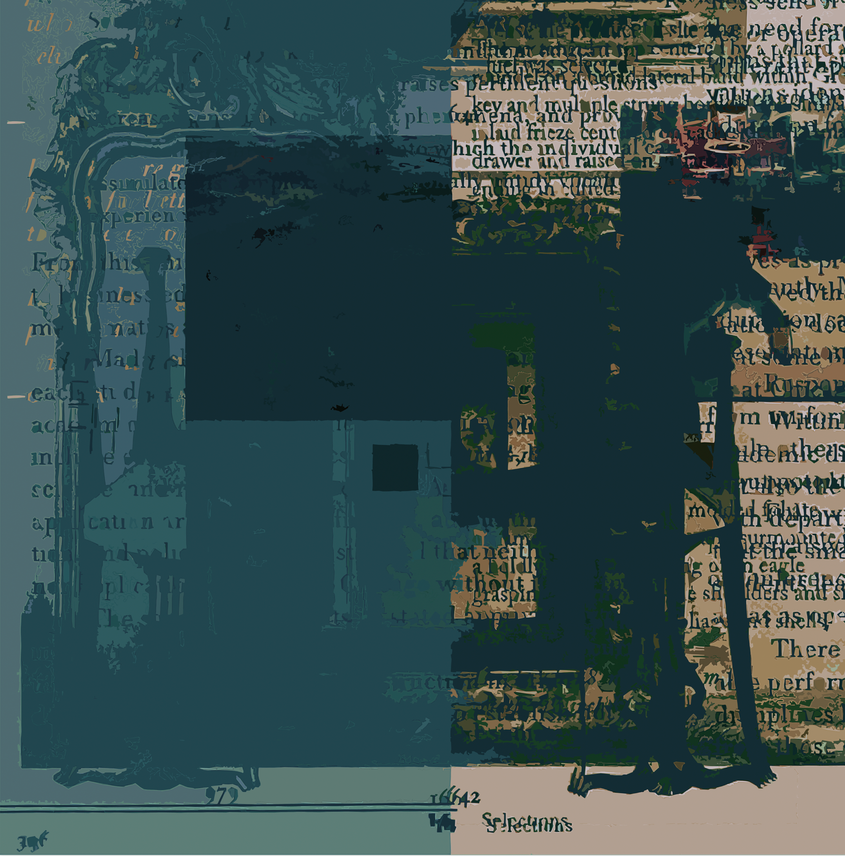
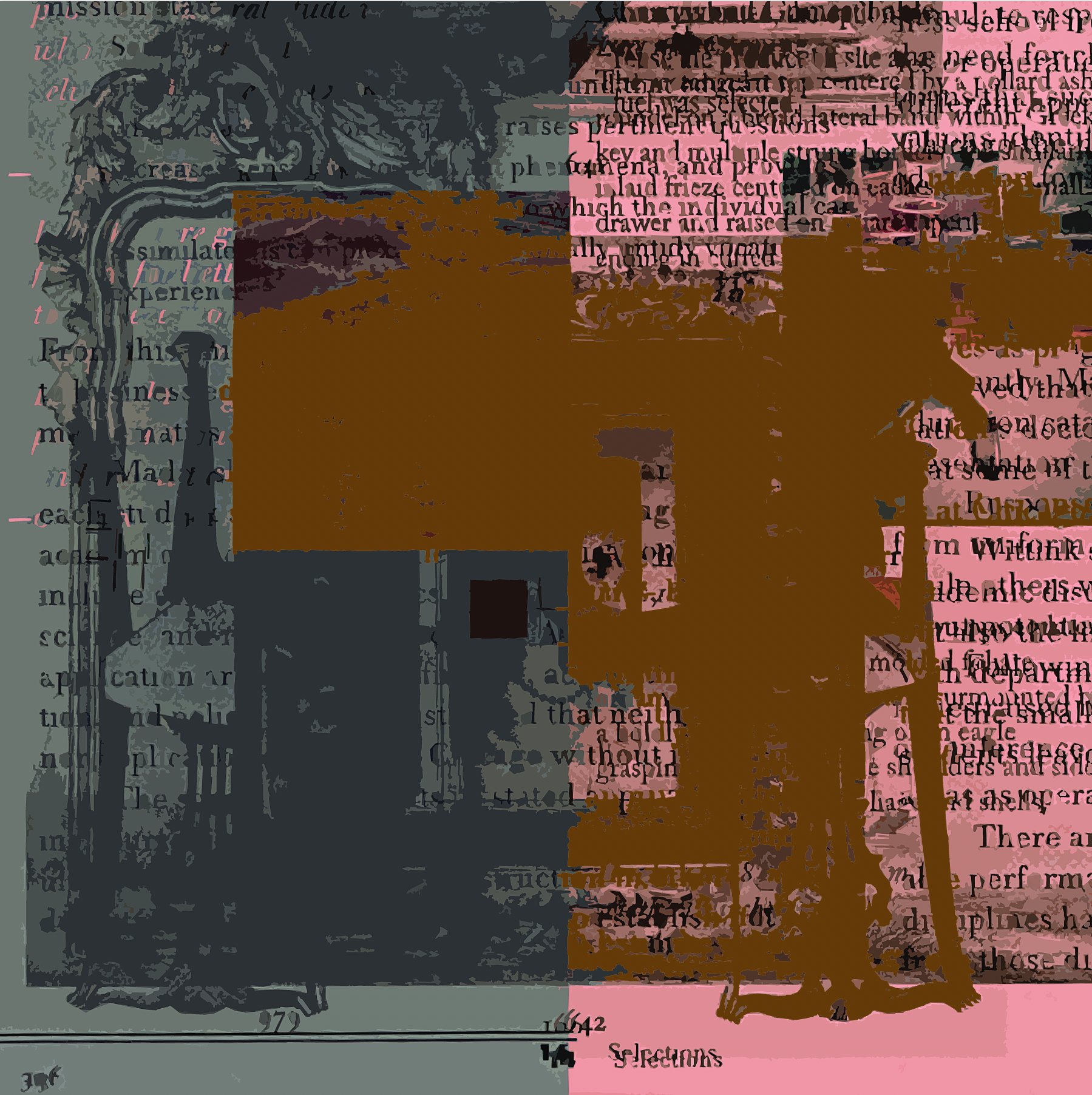
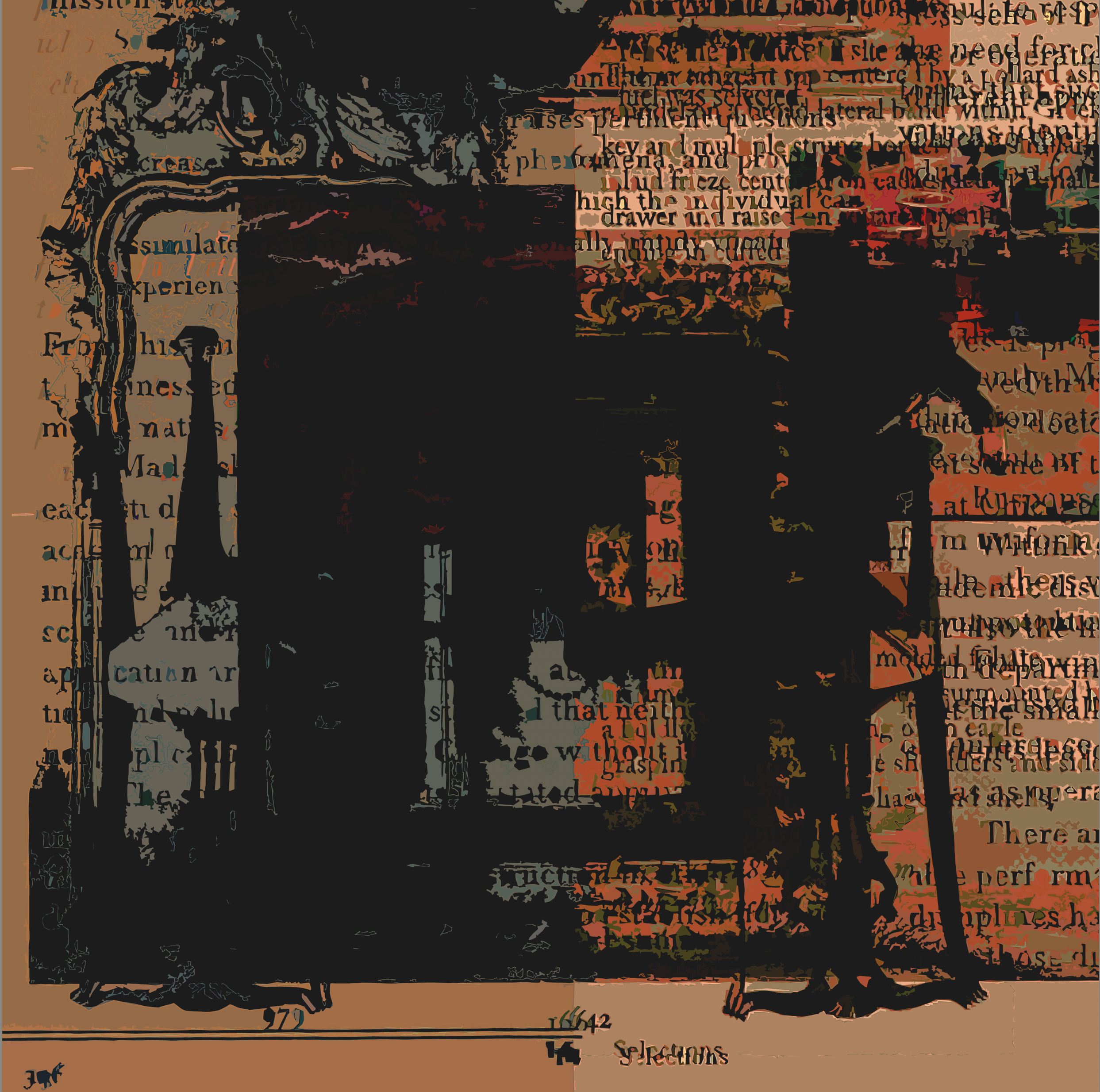
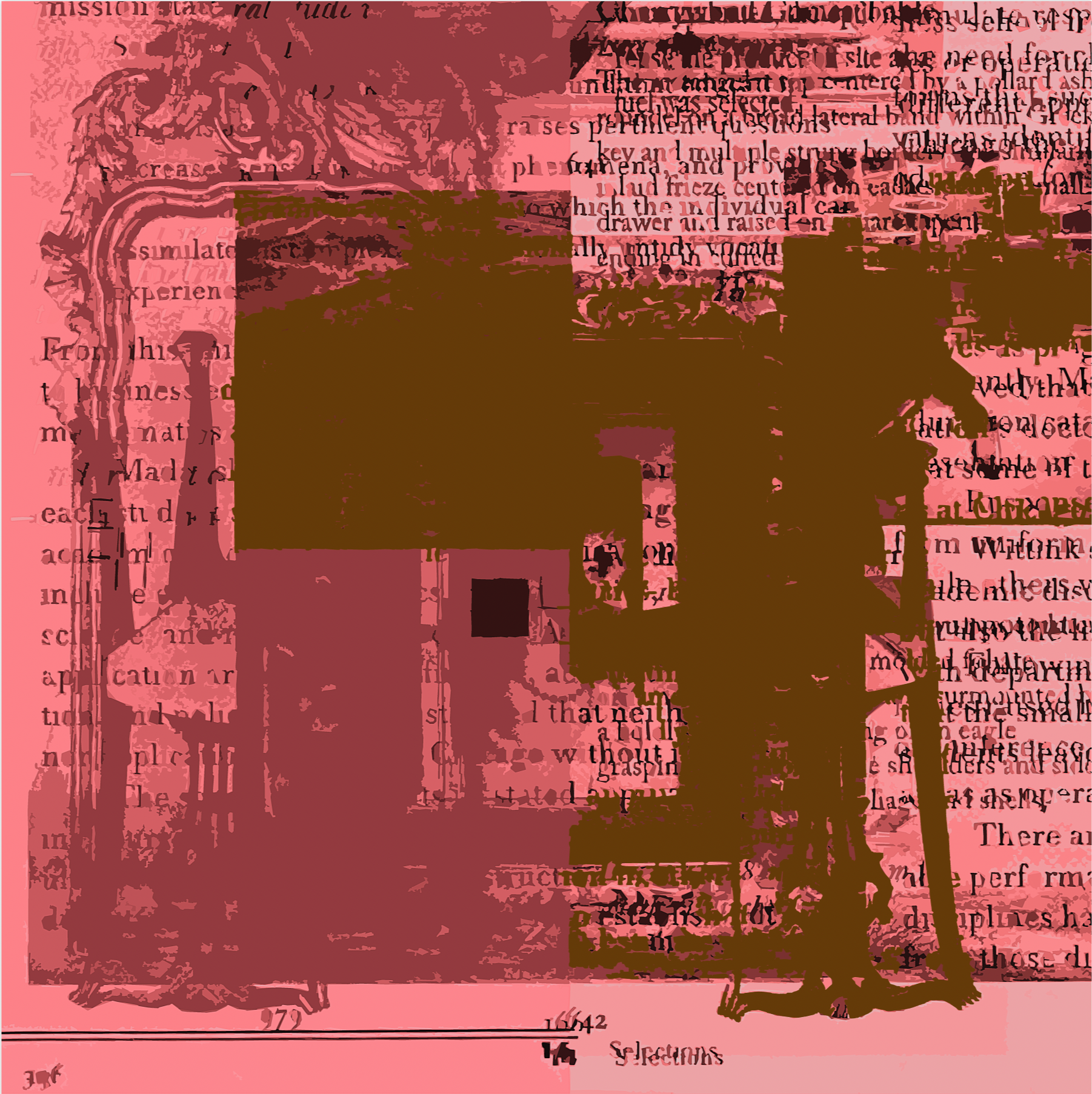
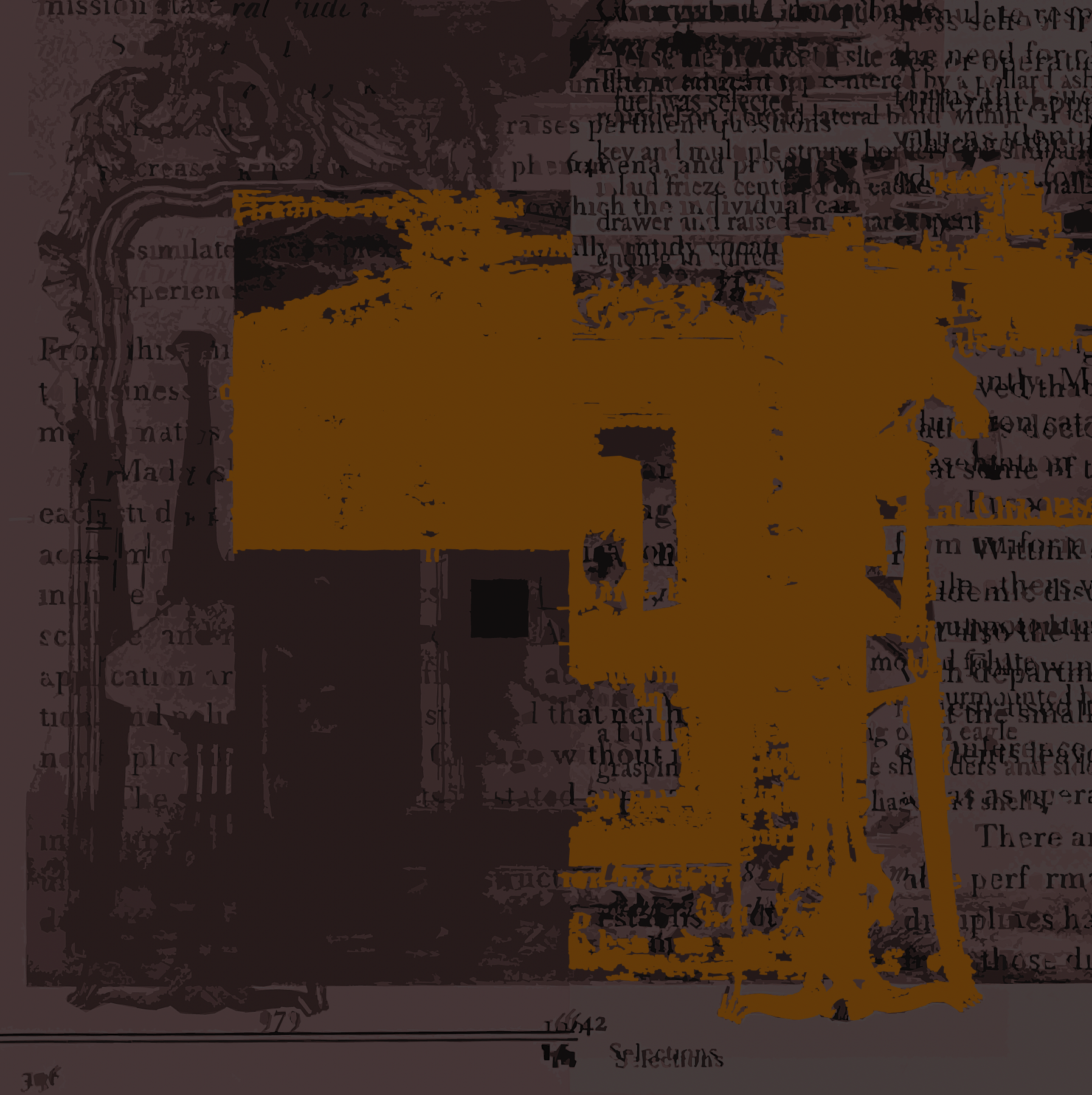
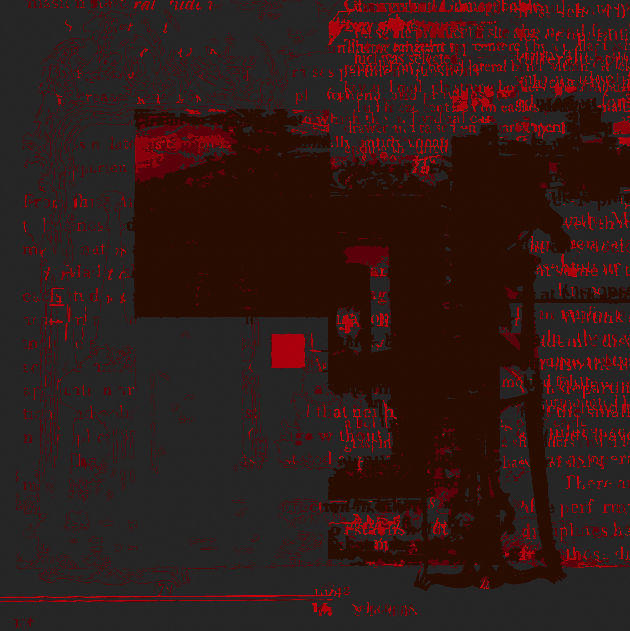
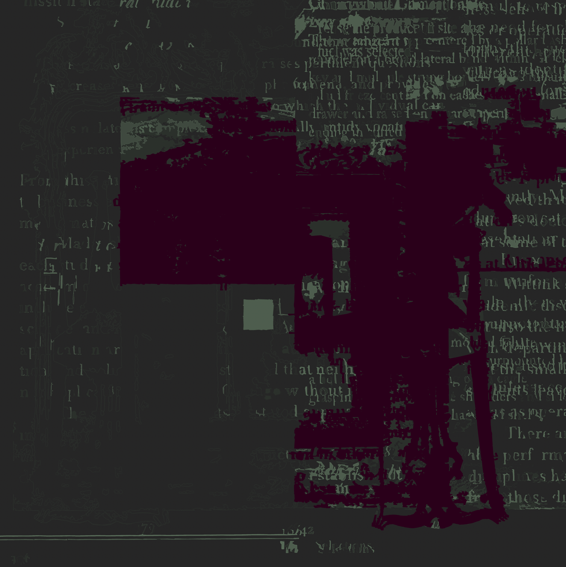
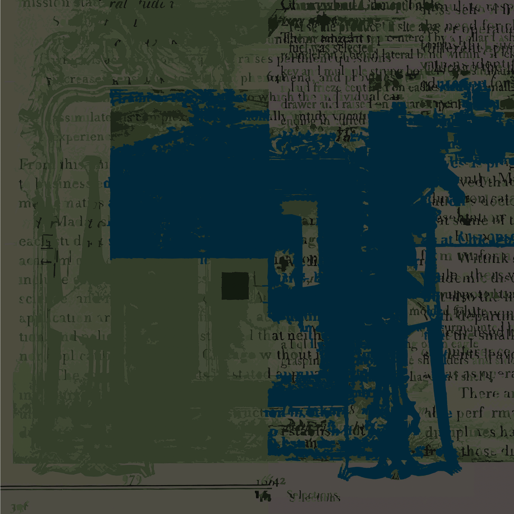
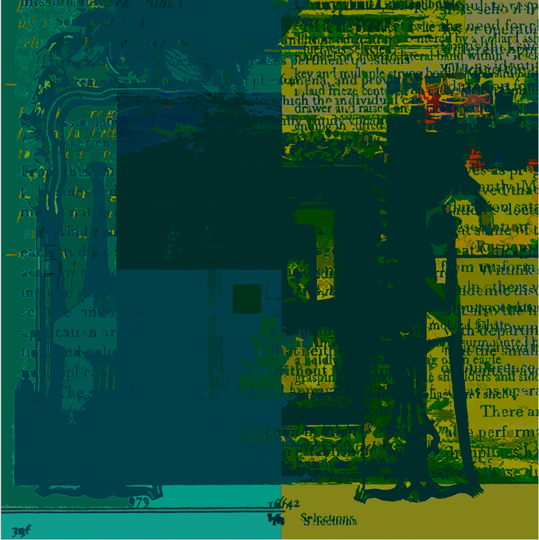
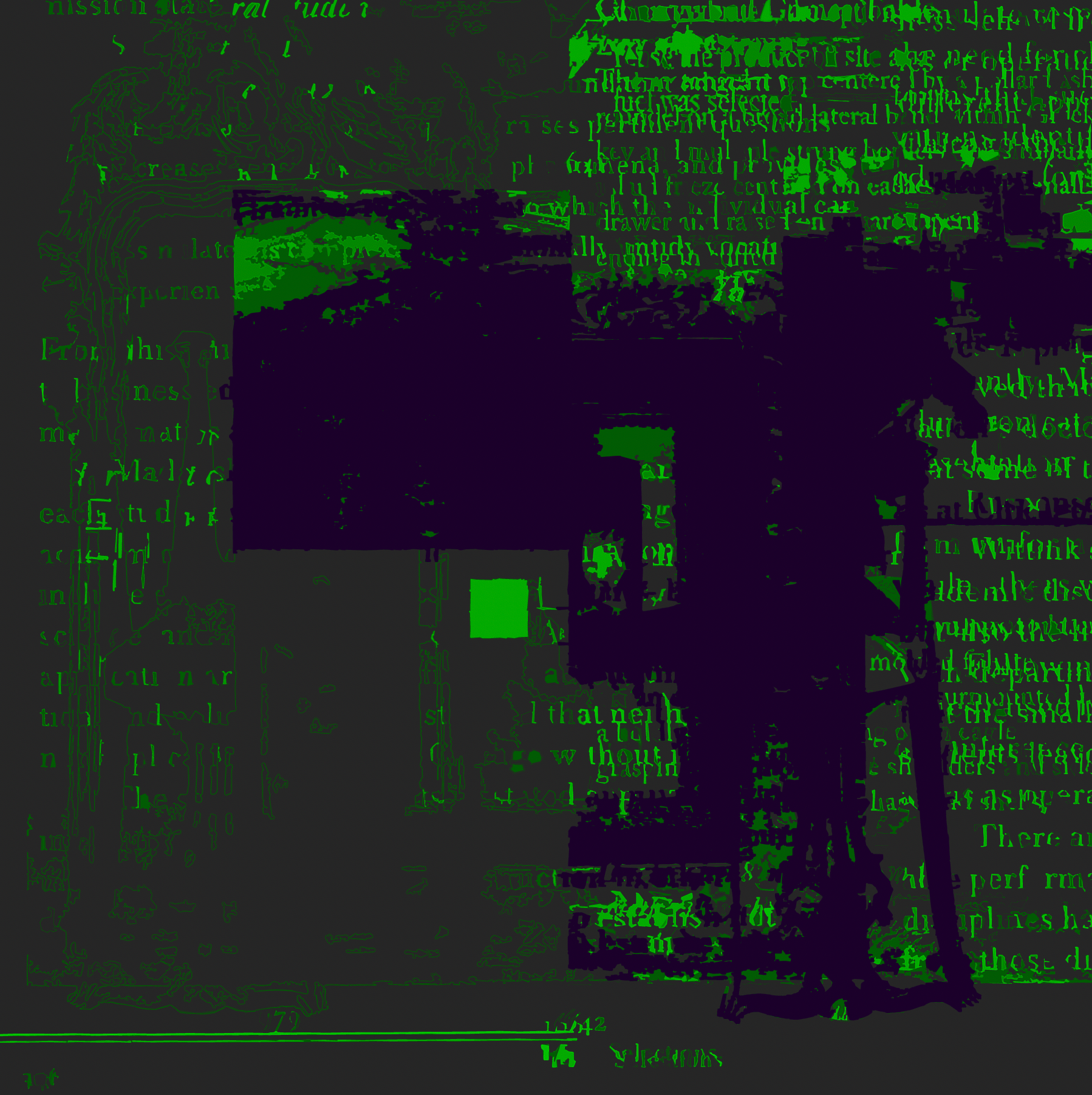
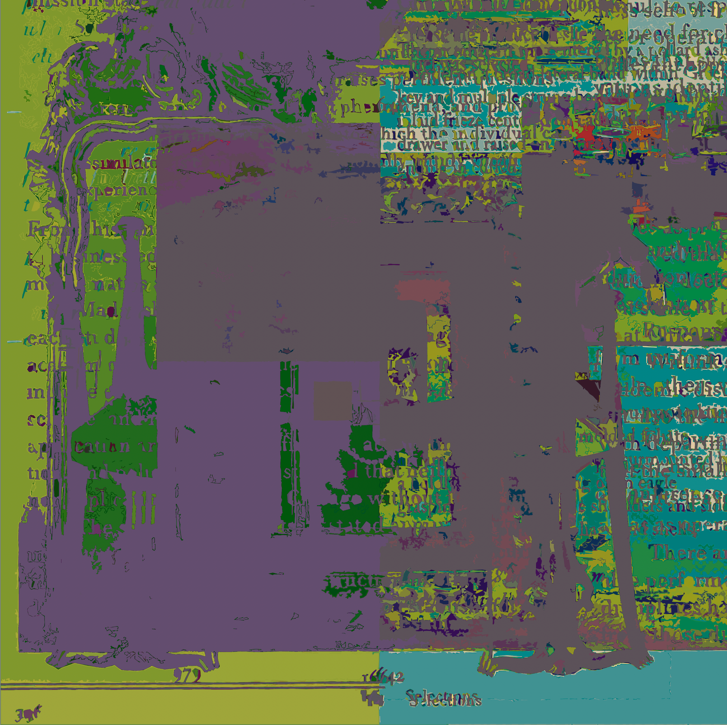
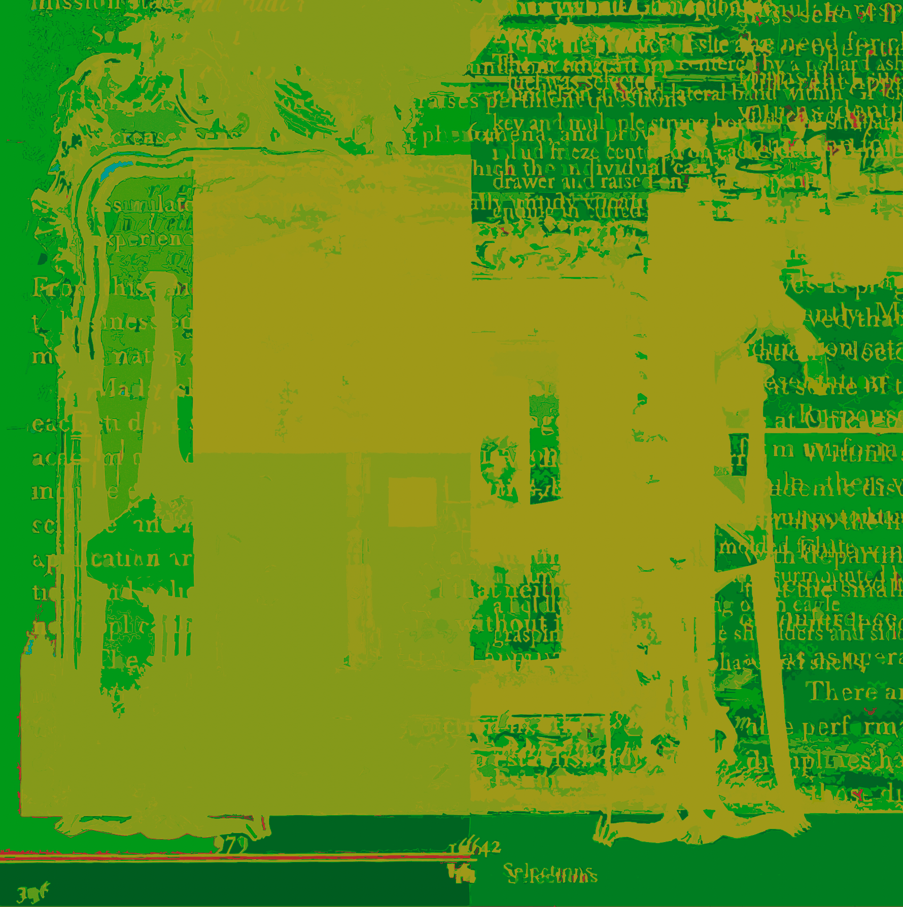
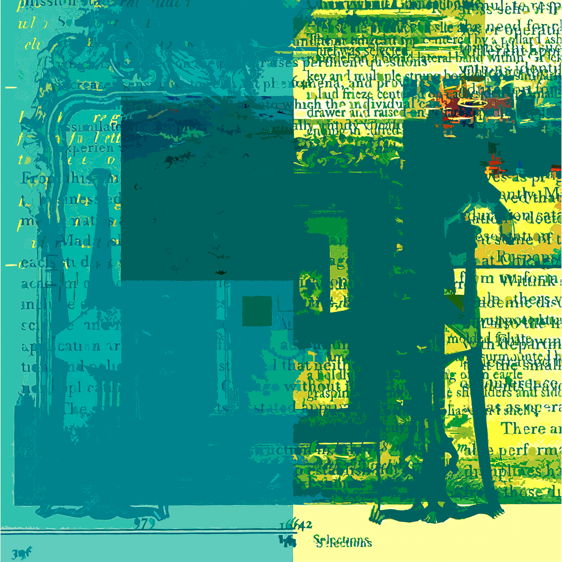
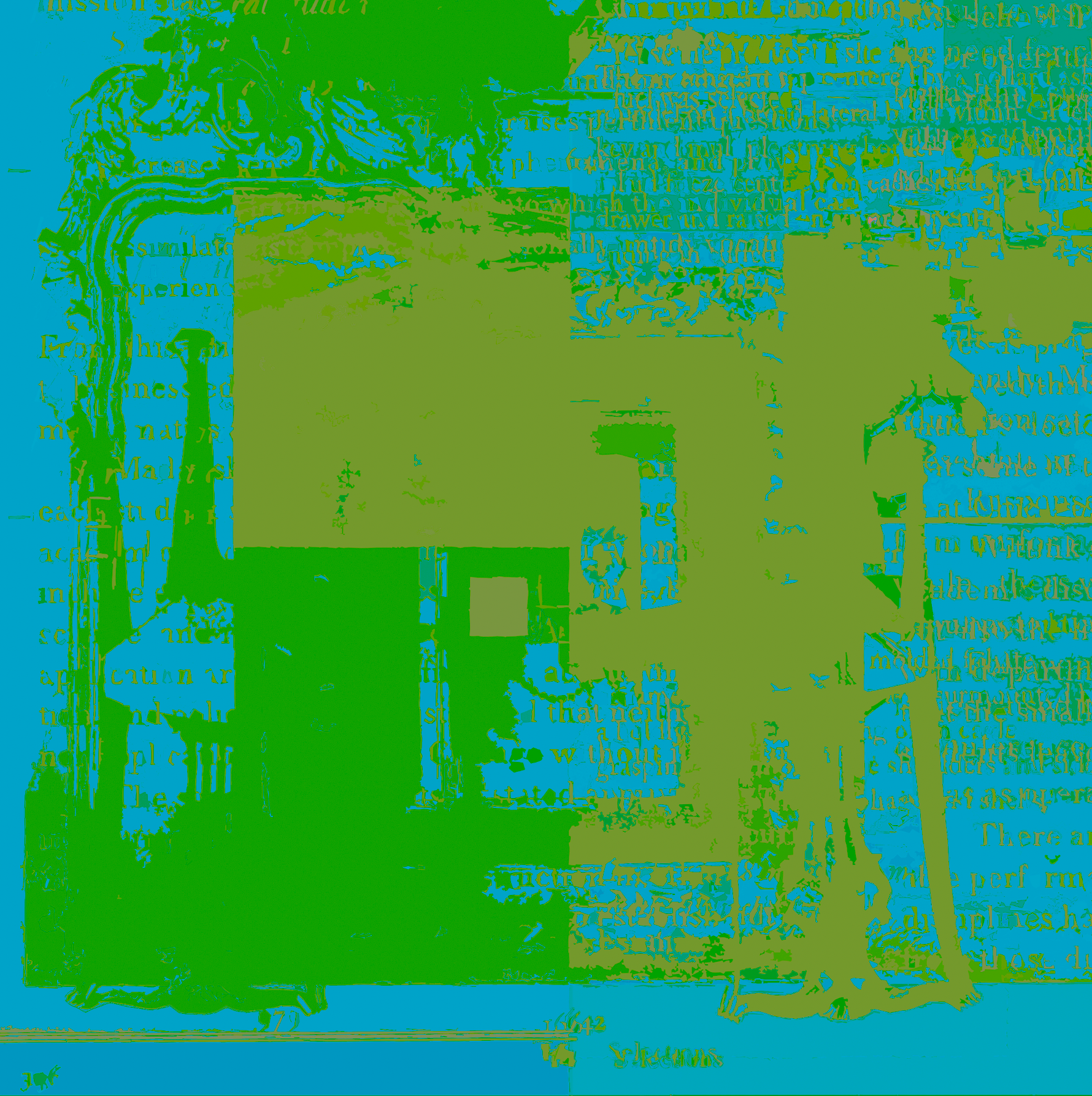
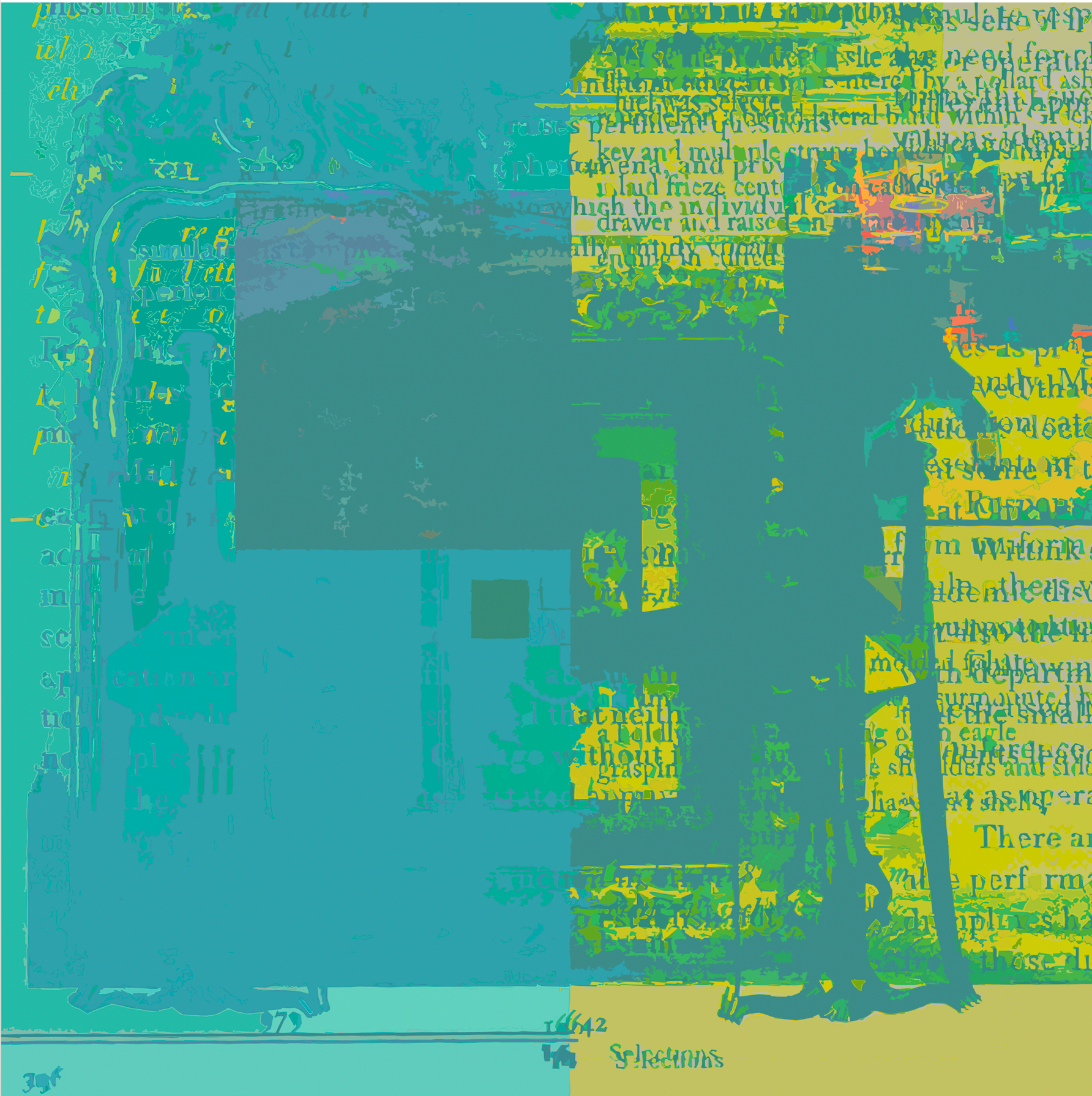
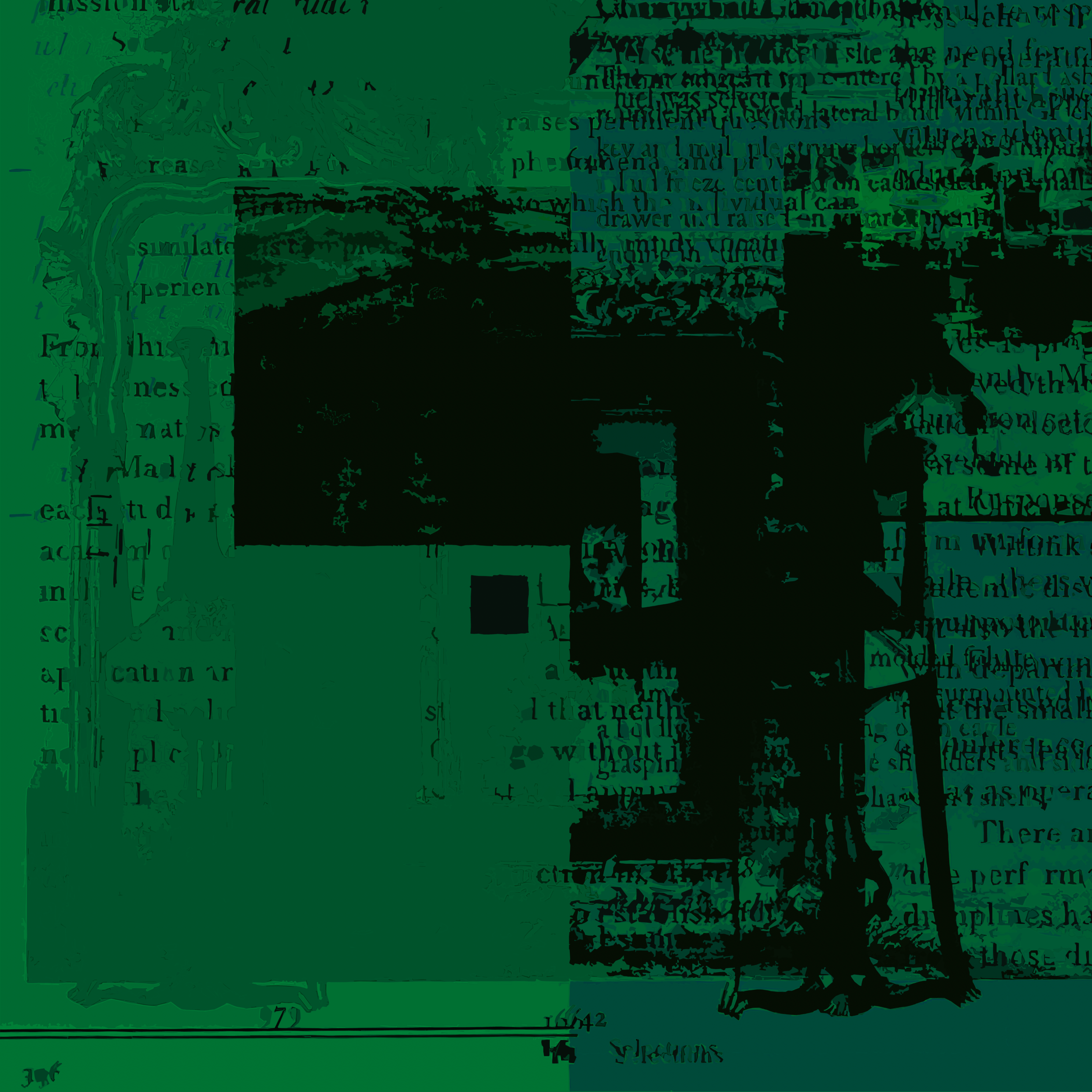
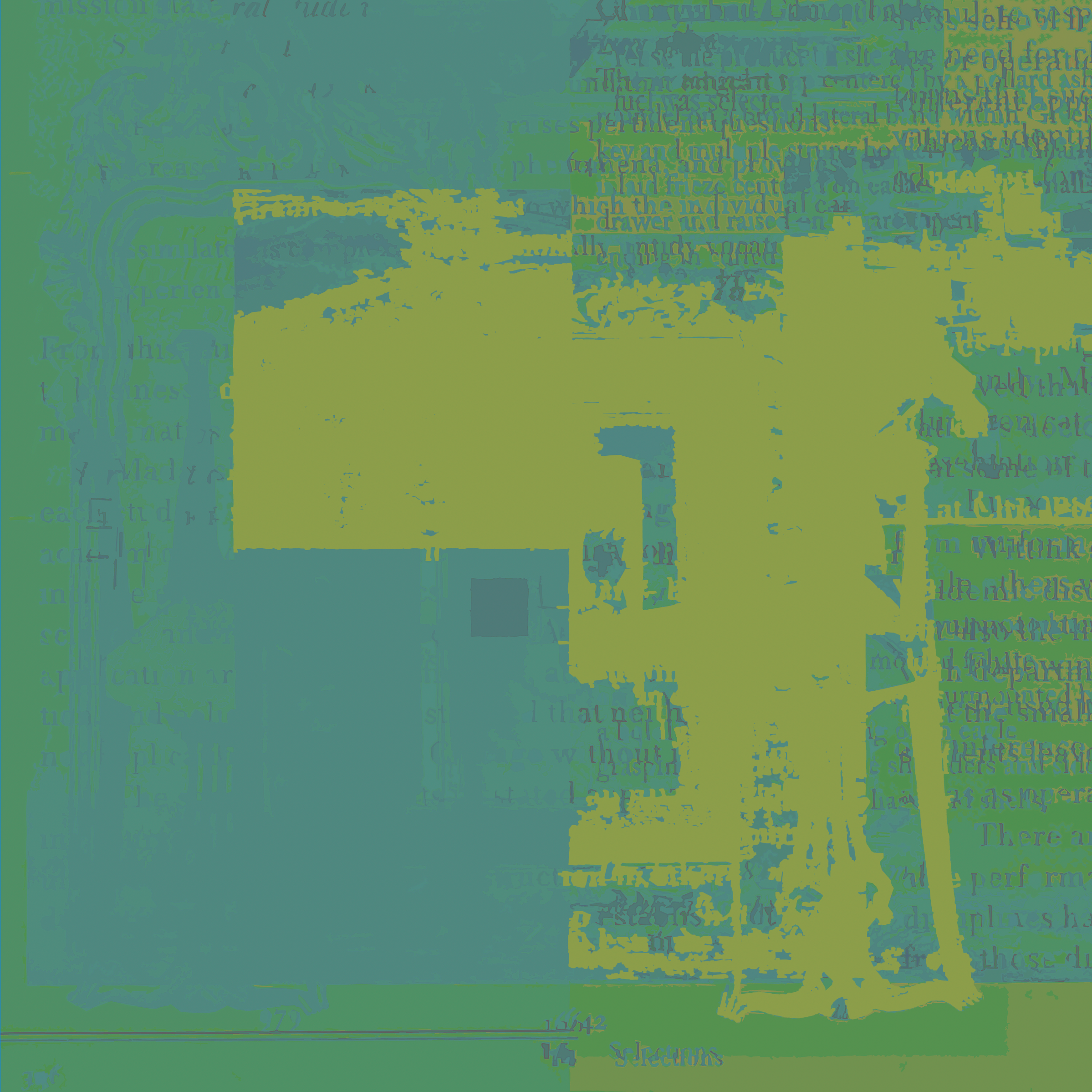
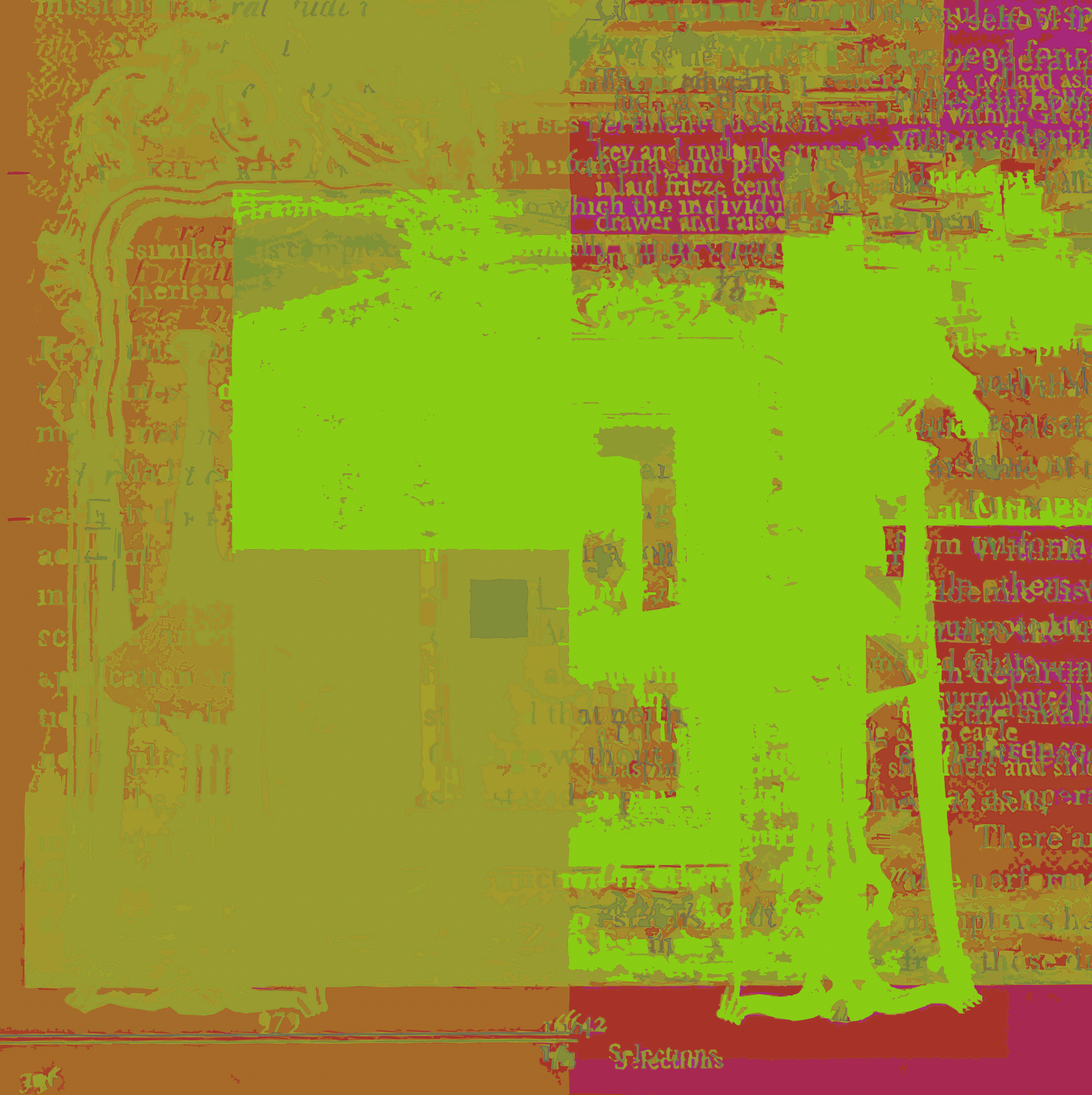
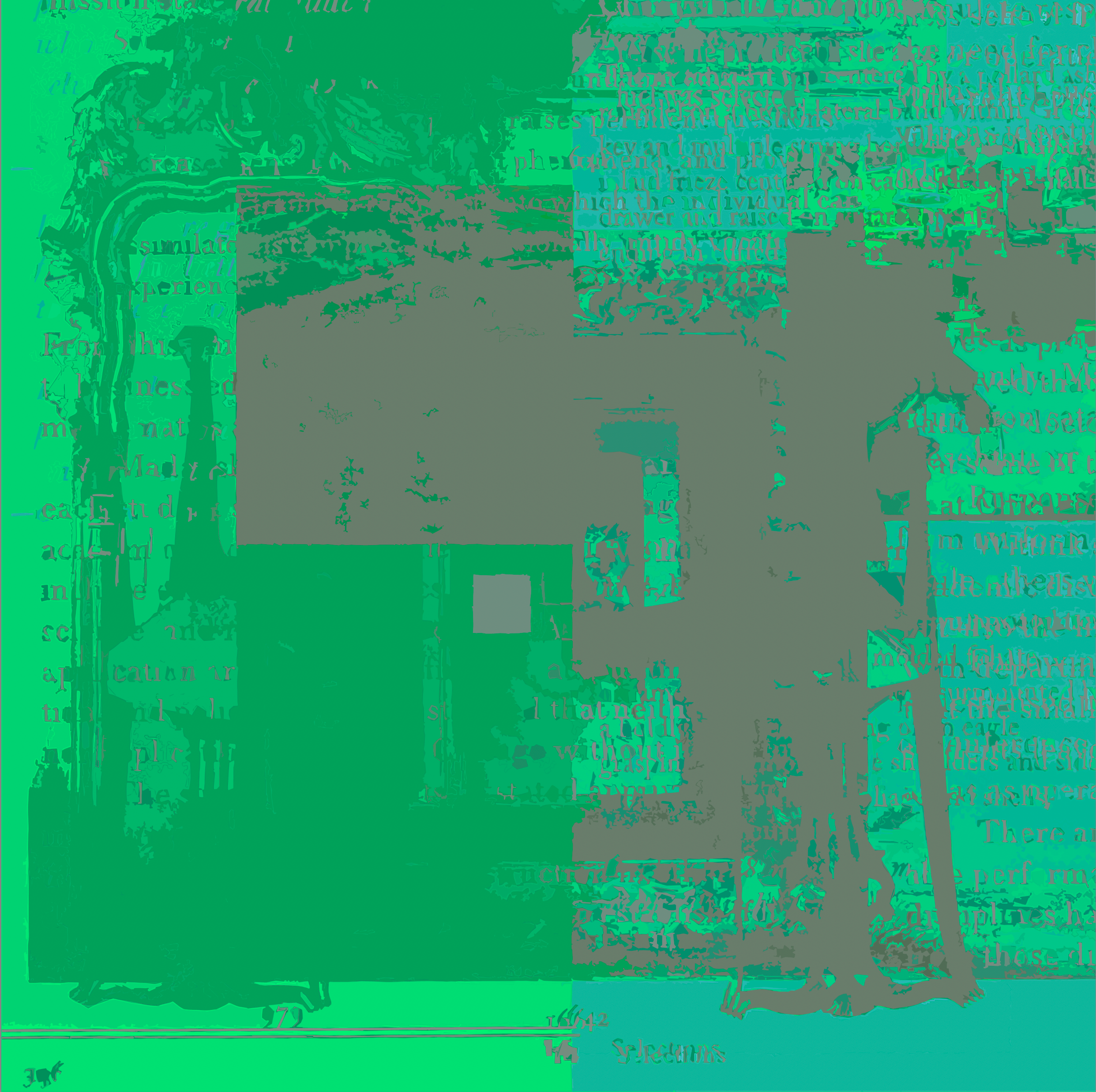
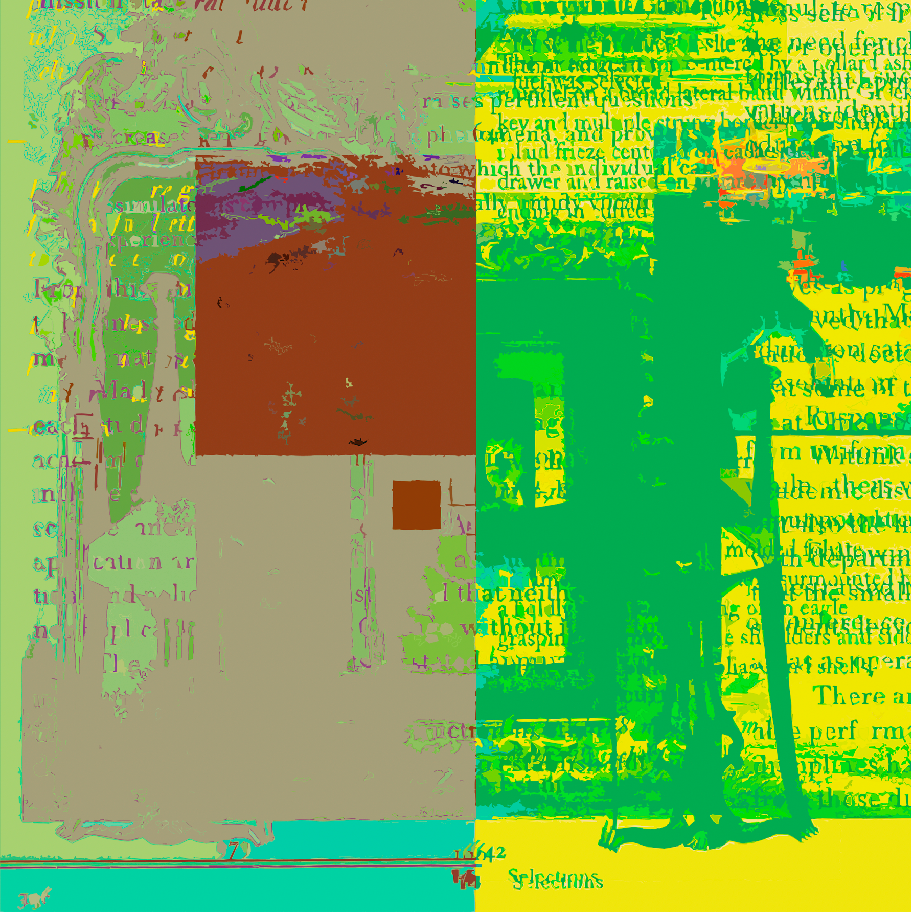
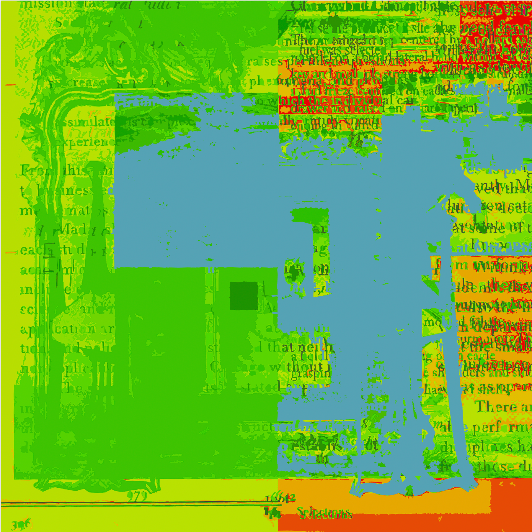
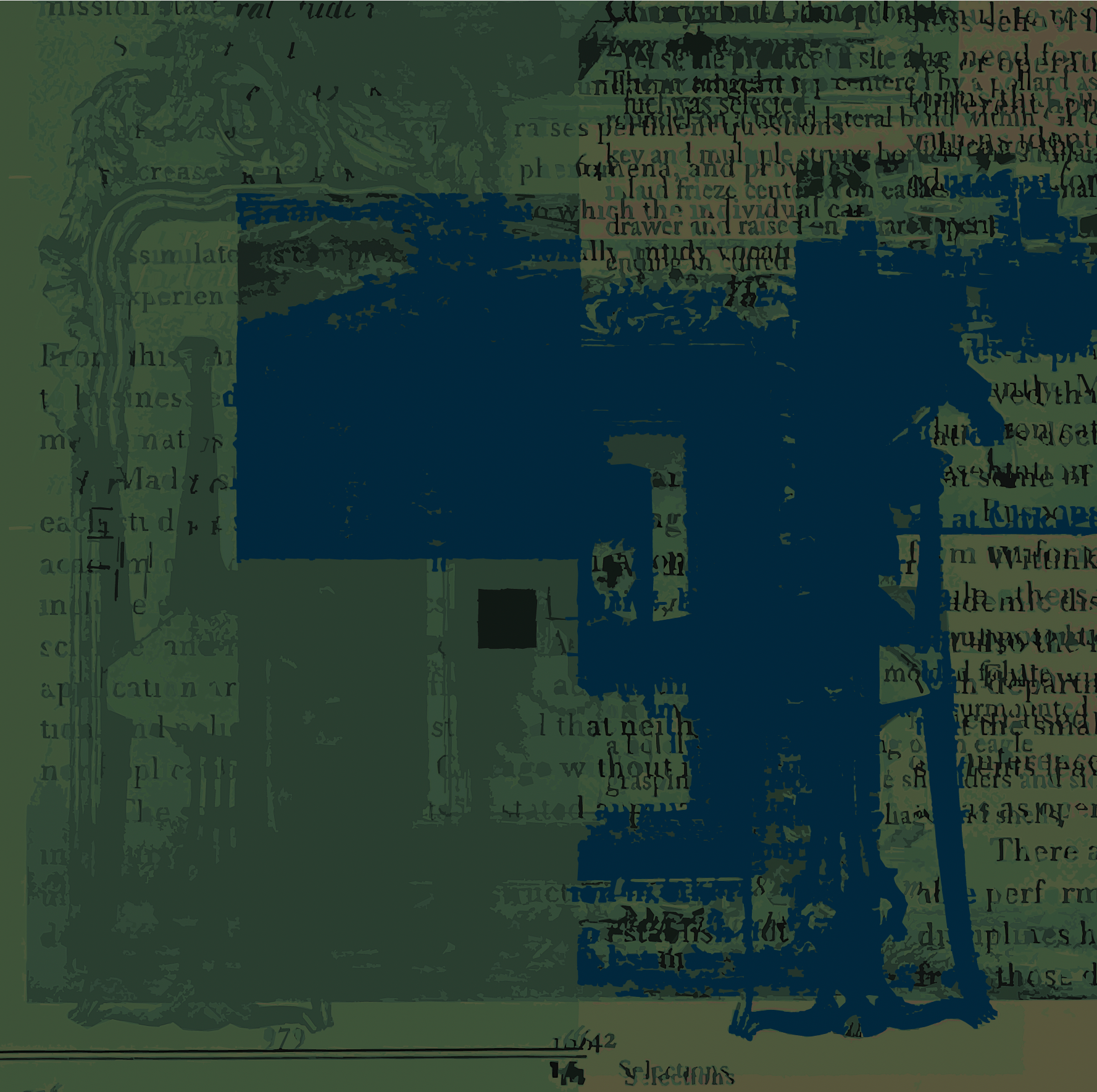
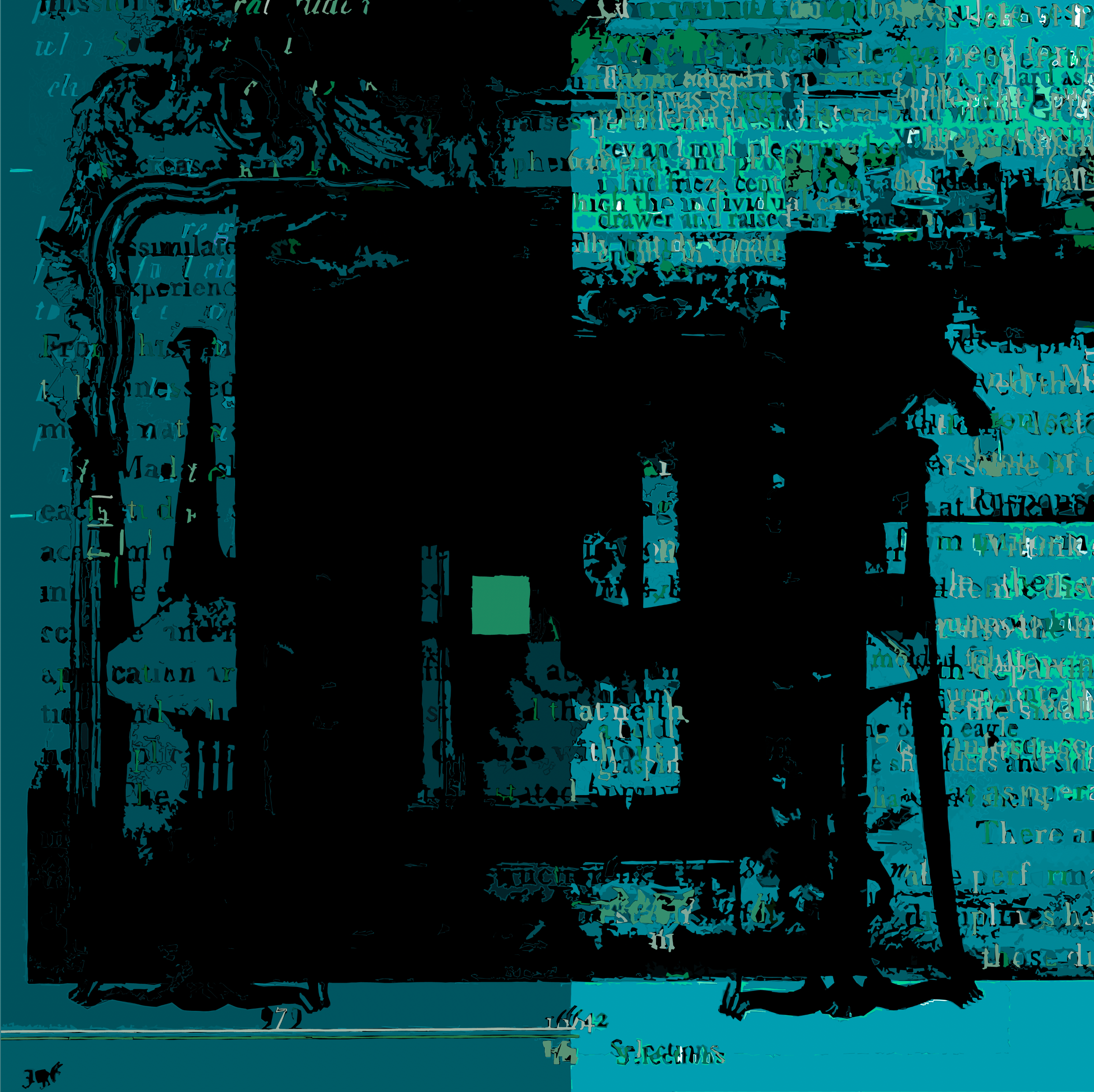
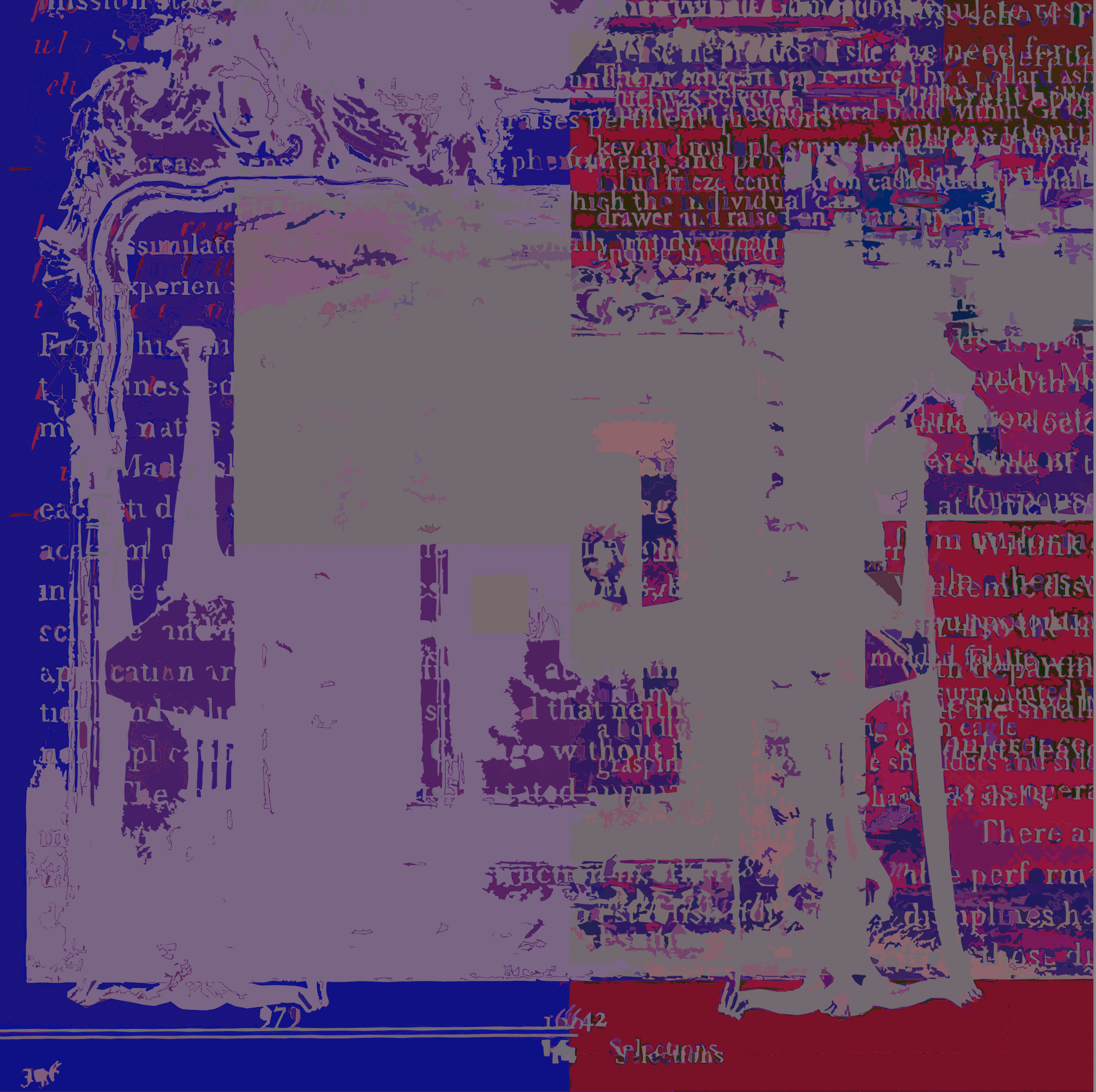
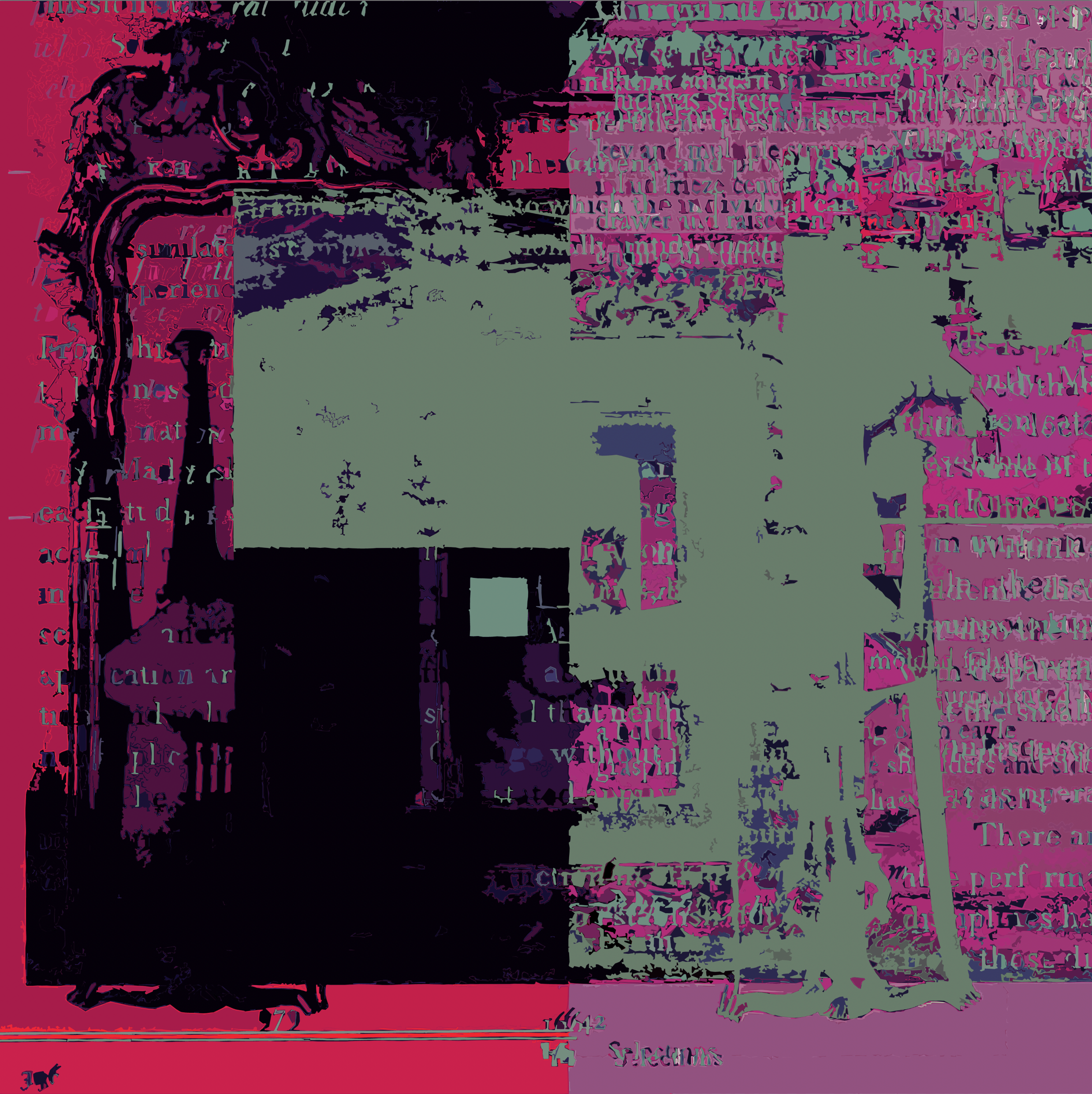
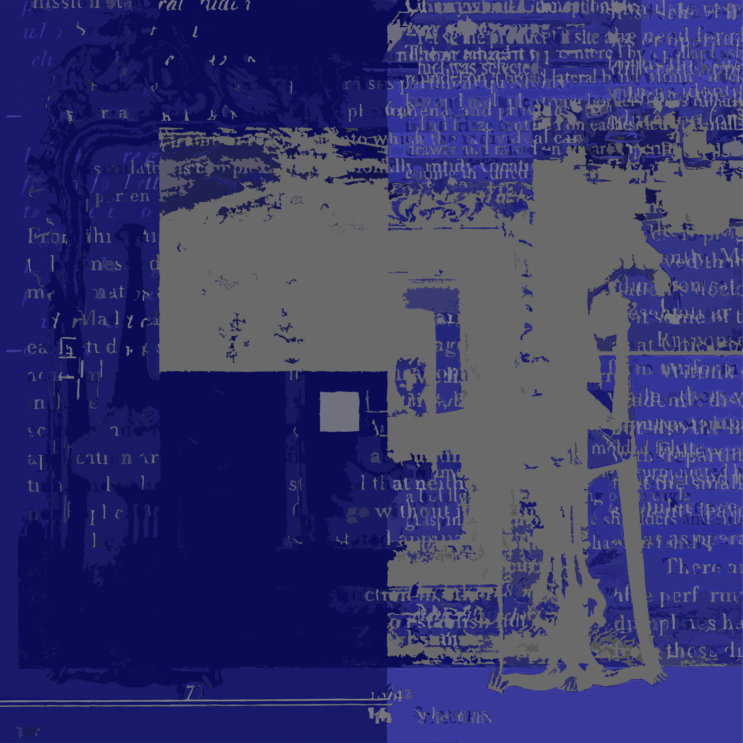
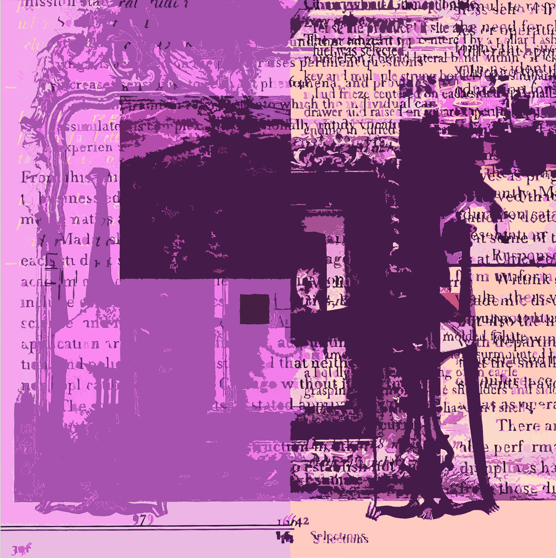
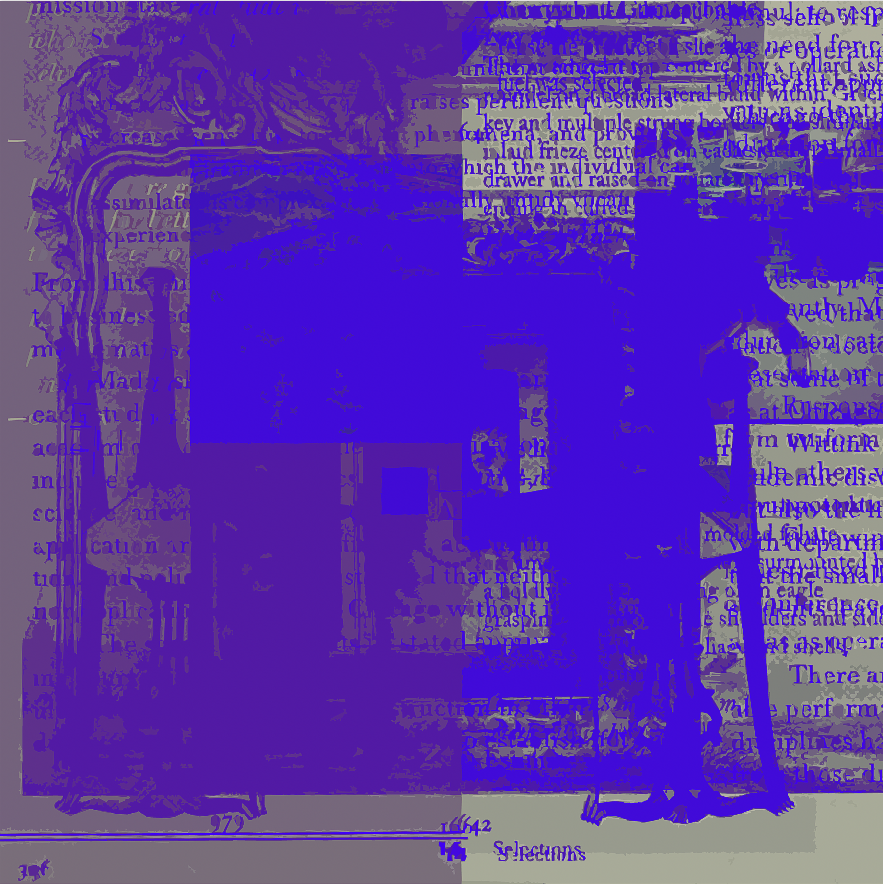
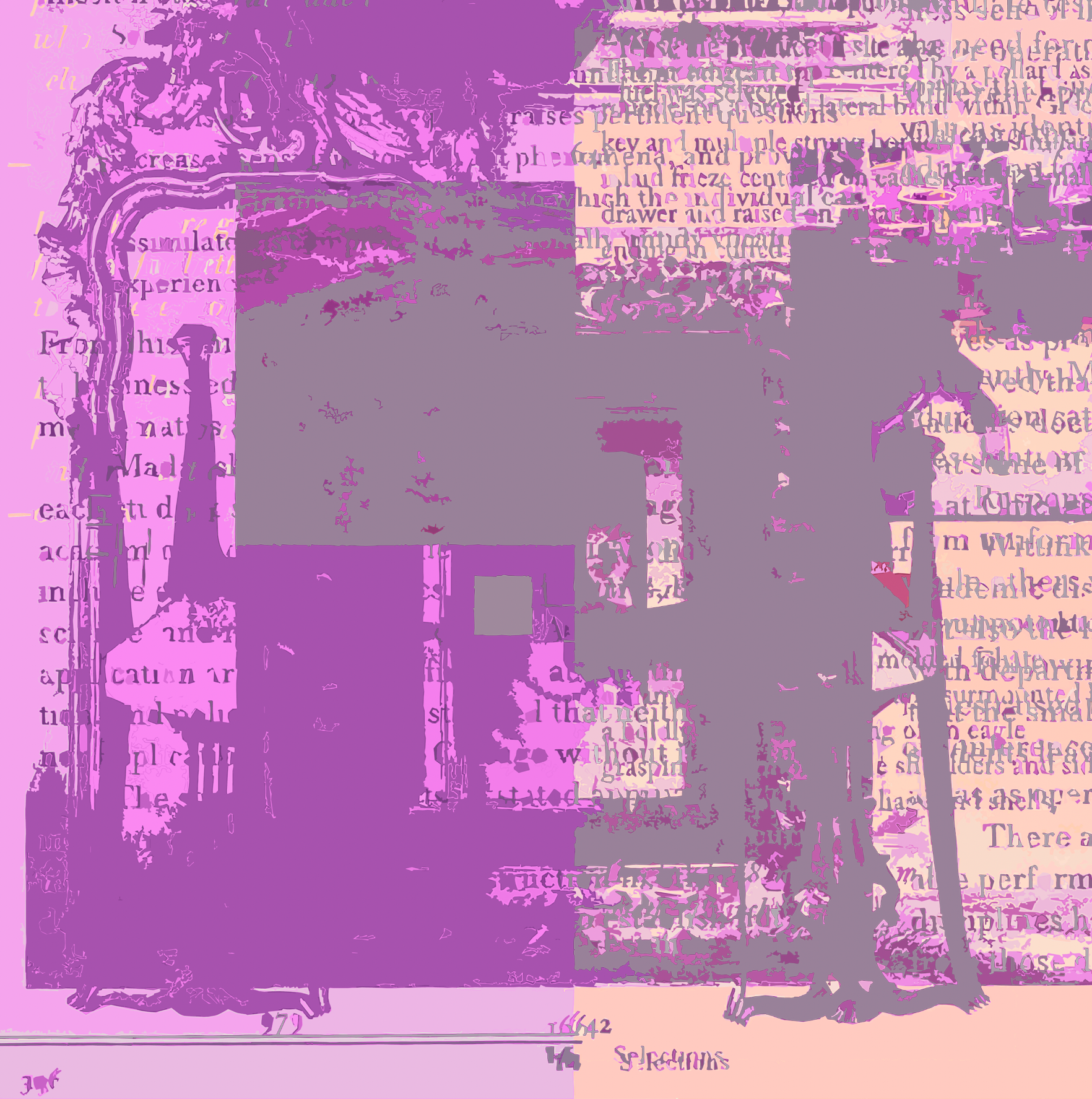
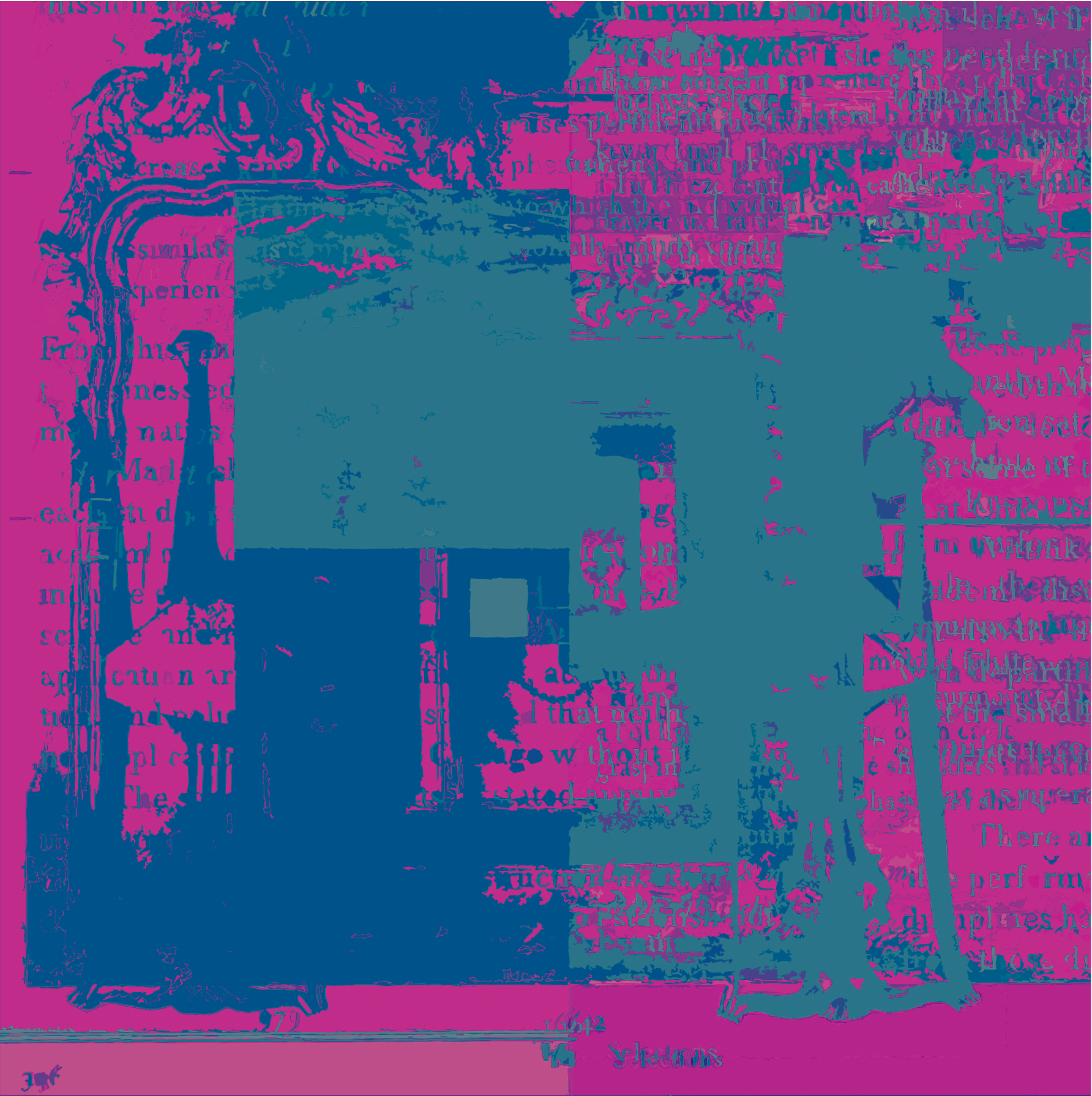
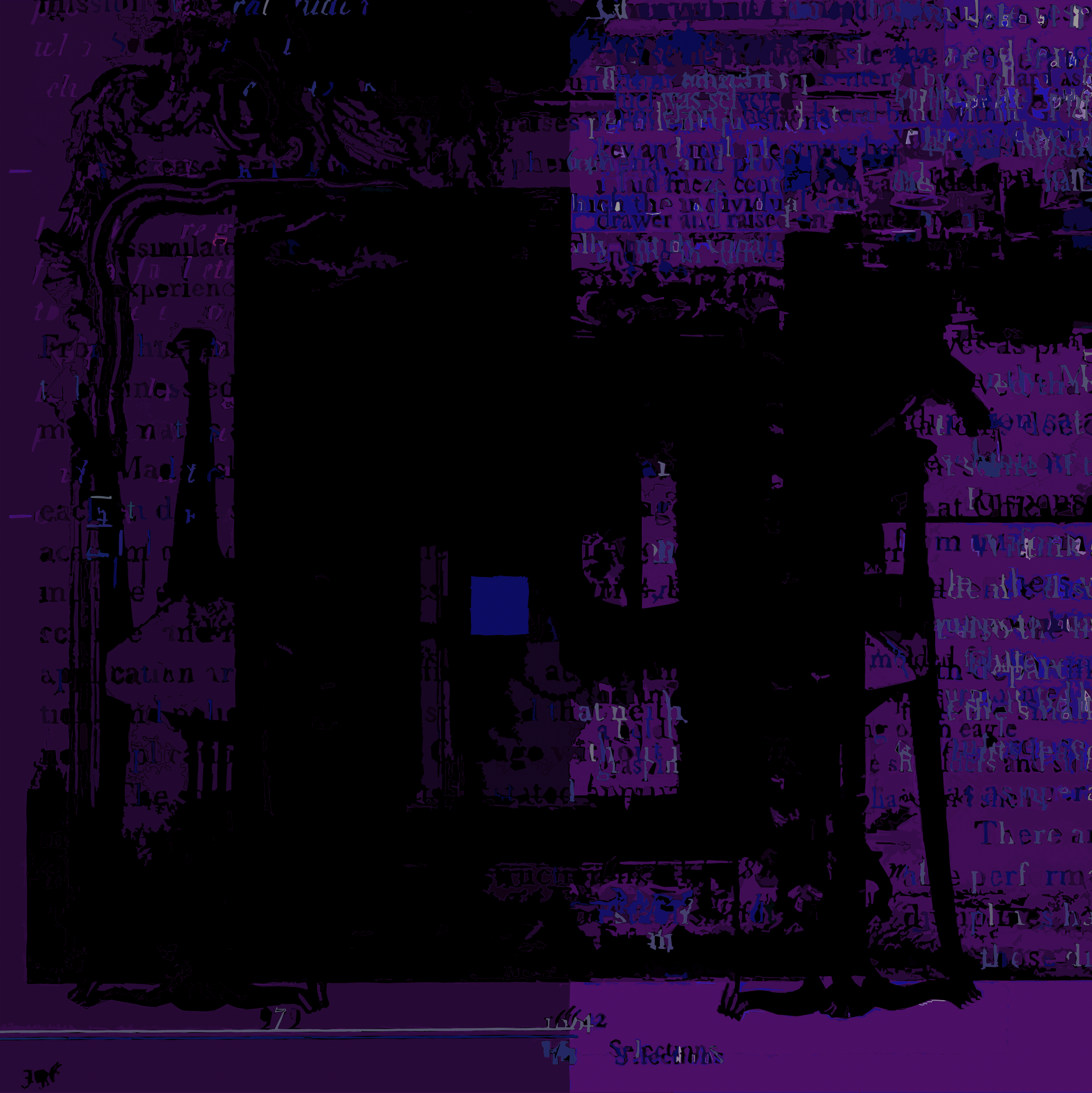
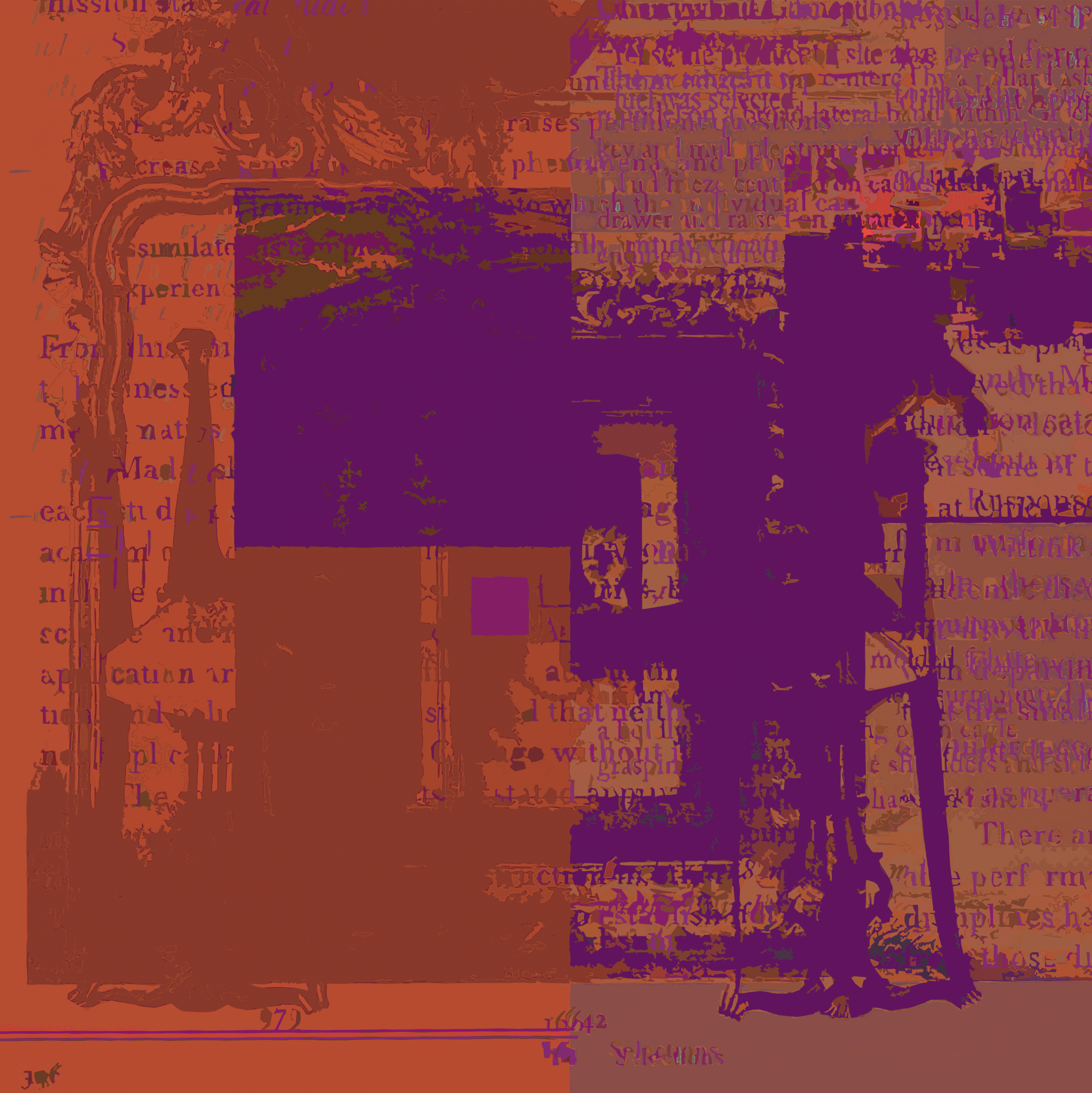
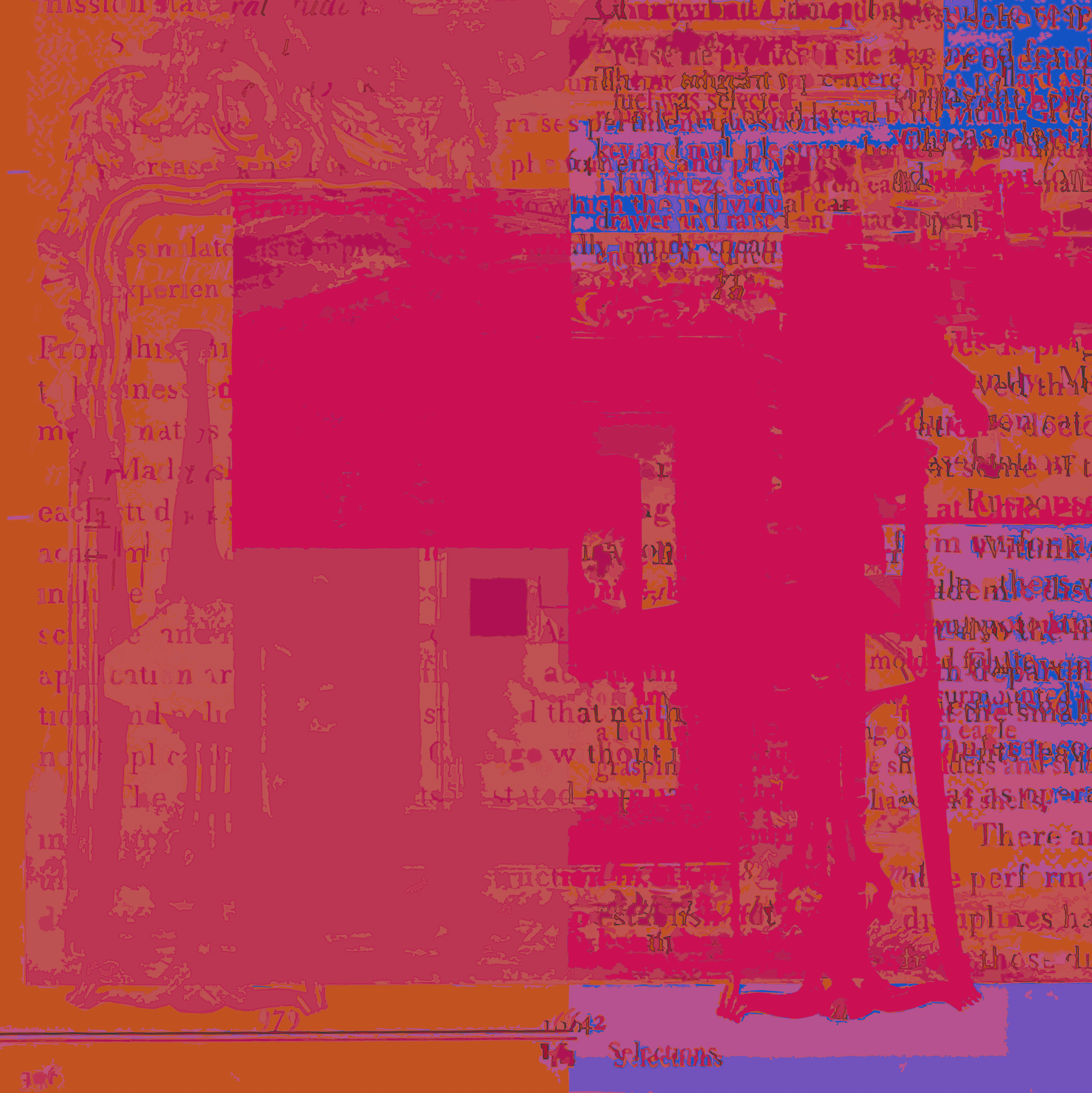
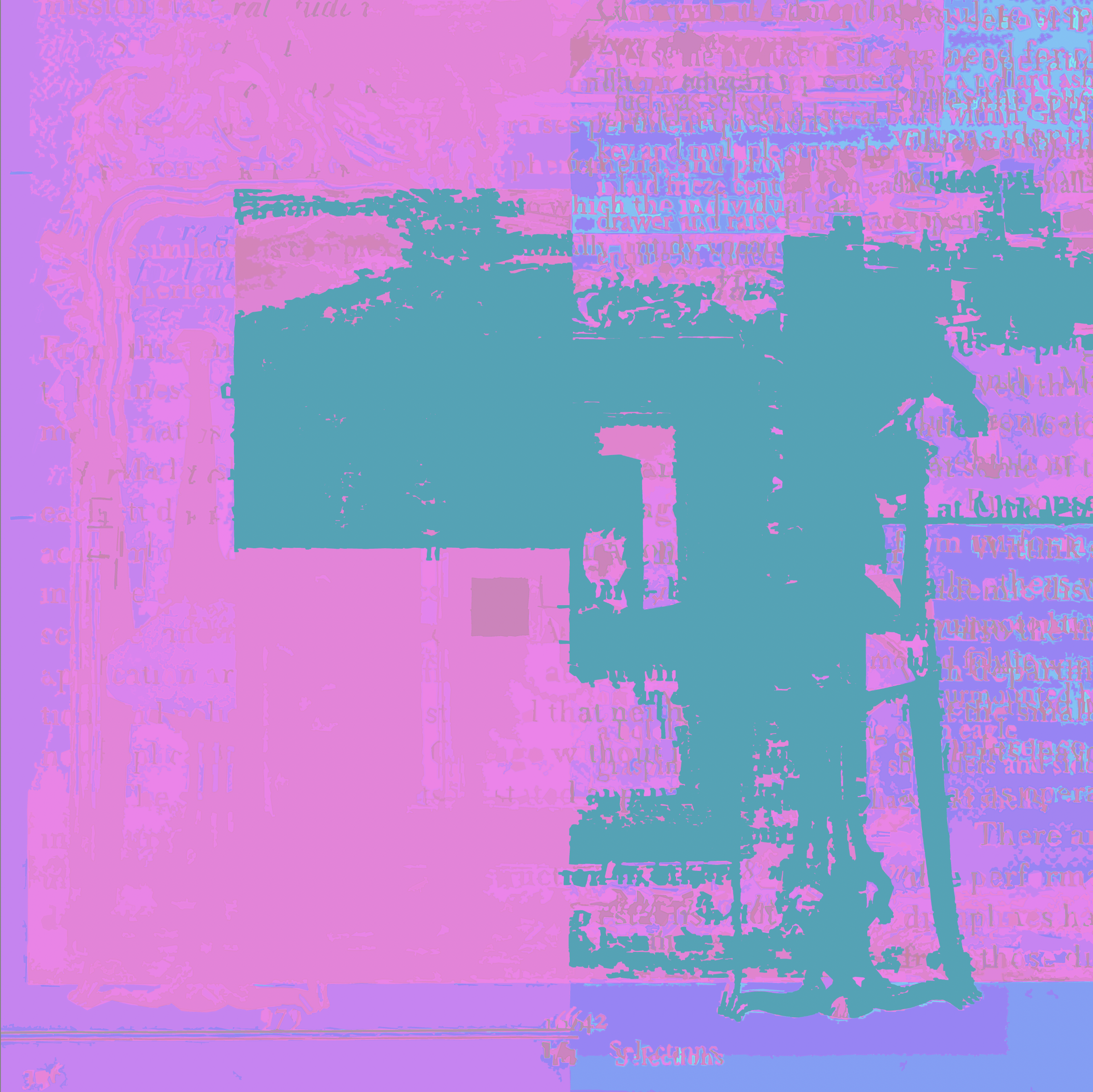
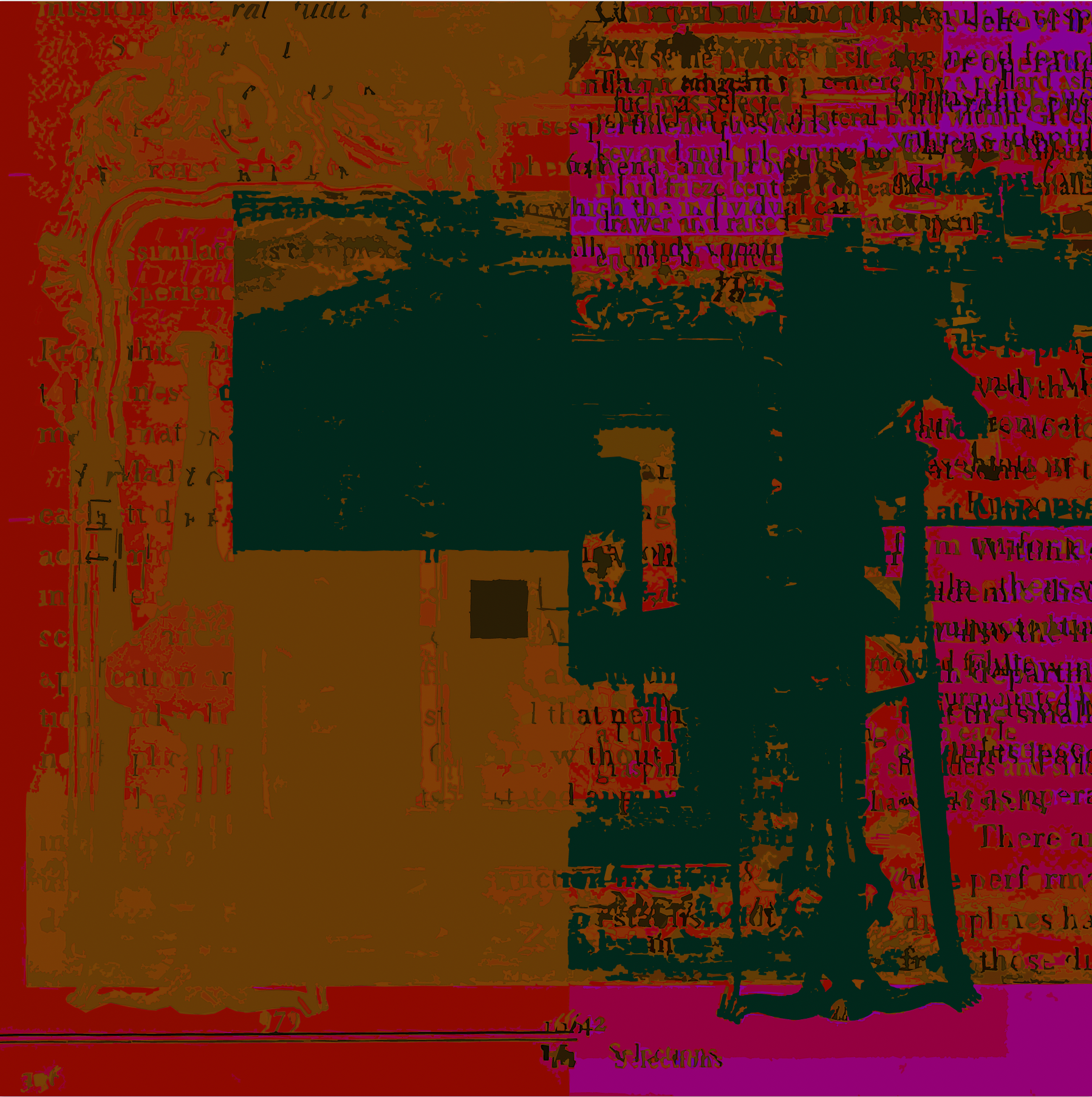
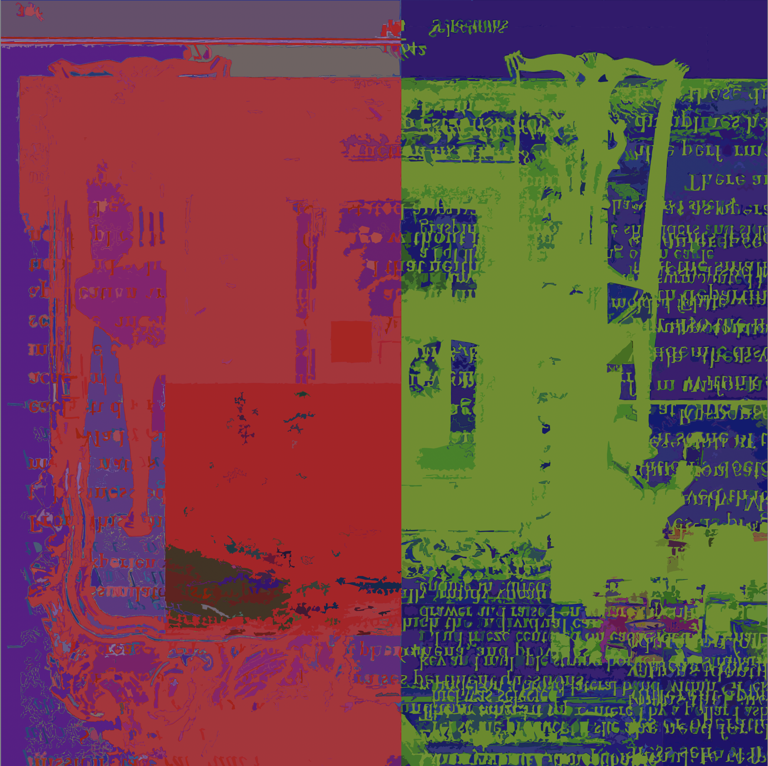
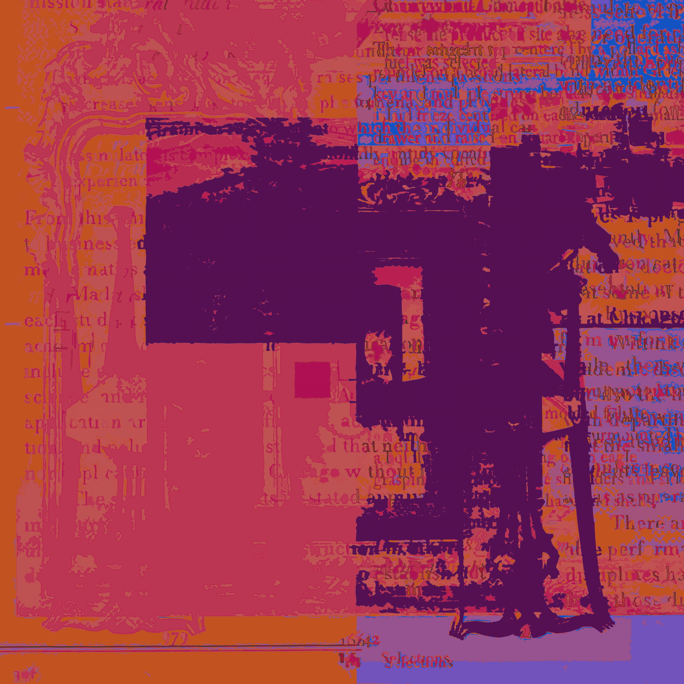
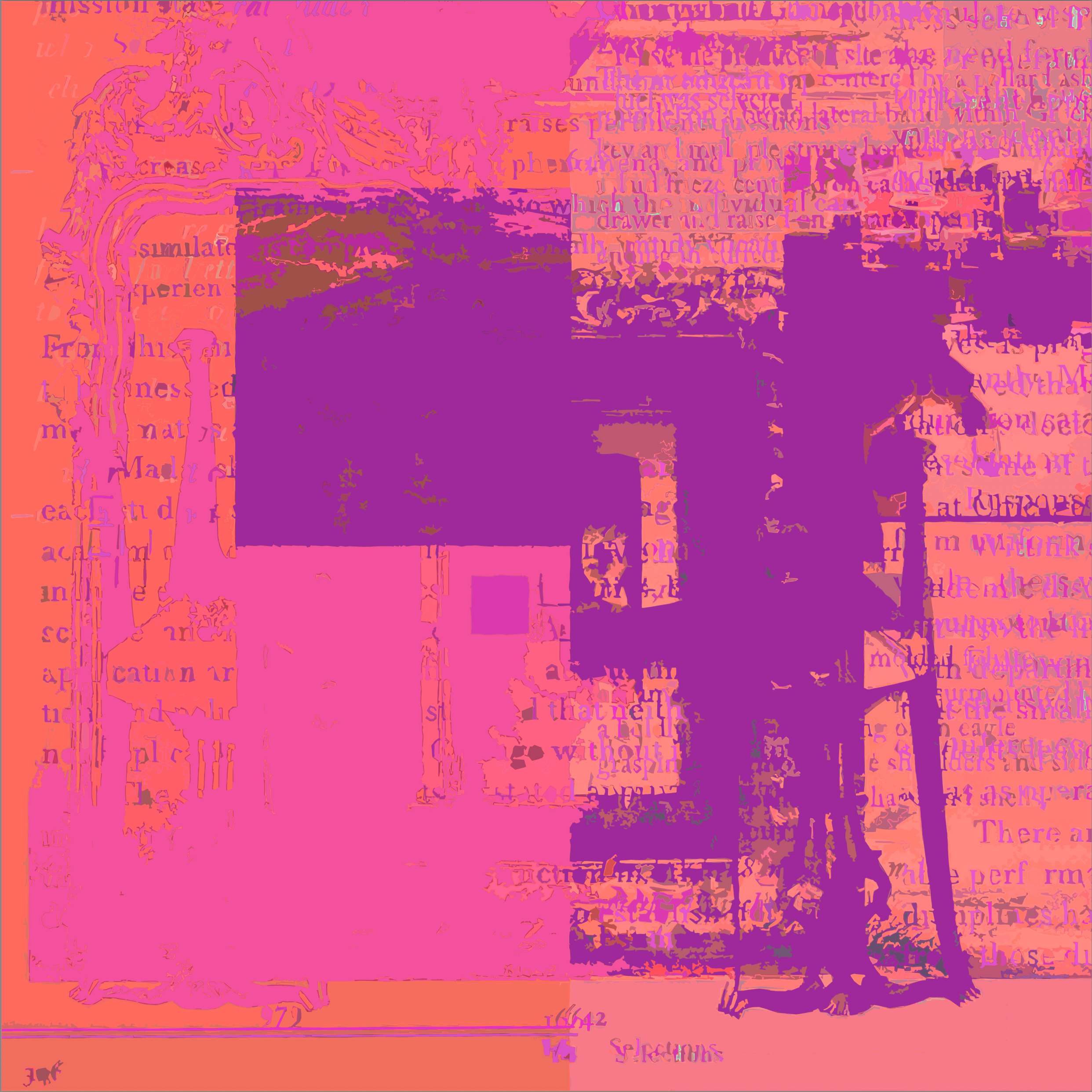
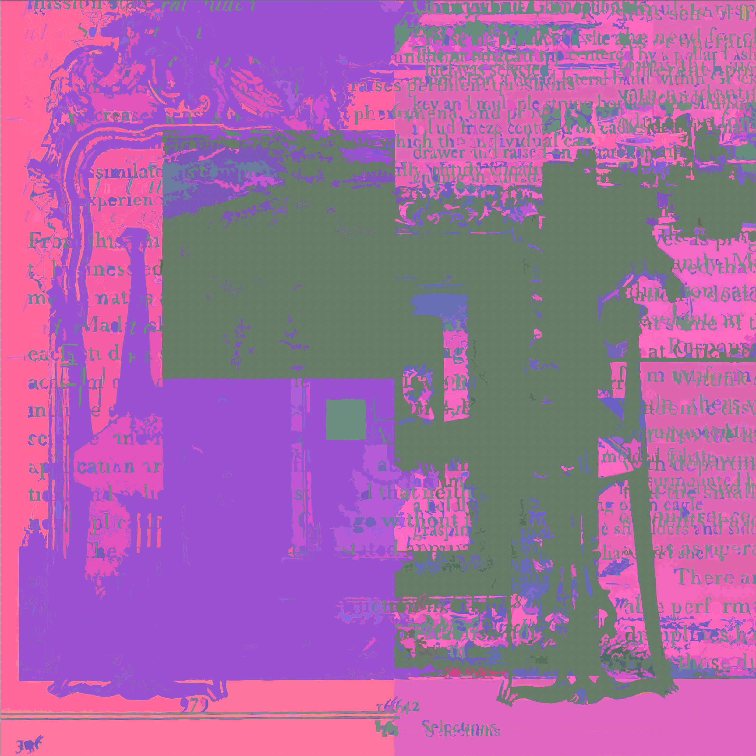
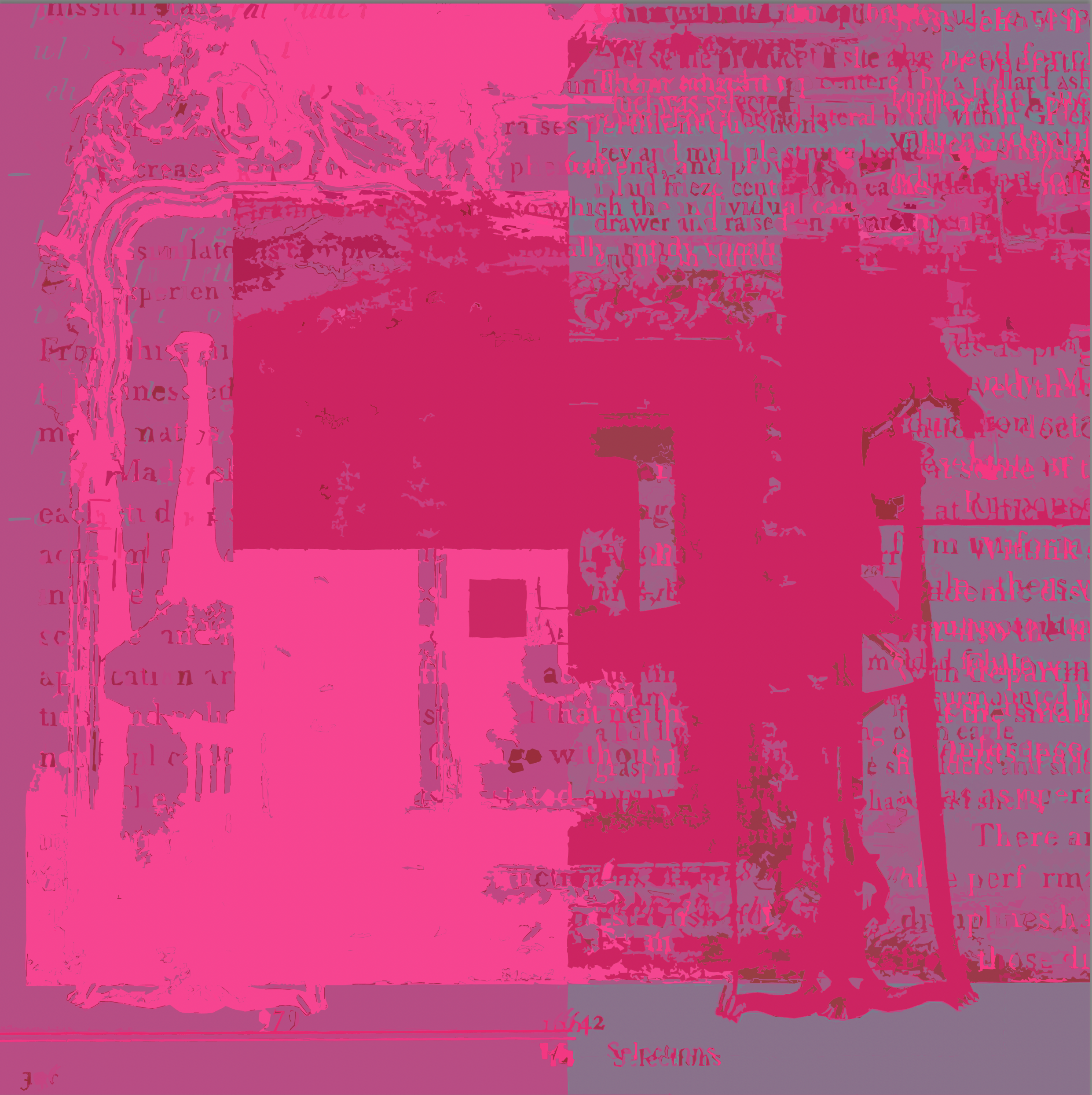
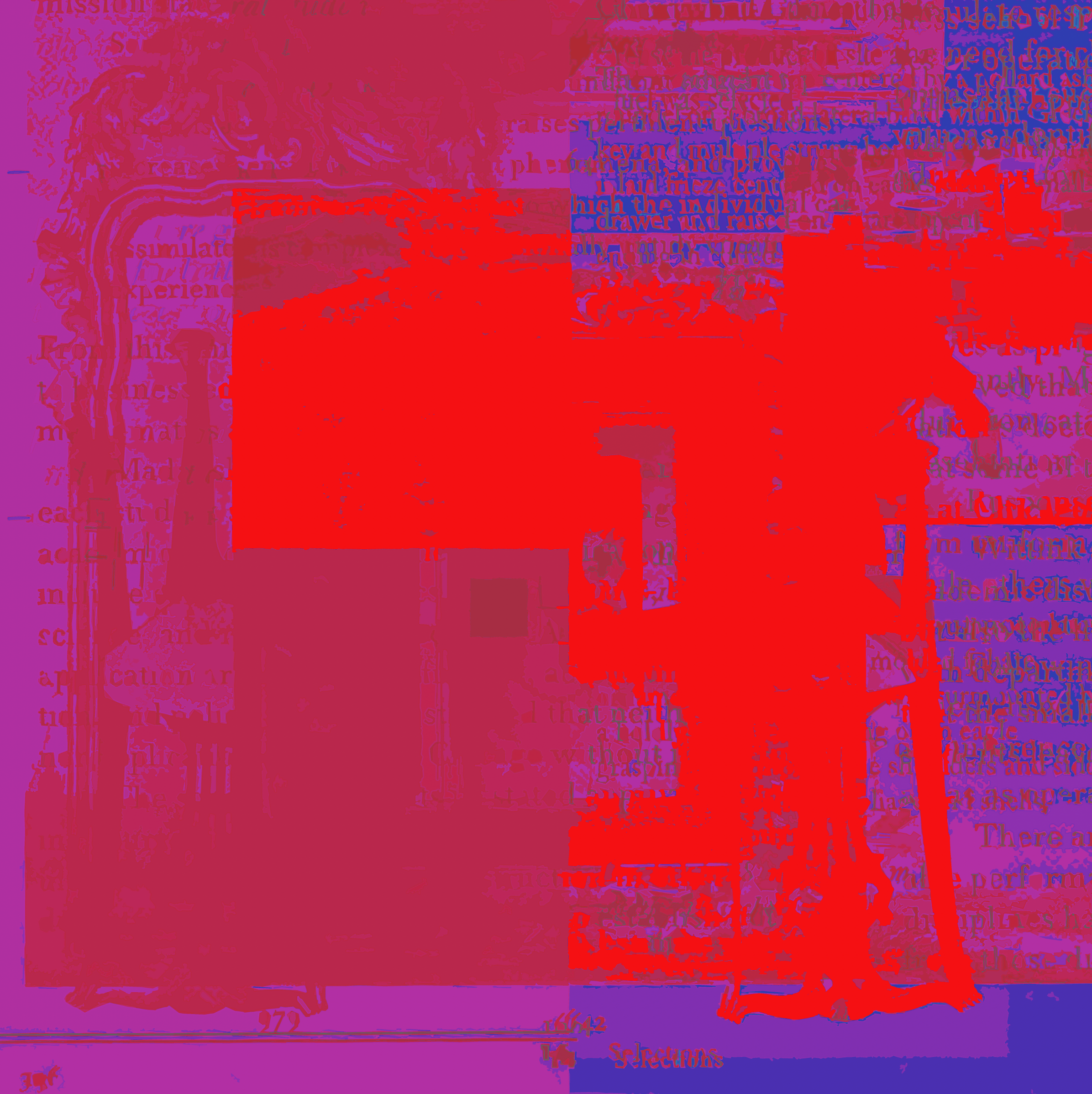
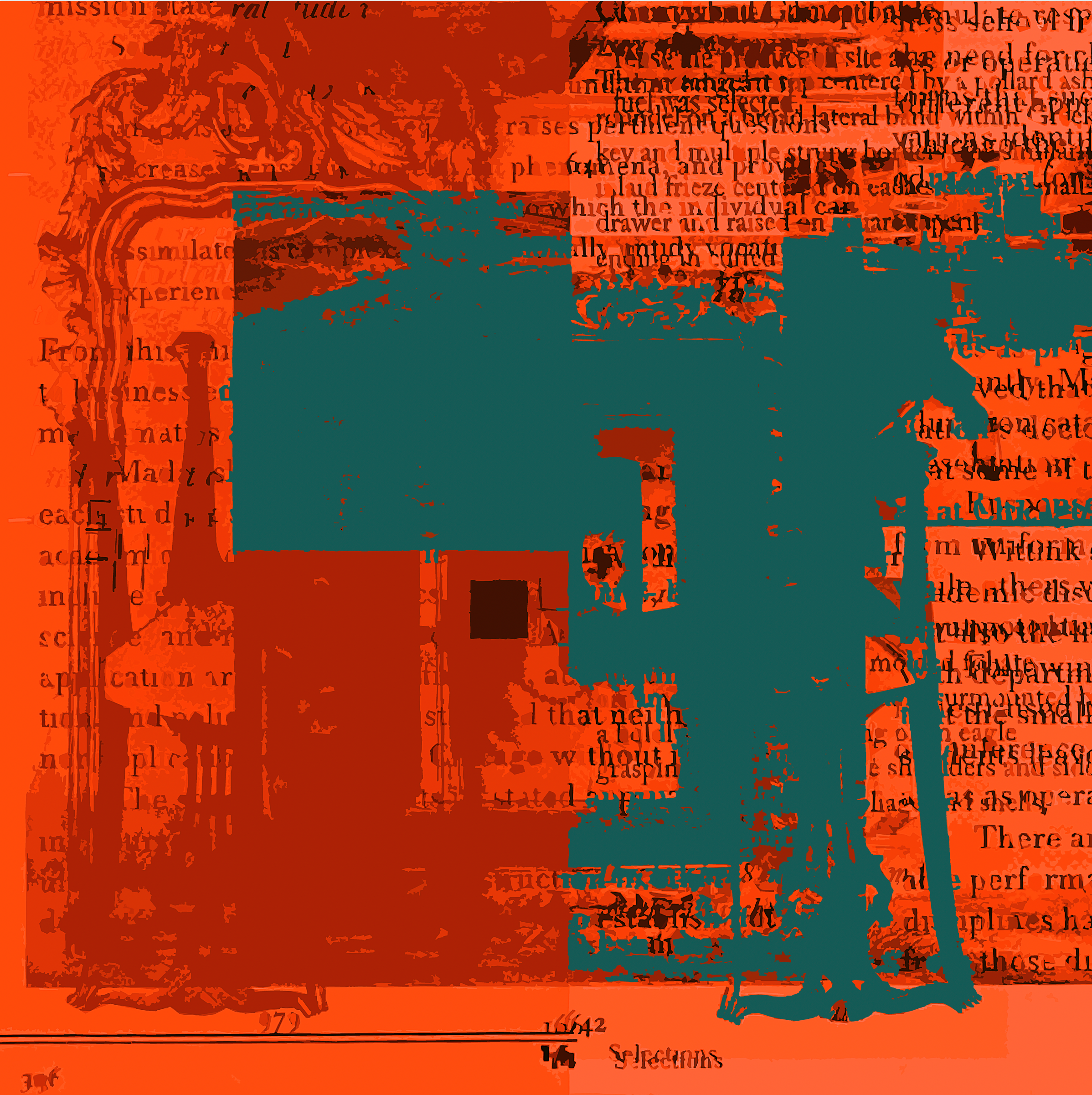
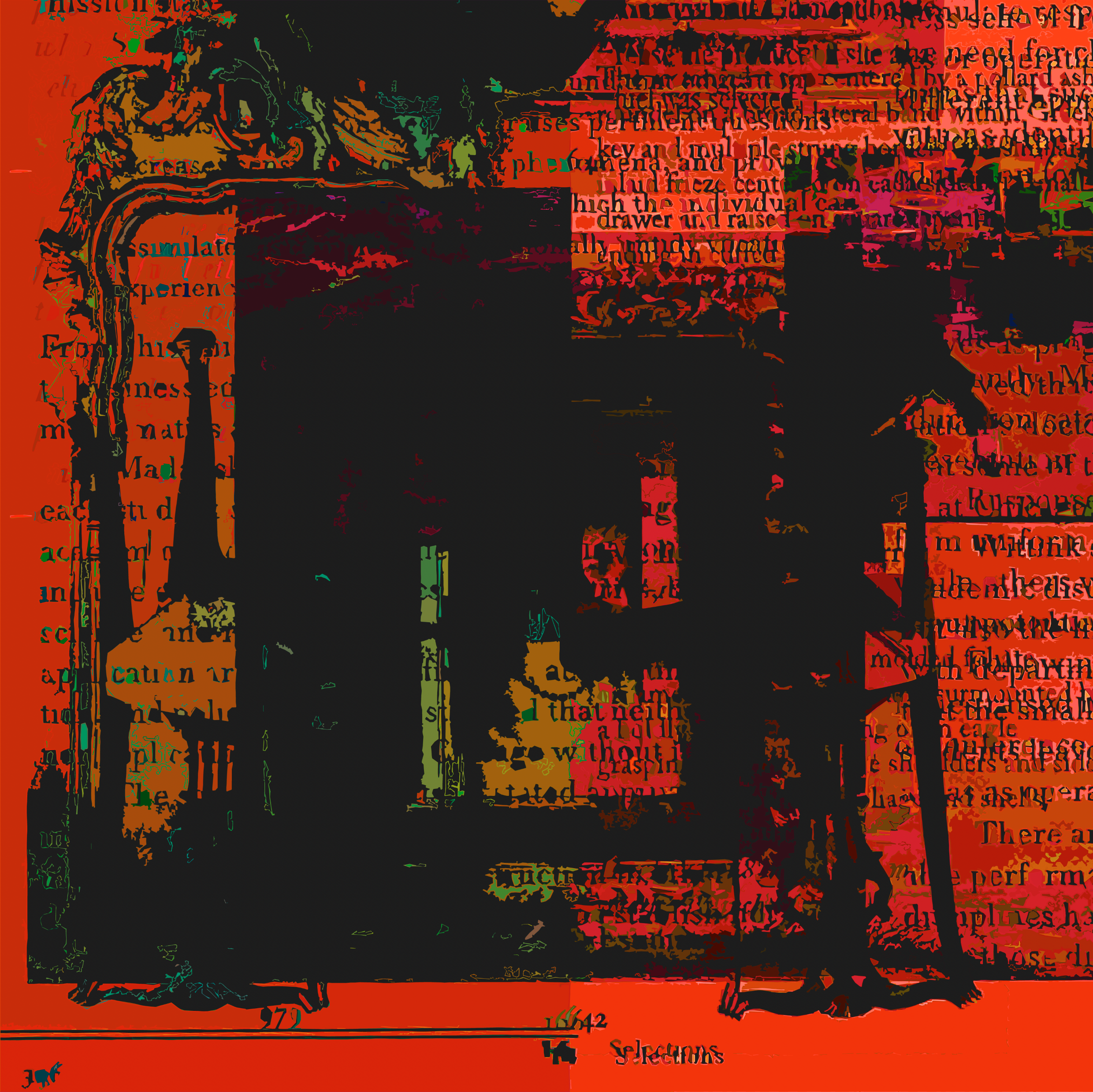
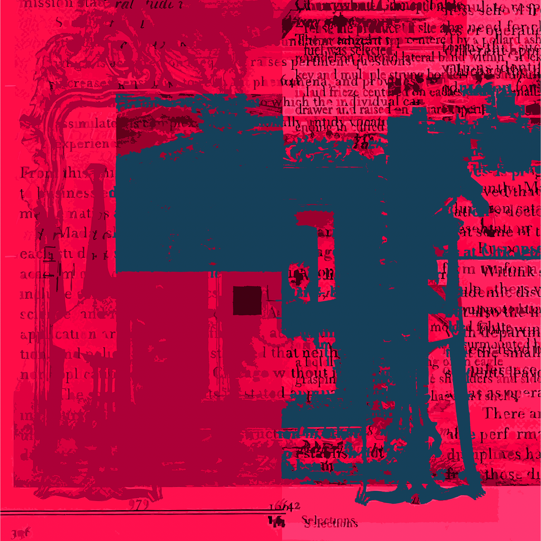
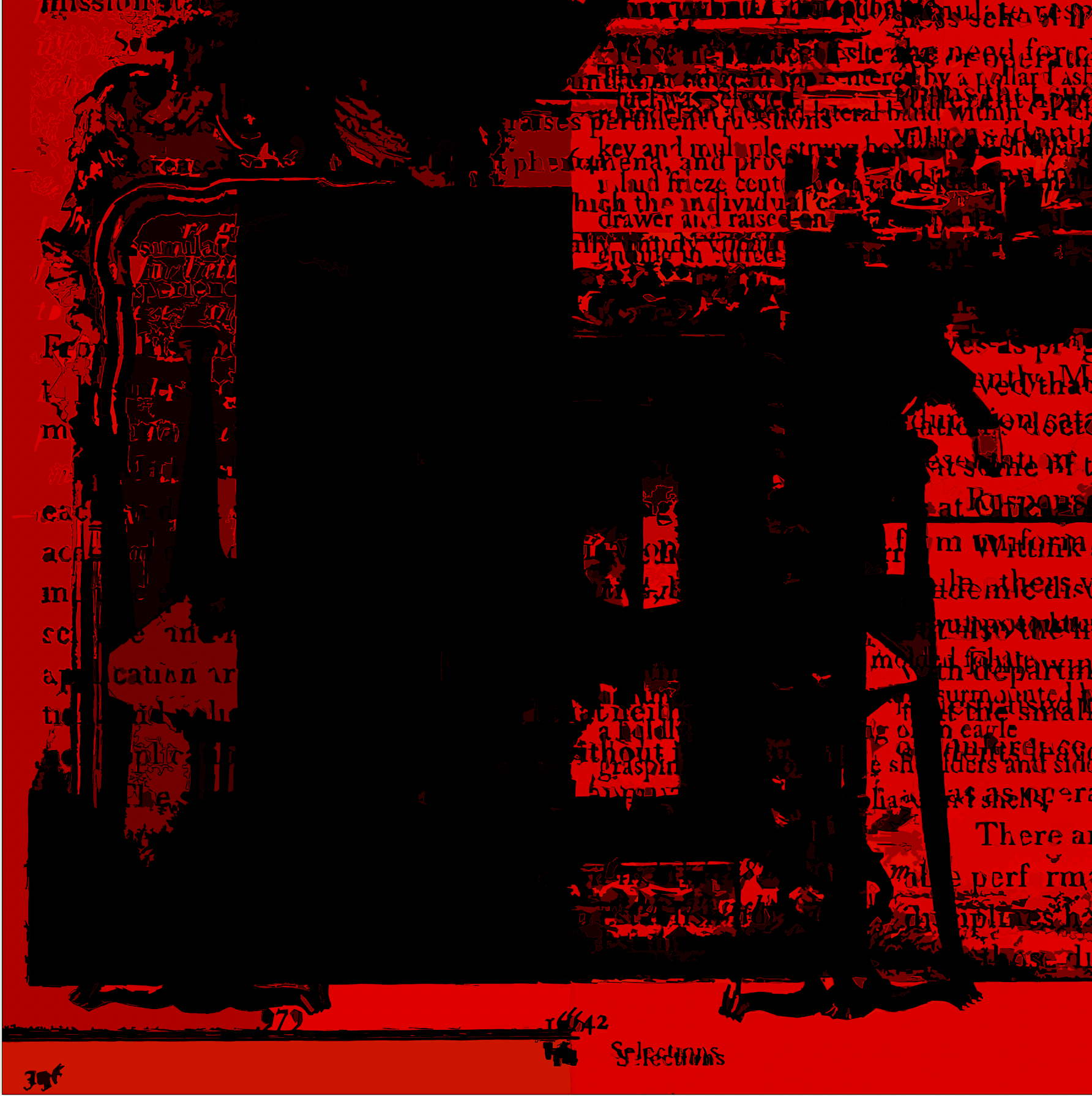
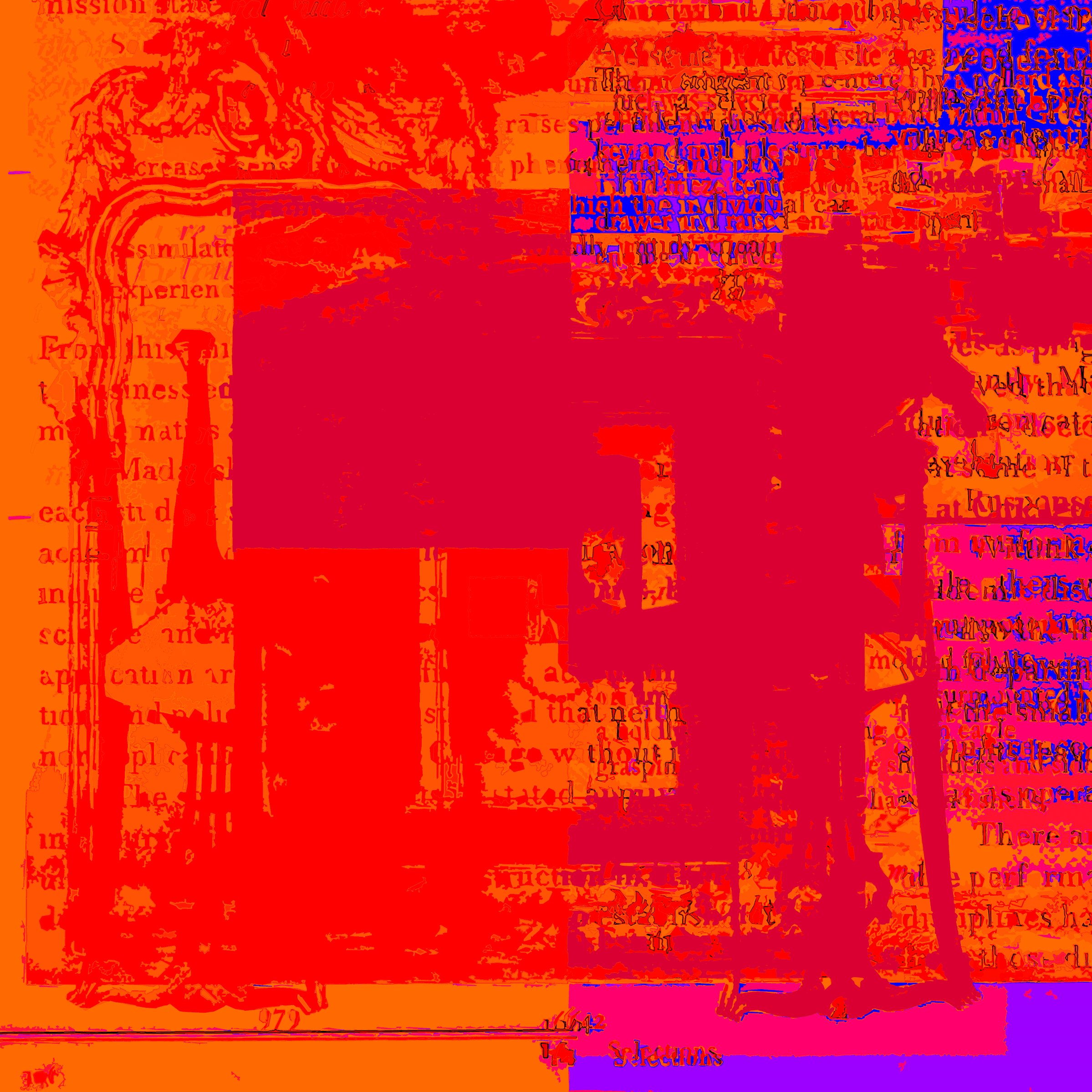
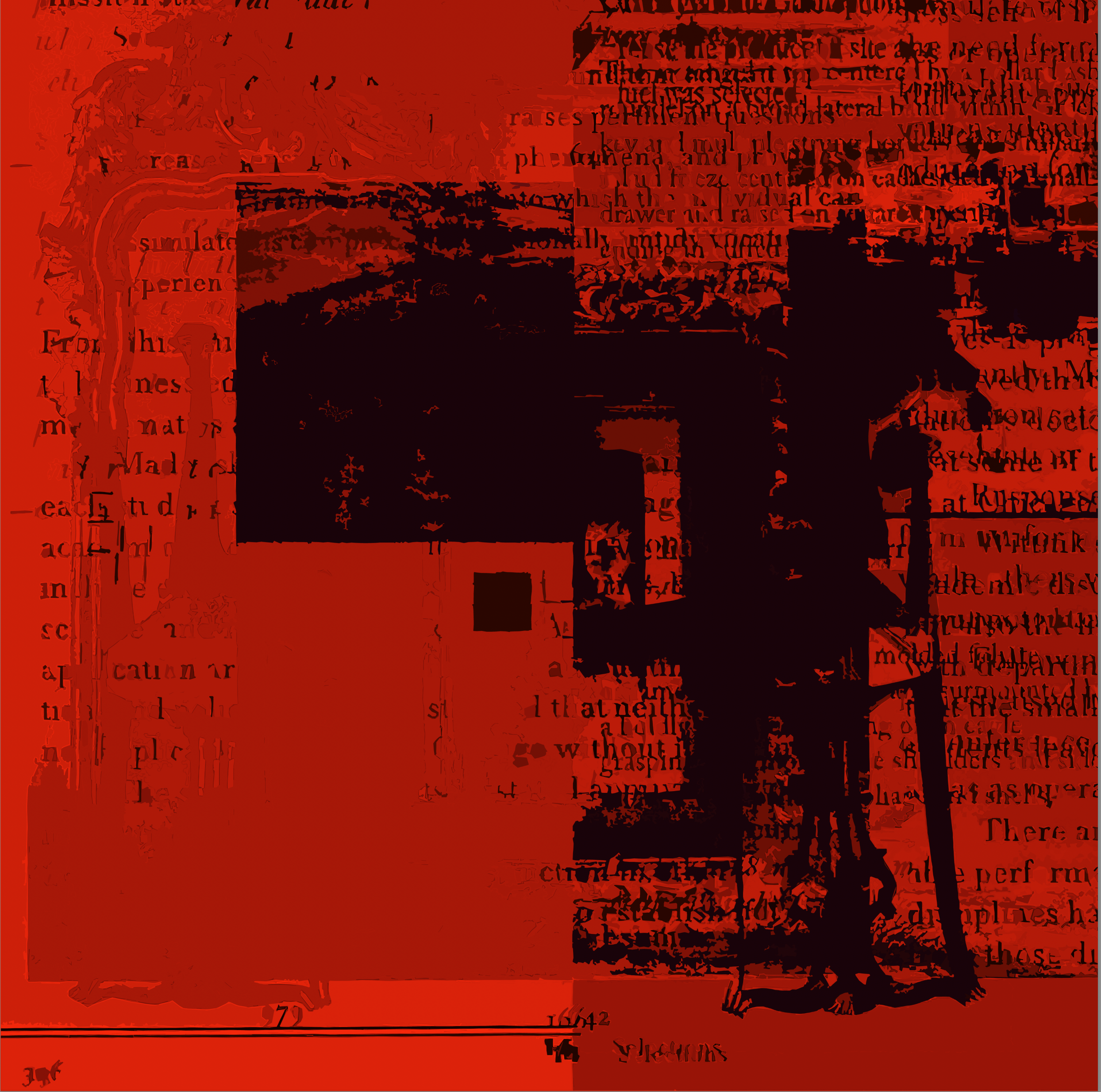
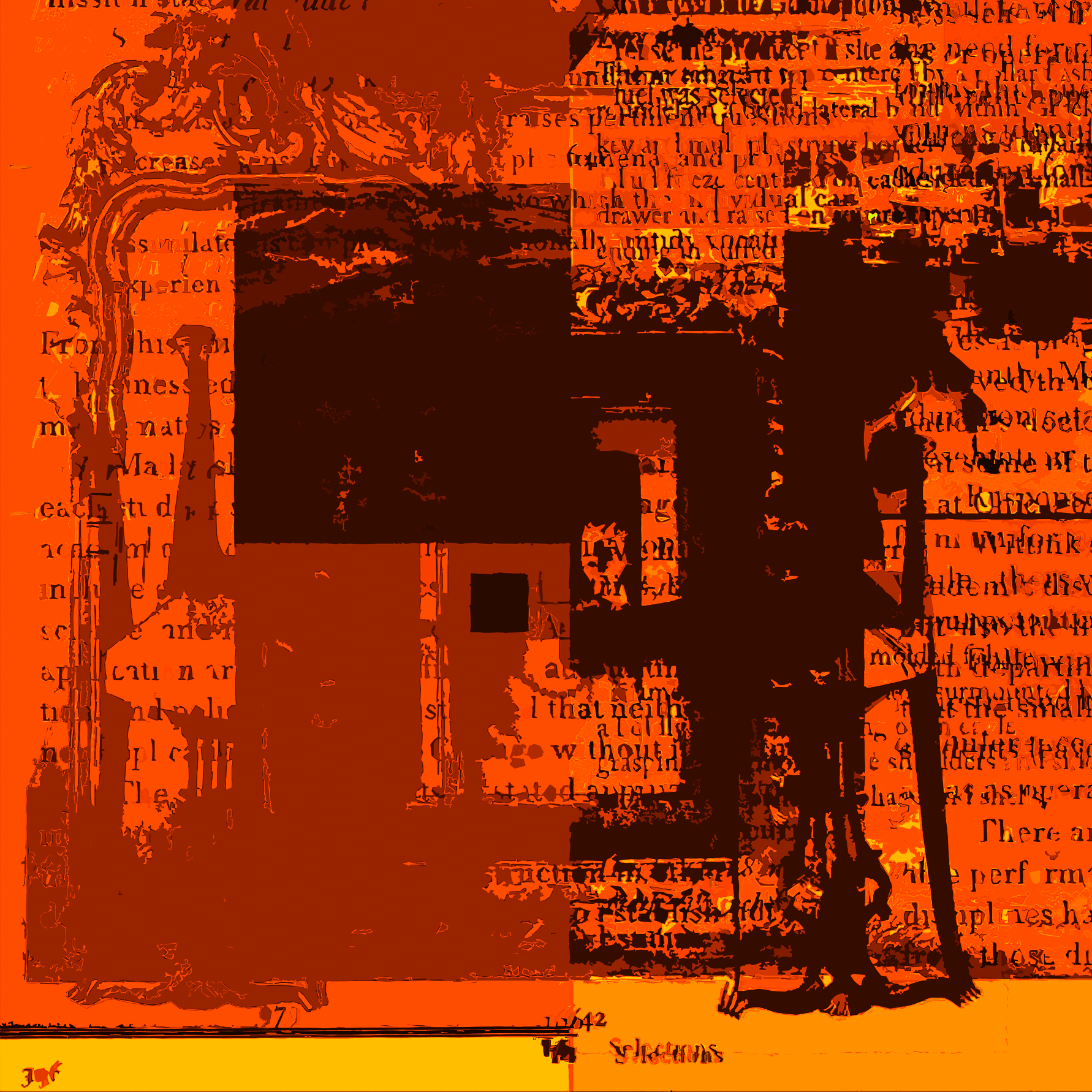
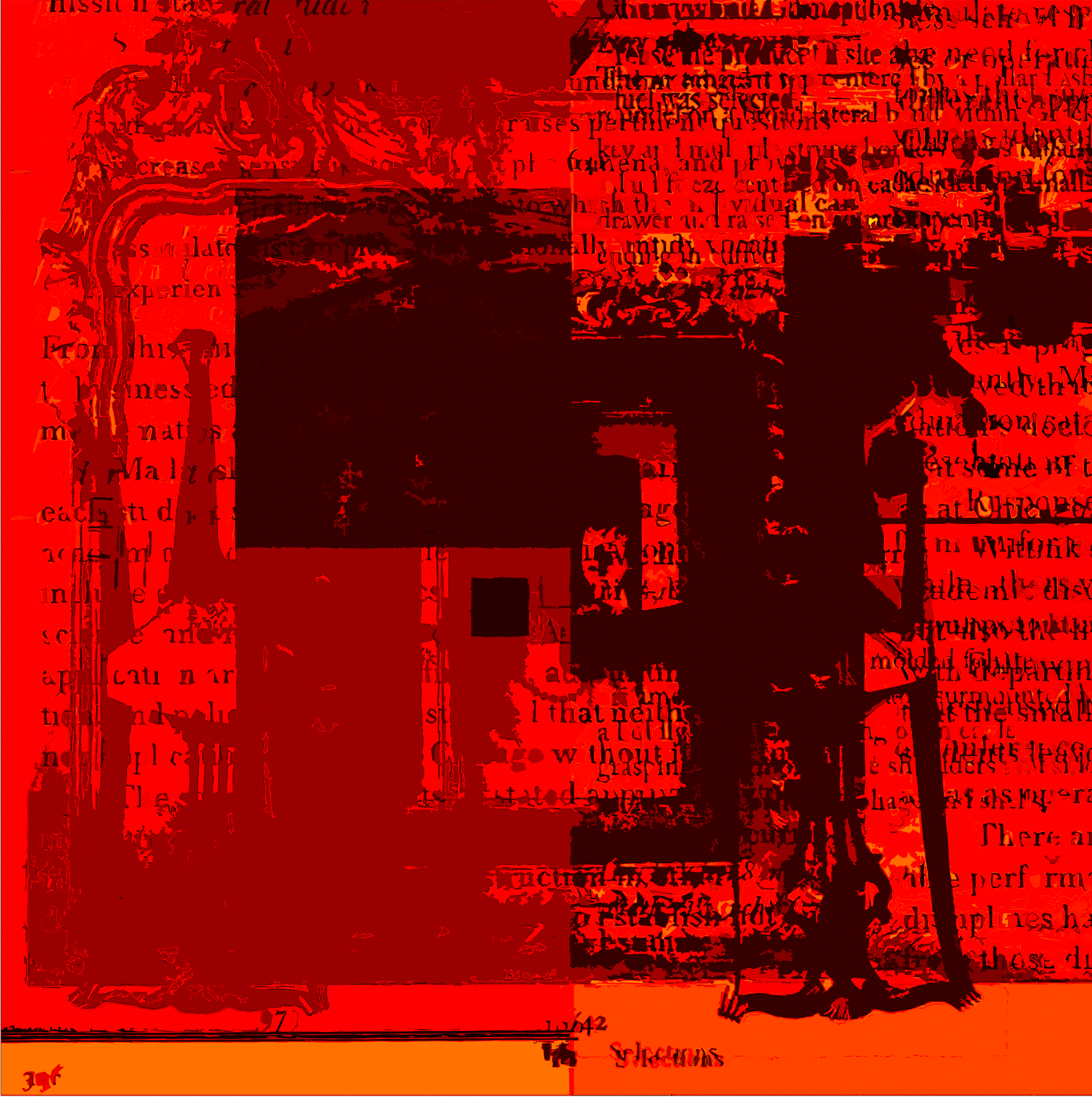
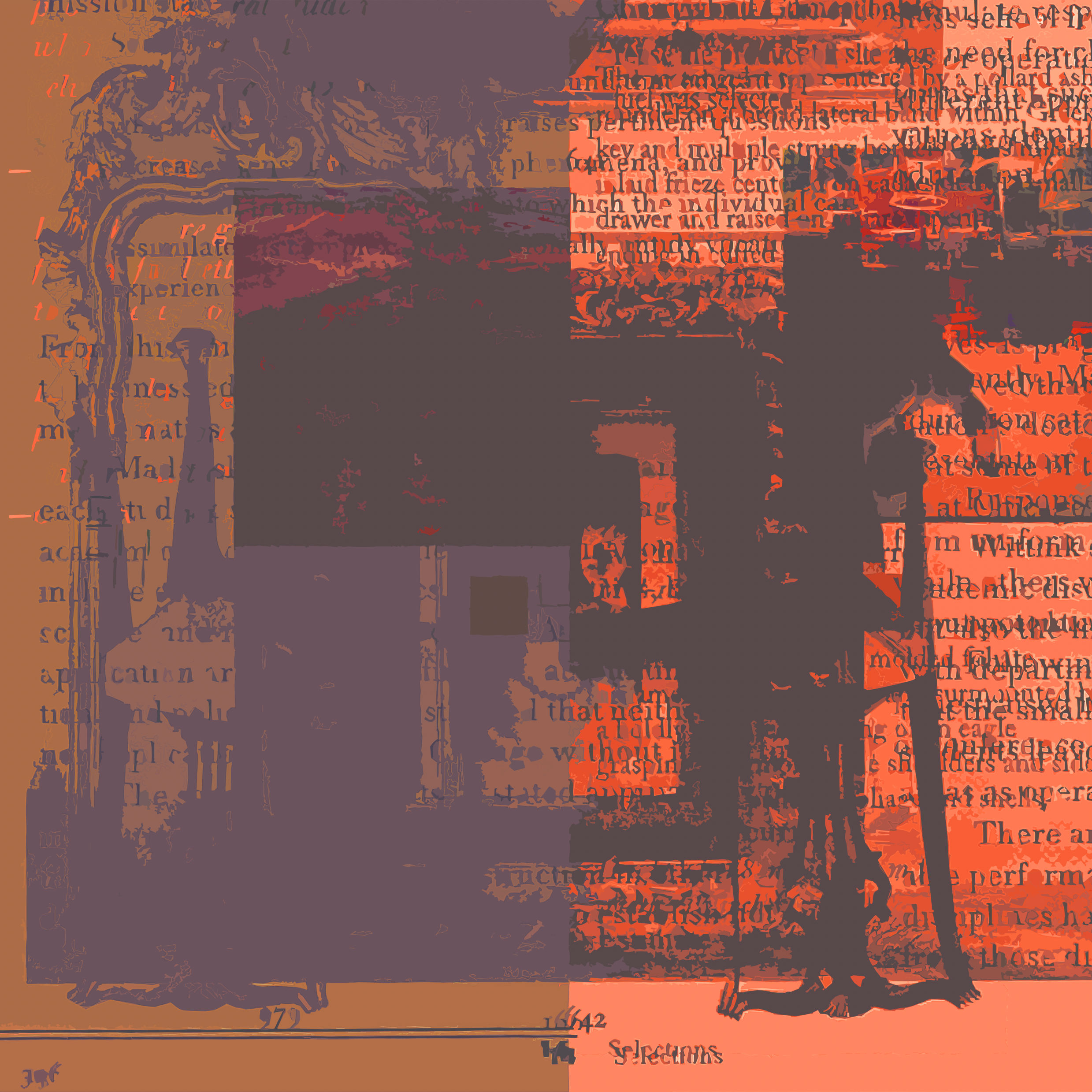
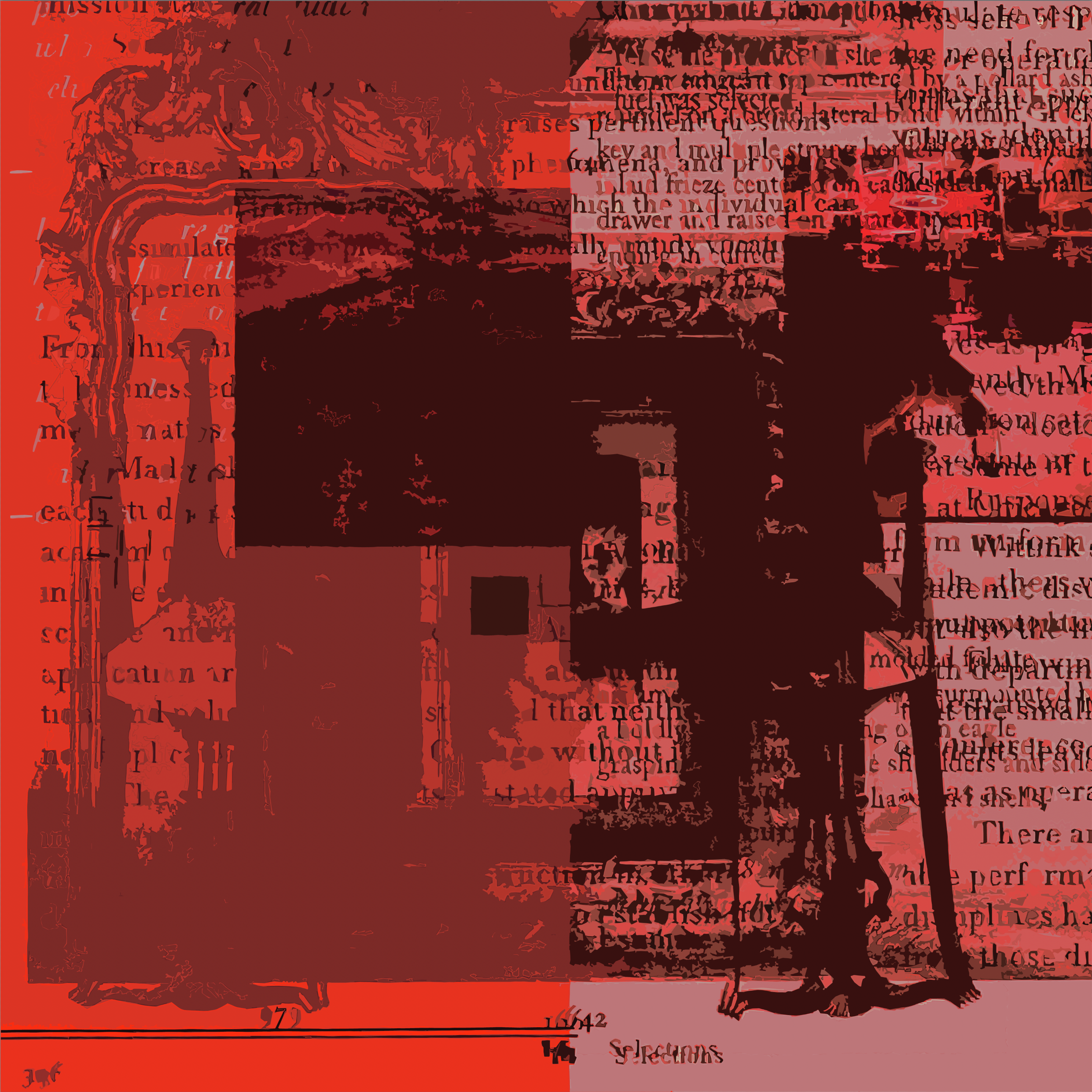
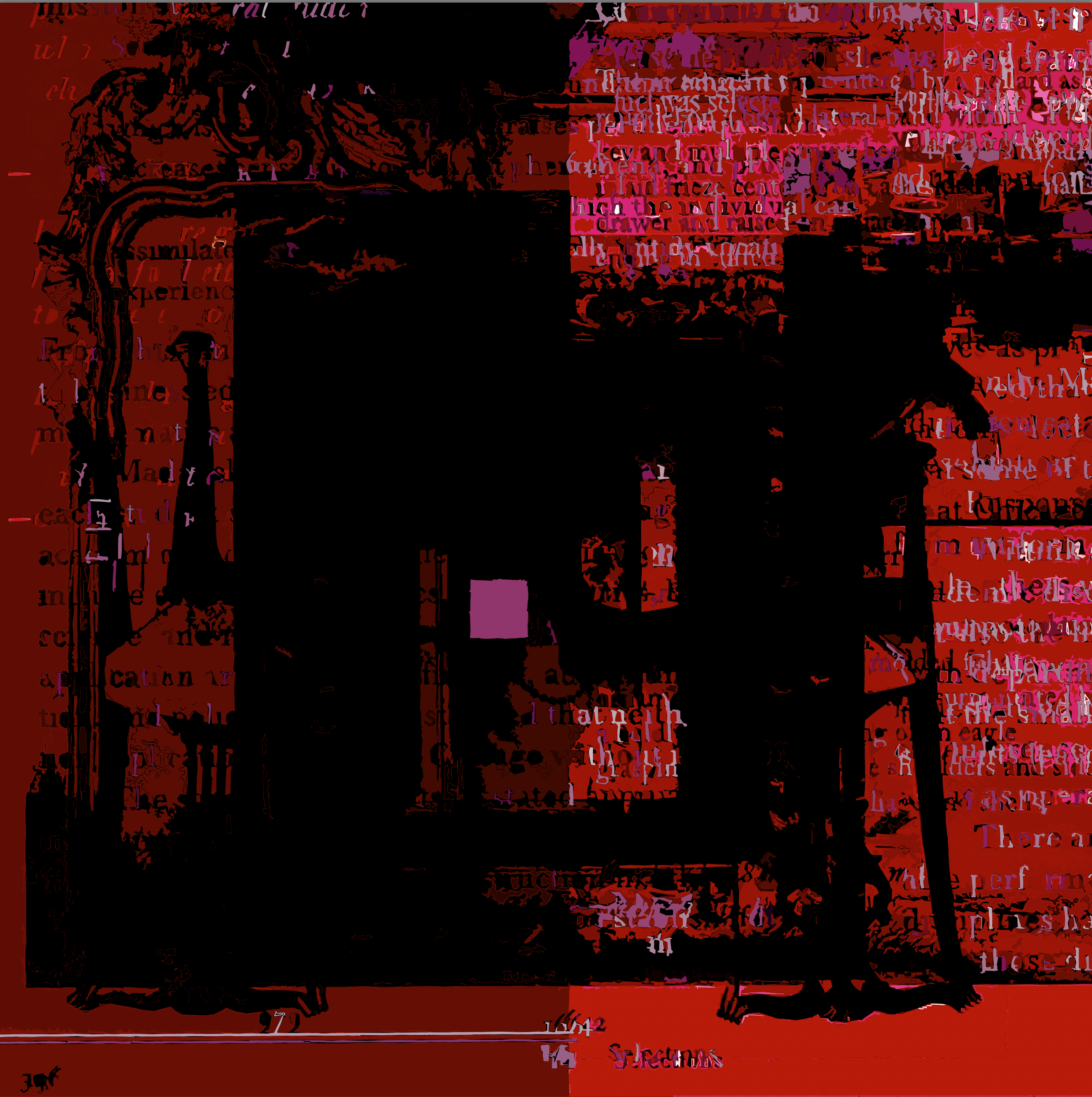
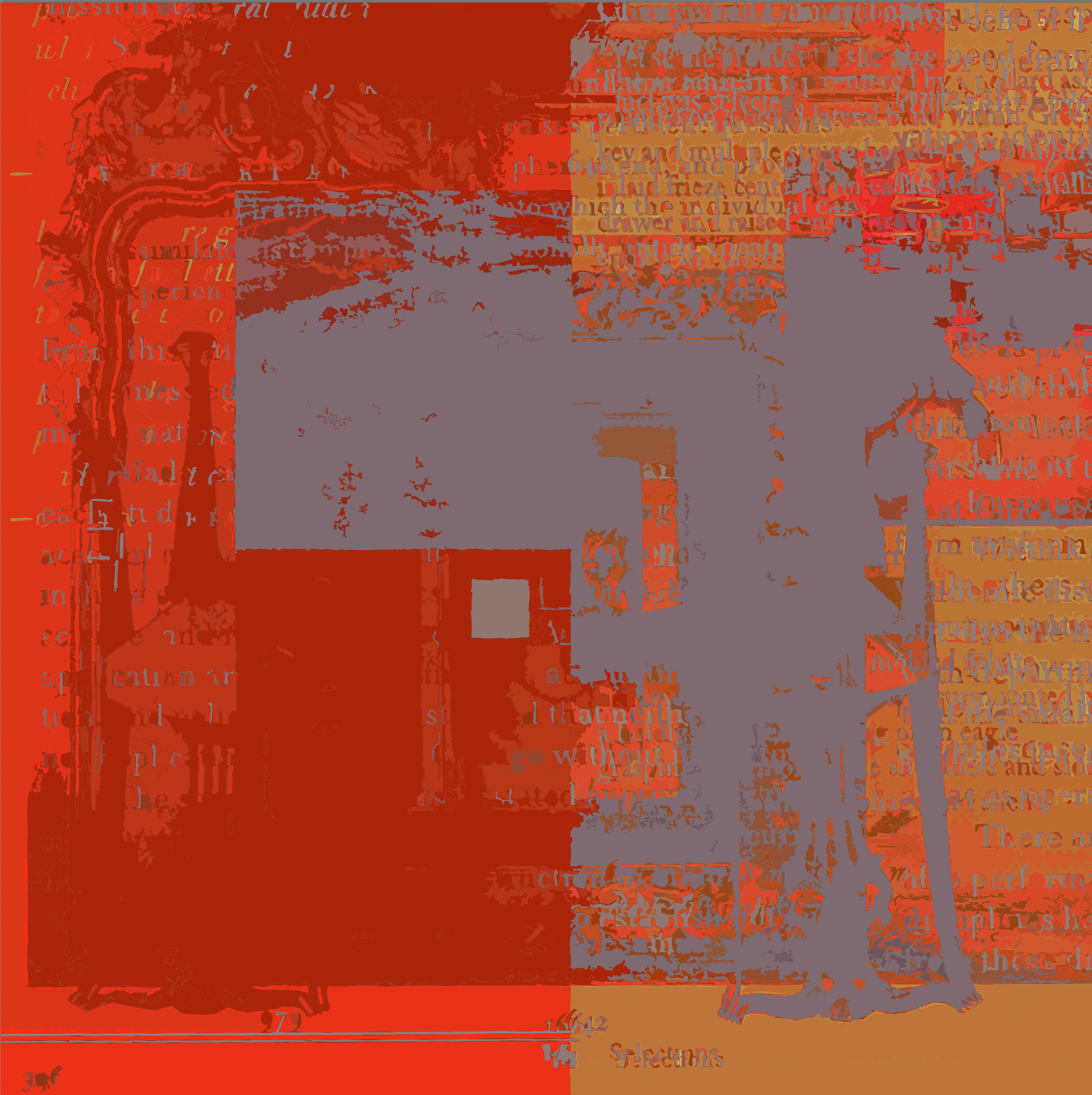
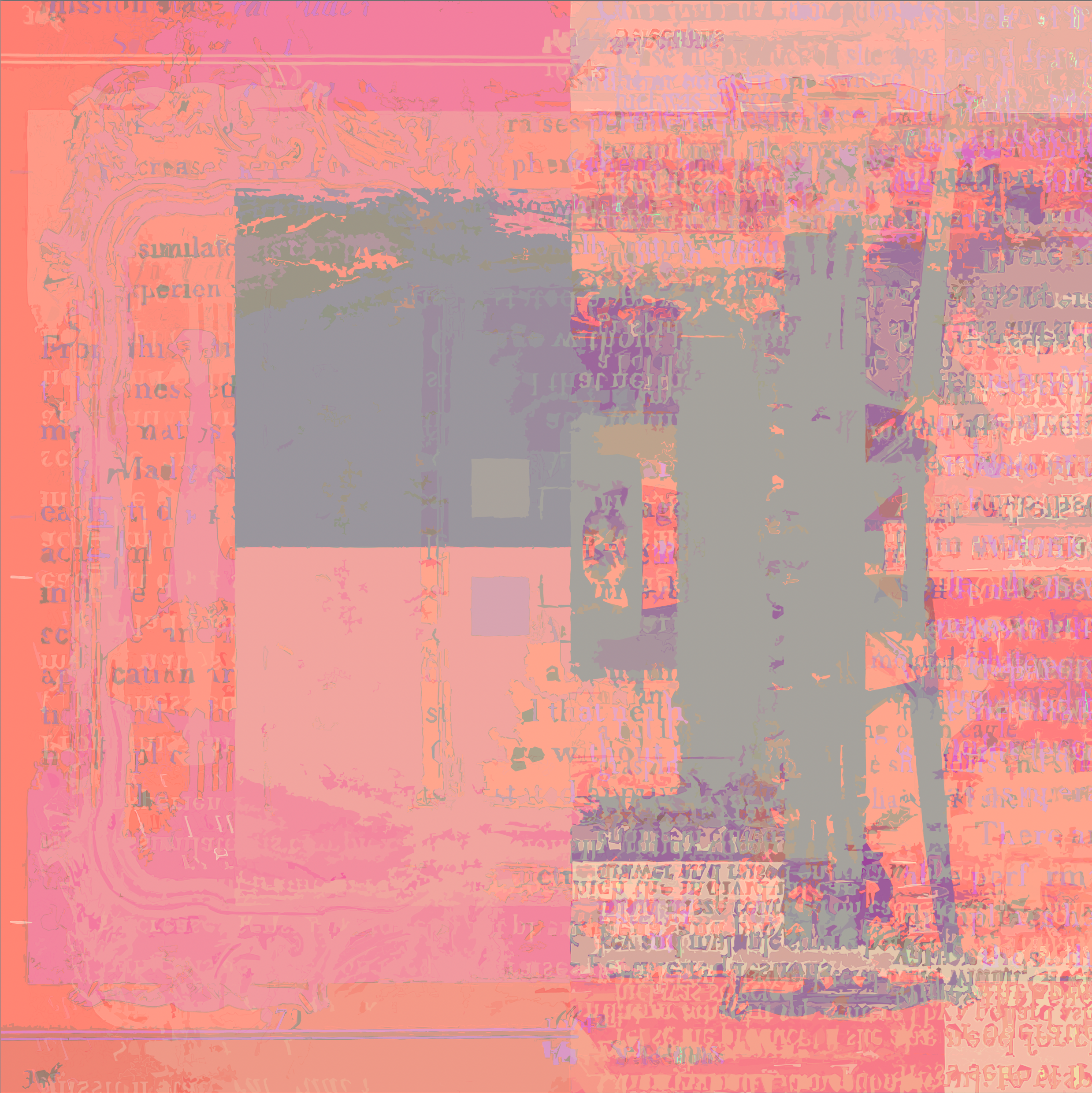
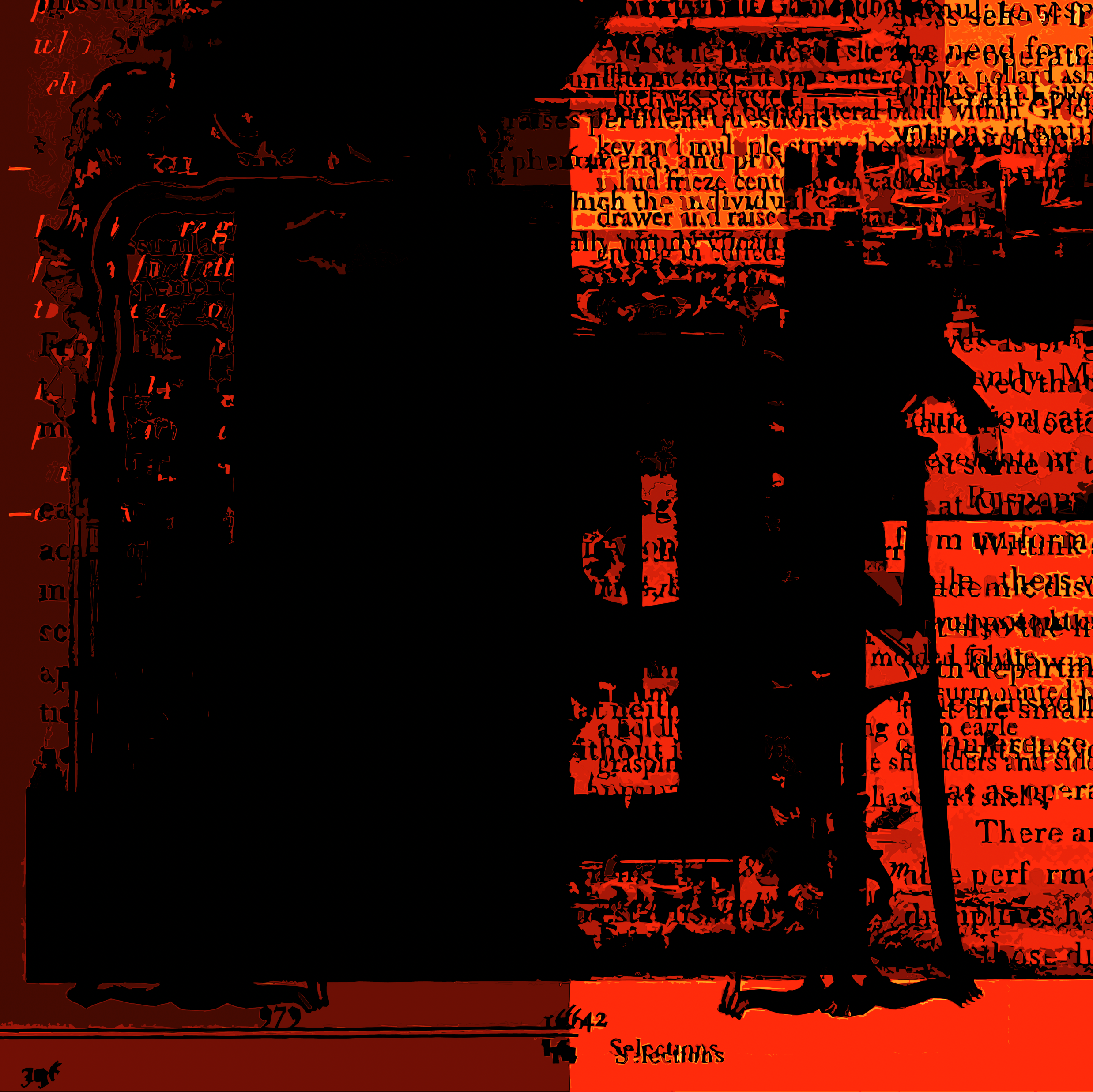
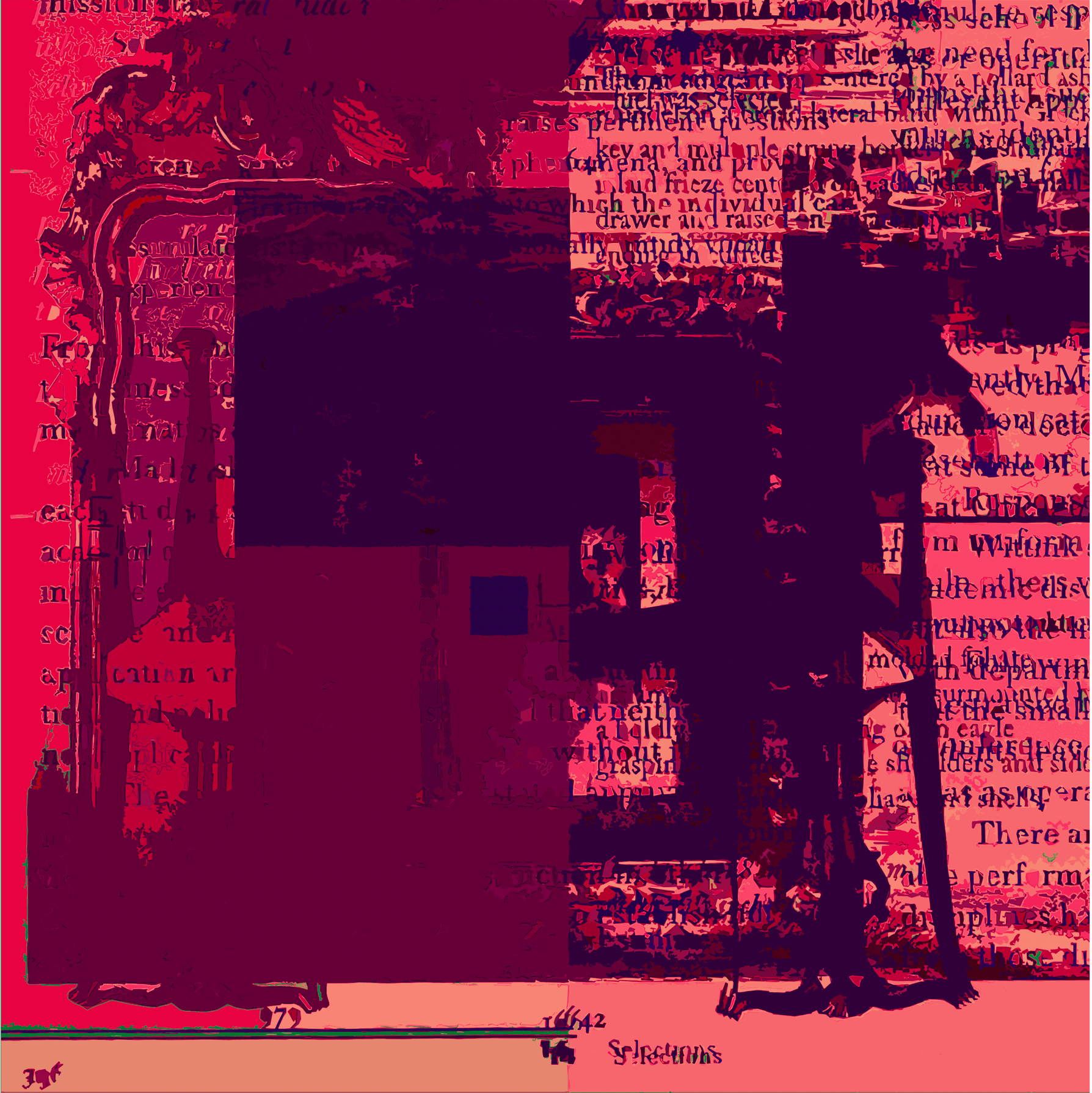
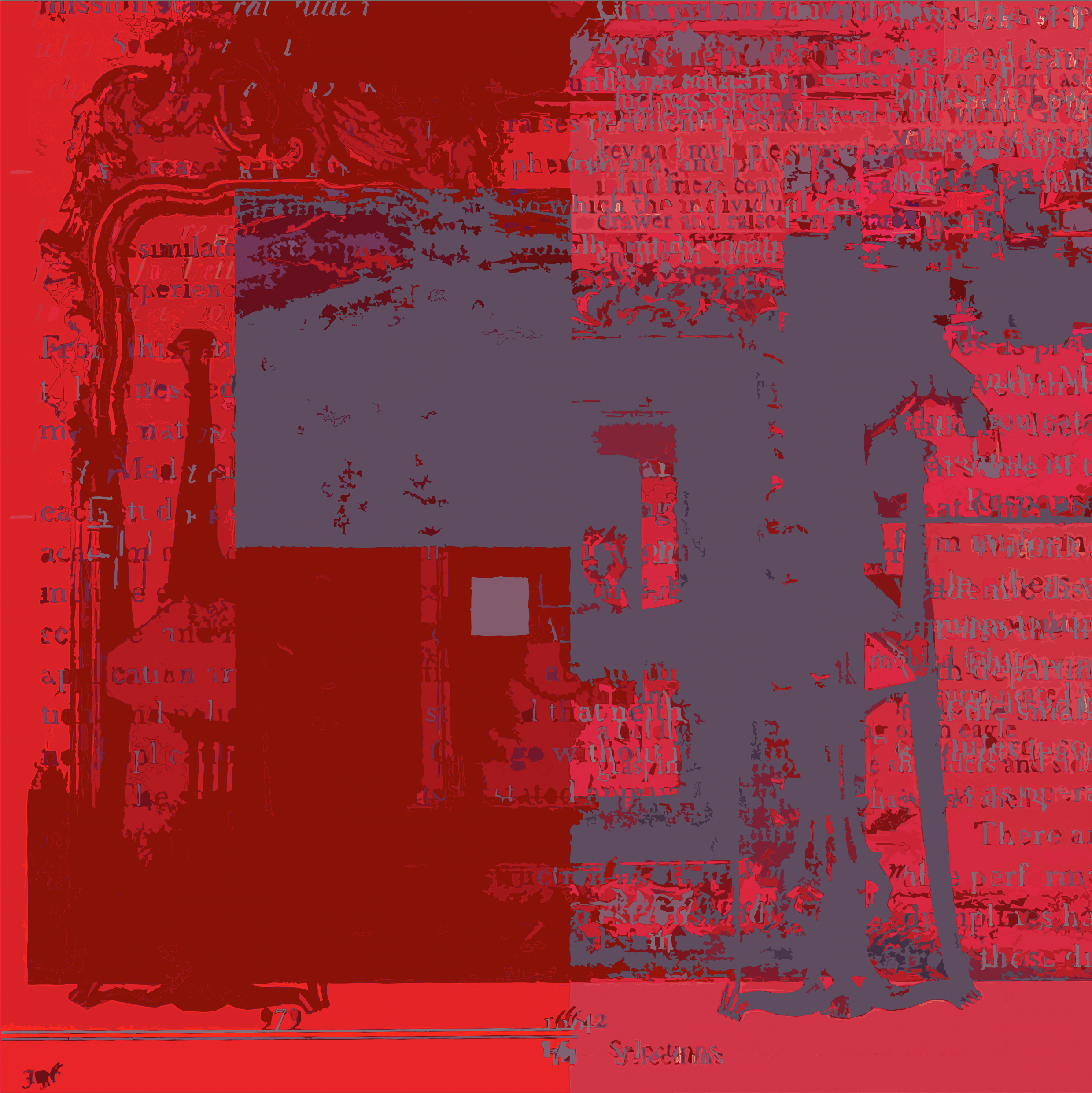
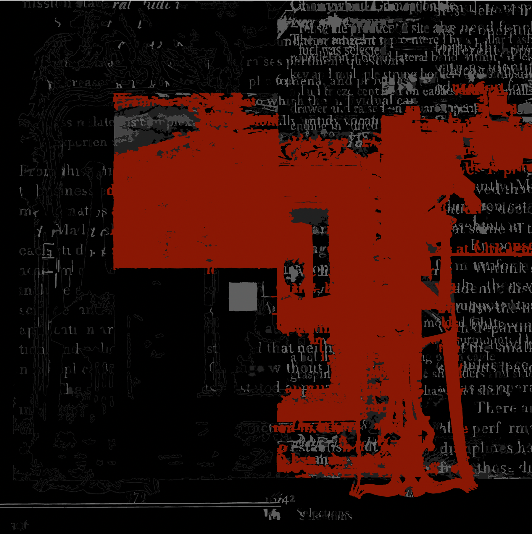
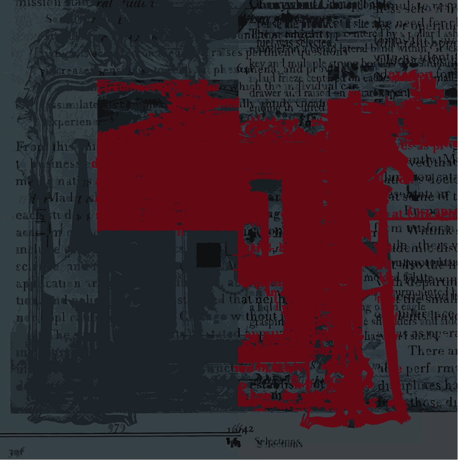
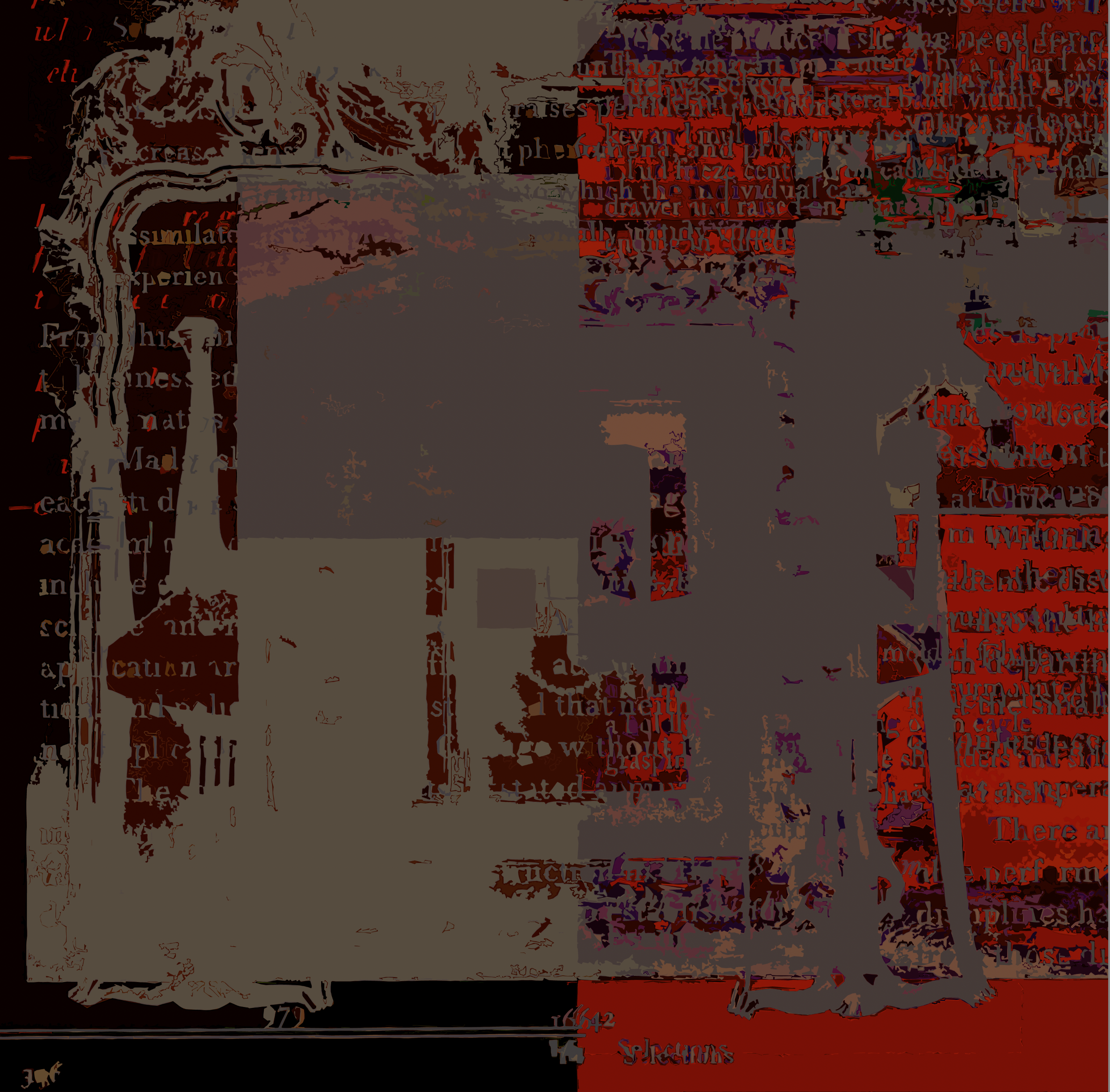
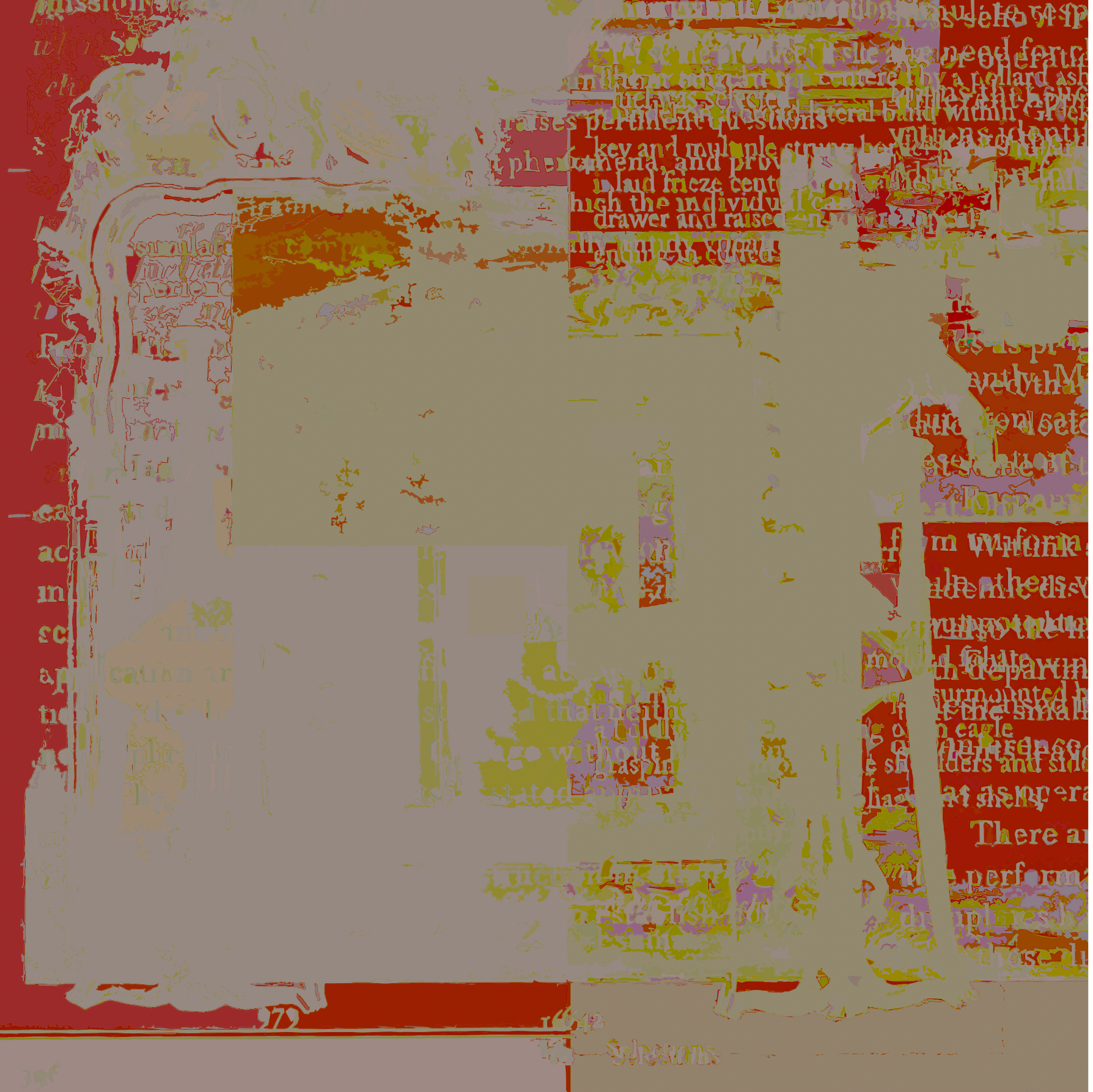
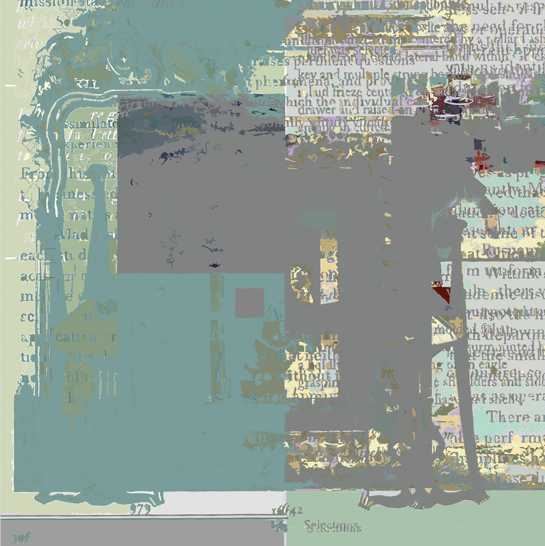
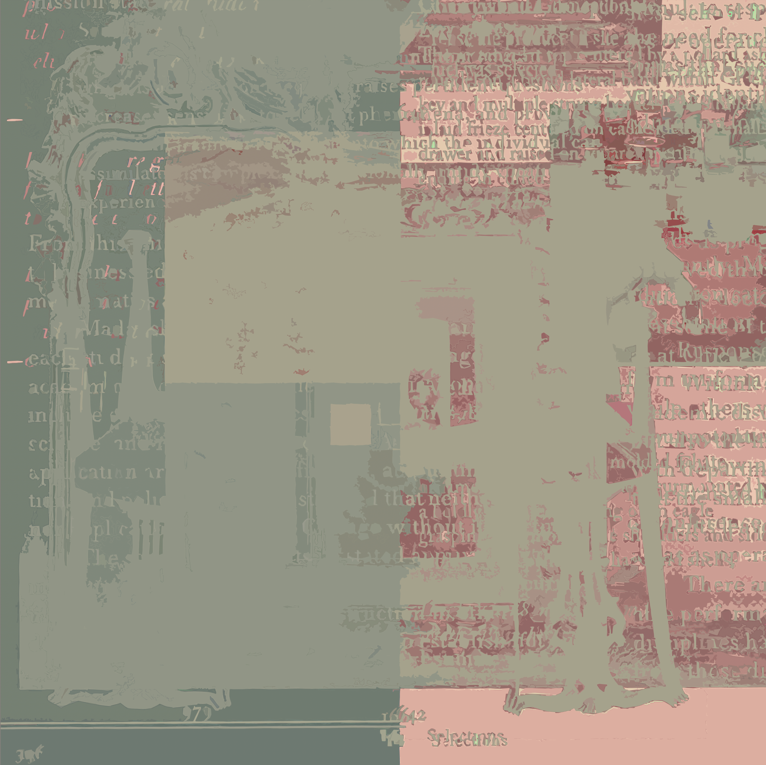
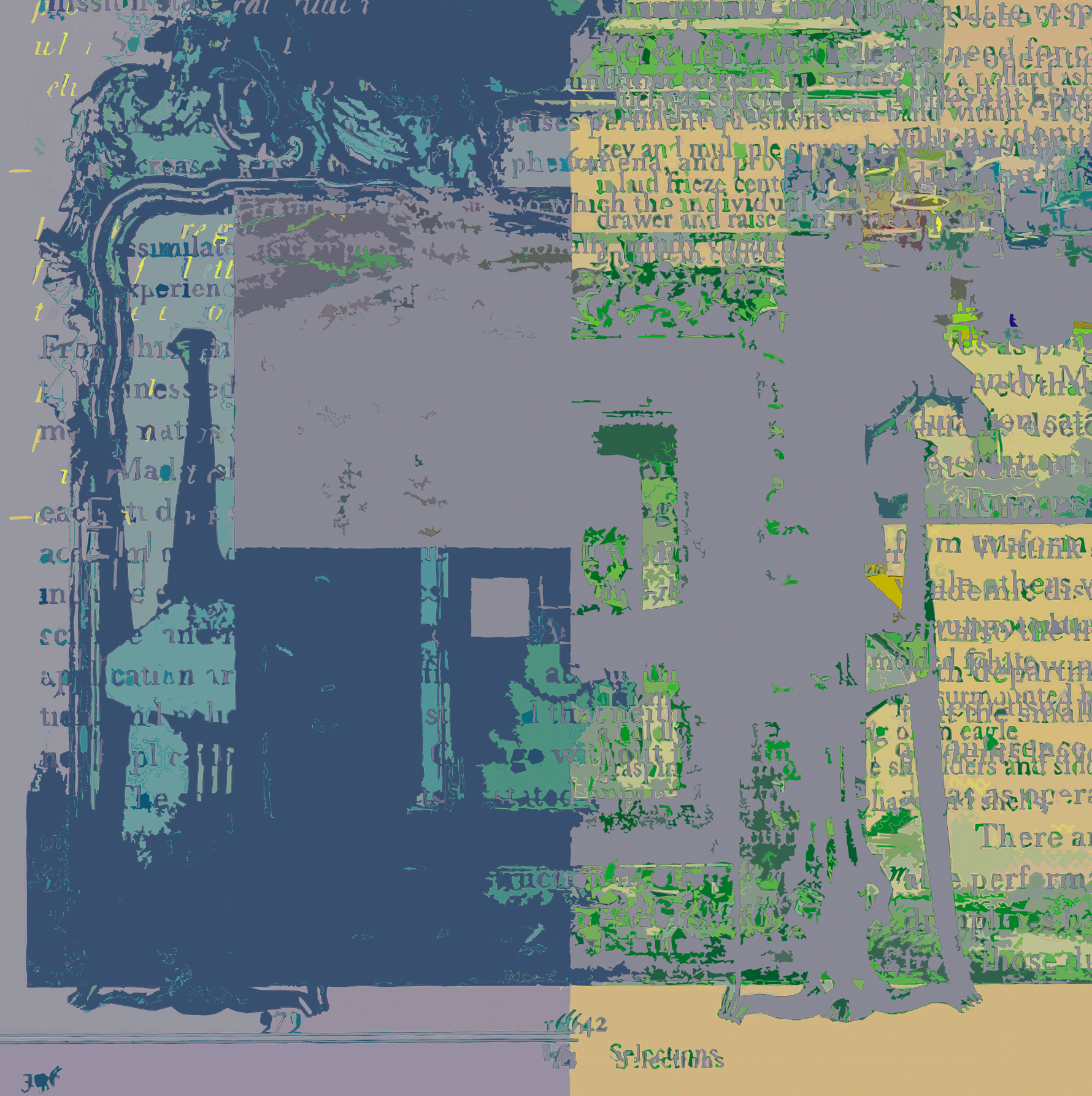
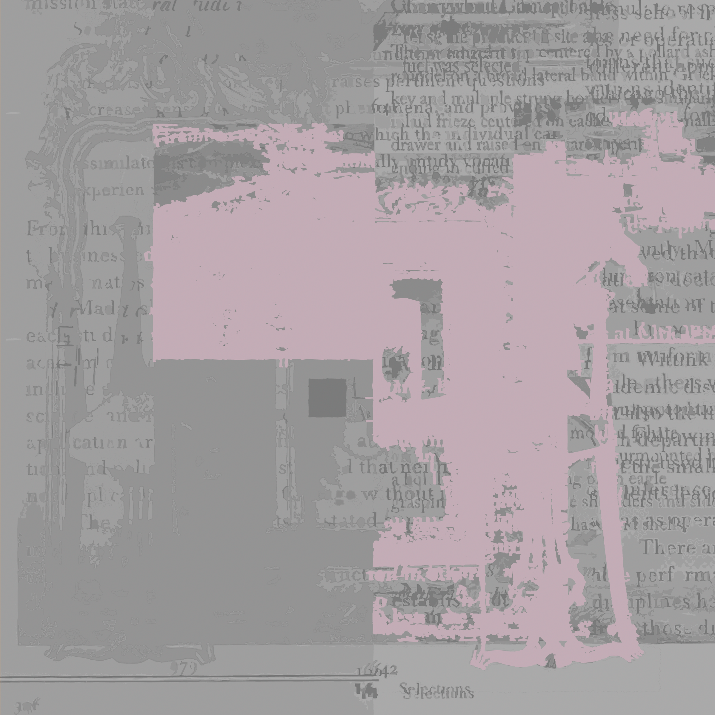
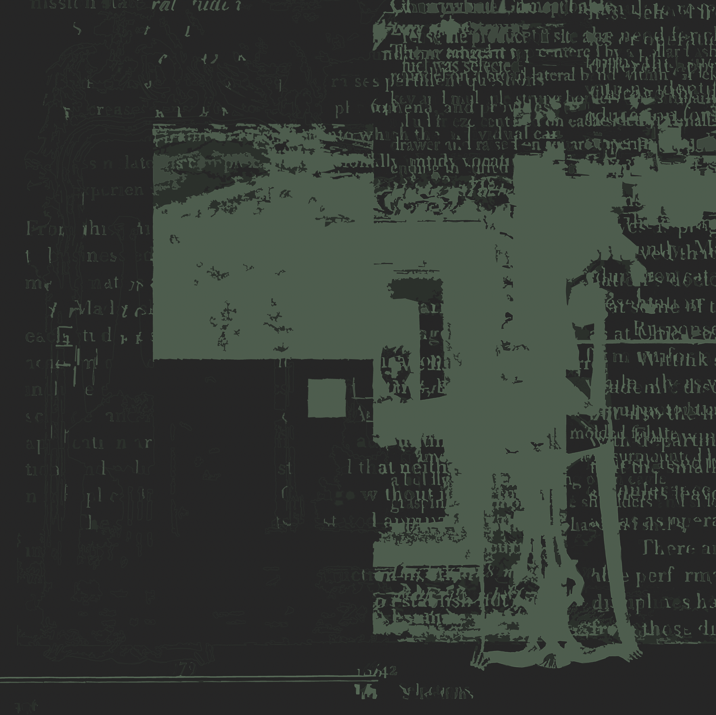
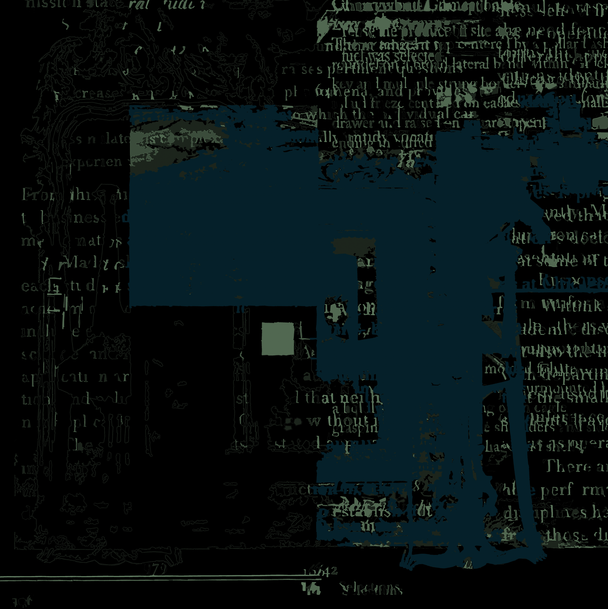
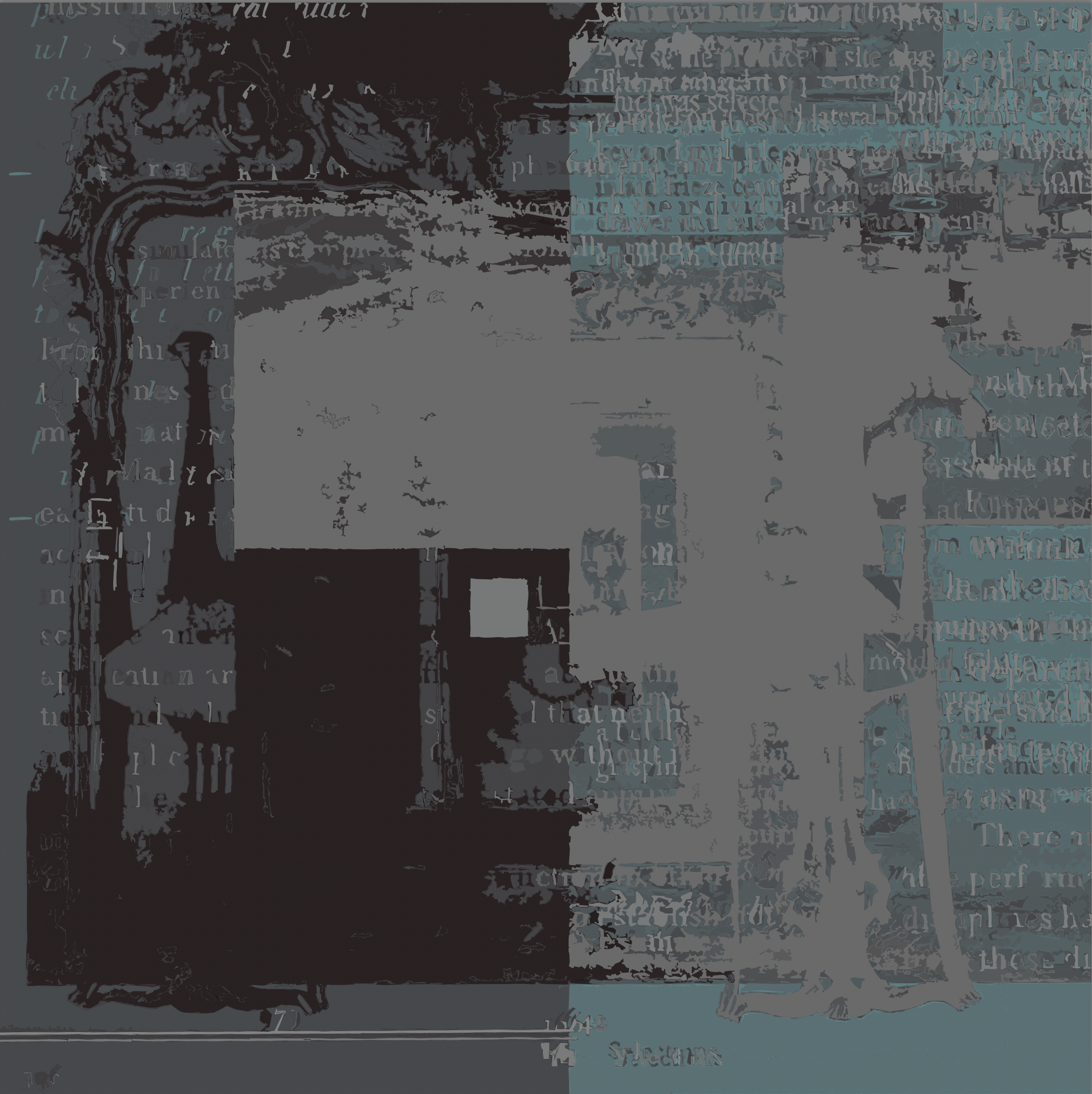
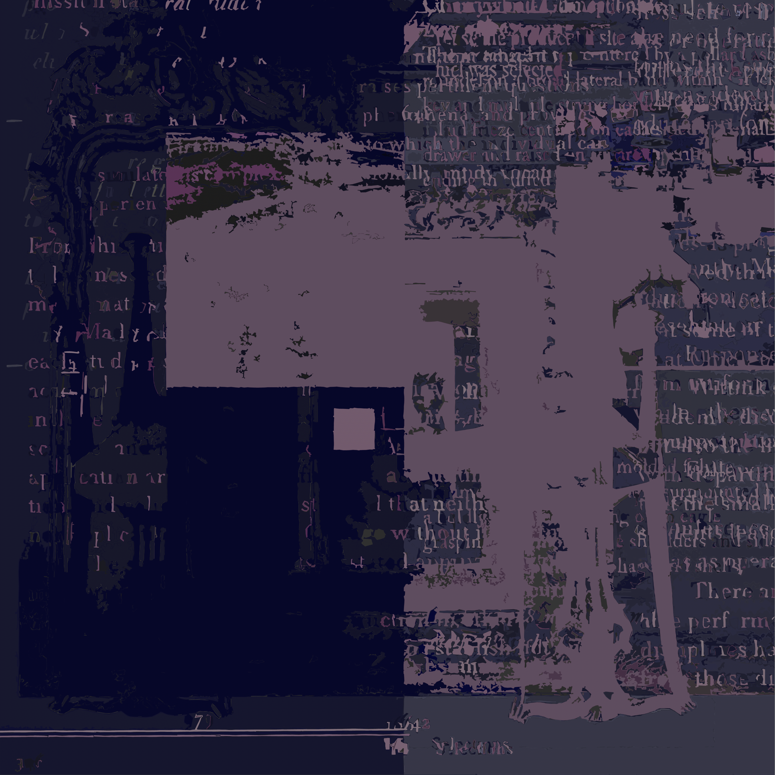
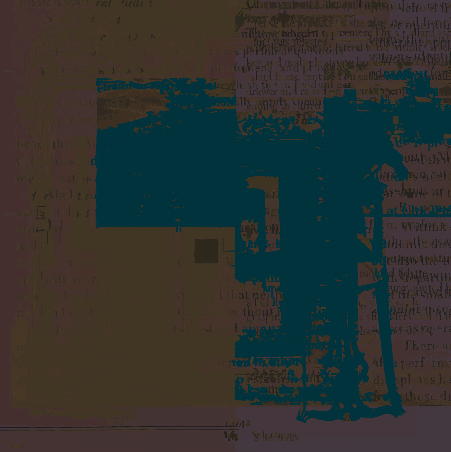
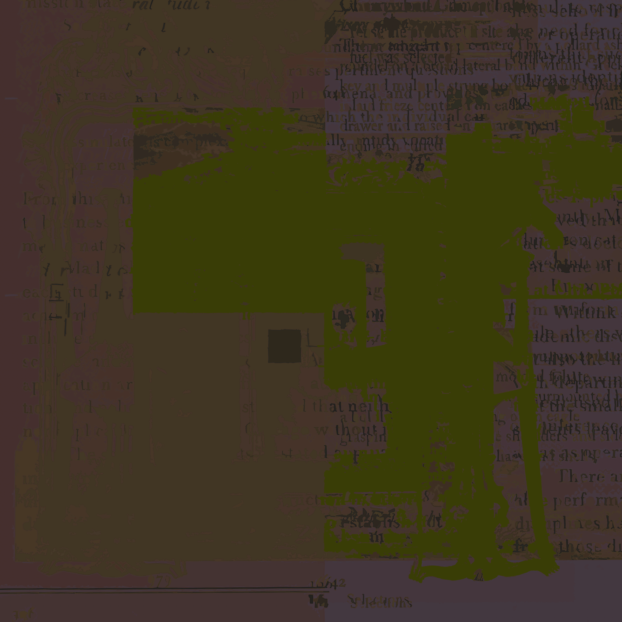
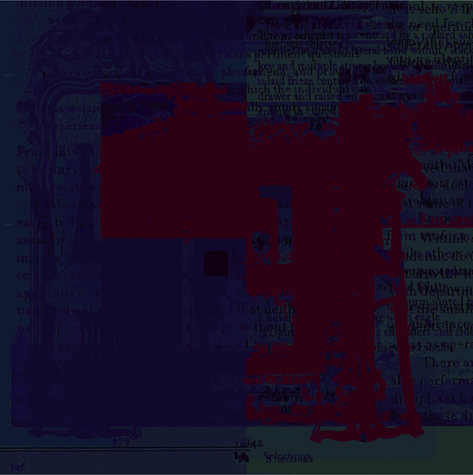
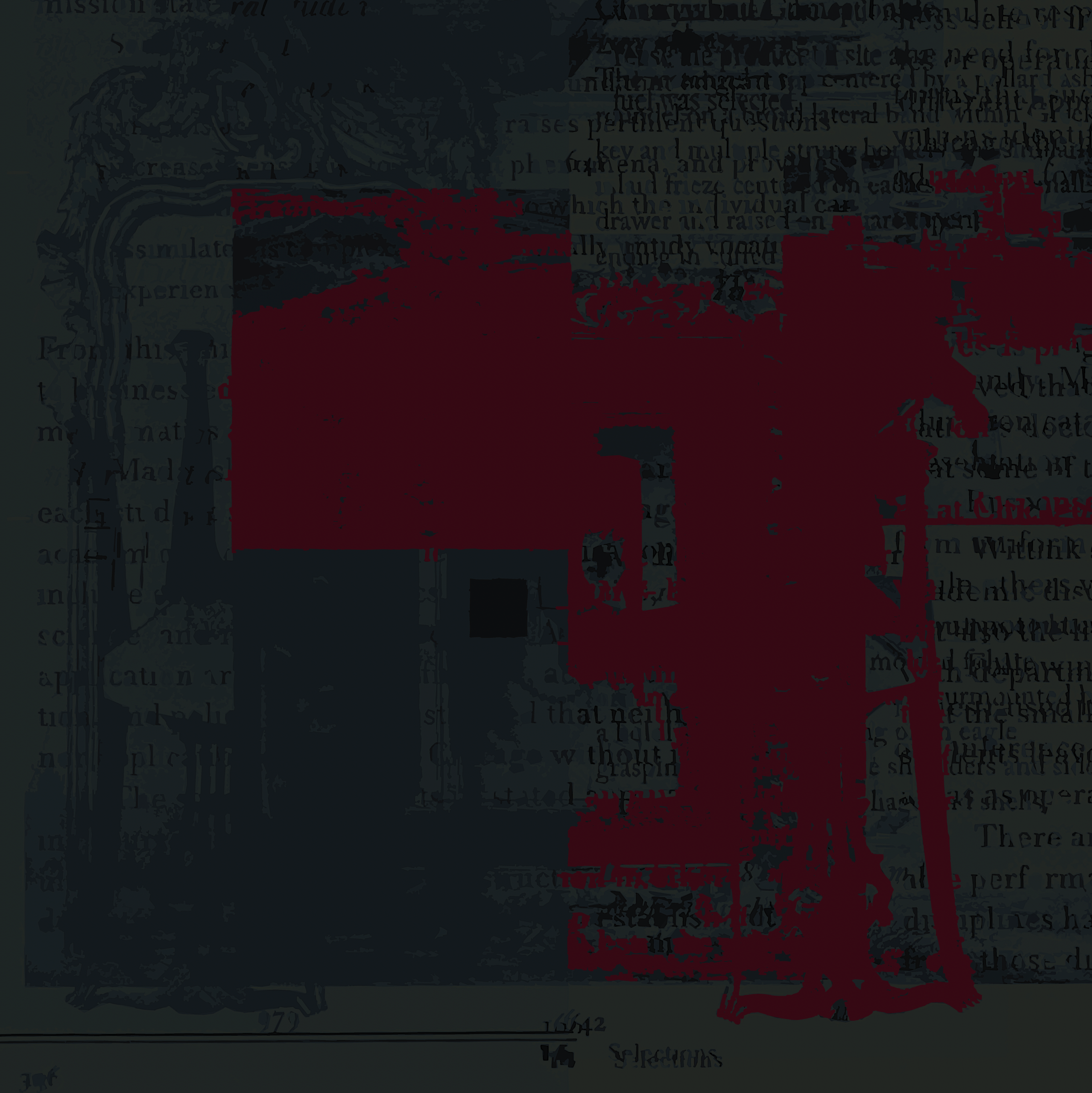
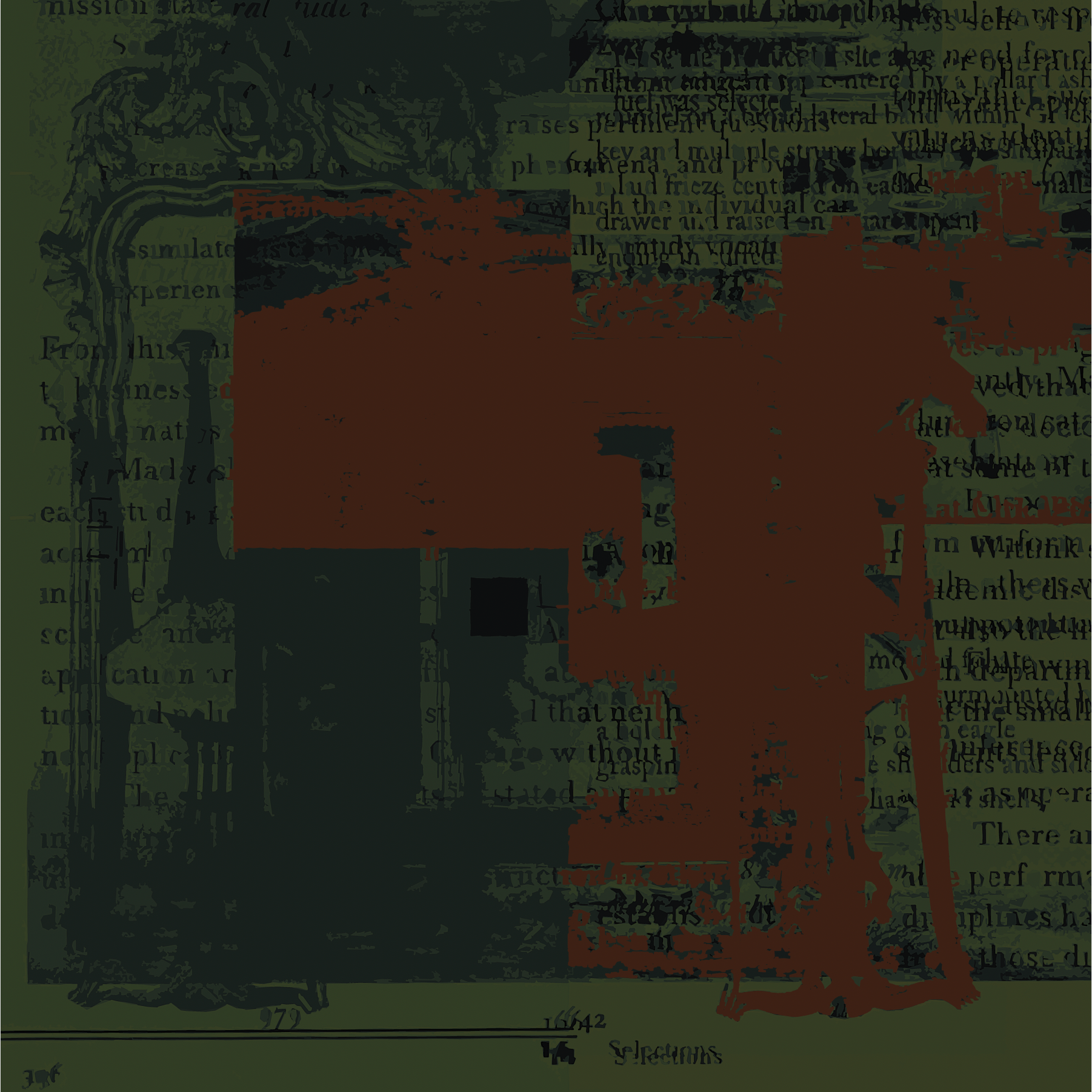
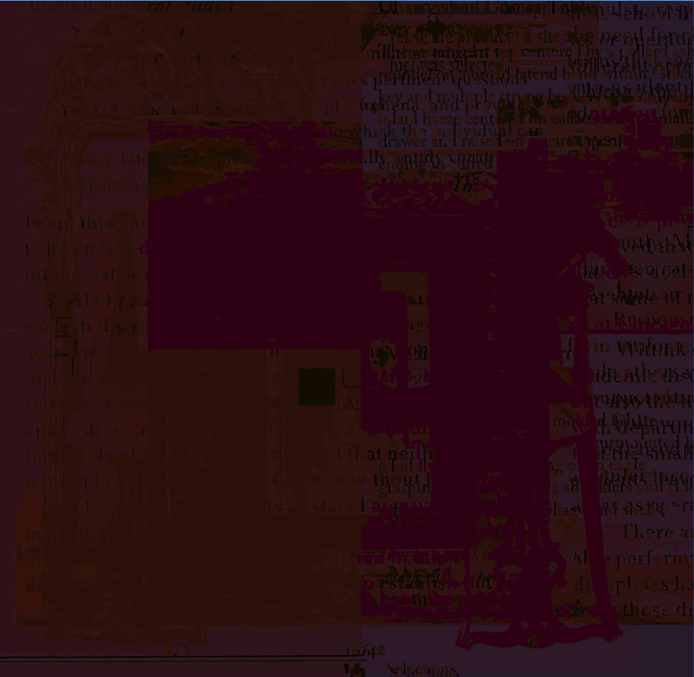
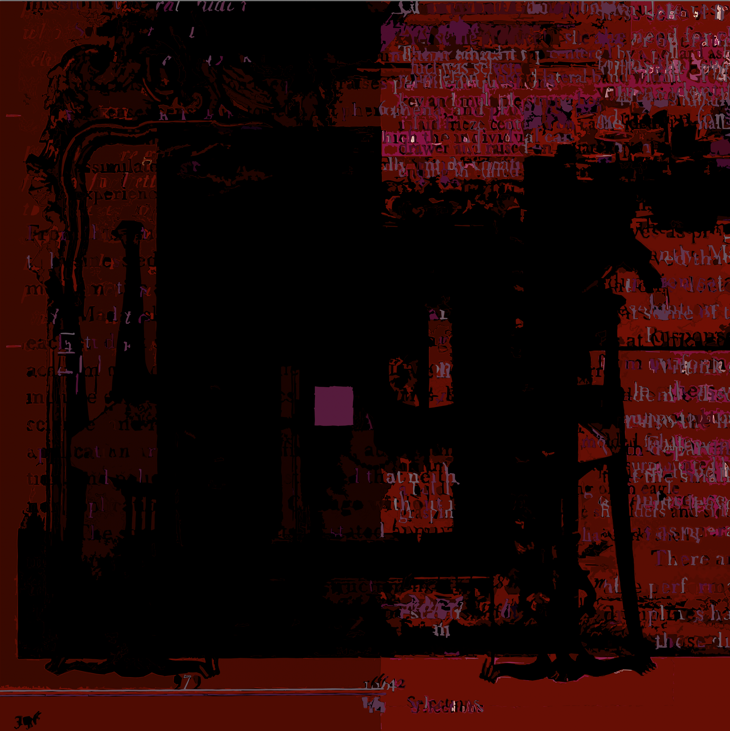
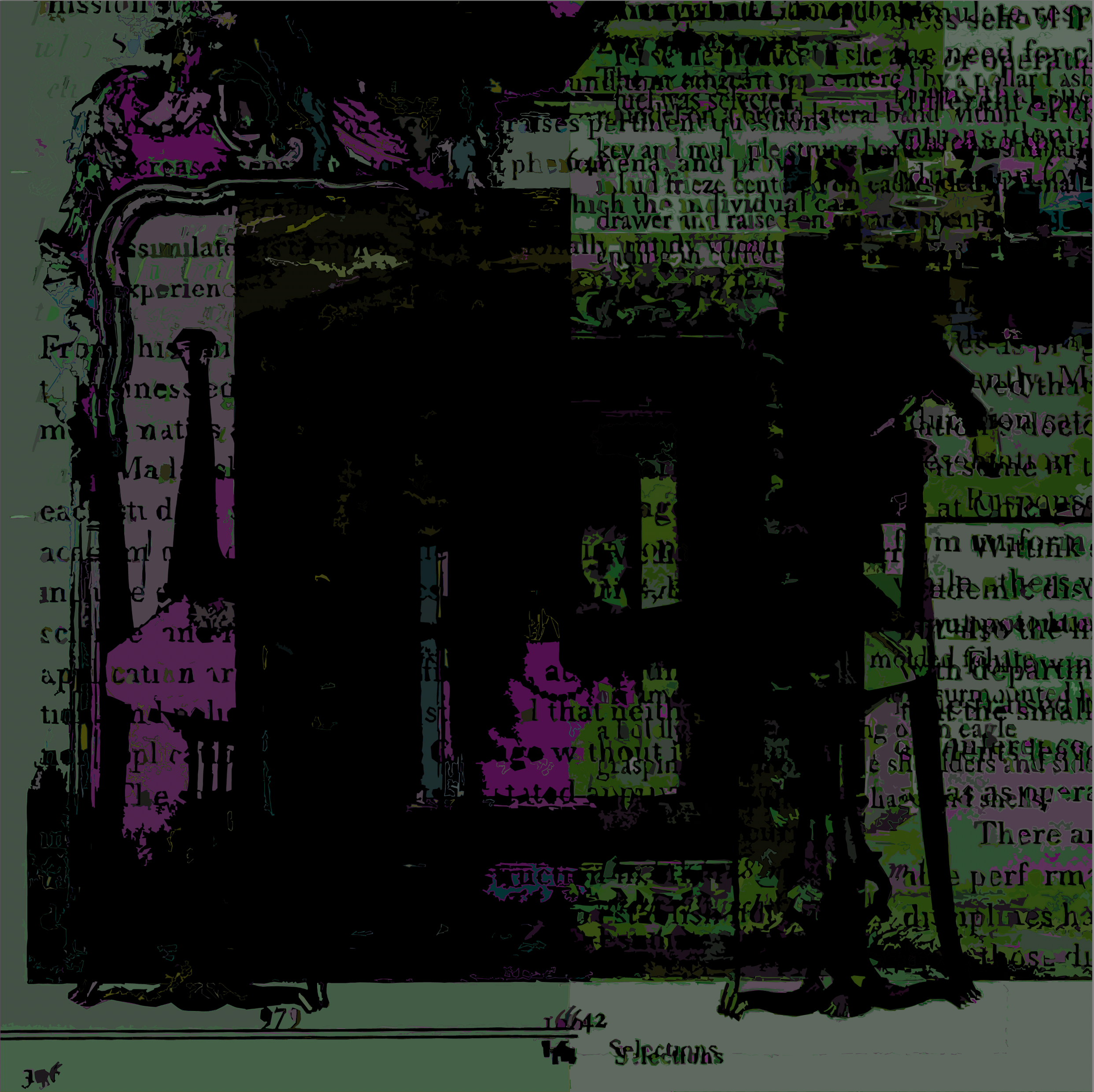
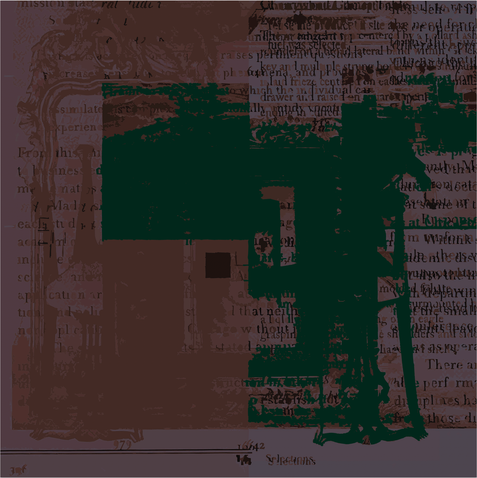
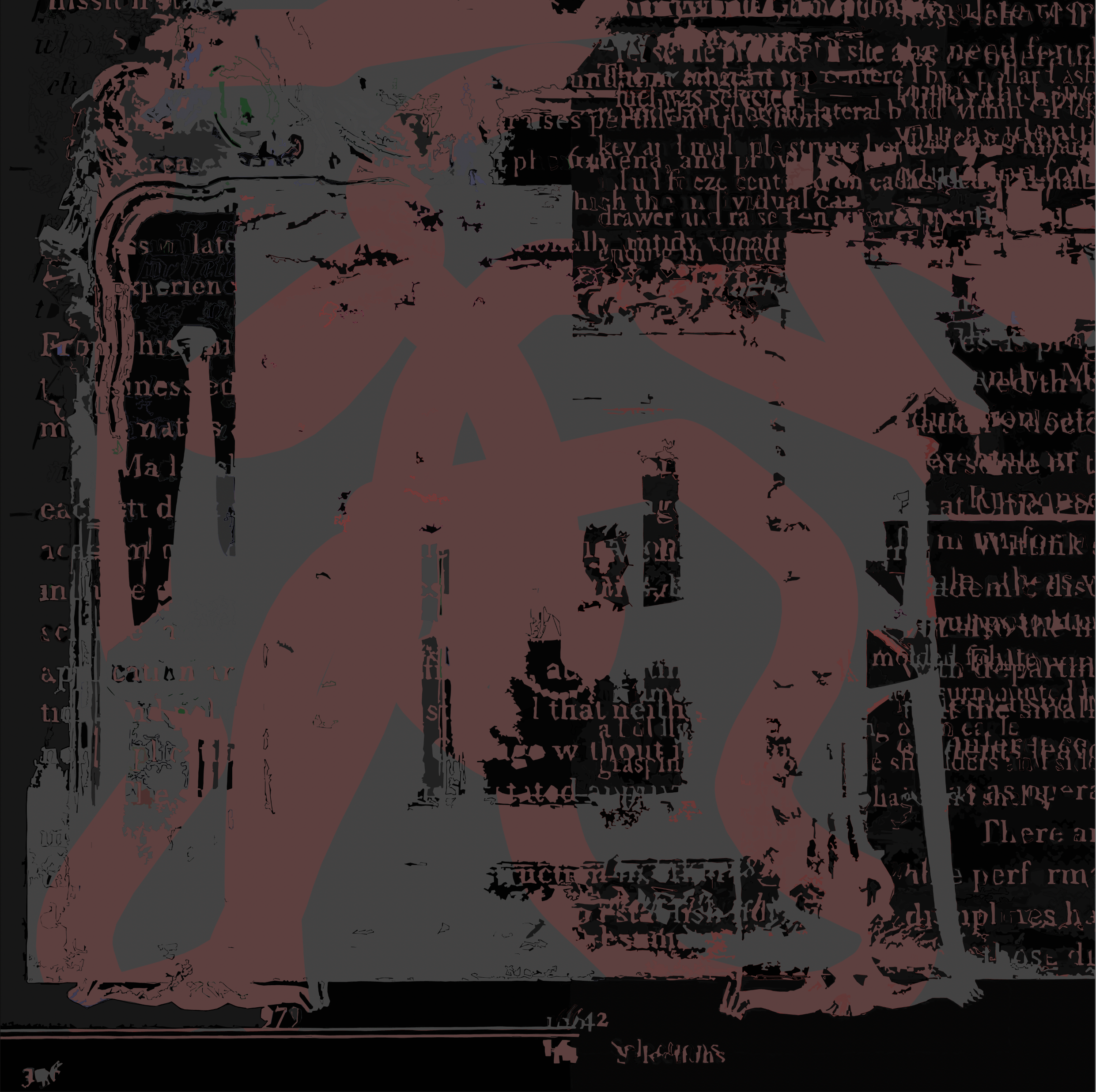
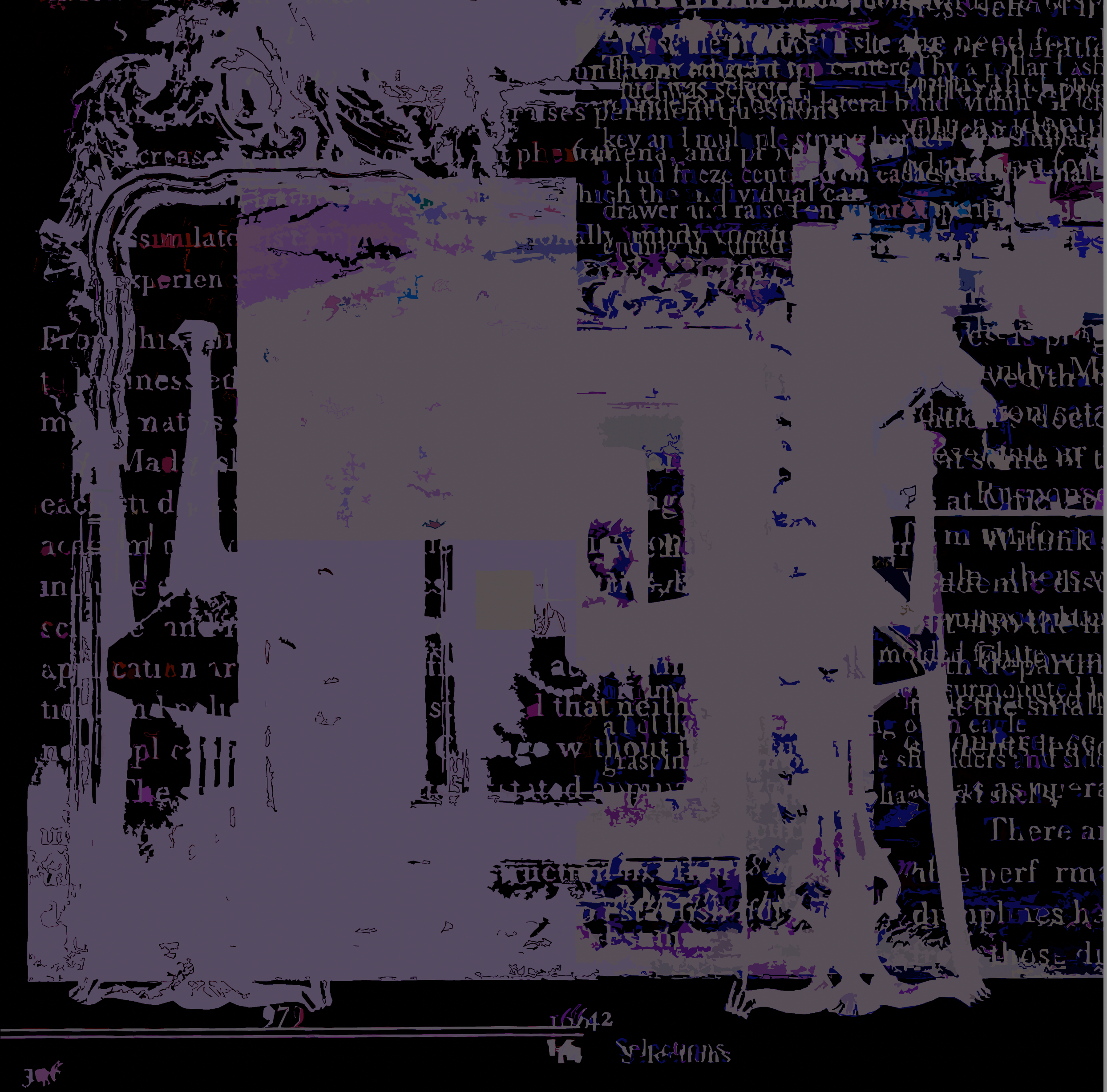
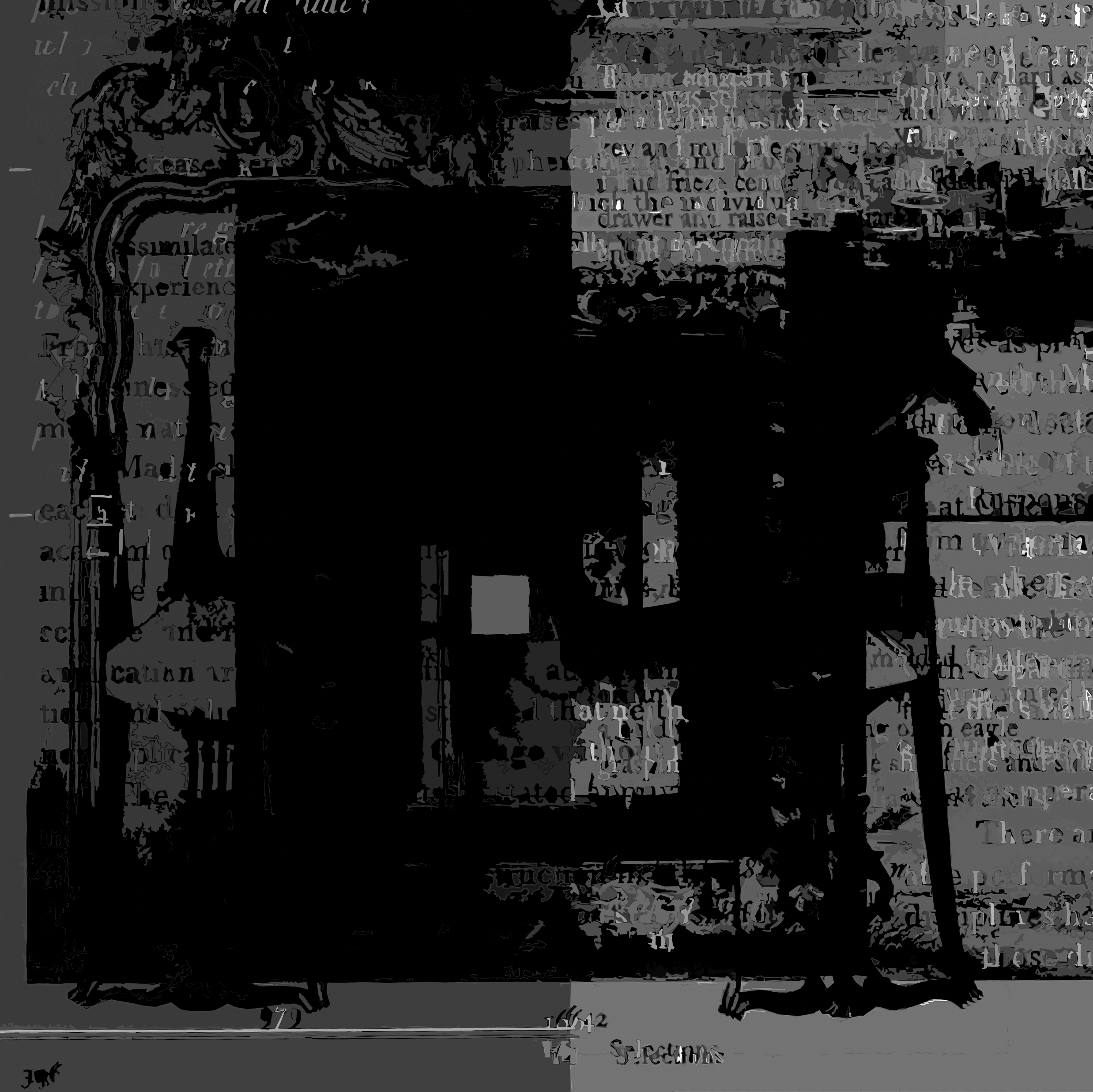
‘Selections’ (Make Ready Series One) 2019-2023. 30 X 30. Original #1 (first shown in series): archival digital pigment print on panel. Ninety nine (99) iterative limited edition archival digital pigment prints on canson hot press.


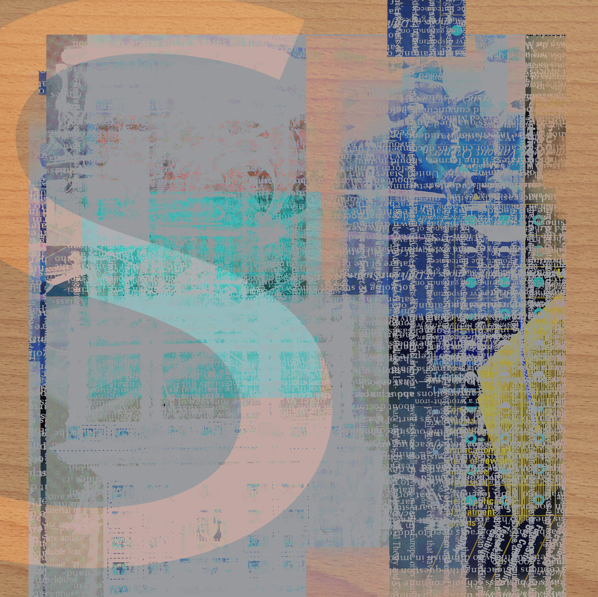
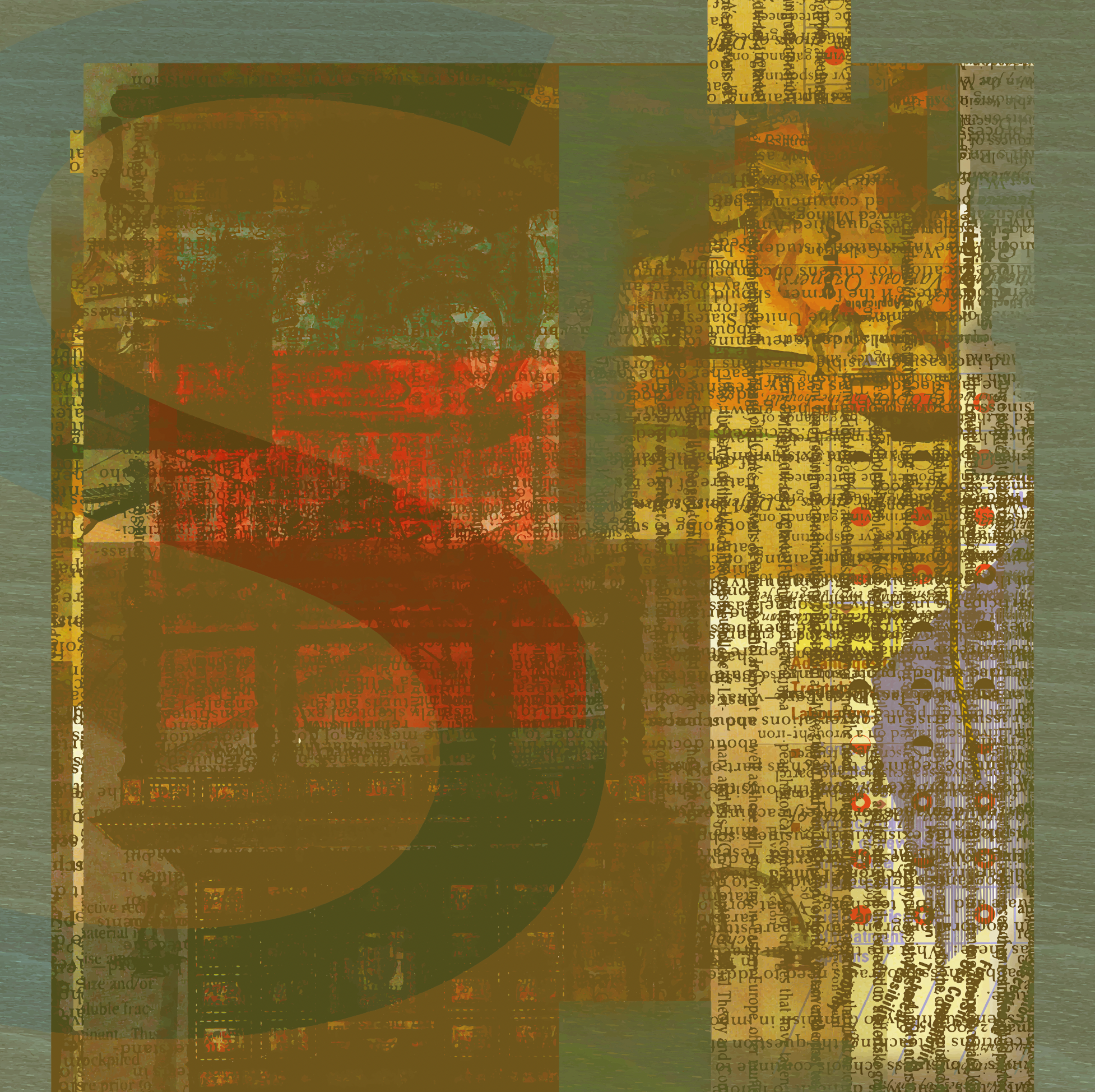
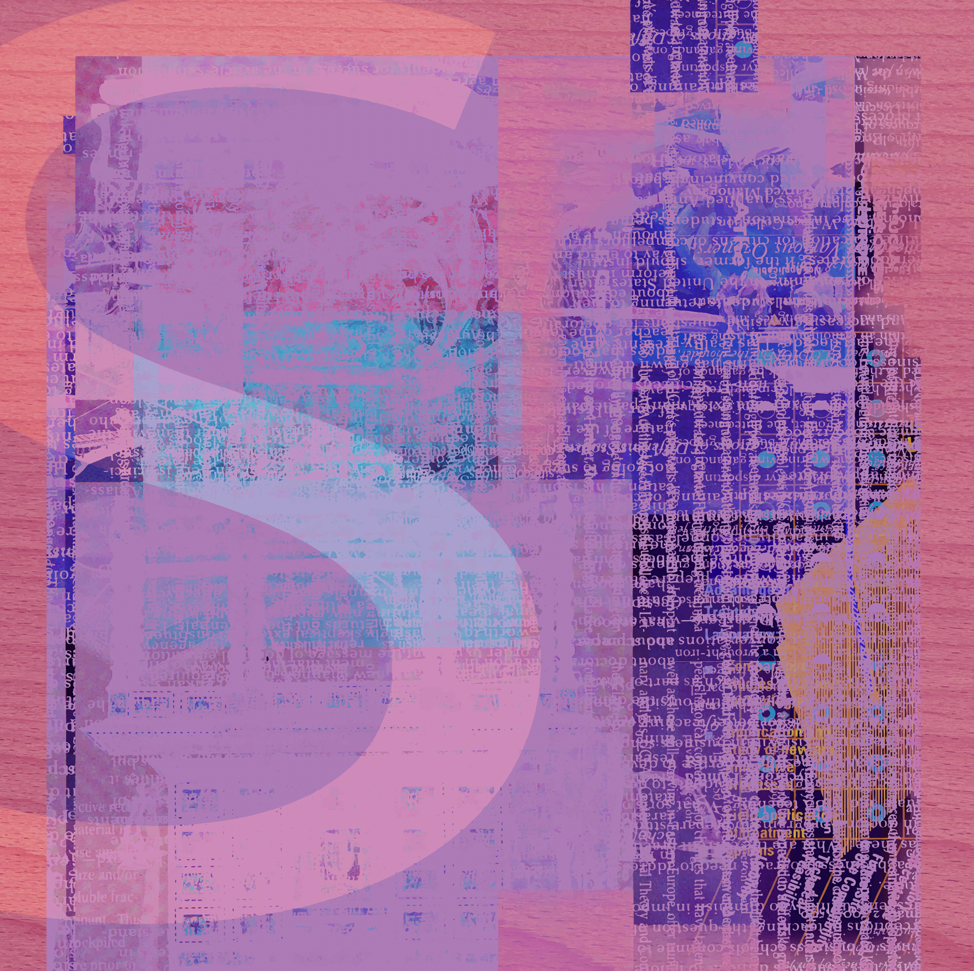
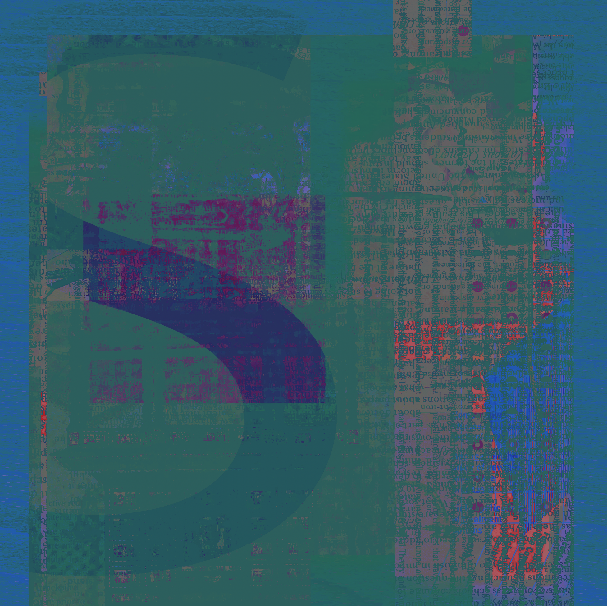
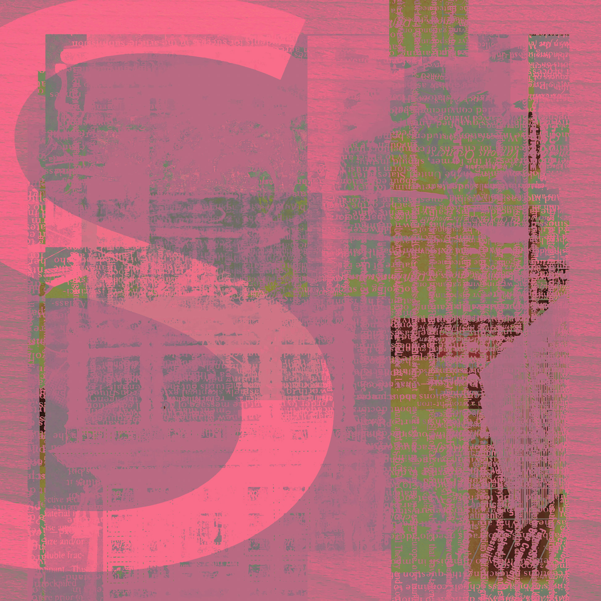
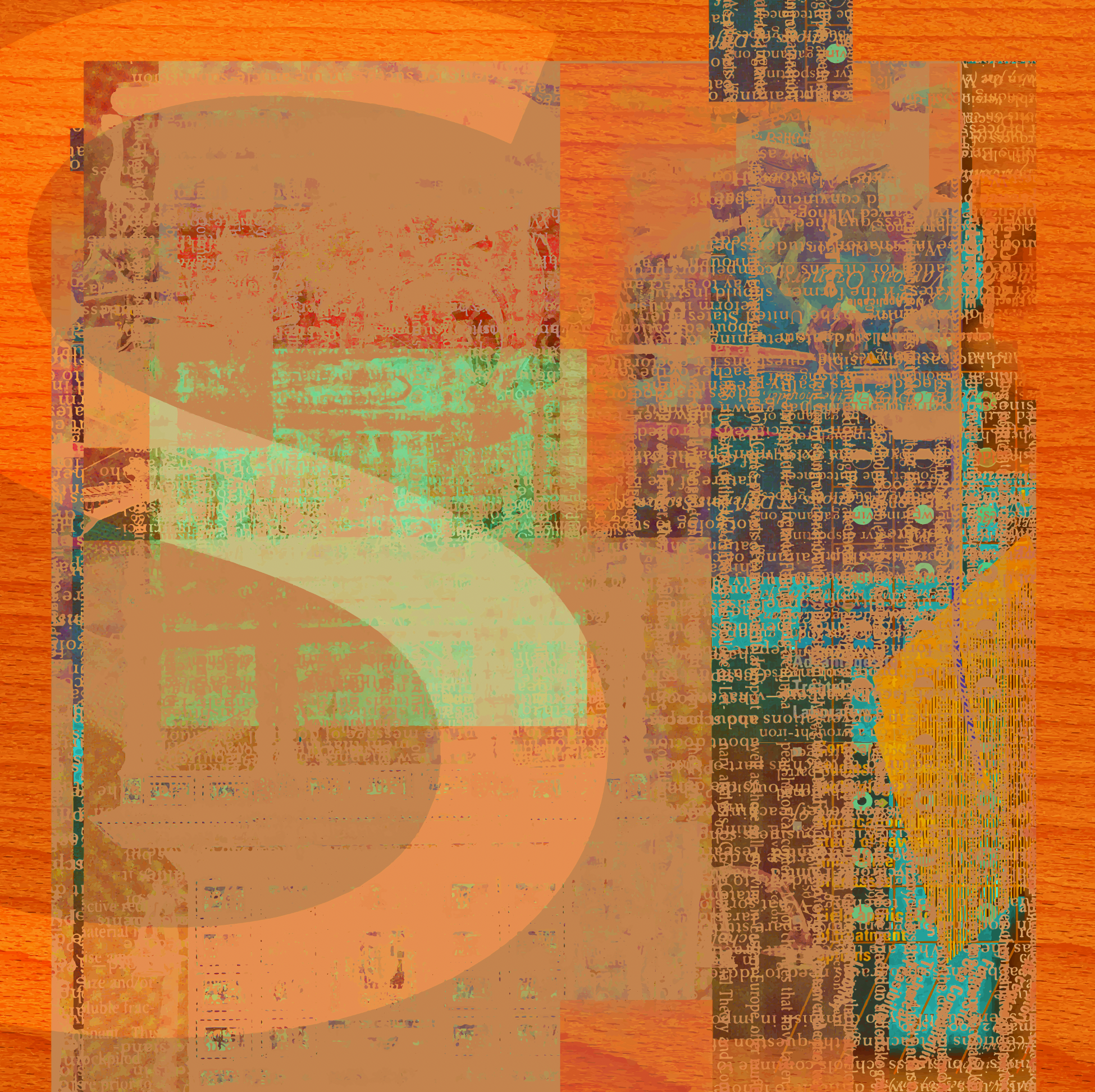
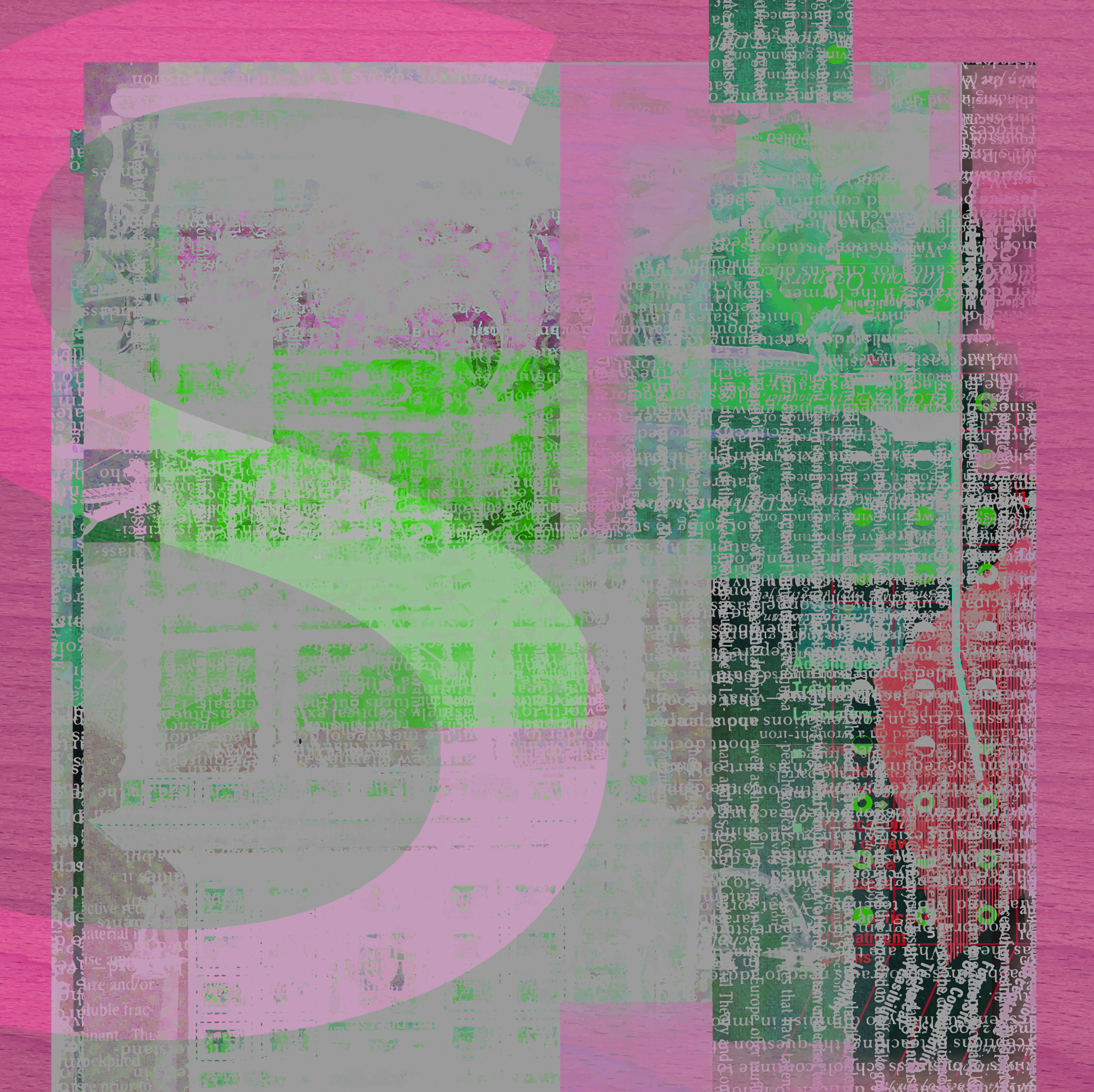
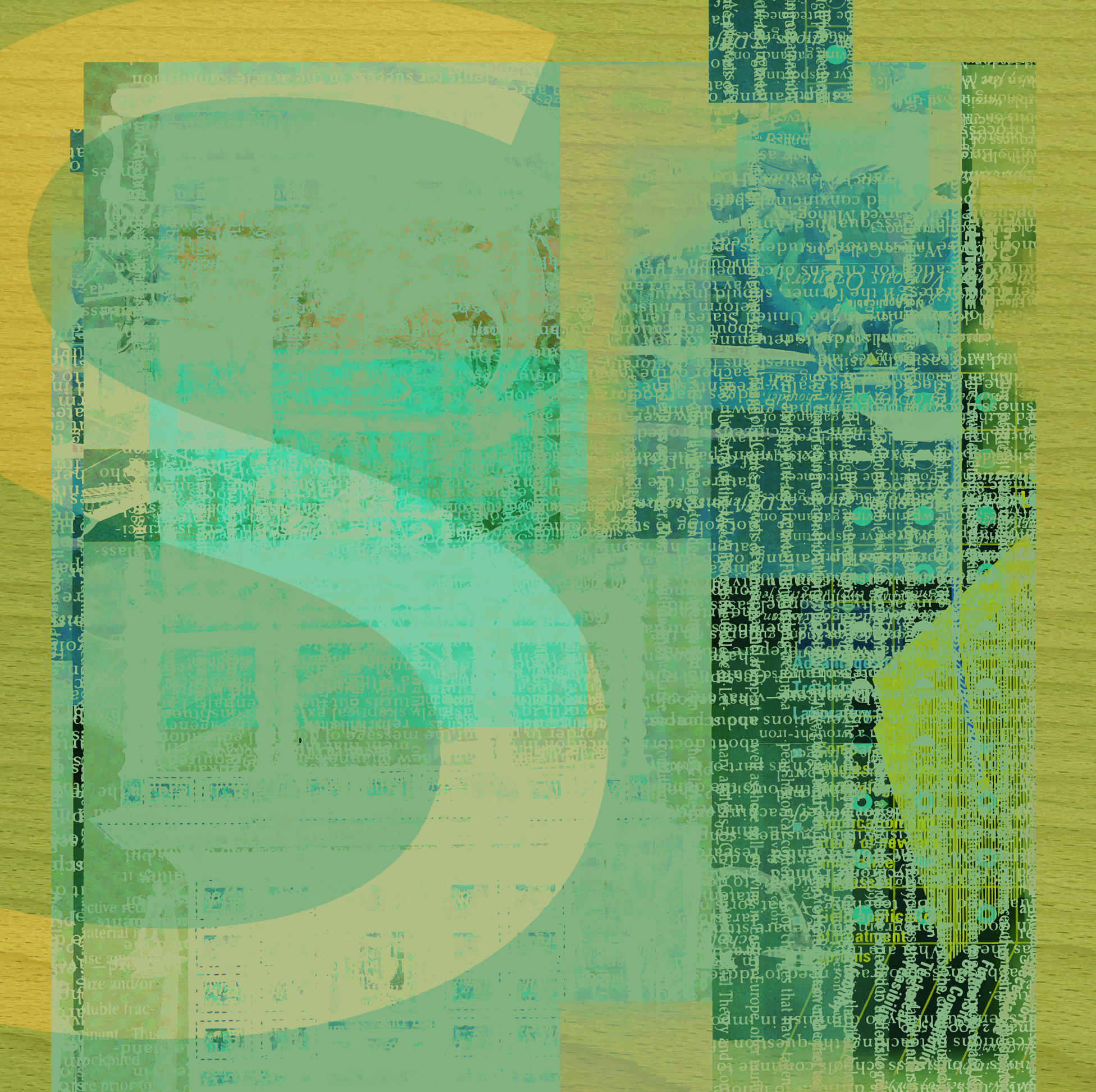
‘Give Me An S’ (Make Ready Series Four) 2019-2020. 48” x 48” Original #1 (first shown in series): archival pigment print on panel. Eight (8) archival limited edition pigment prints on canson hot press.
Make-Ready, Singular Works, 1985-2025, ’Well-involved Vacant Structures’ Various sizes; archival limited edition pigment prints on canson hot press.
'Blue Crest', 1994, 8” x 10” 
'Commerce Bars', 2012, 8” x 10” 
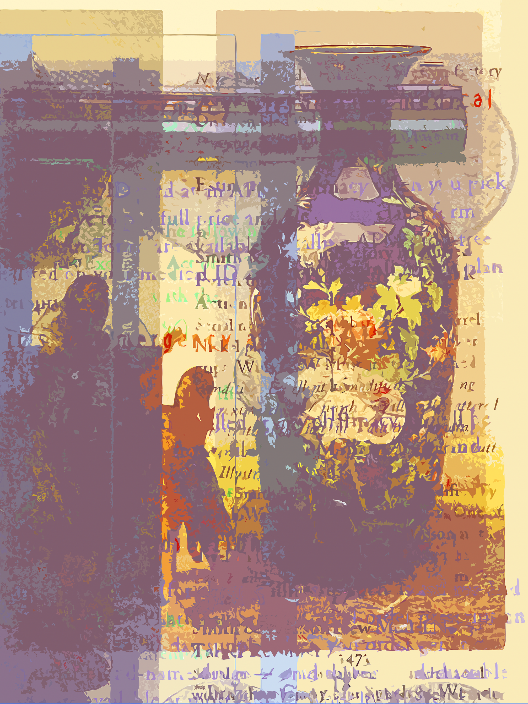
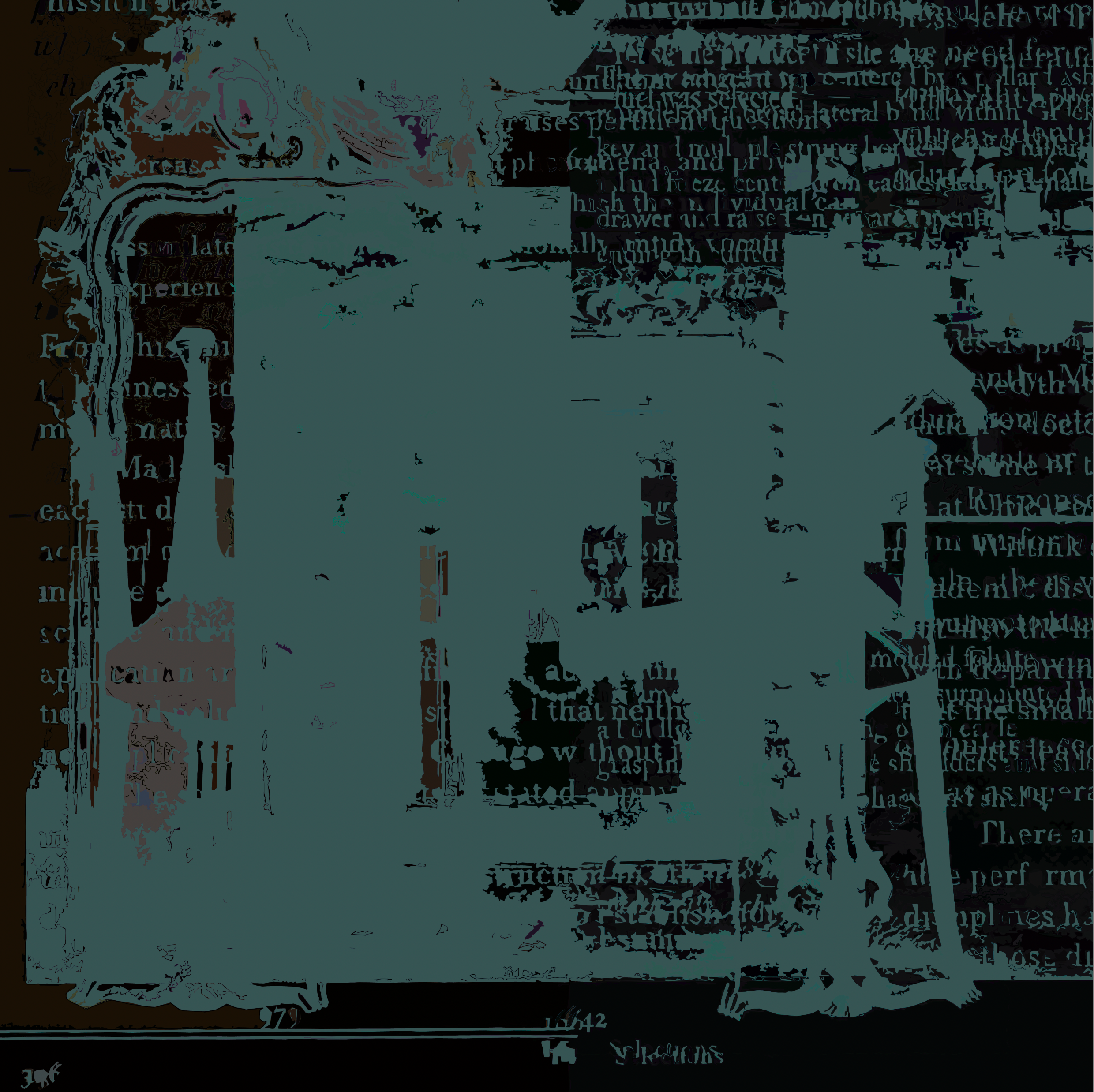
'Literature' 2016, 42" x 42” 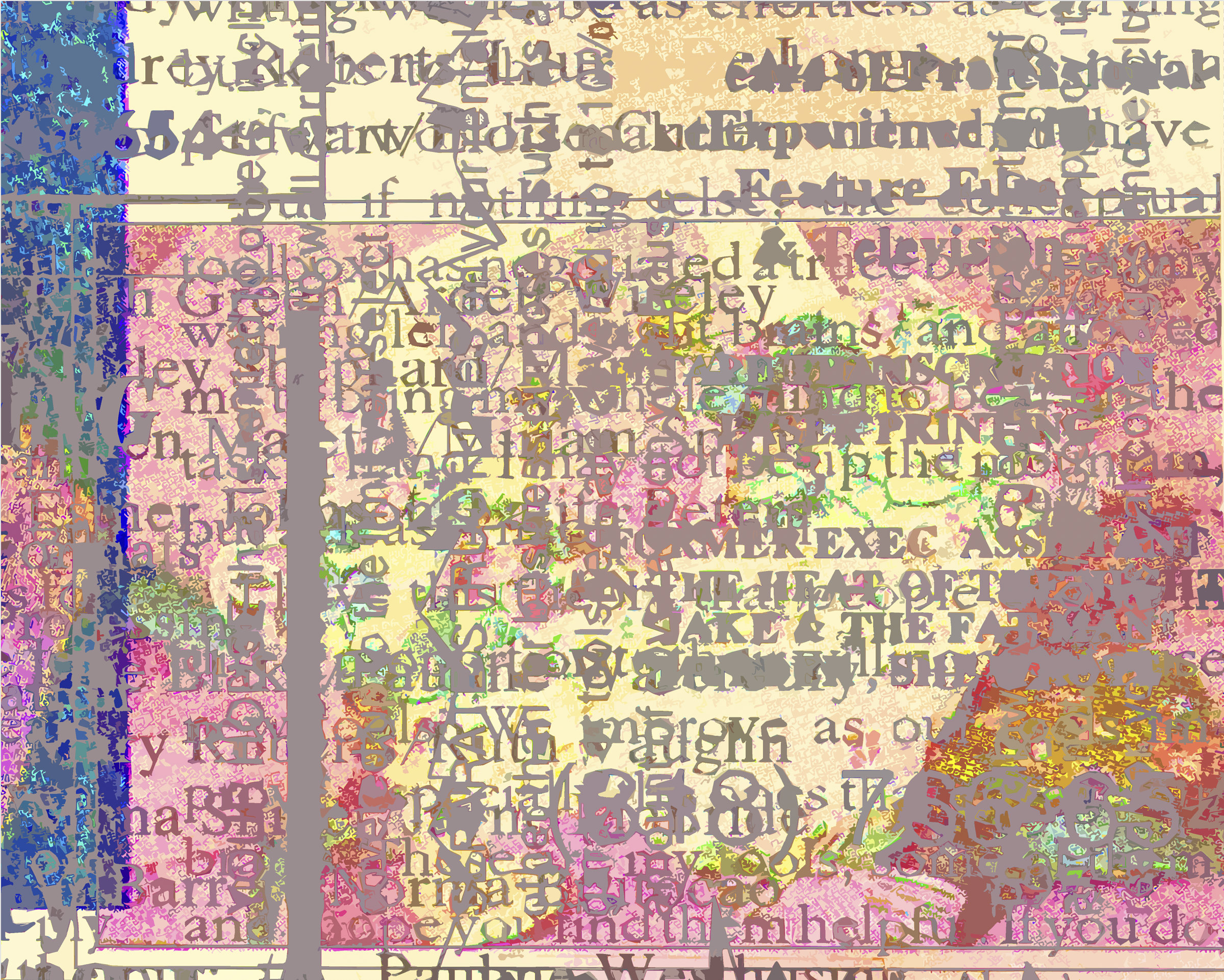
'Happy Currency' 2017, 7" x 9” 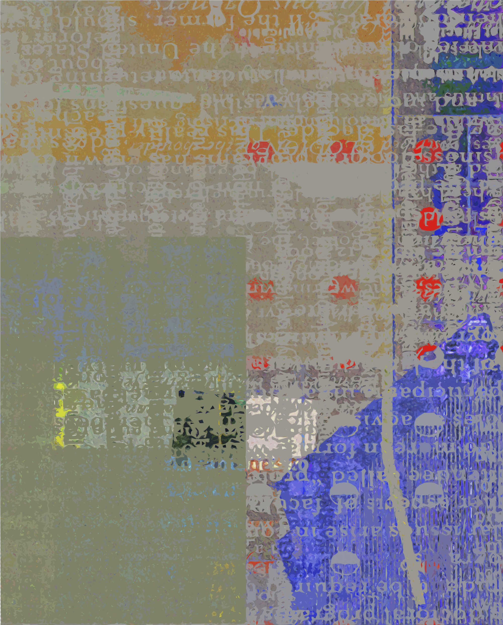
'Took Her To the Circus' 2016, 20" x 25” 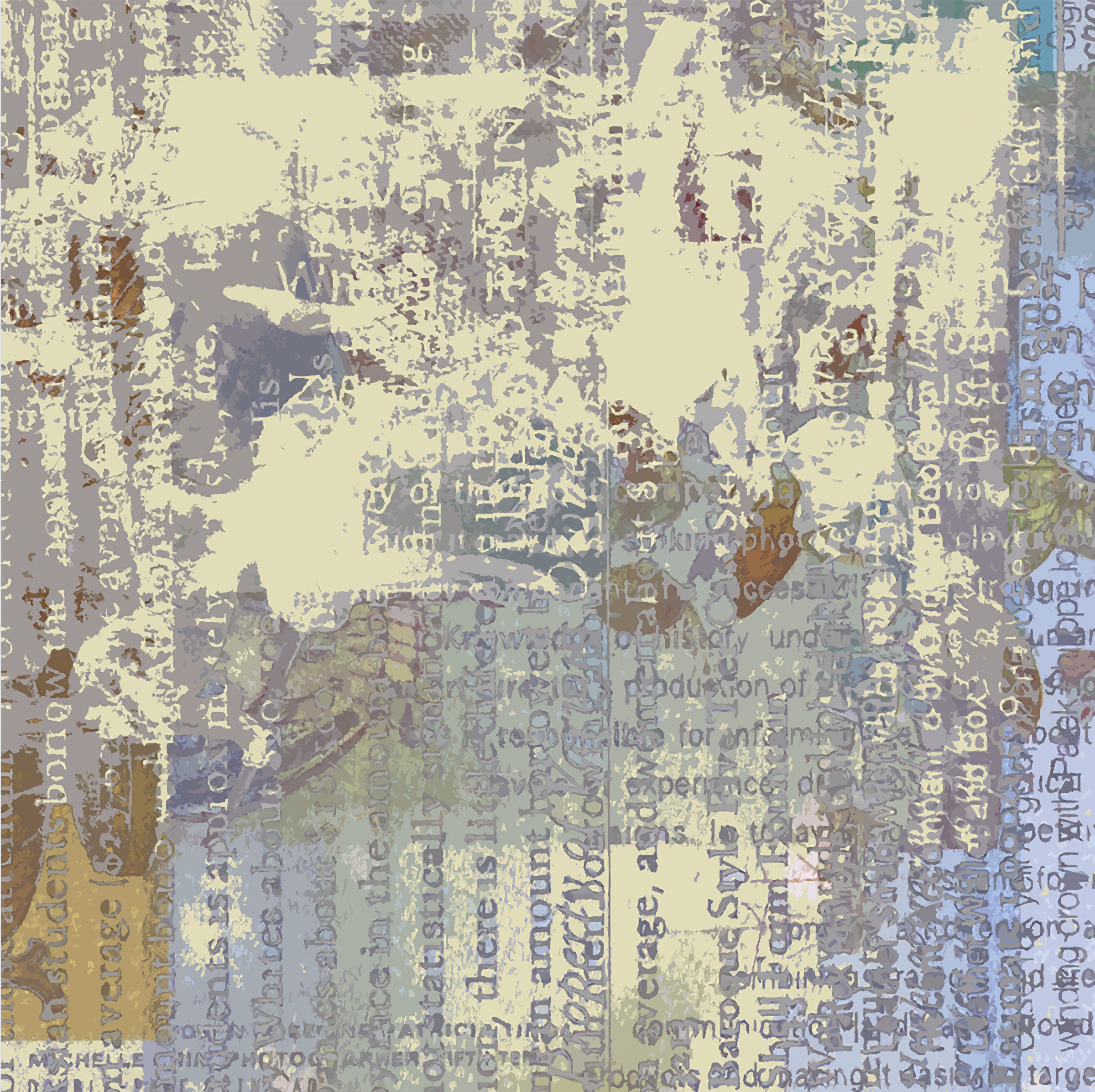
'There You Have It' 2024, 24" x 14” 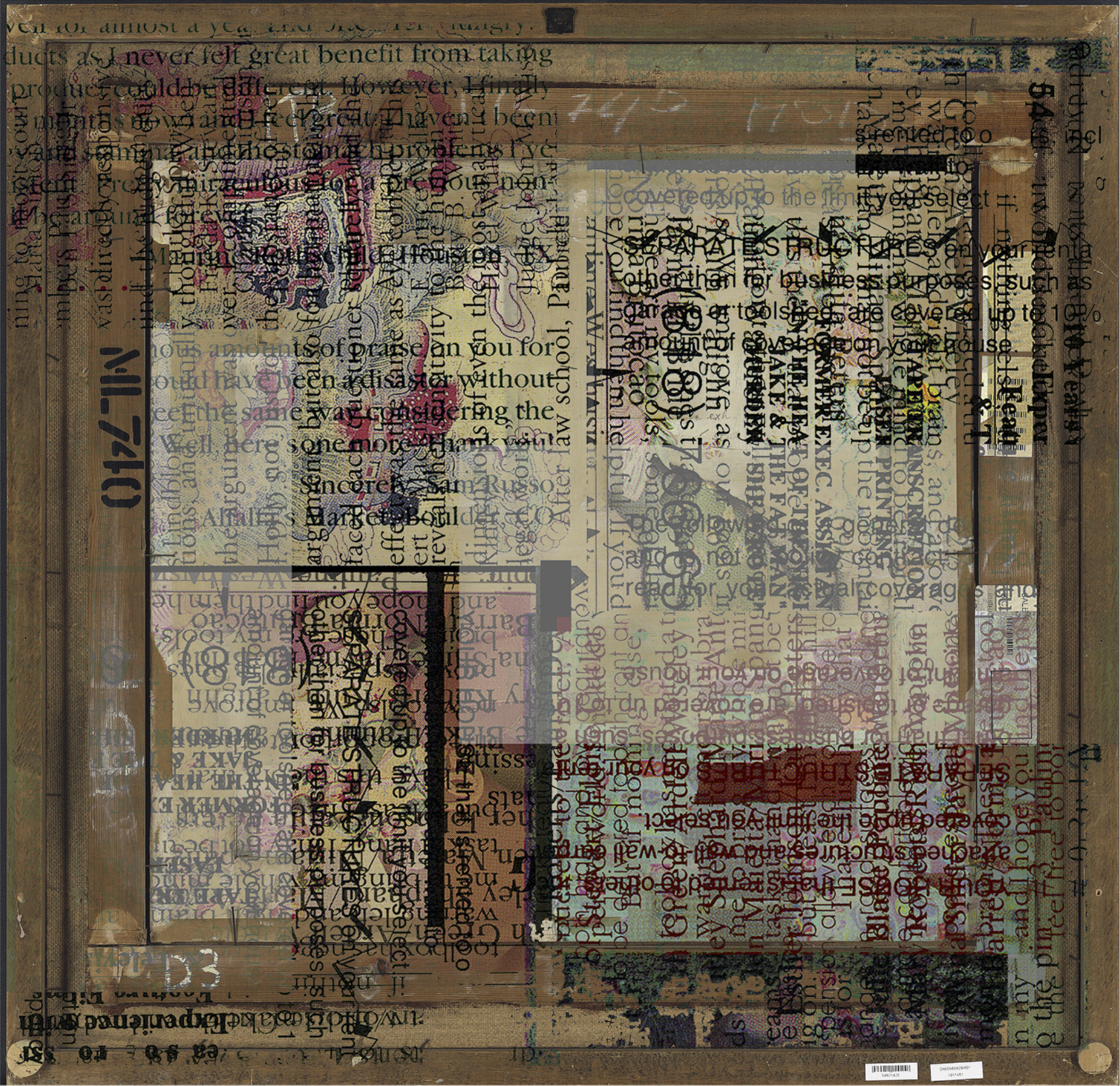
'Never Been To Asia' 2016, 24" x 14” 
'Dot Farm 1' 2016, 52" x 58” 
'Limesickle' 2022, 52" x 64” 
'Than' 2016, 20" x 25” 
'Station To Station' 2012, 18" x 24” 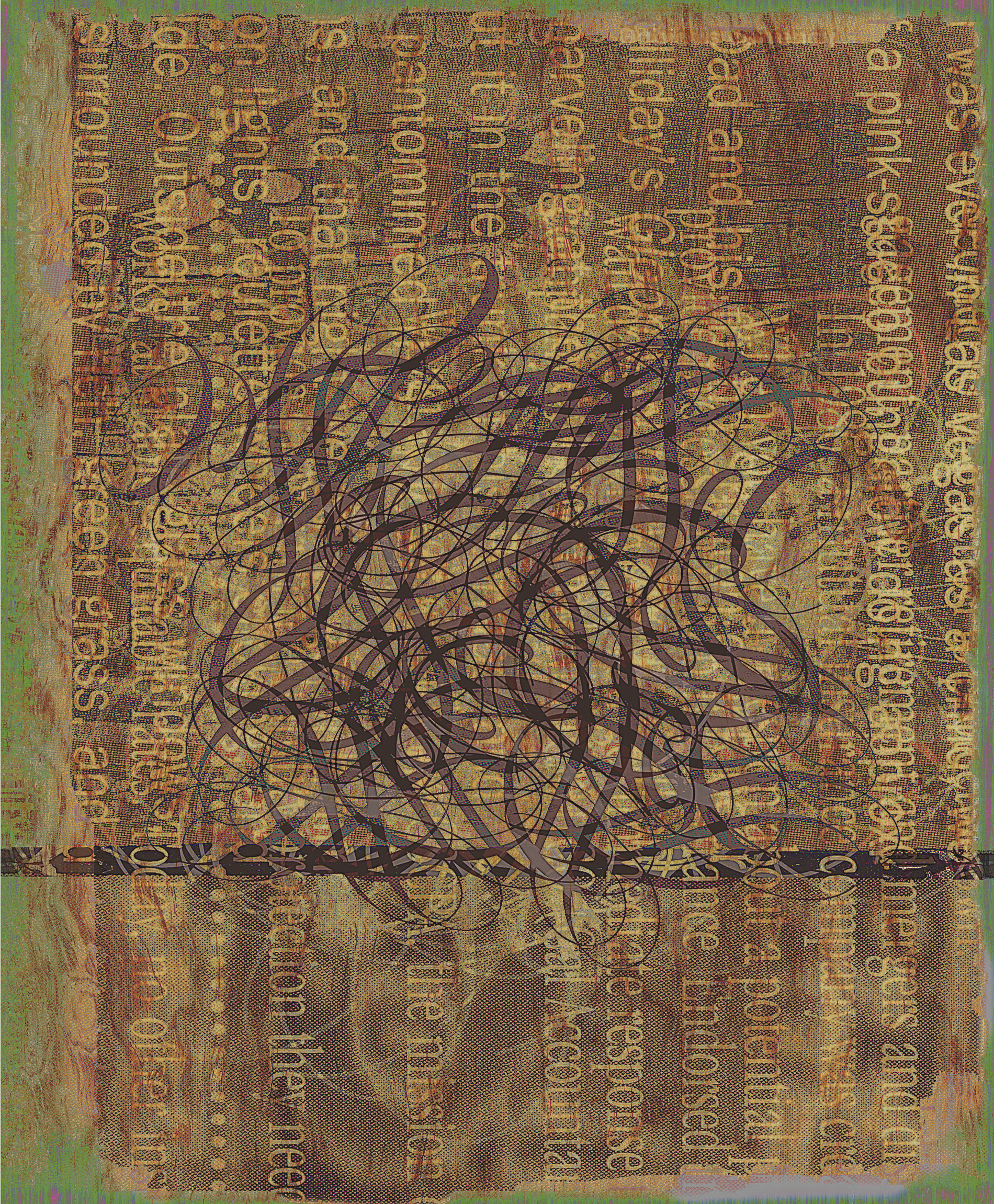
'Conundrum' 2012, 18" x 22” 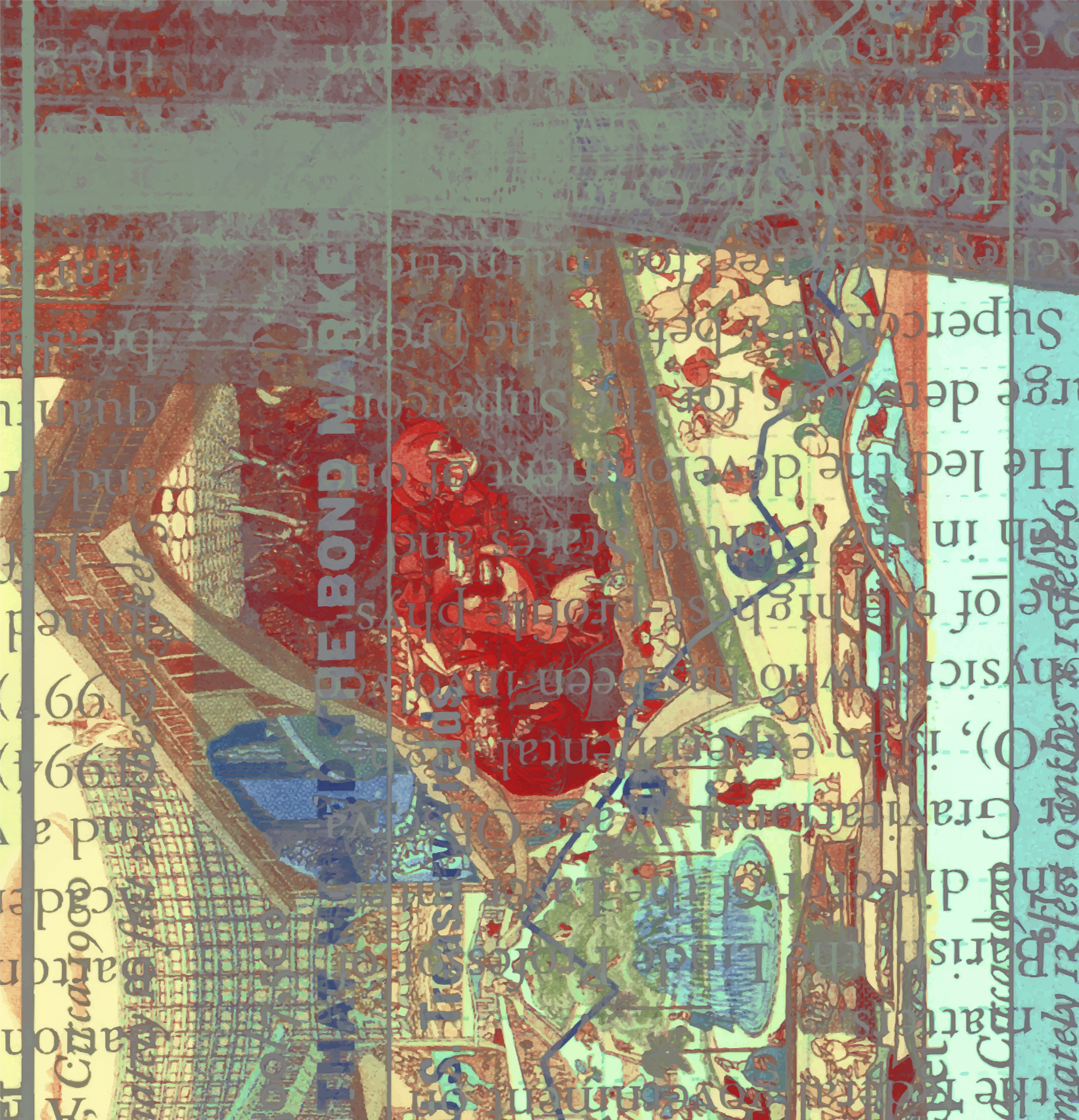
'Dr Christian Barnard' 1992 12" x 12” 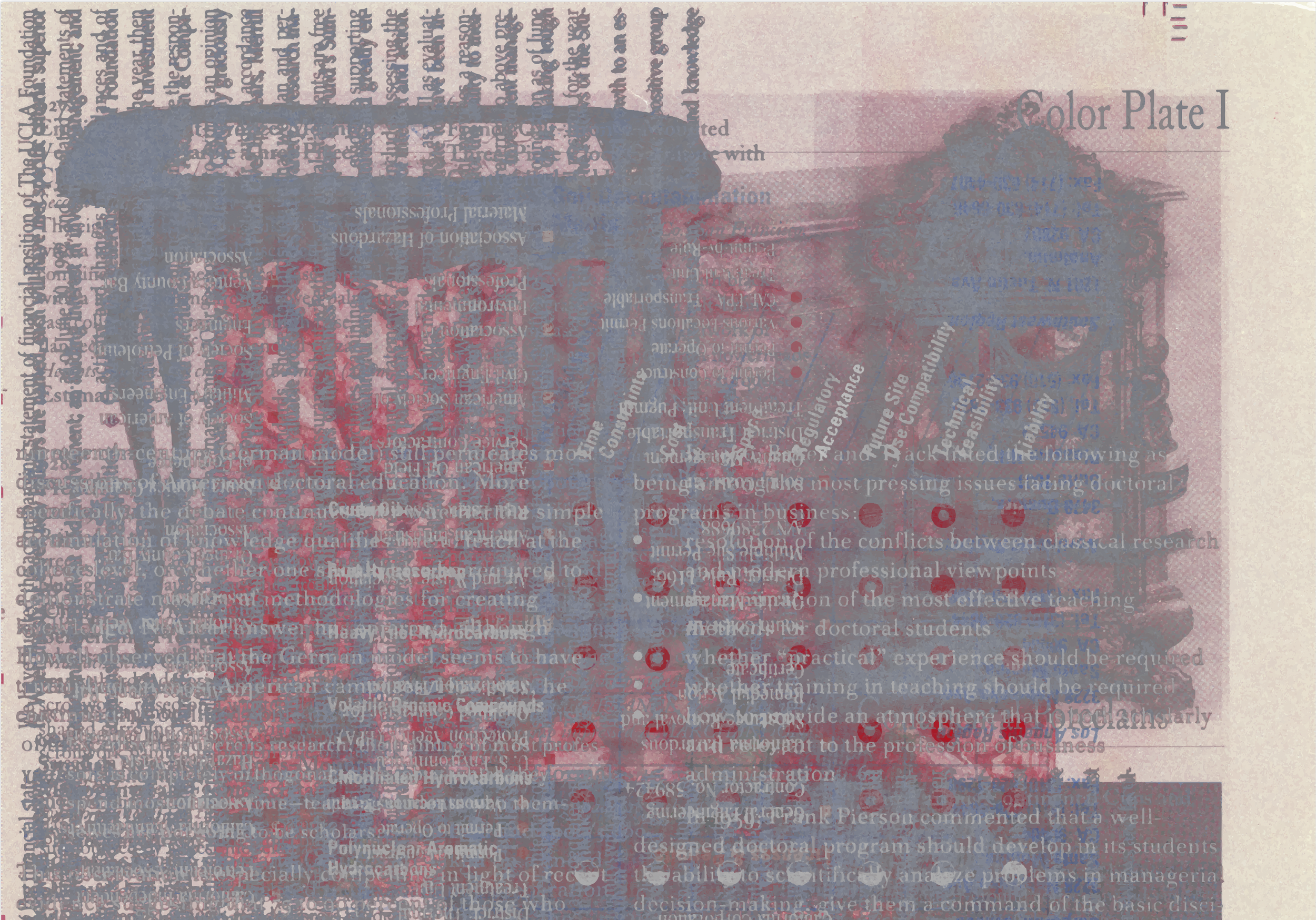
'Color Plate' 2016, 24" x 14” 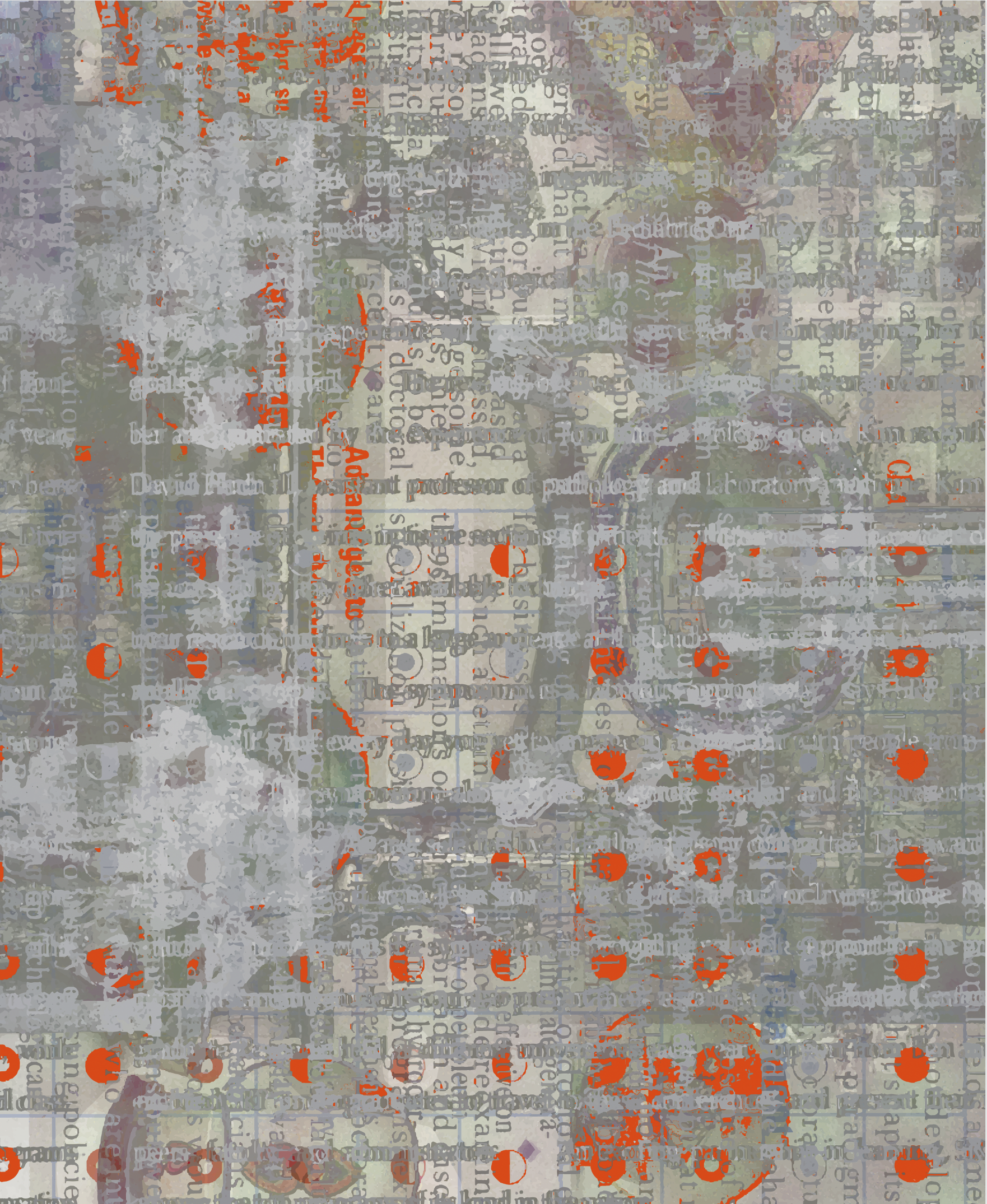
'Dot Farm 2' 2016, 52" x 64” Make-Ready, Singular Representational Works. 1985-2025, ’Well-involved Vacant Structures’; Various sizes; archival limited edition pigment prints on canson hot press.
‘Immersion’ 2018. 16”x20”
‘Elba’ 2004. 18” x 18”
‘Frik ‘n Frak’ 2004.60”x30”
‘Glance’ 1986. 24” x 24”
‘Kim Oh No’ 1989. 16” x 13” Serigraph on Canson hot press.
‘So I’m Running Up This Hill And There’s A Yellow Hen on the Side of The Road That I Run Into’ 1989. 12 x 17”
‘White Nephrite Study’ 2012. 52” x 54” Archival print on Canson hot press.
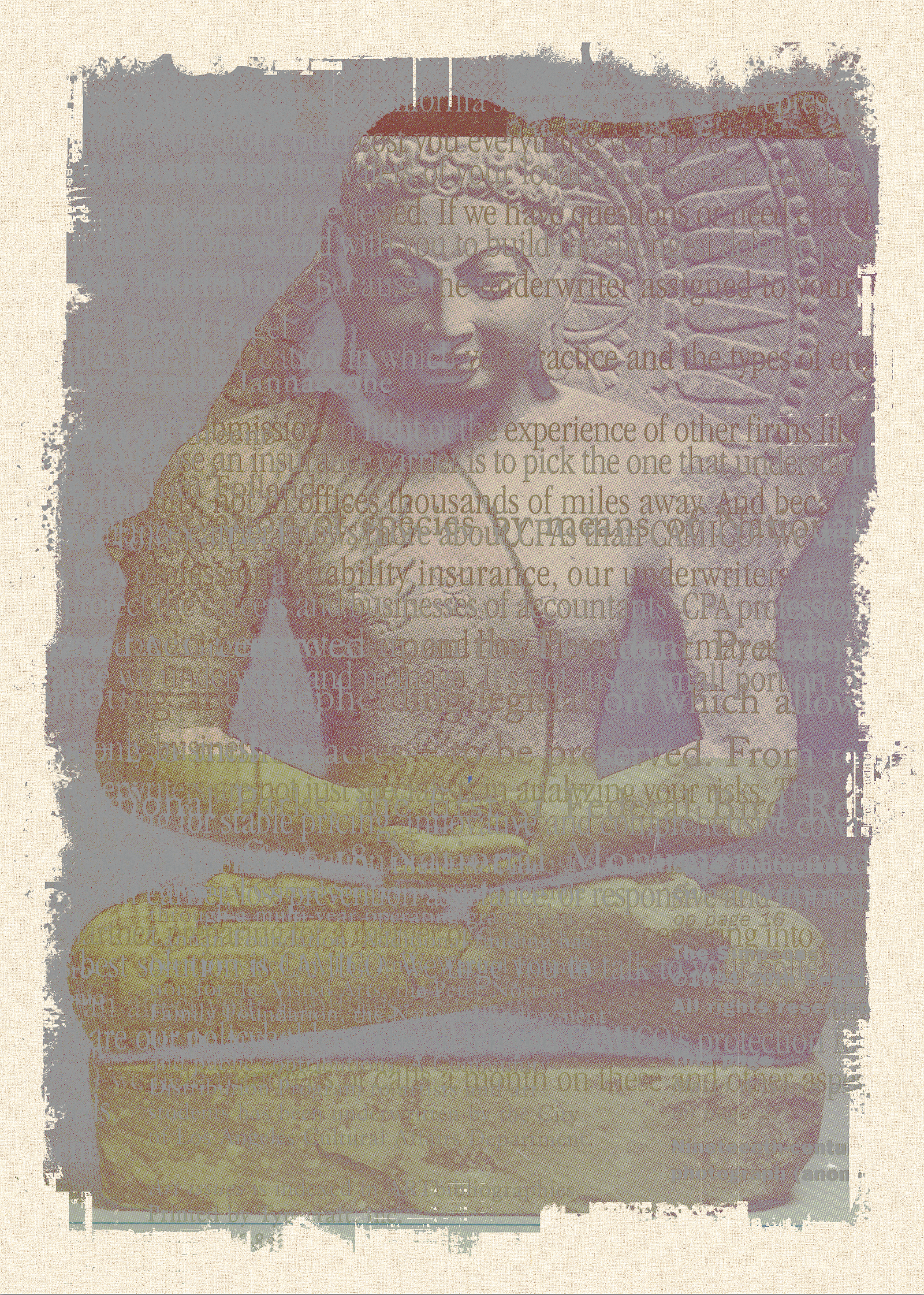
‘Deity’ 2012. 28’ x 38” Polychrome dye print, Belgian canvas on panel.
‘Decrepit Corps’ 2008. 120” x 82”
‘Family Adventure’ 2004. 20”x18”
‘A Man With a Stranger’s Face’ 2006. 20” x 20”
‘Mary’s Sun’ 1988. 6” x 4”
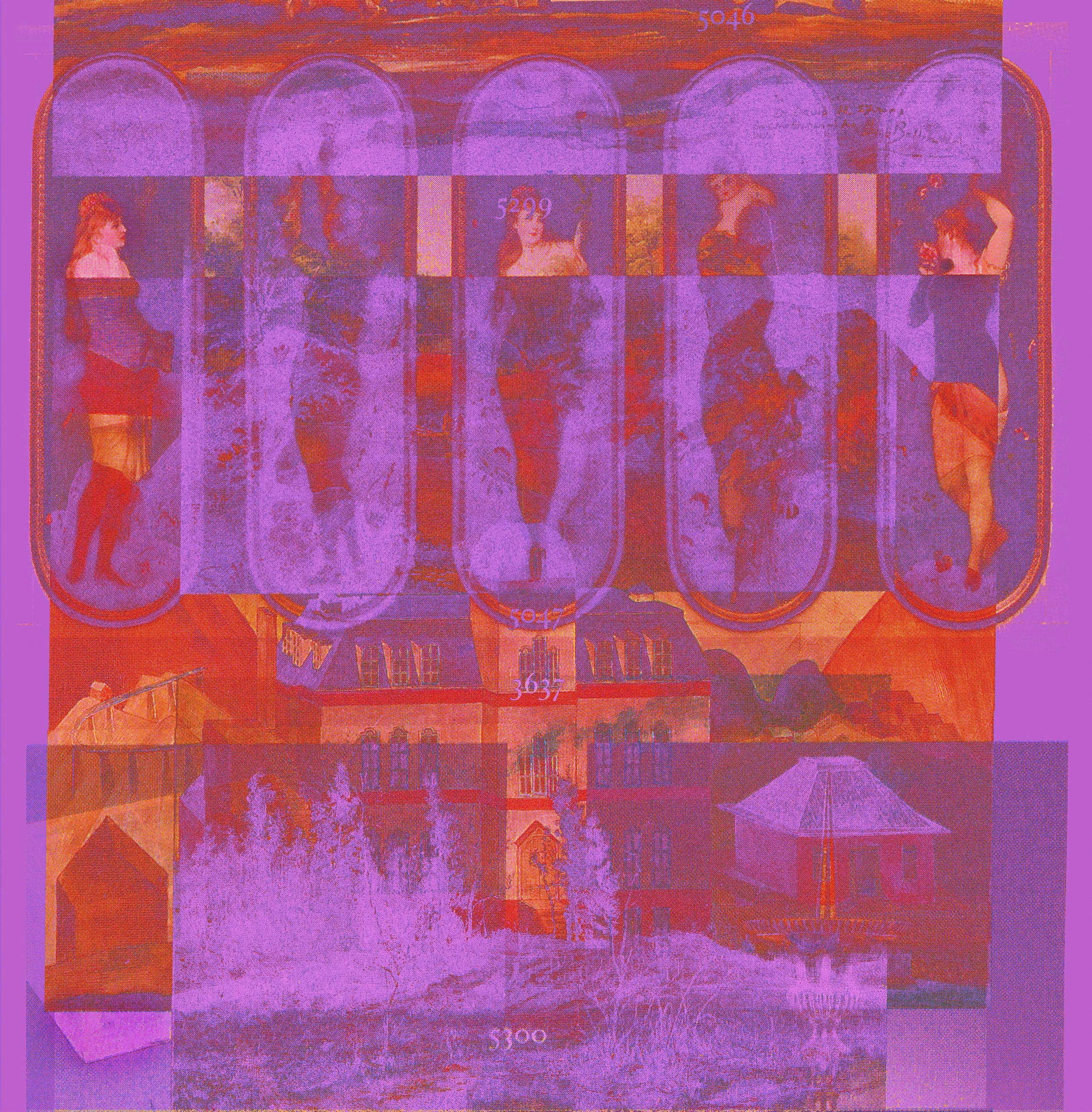
‘5300’ 2002. 18” x 18”
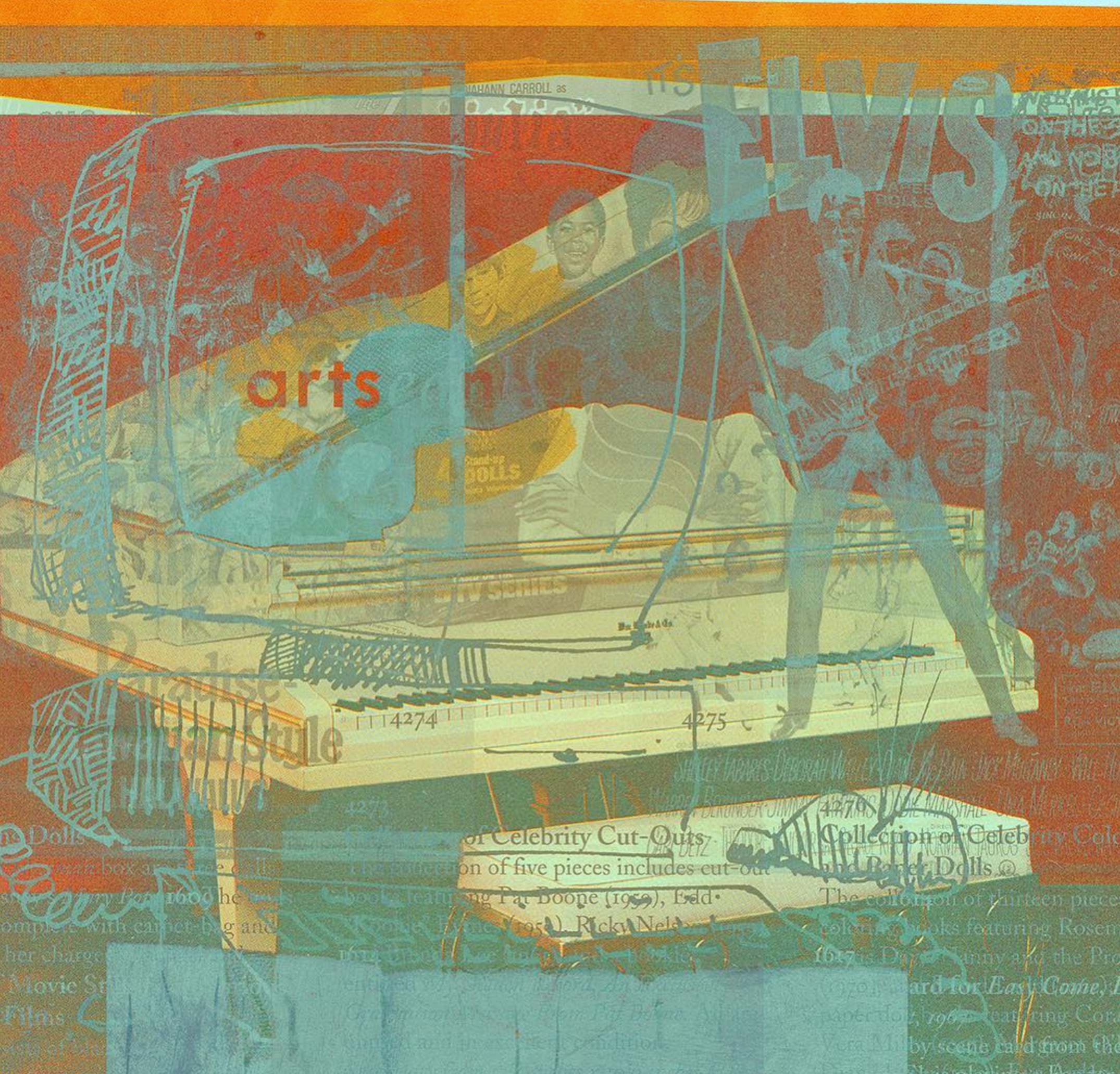
‘Celebrity Cut Outs’ 2004. 24” x 24”
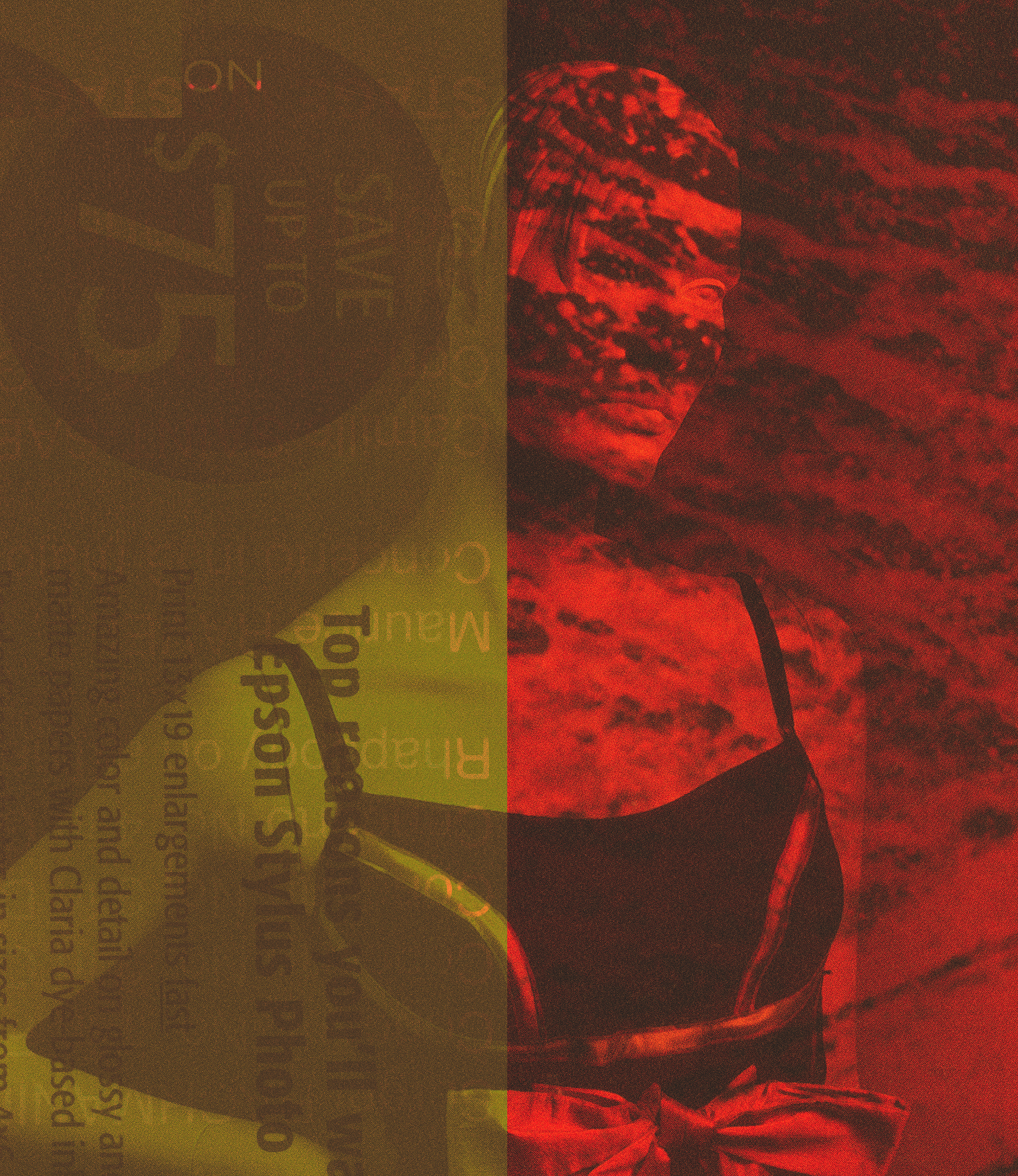
‘Save Up to $75’ 2002. 14” x 16”
‘To Pick The One’ 2011. 40” x 56”